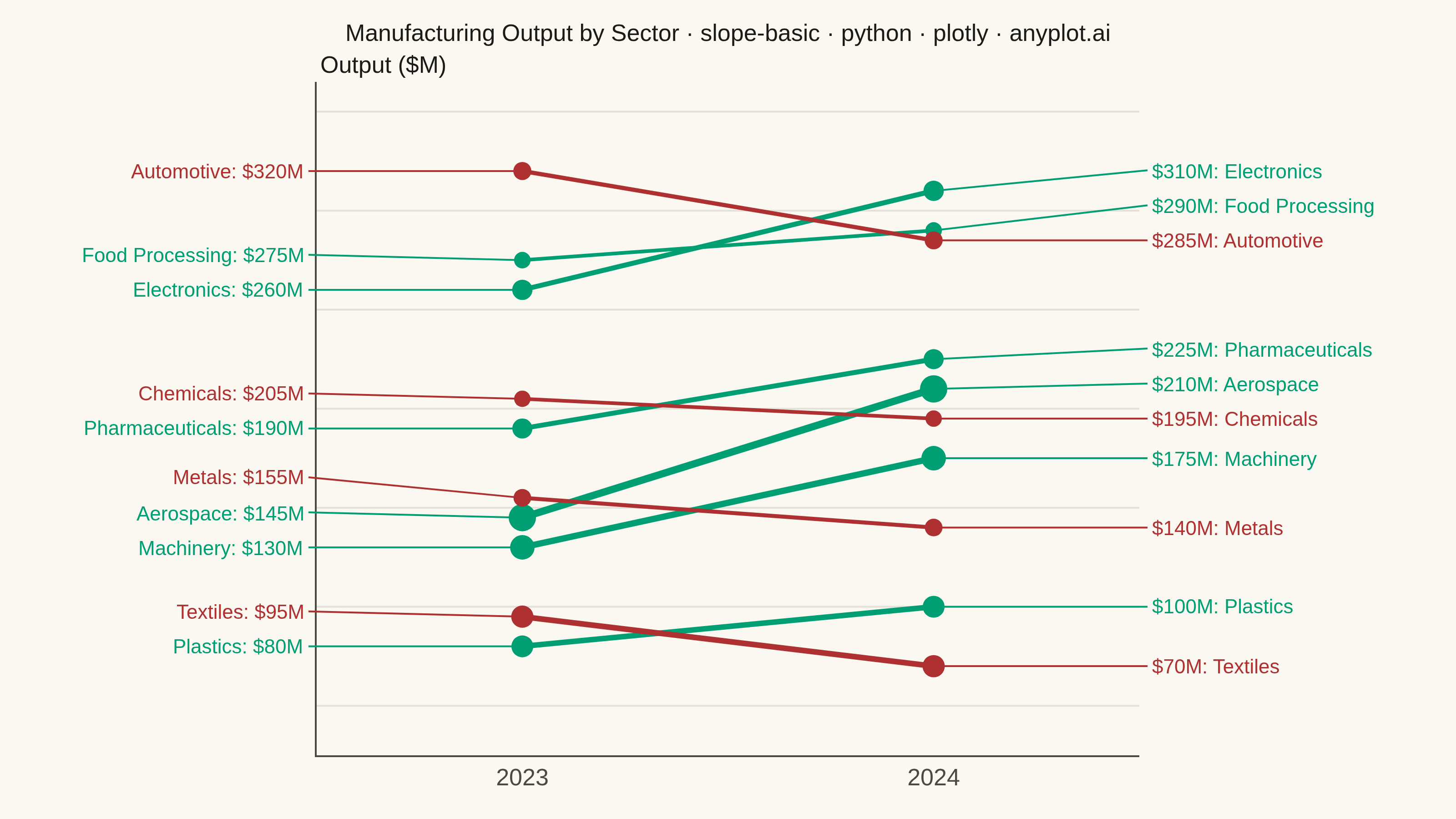
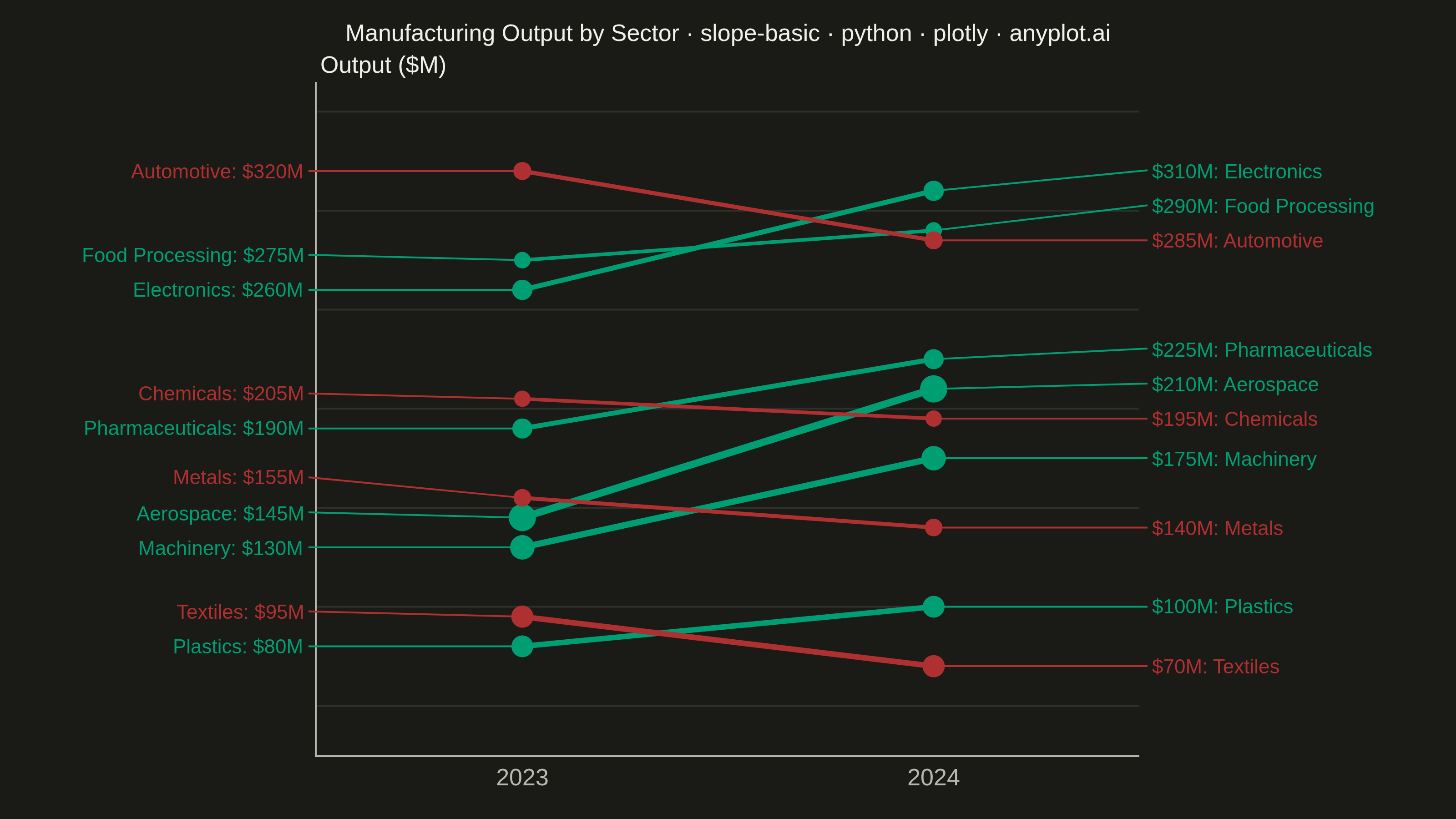
A slope chart (slopegraph) visualizes changes between two or more time points by connecting values with lines across vertical axes. It emphasizes the direction and magnitude of change rather than absolute values, making it ideal for spotting increases, decreases, and rank changes at a glance. This chart type excels at before/after comparisons and highlighting which items improved or declined.
""" anyplot.ai
slope-basic: Basic Slope Chart (Slopegraph)
Library: plotly 6.9.0 | Python 3.13.14
Quality: 91/100 | Updated: 2026-07-25
"""

import os

import plotly.graph_objects as go


# Theme tokens
THEME = os.getenv("ANYPLOT_THEME", "light")
PAGE_BG = "#FAF8F1" if THEME == "light" else "#1A1A17"
INK = "#1A1A17" if THEME == "light" else "#F0EFE8"
INK_SOFT = "#4A4A44" if THEME == "light" else "#B8B7B0"
GRID = "rgba(26,26,23,0.10)" if THEME == "light" else "rgba(240,239,232,0.10)"

# Imprint palette: brand green = growth, matte red = decline (finance/industrial
# gain-loss semantic exception — see default-style-guide.md "Semantic exception")
COLOR_UP = "#009E73"
COLOR_DOWN = "#AE3030"

# Data - US manufacturing sector output ($M), 2023 vs 2024
sectors = [
    "Aerospace",
    "Electronics",
    "Pharmaceuticals",
    "Machinery",
    "Food Processing",
    "Plastics",
    "Chemicals",
    "Metals",
    "Automotive",
    "Textiles",
]

output_2023 = [145, 260, 190, 130, 275, 80, 205, 155, 320, 95]
output_2024 = [210, 310, 225, 175, 290, 100, 195, 140, 285, 70]

colors = [COLOR_UP if end > start else COLOR_DOWN for start, end in zip(output_2023, output_2024, strict=True)]

# Emphasize the biggest movers with bolder lines/markers (data-driven, not decorative)
pct_changes = [abs(end - start) / start for start, end in zip(output_2023, output_2024, strict=True)]
lo, hi = min(pct_changes), max(pct_changes)
spread = hi - lo
emphasis = [(c - lo) / spread if spread else 0.5 for c in pct_changes]
line_widths = [2.0 + e * 2.0 for e in emphasis]
marker_sizes = [9 + e * 6 for e in emphasis]


all_values = output_2023 + output_2024
y_min, y_max = min(all_values), max(all_values)
y_pad = (y_max - y_min) * 0.18
y_axis_range = [y_min - y_pad, y_max + y_pad]
min_label_gap = (y_axis_range[1] - y_axis_range[0]) * 0.052

# Anti-overlap label placement: push stacked label positions apart while
# keeping the stack centered on the original values (left/right run the same
# pass independently, since the two label columns never interact).
left_label_y = []
for values in (output_2023, output_2024):
    order = sorted(range(len(values)), key=lambda i: values[i])
    stacked = [values[i] for i in order]
    for i in range(1, len(stacked)):
        if stacked[i] - stacked[i - 1] < min_label_gap:
            stacked[i] = stacked[i - 1] + min_label_gap
    for i in range(len(stacked) - 2, -1, -1):
        if stacked[i + 1] - stacked[i] < min_label_gap:
            stacked[i] = stacked[i + 1] - min_label_gap
    adjusted = [0.0] * len(values)
    for position, i in enumerate(order):
        adjusted[i] = stacked[position]
    left_label_y.append(adjusted)
left_label_y, right_label_y = left_label_y

# Label columns: leader-line anchors sit exactly at the xaxis range bounds (the
# same x position as the axis spine), so label text - regardless of how long a
# sector name is - always renders into the margin whitespace and never crosses
# back over the spine into the plot area. Margins are sized from the longest
# label string in each column so no text clips the canvas edge either.
x_axis_range = [-0.5, 1.5]
left_label_text = [f"{sector}: ${value}M" for sector, value in zip(sectors, output_2023, strict=True)]
right_label_text = [f"${value}M: {sector}" for sector, value in zip(sectors, output_2024, strict=True)]
label_fontsize = 11
char_width = 0.62 * label_fontsize
left_margin = round(24 + char_width * max(len(t) for t in left_label_text))
right_margin = round(24 + char_width * max(len(t) for t in right_label_text))
left_anchor_x = x_axis_range[0] - 0.02
right_anchor_x = x_axis_range[1] + 0.02

# Plot
fig = go.Figure()

for i, sector in enumerate(sectors):
    fig.add_trace(
        go.Scatter(
            x=[0, 1],
            y=[output_2023[i], output_2024[i]],
            mode="lines+markers",
            line={"color": colors[i], "width": line_widths[i]},
            marker={"size": marker_sizes[i], "color": colors[i]},
            name=sector,
            showlegend=False,
            hovertemplate=(f"{sector}<br>2023: ${output_2023[i]}M<br>2024: ${output_2024[i]}M<extra></extra>"),
        )
    )

# Labels at 2023 (left side) — leader line points from the (possibly nudged)
# label position back to the true data value, so decluttering never disconnects
# a label from the entity it describes.
for i in range(len(sectors)):
    fig.add_annotation(
        x=0,
        y=output_2023[i],
        ax=left_anchor_x,
        ay=left_label_y[i],
        axref="x",
        ayref="y",
        xref="x",
        yref="y",
        text=left_label_text[i],
        showarrow=True,
        arrowhead=0,
        arrowwidth=1,
        arrowcolor=colors[i],
        xanchor="right",
        yanchor="middle",
        align="right",
        font={"size": label_fontsize, "color": colors[i]},
    )

# Labels at 2024 (right side)
for i in range(len(sectors)):
    fig.add_annotation(
        x=1,
        y=output_2024[i],
        ax=right_anchor_x,
        ay=right_label_y[i],
        axref="x",
        ayref="y",
        xref="x",
        yref="y",
        text=right_label_text[i],
        showarrow=True,
        arrowhead=0,
        arrowwidth=1,
        arrowcolor=colors[i],
        xanchor="left",
        yanchor="middle",
        align="left",
        font={"size": label_fontsize, "color": colors[i]},
    )

# Style
title_text = "Manufacturing Output by Sector · slope-basic · python · plotly · anyplot.ai"
title_fontsize = round(14 * min(1.0, 67 / len(title_text)))

fig.update_layout(
    autosize=False,
    width=800,
    height=450,
    paper_bgcolor=PAGE_BG,
    plot_bgcolor=PAGE_BG,
    font={"color": INK},
    title={"text": title_text, "font": {"size": title_fontsize, "color": INK}, "x": 0.5, "xanchor": "center"},
    xaxis={
        "tickmode": "array",
        "tickvals": [0, 1],
        "ticktext": ["2023", "2024"],
        "tickfont": {"size": 13, "color": INK_SOFT},
        "range": x_axis_range,
        "showgrid": False,
        "zeroline": False,
        "linecolor": INK_SOFT,
        "mirror": False,
    },
    yaxis={
        # Numeric ticks are hidden: every entity is already directly labeled with
        # its exact value at both endpoints, and the tick-number column would sit
        # in the same margin band as those labels and collide with them.
        "showticklabels": False,
        "range": y_axis_range,
        "showgrid": True,
        "gridwidth": 1,
        "gridcolor": GRID,
        "zeroline": False,
        "linecolor": INK_SOFT,
        "mirror": False,
    },
    margin={"l": left_margin, "r": right_margin, "t": 45, "b": 35},
)

# Units label placed above the plot instead of a rotated axis title, so it
# never competes with the wide left-side entity label column for margin space.
fig.add_annotation(
    x=0,
    y=1,
    xref="paper",
    yref="paper",
    xanchor="left",
    yanchor="bottom",
    text="Output ($M)",
    showarrow=False,
    font={"size": 13, "color": INK},
)

# Save
fig.write_image(f"plot-{THEME}.png", width=800, height=450, scale=4)
fig.write_html(f"plot-{THEME}.html", include_plotlyjs="cdn")
Runnable source as JSON, for any HTTP client: https://api.anyplot.ai/specs/slope-basic/plotly/code. Any spec id and library id listed in llms-full.txt fit the same URL shape; every URL below is complete and callable.
{
  "spec_id": "slope-basic",
  "language": "python",
  "library": "plotly",
  "page": "https://anyplot.ai/slope-basic/python/plotly",
  "hub": "https://anyplot.ai/slope-basic",
  "code_json": "https://api.anyplot.ai/specs/slope-basic/plotly/code",
  "spec_json": "https://api.anyplot.ai/specs/slope-basic",
  "render_light_png": "https://storage.googleapis.com/anyplot-images/plots/slope-basic/python/plotly/plot-light.png",
  "render_dark_png": "https://storage.googleapis.com/anyplot-images/plots/slope-basic/python/plotly/plot-dark.png",
  "interactive_light_html": "https://storage.googleapis.com/anyplot-images/plots/slope-basic/python/plotly/plot-light.html",
  "interactive_dark_html": "https://storage.googleapis.com/anyplot-images/plots/slope-basic/python/plotly/plot-dark.html",
  "quality_score": 91.0,
  "license": "MIT",
  "guide": "https://anyplot.ai/llms.txt"
}
Part of Basic Slope Chart (Slopegraph) on anyplot.ai.