The same plot in 14 other libraries — JavaScript: Chart.js, D3.js, Apache ECharts, Highcharts; Python: Altair, Bokeh, lets-plot, Matplotlib, Plotly, plotnine, Pygal, Seaborn; R: ggplot2; Julia: Makie.jl. Compare all 15 side by side: Basic Slope Chart (Slopegraph) in Python, R, Julia and JavaScript.
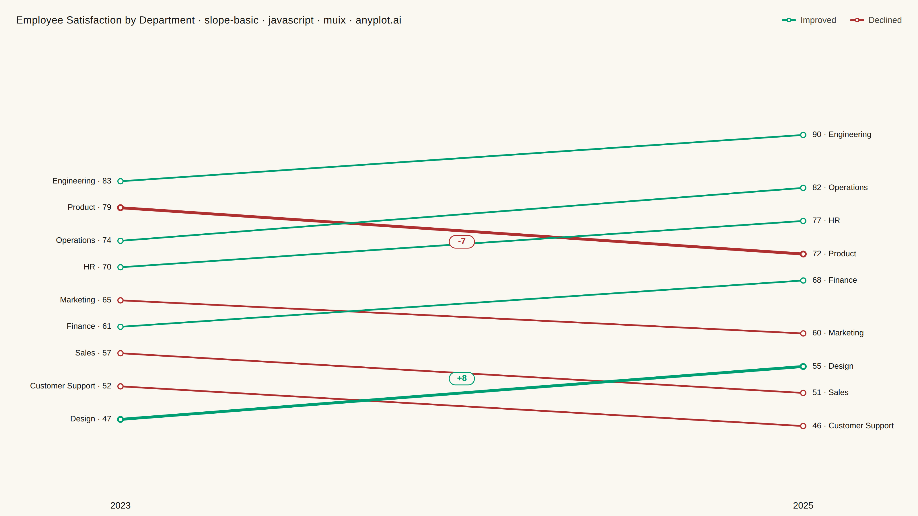
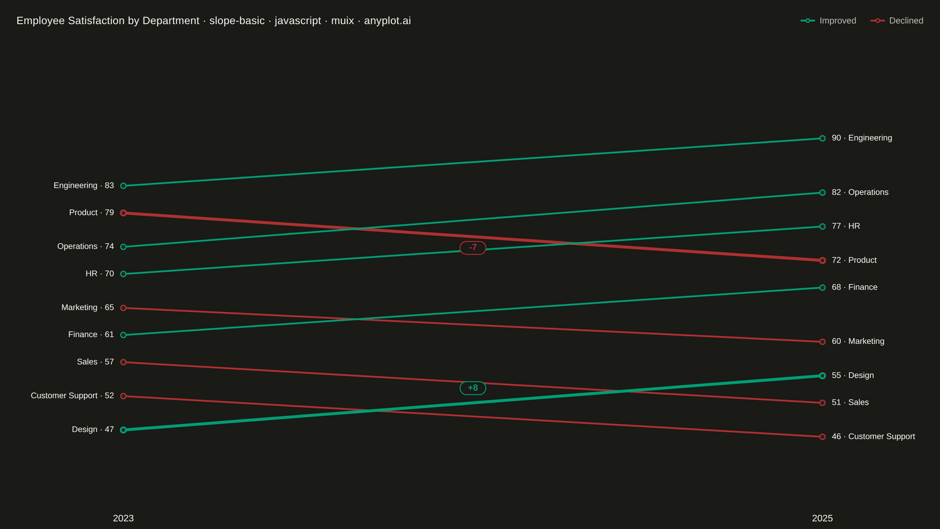
A slope chart (slopegraph) visualizes changes between two time points by connecting values with lines across vertical axes. It emphasizes the direction and magnitude of change rather than absolute values, making it ideal for spotting increases, decreases, and rank changes at a glance. This chart type excels at before/after comparisons and highlighting which items improved or declined.
// anyplot.ai
// slope-basic: Basic Slope Chart (Slopegraph)
// Library: muix 7.29.1 | JavaScript 22.23.1
// Quality: 94/100 | Updated: 2026-07-26

import { LineChart } from "@mui/x-charts/LineChart";
import { useXScale, useYScale } from "@mui/x-charts/hooks";

const t = window.ANYPLOT_TOKENS;

// --- Data: employee satisfaction score (0-100) by department, 2023 vs 2025 -
const PERIODS = ["2023", "2025"];
const departments = [
  { name: "Customer Support", start: 52, end: 46 },
  { name: "Sales", start: 57, end: 51 },
  { name: "Design", start: 47, end: 55 },
  { name: "Marketing", start: 65, end: 60 },
  { name: "Finance", start: 61, end: 68 },
  { name: "Product", start: 79, end: 72 },
  { name: "HR", start: 70, end: 77 },
  { name: "Operations", start: 74, end: 82 },
  { name: "Engineering", start: 83, end: 90 },
];

// Direction semantics — profit/up/gain -> brand green, loss/down -> matte red
const IMPROVED = t.palette[0];
const DECLINED = t.palette[4];

// Slugified id (no spaces) so the per-series CSS class selectors below stay valid.
const slug = (name) => name.replace(/\s+/g, "-");

const series = departments.map((d) => ({
  id: slug(d.name),
  data: [d.start, d.end],
  label: d.name,
  color: d.end >= d.start ? IMPROVED : DECLINED,
  showMark: true,
  curve: "linear",
}));

// The biggest riser and biggest decliner get a bolder stroke + a delta
// callout — a focal point so the eye isn't spread evenly across all 9
// equally-weighted lines.
const biggestRiser = departments.reduce((best, d) => (d.end - d.start > best.end - best.start ? d : best));
const biggestDecliner = departments.reduce((best, d) => (d.end - d.start < best.end - best.start ? d : best));

// Direct endpoint labels — name + value on BOTH columns so a reader never
// has to trace color/slope back to the left label to identify a department.
function EndpointLabels() {
  const xScale = useXScale();
  const yScale = useYScale();
  const xStart = xScale("2023");
  const xEnd = xScale("2025");

  return (
    <g fontFamily="'Roboto','Helvetica Neue',Arial,sans-serif" fontSize={14}>
      {departments.map((d) => (
        <g key={d.name}>
          <text
            x={xStart - 16}
            y={yScale(d.start)}
            textAnchor="end"
            dominantBaseline="middle"
            fill={t.ink}
          >
            {d.name} · {d.start}
          </text>
          <text
            x={xEnd + 16}
            y={yScale(d.end)}
            textAnchor="start"
            dominantBaseline="middle"
            fill={t.ink}
          >
            {d.end} · {d.name}
          </text>
        </g>
      ))}
    </g>
  );
}

// Delta callouts for the single biggest riser and biggest decliner — a small
// chip near the line's midpoint so the standout changes read at a glance.
function DeltaAnnotations() {
  const xScale = useXScale();
  const yScale = useYScale();
  const xMid = (xScale("2023") + xScale("2025")) / 2;

  const callouts = [
    { d: biggestRiser, color: IMPROVED, dy: -22 },
    { d: biggestDecliner, color: DECLINED, dy: 22 },
  ].map(({ d, color, dy }) => {
    const delta = d.end - d.start;
    return {
      key: d.name,
      label: `${delta > 0 ? "+" : ""}${delta}`,
      color,
      x: xMid,
      y: yScale((d.start + d.end) / 2) + dy,
    };
  });

  return (
    <g fontFamily="'Roboto','Helvetica Neue',Arial,sans-serif" fontSize={15} fontWeight={700}>
      {callouts.map((c) => (
        <g key={c.key}>
          <rect x={c.x - 22} y={c.y - 14} width={44} height={22} rx={11} fill={t.pageBg} stroke={c.color} strokeWidth={1.5} />
          <text x={c.x} y={c.y - 3} textAnchor="middle" dominantBaseline="middle" fill={c.color}>
            {c.label}
          </text>
        </g>
      ))}
    </g>
  );
}

const TITLE = "Employee Satisfaction by Department · slope-basic · javascript · muix · anyplot.ai";
const TITLE_FONT_SIZE = Math.round(22 * Math.min(1, 67 / TITLE.length));
const TITLE_H = 70;

export default function Chart() {
  const { width, height } = window.ANYPLOT_SIZE;

  return (
    <div
      style={{
        width,
        height,
        background: t.pageBg,
        boxSizing: "border-box",
        fontFamily: "'Roboto','Helvetica Neue',Arial,sans-serif",
      }}
    >
      <div
        style={{
          height: TITLE_H,
          display: "flex",
          alignItems: "center",
          justifyContent: "space-between",
          paddingLeft: 28,
          paddingRight: 28,
        }}
      >
        <span style={{ color: t.ink, fontSize: TITLE_FONT_SIZE, fontWeight: 500, letterSpacing: 0.3 }}>
          {TITLE}
        </span>
        <div style={{ display: "flex", alignItems: "center", gap: 24 }}>
          <div style={{ display: "flex", alignItems: "center", gap: 8 }}>
            <svg width={24} height={12} style={{ overflow: "visible" }}>
              <line x1={1} y1={6} x2={23} y2={6} stroke={IMPROVED} strokeWidth={3} strokeLinecap="round" />
              <circle cx={12} cy={6} r={3} fill={t.pageBg} stroke={IMPROVED} strokeWidth={2} />
            </svg>
            <span style={{ color: t.inkSoft, fontSize: 15 }}>Improved</span>
          </div>
          <div style={{ display: "flex", alignItems: "center", gap: 8 }}>
            <svg width={24} height={12} style={{ overflow: "visible" }}>
              <line x1={1} y1={6} x2={23} y2={6} stroke={DECLINED} strokeWidth={3} strokeLinecap="round" />
              <circle cx={12} cy={6} r={3} fill={t.pageBg} stroke={DECLINED} strokeWidth={2} />
            </svg>
            <span style={{ color: t.inkSoft, fontSize: 15 }}>Declined</span>
          </div>
        </div>
      </div>

      <LineChart
        width={width}
        height={height - TITLE_H}
        skipAnimation
        margin={{ left: 210, right: 200, top: 50, bottom: 30 }}
        xAxis={[
          {
            scaleType: "point",
            data: PERIODS,
            position: "top",
            disableLine: true,
            disableTicks: true,
            tickLabelStyle: { fontSize: 16, fontWeight: 500, fill: t.ink },
          },
        ]}
        yAxis={[
          {
            min: 35,
            max: 100,
            disableLine: true,
            disableTicks: true,
            tickLabelInterval: () => false,
          },
        ]}
        series={series}
        slotProps={{ legend: { hidden: true } }}
        sx={{
          "& .MuiLineElement-root": { strokeWidth: 3 },
          "& .MuiMarkElement-root": { strokeWidth: 2 },
          [`& .MuiLineElement-series-${slug(biggestRiser.name)}`]: { strokeWidth: 5 },
          [`& .MuiLineElement-series-${slug(biggestDecliner.name)}`]: { strokeWidth: 5 },
          [`& .MuiMarkElement-series-${slug(biggestRiser.name)}`]: { strokeWidth: 3 },
          [`& .MuiMarkElement-series-${slug(biggestDecliner.name)}`]: { strokeWidth: 3 },
        }}
      >
        <EndpointLabels />
        <DeltaAnnotations />
      </LineChart>
    </div>
  );
}
Runnable source as JSON, for any HTTP client: https://api.anyplot.ai/specs/slope-basic/muix/code. Any spec id and library id listed in llms-full.txt fit the same URL shape; every URL below is complete and callable.
{
  "spec_id": "slope-basic",
  "language": "javascript",
  "library": "muix",
  "page": "https://anyplot.ai/slope-basic/javascript/muix",
  "hub": "https://anyplot.ai/slope-basic",
  "code_json": "https://api.anyplot.ai/specs/slope-basic/muix/code",
  "spec_json": "https://api.anyplot.ai/specs/slope-basic",
  "render_light_png": "https://storage.googleapis.com/anyplot-images/plots/slope-basic/javascript/muix/plot-light.png",
  "render_dark_png": "https://storage.googleapis.com/anyplot-images/plots/slope-basic/javascript/muix/plot-dark.png",
  "interactive_light_html": "https://storage.googleapis.com/anyplot-images/plots/slope-basic/javascript/muix/plot-light.html",
  "interactive_dark_html": "https://storage.googleapis.com/anyplot-images/plots/slope-basic/javascript/muix/plot-dark.html",
  "quality_score": 94.0,
  "license": "MIT",
  "guide": "https://anyplot.ai/llms.txt"
}
Part of Basic Slope Chart (Slopegraph) on anyplot.ai.