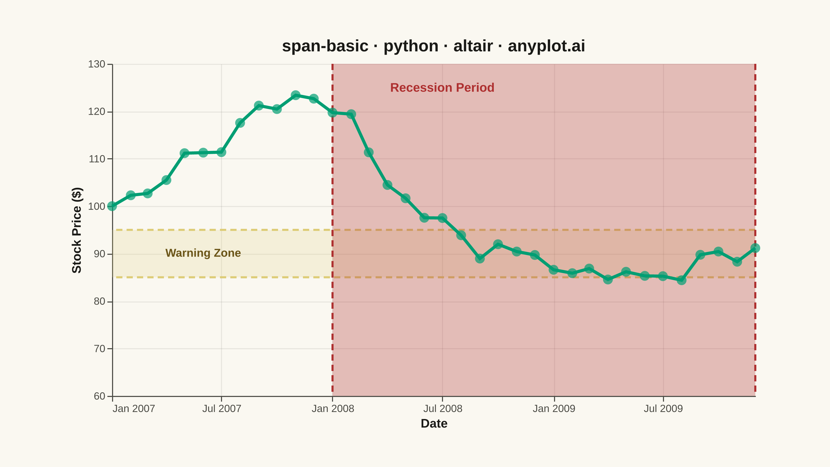
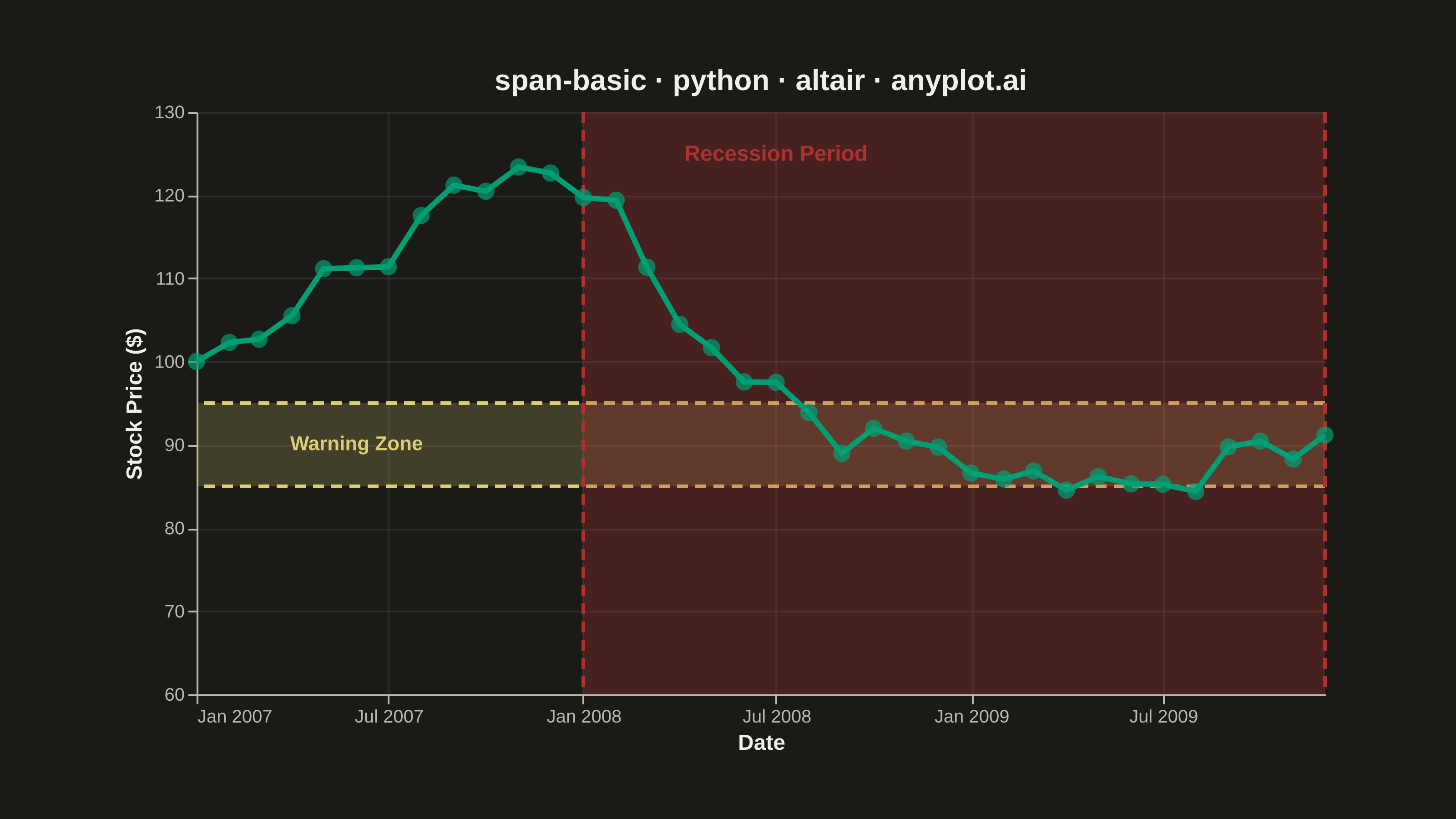
A span plot highlights a specific region of interest on a chart using a shaded rectangular area that spans the full height or width of the plot. Vertical spans mark ranges along the x-axis (e.g., time periods), while horizontal spans mark ranges along the y-axis (e.g., value thresholds). The semi-transparent fill allows underlying data to remain visible while drawing attention to the highlighted region.
""" anyplot.ai
span-basic: Basic Span Plot (Highlighted Region)
Library: altair 6.2.2 | Python 3.13.14
Quality: 90/100 | Updated: 2026-07-25
"""

import os

import altair as alt
import numpy as np
import pandas as pd
from PIL import Image


# Theme tokens
THEME = os.getenv("ANYPLOT_THEME", "light")
PAGE_BG = "#FAF8F1" if THEME == "light" else "#1A1A17"
ELEVATED_BG = "#FFFDF6" if THEME == "light" else "#242420"
INK = "#1A1A17" if THEME == "light" else "#F0EFE8"
INK_SOFT = "#4A4A44" if THEME == "light" else "#B8B7B0"

# Imprint categorical palette — 8 hues, theme-independent, hybrid-v3 sort
IMPRINT_PALETTE = ["#009E73", "#C475FD", "#4467A3", "#BD8233", "#AE3030", "#2ABCCD", "#954477", "#99B314"]
ANYPLOT_AMBER = "#DDCC77"  # semantic anchor — warning / caution (outside the categorical pool)

BRAND = IMPRINT_PALETTE[0]  # position 1 — always the primary series (price line)
# Semantic exception (see default-style-guide.md "Color Philosophy"): the recession
# is a bad/loss period, so it uses the deferred red anchor (position 5) rather than
# the next ordinal slot; the warning threshold band uses the dedicated amber anchor.
# Both spans carry an explicit text label ("Recession Period" / "Warning Zone") so
# the semantic mapping is unambiguous, per the style guide's requirement.
RECESSION_COLOR = IMPRINT_PALETTE[4]  # matte red — bad/loss semantic anchor
WARNING_COLOR = ANYPLOT_AMBER  # amber — warning semantic anchor
# Amber text on the pale-cream light bg falls below WCAG 3:1 (documented amber/light
# tension in the style guide); darken the "Warning Zone" label text only in light mode
# — the span fill/edge rules keep the true amber anchor in both themes.
WARNING_LABEL_COLOR = "#6B5518" if THEME == "light" else WARNING_COLOR

# Data — stock price with recession dip and warning threshold zone
np.random.seed(42)
dates = pd.date_range(start="2007-01-01", periods=36, freq="MS")

base_price = 100
prices = [base_price]
for i in range(1, 36):
    if 12 <= i < 24:
        drift = -0.01
    else:
        drift = 0.008
    change = drift + np.random.randn() * 0.03
    prices.append(prices[-1] * (1 + change))

df = pd.DataFrame({"Date": dates, "Price": prices})

recession_start = pd.Timestamp("2008-01-01")
recession_end = pd.Timestamp("2009-12-01")
threshold_low = 85
threshold_high = 95

price_scale = alt.Scale(domain=[60, 130])

# Base line chart
line = (
    alt.Chart(df)
    .mark_line(strokeWidth=3, color=BRAND)
    .encode(
        x=alt.X(
            "Date:T",
            title="Date",
            axis=alt.Axis(
                labelFontSize=10, titleFontSize=12, tickCount={"interval": "month", "step": 6}, format="%b %Y"
            ),
        ),
        y=alt.Y(
            "Price:Q", title="Stock Price ($)", scale=price_scale, axis=alt.Axis(labelFontSize=10, titleFontSize=12)
        ),
        tooltip=[alt.Tooltip("Date:T", format="%b %Y"), alt.Tooltip("Price:Q", format=".2f", title="Price ($)")],
    )
)

points = (
    alt.Chart(df)
    .mark_point(size=90, color=BRAND, filled=True)
    .encode(
        x="Date:T",
        y=alt.Y("Price:Q", scale=price_scale),
        tooltip=[alt.Tooltip("Date:T", format="%b %Y"), alt.Tooltip("Price:Q", format=".2f", title="Price ($)")],
    )
)

# Vertical span — recession period
recession_span_data = pd.DataFrame({"start": [recession_start], "end": [recession_end]})
vertical_span = (
    alt.Chart(recession_span_data)
    .mark_rect(opacity=0.30, color=RECESSION_COLOR)
    .encode(x=alt.X("start:T"), x2=alt.X2("end:T"))
)

left_edge = (
    alt.Chart(pd.DataFrame({"x": [recession_start]}))
    .mark_rule(strokeWidth=2, strokeDash=[6, 4], color=RECESSION_COLOR)
    .encode(x="x:T")
)

right_edge = (
    alt.Chart(pd.DataFrame({"x": [recession_end]}))
    .mark_rule(strokeWidth=2, strokeDash=[6, 4], color=RECESSION_COLOR)
    .encode(x="x:T")
)

# Horizontal span — warning threshold zone
threshold_span_data = pd.DataFrame({"y": [threshold_low], "y2": [threshold_high]})
horizontal_span = (
    alt.Chart(threshold_span_data)
    .mark_rect(opacity=0.2, color=WARNING_COLOR)
    .encode(y=alt.Y("y:Q", scale=price_scale), y2=alt.Y2("y2:Q"))
)

bottom_edge = (
    alt.Chart(pd.DataFrame({"y": [threshold_low]}))
    .mark_rule(strokeWidth=2, strokeDash=[6, 4], color=WARNING_COLOR)
    .encode(y=alt.Y("y:Q", scale=price_scale))
)

top_edge = (
    alt.Chart(pd.DataFrame({"y": [threshold_high]}))
    .mark_rule(strokeWidth=2, strokeDash=[6, 4], color=WARNING_COLOR)
    .encode(y=alt.Y("y:Q", scale=price_scale))
)

# Text labels for span regions
recession_label = (
    alt.Chart(pd.DataFrame({"x": [pd.Timestamp("2008-07-01")], "y": [125], "text": ["Recession Period"]}))
    .mark_text(fontSize=12, fontWeight="bold", color=RECESSION_COLOR)
    .encode(x="x:T", y=alt.Y("y:Q", scale=price_scale), text="text:N")
)

threshold_label = (
    alt.Chart(pd.DataFrame({"x": [pd.Timestamp("2007-06-01")], "y": [90], "text": ["Warning Zone"]}))
    .mark_text(fontSize=11, fontWeight="bold", color=WARNING_LABEL_COLOR)
    .encode(x="x:T", y=alt.Y("y:Q", scale=price_scale), text="text:N")
)

# Combine all layers with theme-adaptive chrome
chart = (
    alt.layer(
        horizontal_span,
        bottom_edge,
        top_edge,
        vertical_span,
        left_edge,
        right_edge,
        line,
        points,
        recession_label,
        threshold_label,
    )
    .properties(
        width=620,
        height=320,
        background=PAGE_BG,
        title=alt.Title("span-basic · python · altair · anyplot.ai", fontSize=16, color=INK),
    )
    .configure_view(fill=PAGE_BG, continuousWidth=620, continuousHeight=320, strokeWidth=0)
    .configure_axis(
        domainColor=INK_SOFT,
        tickColor=INK_SOFT,
        gridColor=INK_SOFT,
        gridOpacity=0.10,
        labelColor=INK_SOFT,
        titleColor=INK,
    )
    .configure_legend(
        fillColor=ELEVATED_BG,
        strokeColor=INK_SOFT,
        labelColor=INK_SOFT,
        titleColor=INK,
        labelFontSize=10,
        titleFontSize=10,
    )
    .configure_title(color=INK, fontSize=16)
)

# Save — hard target: 3200 x 1800 (landscape). See prompts/library/altair.md "Canvas".
chart.save(f"plot-{THEME}.png", scale_factor=4.0)
chart.save(f"plot-{THEME}.html")

# PAD-only to the exact canonical canvas — vl-convert's title/axis/legend padding
# means the saved PNG rarely lands exactly on target. Never crop (would clip text).
TW, TH = 3200, 1800
_img = Image.open(f"plot-{THEME}.png").convert("RGB")
_w, _h = _img.size
if _w > TW or _h > TH:
    raise SystemExit(
        f"altair vl-convert produced {_w}x{_h}, exceeds target {TW}x{TH}. "
        f"Shrink chart .properties(width=, height=) values and re-render."
    )
if _w < TW or _h < TH:
    _canvas = Image.new("RGB", (TW, TH), PAGE_BG)
    _canvas.paste(_img, ((TW - _w) // 2, (TH - _h) // 2))
    _canvas.save(f"plot-{THEME}.png")
Runnable source as JSON, for any HTTP client: https://api.anyplot.ai/specs/span-basic/altair/code. Any spec id and library id listed in llms-full.txt fit the same URL shape; every URL below is complete and callable.
{
  "spec_id": "span-basic",
  "language": "python",
  "library": "altair",
  "page": "https://anyplot.ai/span-basic/python/altair",
  "hub": "https://anyplot.ai/span-basic",
  "code_json": "https://api.anyplot.ai/specs/span-basic/altair/code",
  "spec_json": "https://api.anyplot.ai/specs/span-basic",
  "render_light_png": "https://storage.googleapis.com/anyplot-images/plots/span-basic/python/altair/plot-light.png",
  "render_dark_png": "https://storage.googleapis.com/anyplot-images/plots/span-basic/python/altair/plot-dark.png",
  "interactive_light_html": "https://storage.googleapis.com/anyplot-images/plots/span-basic/python/altair/plot-light.html",
  "interactive_dark_html": "https://storage.googleapis.com/anyplot-images/plots/span-basic/python/altair/plot-dark.html",
  "quality_score": 90.0,
  "license": "MIT",
  "guide": "https://anyplot.ai/llms.txt"
}
Part of Basic Span Plot (Highlighted Region) on anyplot.ai.