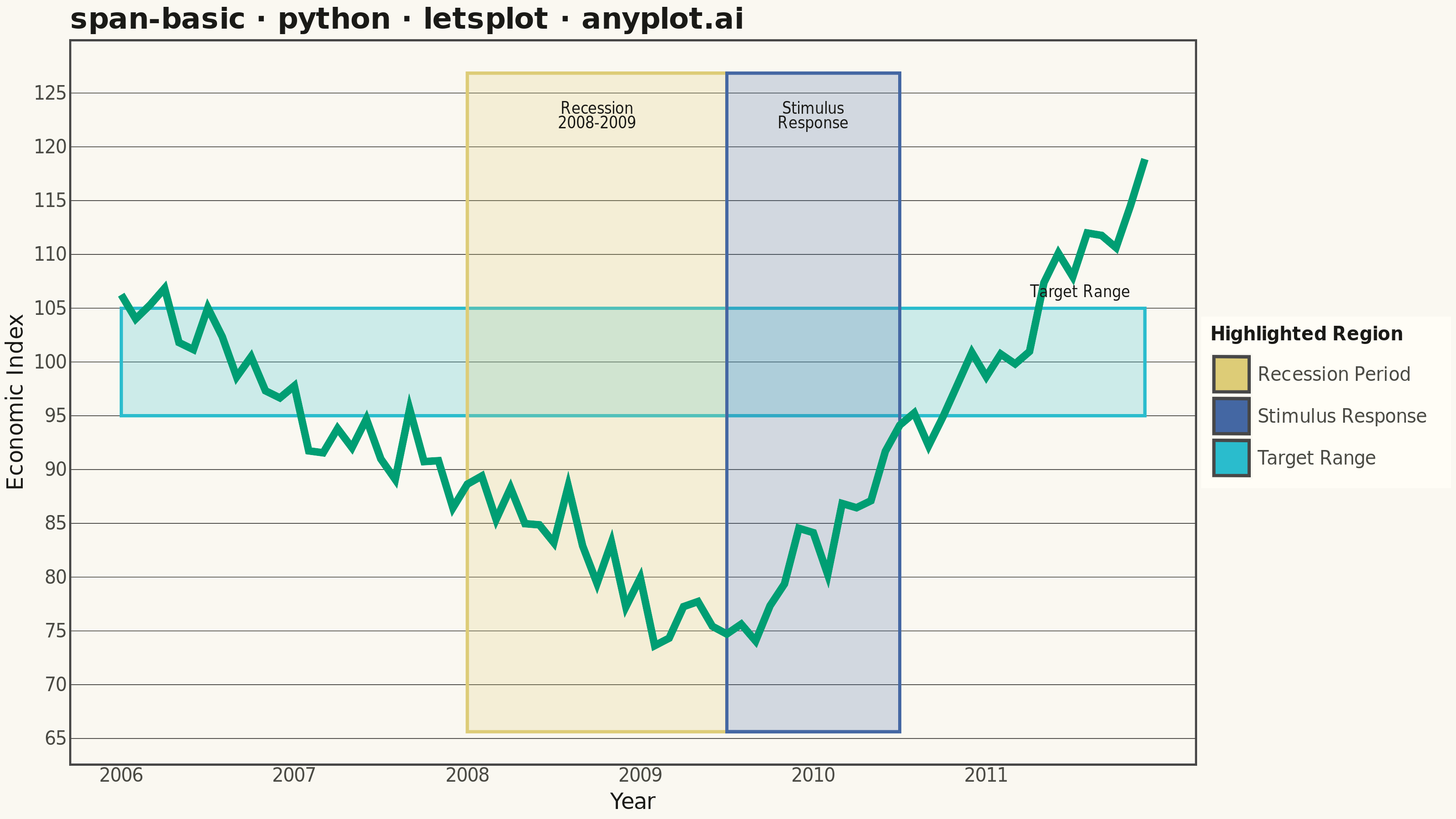
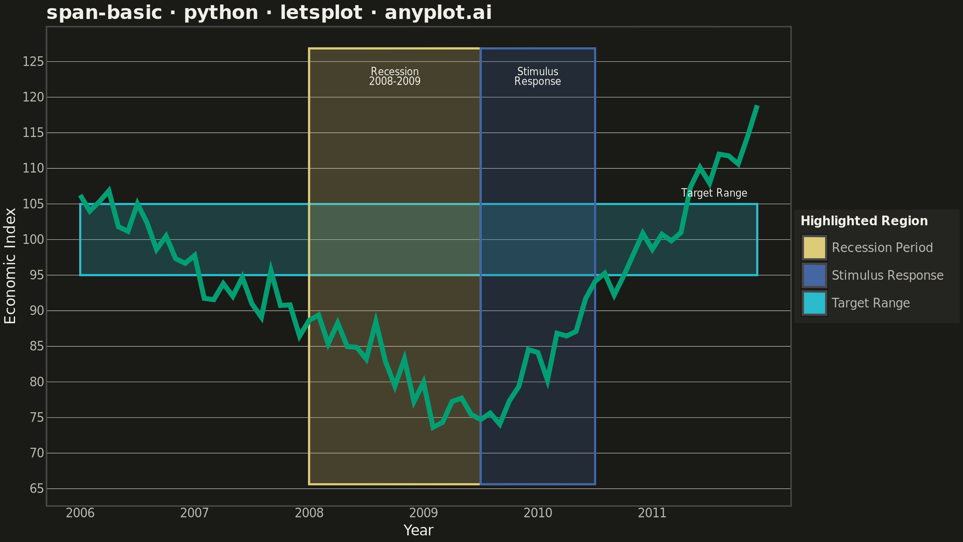
A span plot highlights a specific region of interest on a chart using a shaded rectangular area that spans the full height or width of the plot. Vertical spans mark ranges along the x-axis (e.g., time periods), while horizontal spans mark ranges along the y-axis (e.g., value thresholds). The semi-transparent fill allows underlying data to remain visible while drawing attention to the highlighted region.
""" anyplot.ai
span-basic: Basic Span Plot (Highlighted Region)
Library: letsplot 4.11.0 | Python 3.13.14
Quality: 93/100 | Updated: 2026-07-25
"""

import os

import numpy as np
import pandas as pd
from lets_plot import (
    LetsPlot,
    aes,
    element_blank,
    element_line,
    element_rect,
    element_text,
    geom_line,
    geom_rect,
    geom_text,
    ggplot,
    ggsave,
    ggsize,
    labs,
    layer_tooltips,
    scale_color_manual,
    scale_fill_manual,
    scale_x_continuous,
    theme,
    theme_minimal,
)


LetsPlot.setup_html()

# Theme tokens (see prompts/default-style-guide.md "Background" + "Theme-adaptive Chrome")
THEME = os.getenv("ANYPLOT_THEME", "light")
PAGE_BG = "#FAF8F1" if THEME == "light" else "#1A1A17"
ELEVATED_BG = "#FFFDF6" if THEME == "light" else "#242420"
INK = "#1A1A17" if THEME == "light" else "#F0EFE8"
INK_SOFT = "#4A4A44" if THEME == "light" else "#B8B7B0"
BRAND = "#009E73"  # Imprint palette position 1 — ALWAYS first series
ANYPLOT_AMBER = "#DDCC77"  # warning / caution semantic anchor — recession (vertical span)
STIMULUS_BLUE = "#4467A3"  # Imprint palette position 3 — policy response (vertical span)
TARGET_TEAL = "#2ABCCD"  # Imprint palette position 6 — acceptable-value threshold (horizontal span)

# Data - simulated economic indicator over time (2006-2011)
np.random.seed(42)
months = pd.date_range("2006-01", periods=72, freq="ME")
# Economic cycle: growth -> recession dip -> recovery
base = np.linspace(105, 90, 24).tolist() + np.linspace(90, 75, 18).tolist() + np.linspace(75, 115, 30).tolist()
noise = np.random.randn(72) * 2.5
values = np.array(base) + noise

df = pd.DataFrame({"date": months, "index": values})
df["date_num"] = np.arange(len(df))

# Year labels for x-axis
year_positions = [0, 12, 24, 36, 48, 60]
year_labels = ["2006", "2007", "2008", "2009", "2010", "2011"]

x_start, x_end = df["date_num"].min(), df["date_num"].max()
y_min, y_max = df["index"].min() - 8, df["index"].max() + 8

# Vertical spans - time periods of interest (recession, then policy response)
vertical_spans = pd.DataFrame(
    {
        "xmin": [24, 42],
        "xmax": [42, 54],
        "ymin": [y_min, y_min],
        "ymax": [y_max, y_max],
        "label": ["Recession Period", "Stimulus Response"],
        "range_desc": ["Jan 2008 - Jun 2009", "Jul 2009 - Jun 2010"],
    }
)

# Horizontal span - acceptable value-range threshold across the full period
horizontal_span = pd.DataFrame(
    {
        "xmin": [x_start],
        "xmax": [x_end],
        "ymin": [95],
        "ymax": [105],
        "label": ["Target Range"],
        "range_desc": ["95 - 105 index pts"],
    }
)

spans = pd.concat([horizontal_span, vertical_spans], ignore_index=True)
span_colors = {"Recession Period": ANYPLOT_AMBER, "Stimulus Response": STIMULUS_BLUE, "Target Range": TARGET_TEAL}
span_order = list(span_colors.keys())

# Label positions for span annotations
span_label = pd.DataFrame(
    {
        "x": [33, 48, x_end - 1],
        "y": [df["index"].max() + 4, df["index"].max() + 4, 106.5],
        "text": ["Recession\n2008-2009", "Stimulus\nResponse", "Target Range"],
        "hjust": [0.5, 0.5, 1.0],
    }
)

# Theme-adaptive chrome (see prompts/library/letsplot.md "Theme-adaptive Chrome")
anyplot_theme = theme(
    plot_background=element_rect(fill=PAGE_BG, color=PAGE_BG),
    panel_background=element_rect(fill=PAGE_BG),
    panel_border=element_blank(),
    panel_grid_major_x=element_blank(),
    panel_grid_minor_x=element_blank(),
    panel_grid_major_y=element_line(color=INK, size=0.3),
    panel_grid_minor_y=element_blank(),
    axis_title=element_text(color=INK, size=12),
    axis_text=element_text(color=INK_SOFT, size=10),
    axis_line=element_line(color=INK_SOFT),
    plot_title=element_text(color=INK, size=16, face="bold"),
    legend_background=element_rect(fill=ELEVATED_BG, color=INK_SOFT),
    legend_text=element_text(color=INK_SOFT, size=10),
    legend_title=element_text(color=INK, size=10, face="bold"),
)

# Plot
plot = (
    ggplot()
    # Highlighted spans: one horizontal (value threshold) + two vertical (time periods),
    # each with its own tooltip surfaced in the interactive HTML export
    + geom_rect(
        data=spans,
        mapping=aes(xmin="xmin", xmax="xmax", ymin="ymin", ymax="ymax", fill="label", color="label"),
        alpha=0.22,
        tooltips=layer_tooltips().title("@label").line("@range_desc"),
    )
    # Economic indicator line
    + geom_line(
        data=df,
        mapping=aes(x="date_num", y="index"),
        color=BRAND,
        size=1.8,
        tooltips=layer_tooltips().line("Index|@index"),
    )
    # Span label annotations
    + geom_text(
        data=span_label, mapping=aes(x="x", y="y", label="text", hjust="hjust"), size=4, color=INK, tooltips="none"
    )
    + labs(x="Year", y="Economic Index", title="span-basic · python · letsplot · anyplot.ai")
    + scale_fill_manual(values=list(span_colors.values()), limits=span_order, name="Highlighted Region")
    + scale_color_manual(values=list(span_colors.values()), limits=span_order, guide="none")
    + scale_x_continuous(breaks=year_positions, labels=year_labels)
    + theme_minimal()
    + anyplot_theme
    + ggsize(800, 450)
)

# Save PNG (scale 4x gives 3200 x 1800 px) + HTML
ggsave(plot, f"plot-{THEME}.png", path=".", scale=4)
ggsave(plot, f"plot-{THEME}.html", path=".")
Runnable source as JSON, for any HTTP client: https://api.anyplot.ai/specs/span-basic/letsplot/code. Any spec id and library id listed in llms-full.txt fit the same URL shape; every URL below is complete and callable.
{
  "spec_id": "span-basic",
  "language": "python",
  "library": "letsplot",
  "page": "https://anyplot.ai/span-basic/python/letsplot",
  "hub": "https://anyplot.ai/span-basic",
  "code_json": "https://api.anyplot.ai/specs/span-basic/letsplot/code",
  "spec_json": "https://api.anyplot.ai/specs/span-basic",
  "render_light_png": "https://storage.googleapis.com/anyplot-images/plots/span-basic/python/letsplot/plot-light.png",
  "render_dark_png": "https://storage.googleapis.com/anyplot-images/plots/span-basic/python/letsplot/plot-dark.png",
  "interactive_light_html": "https://storage.googleapis.com/anyplot-images/plots/span-basic/python/letsplot/plot-light.html",
  "interactive_dark_html": "https://storage.googleapis.com/anyplot-images/plots/span-basic/python/letsplot/plot-dark.html",
  "quality_score": 93.0,
  "license": "MIT",
  "guide": "https://anyplot.ai/llms.txt"
}
Part of Basic Span Plot (Highlighted Region) on anyplot.ai.