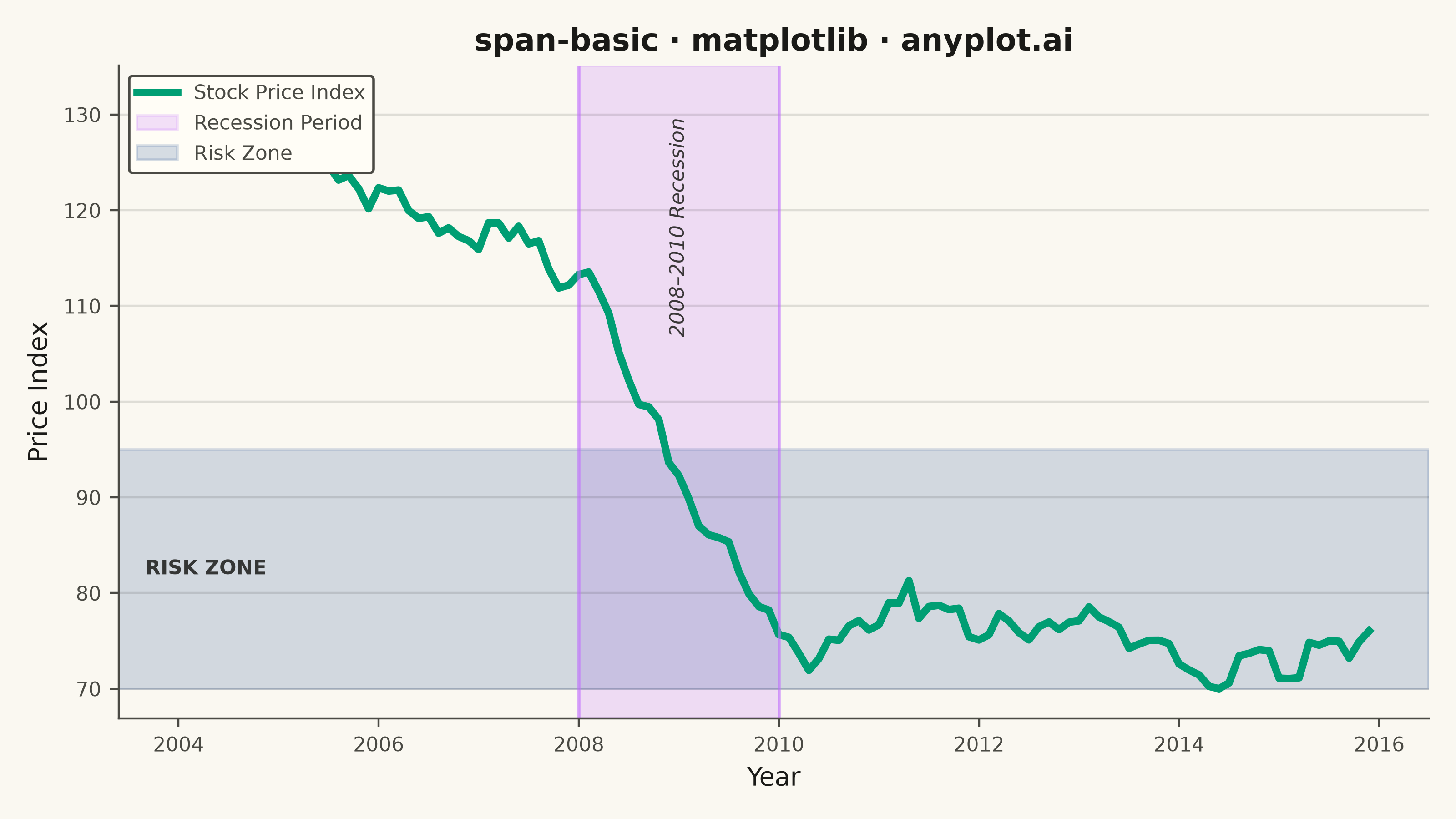
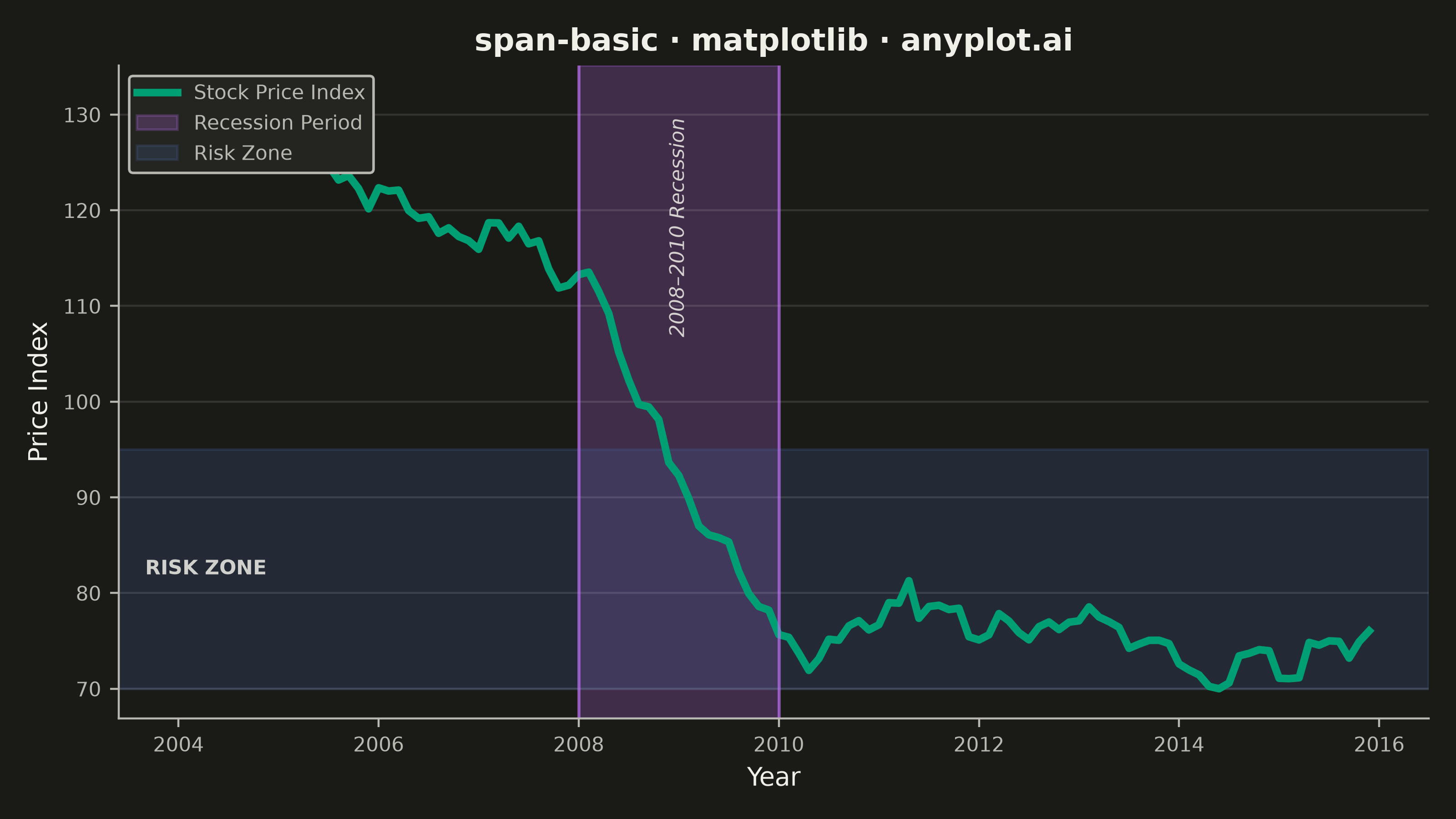
A span plot highlights a specific region of interest on a chart using a shaded rectangular area that spans the full height or width of the plot. Vertical spans mark ranges along the x-axis (e.g., time periods), while horizontal spans mark ranges along the y-axis (e.g., value thresholds). The semi-transparent fill allows underlying data to remain visible while drawing attention to the highlighted region.
""" anyplot.ai
span-basic: Basic Span Plot (Highlighted Region)
Library: matplotlib 3.11.1 | Python 3.13.14
Quality: 88/100 | Updated: 2026-07-25
"""

import os

import matplotlib.pyplot as plt
import numpy as np


# Theme tokens
THEME = os.getenv("ANYPLOT_THEME", "light")
PAGE_BG = "#FAF8F1" if THEME == "light" else "#1A1A17"
ELEVATED_BG = "#FFFDF6" if THEME == "light" else "#242420"
INK = "#1A1A17" if THEME == "light" else "#F0EFE8"
INK_SOFT = "#4A4A44" if THEME == "light" else "#B8B7B0"
INK_MUTED = "#6B6A63" if THEME == "light" else "#A8A79F"

BRAND = "#009E73"  # Imprint palette position 1 — first series
C2 = "#C475FD"  # Imprint palette position 2
C3 = "#4467A3"  # Imprint palette position 3

# Data — stock prices with a simulated recession dip
np.random.seed(42)
dates = np.arange(2004, 2016, 0.1)

price = 100 + np.cumsum(np.random.randn(len(dates)) * 1.5)
recession_mask = (dates >= 2008) & (dates < 2010)
price[recession_mask] -= np.linspace(0, 35, recession_mask.sum())
price[dates >= 2010] -= 35
price = price - price.min() + 70

# Plot
fig, ax = plt.subplots(figsize=(8, 4.5), dpi=400, facecolor=PAGE_BG)
ax.set_facecolor(PAGE_BG)

ax.plot(dates, price, linewidth=3, color=BRAND, label="Stock Price Index")

# Vertical span — recession period (2008–2009), with subtle edge lines to
# mark its boundaries and set it apart from the horizontal span below
ax.axvspan(2008, 2010, alpha=0.22, color=C2, label="Recession Period")
ax.axvline(2008, color=C2, alpha=0.6, linewidth=1.2)
ax.axvline(2010, color=C2, alpha=0.6, linewidth=1.2)

# Horizontal span — risk zone (low values)
ax.axhspan(70, 95, alpha=0.22, color=C3, label="Risk Zone")

# Text labels inside each span (blended transforms keep them anchored to the
# span regardless of the data range, avoiding overlap with the price line).
# Styling is deliberately differentiated between the two span types: the
# time-based span reads as italic prose, the threshold span as a bold
# small-caps tag.
ax.text(
    2009,
    0.92,
    "2008–2010 Recession",
    transform=ax.get_xaxis_transform(),
    rotation=90,
    ha="center",
    va="top",
    fontsize=8,
    style="italic",
    color=INK,
    alpha=0.85,
)
ax.text(
    0.02,
    82.5,
    "RISK ZONE",
    transform=ax.get_yaxis_transform(),
    ha="left",
    va="center",
    fontsize=8,
    fontweight="bold",
    color=INK,
    alpha=0.85,
)

# Style
ax.set_xlabel("Year", fontsize=10, color=INK)
ax.set_ylabel("Price Index", fontsize=10, color=INK)
ax.set_title("span-basic · matplotlib · anyplot.ai", fontsize=12, fontweight="bold", color=INK)
ax.tick_params(axis="both", labelsize=8, colors=INK_SOFT, labelcolor=INK_SOFT)

ax.spines["top"].set_visible(False)
ax.spines["right"].set_visible(False)
for spine in ("left", "bottom"):
    ax.spines[spine].set_color(INK_SOFT)

ax.yaxis.grid(True, alpha=0.12, linewidth=0.8, color=INK)

leg = ax.legend(fontsize=8, loc="upper left")
leg.get_frame().set_facecolor(ELEVATED_BG)
leg.get_frame().set_edgecolor(INK_SOFT)
leg.get_frame().set_alpha(1.0)
plt.setp(leg.get_texts(), color=INK_SOFT)

plt.tight_layout()
plt.savefig(f"plot-{THEME}.png", dpi=400, facecolor=PAGE_BG)
Runnable source as JSON, for any HTTP client: https://api.anyplot.ai/specs/span-basic/matplotlib/code. Any spec id and library id listed in llms-full.txt fit the same URL shape; every URL below is complete and callable.
{
  "spec_id": "span-basic",
  "language": "python",
  "library": "matplotlib",
  "page": "https://anyplot.ai/span-basic/python/matplotlib",
  "hub": "https://anyplot.ai/span-basic",
  "code_json": "https://api.anyplot.ai/specs/span-basic/matplotlib/code",
  "spec_json": "https://api.anyplot.ai/specs/span-basic",
  "render_light_png": "https://storage.googleapis.com/anyplot-images/plots/span-basic/python/matplotlib/plot-light.png",
  "render_dark_png": "https://storage.googleapis.com/anyplot-images/plots/span-basic/python/matplotlib/plot-dark.png",
  "quality_score": 88.0,
  "license": "MIT",
  "guide": "https://anyplot.ai/llms.txt"
}
Part of Basic Span Plot (Highlighted Region) on anyplot.ai.