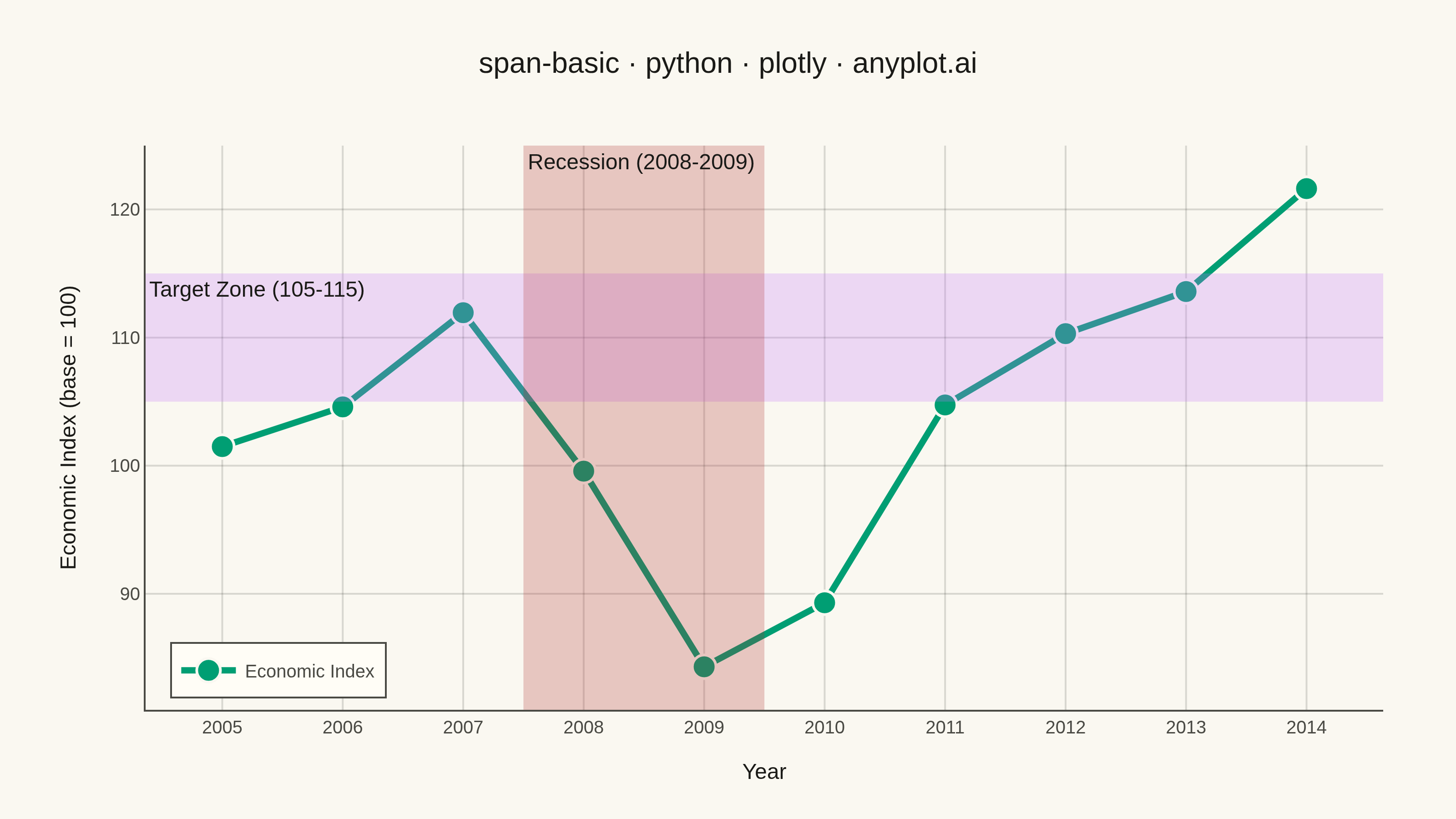
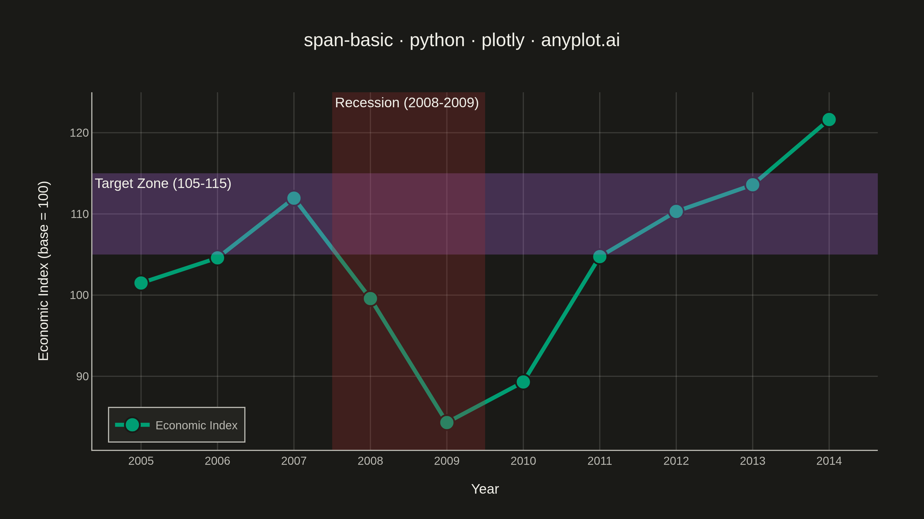
A span plot highlights a specific region of interest on a chart using a shaded rectangular area that spans the full height or width of the plot. Vertical spans mark ranges along the x-axis (e.g., time periods), while horizontal spans mark ranges along the y-axis (e.g., value thresholds). The semi-transparent fill allows underlying data to remain visible while drawing attention to the highlighted region.
""" anyplot.ai
span-basic: Basic Span Plot (Highlighted Region)
Library: plotly 6.9.0 | Python 3.13.14
Quality: 90/100 | Updated: 2026-07-25
"""

import os

import numpy as np
import plotly.graph_objects as go


# Theme tokens (see prompts/default-style-guide.md "Theme-adaptive Chrome")
THEME = os.getenv("ANYPLOT_THEME", "light")
PAGE_BG = "#FAF8F1" if THEME == "light" else "#1A1A17"
ELEVATED_BG = "#FFFDF6" if THEME == "light" else "#242420"
INK = "#1A1A17" if THEME == "light" else "#F0EFE8"
INK_SOFT = "#4A4A44" if THEME == "light" else "#B8B7B0"
GRID = "rgba(26,26,23,0.15)" if THEME == "light" else "rgba(240,239,232,0.15)"

# Imprint palette — first series always brand green; recession reaches the
# deferred semantic-red anchor (bad/loss economic event), target zone takes
# the next canonical slot (lavender)
IMPRINT_PALETTE = ["#009E73", "#C475FD", "#4467A3", "#BD8233", "#AE3030", "#2ABCCD", "#954477", "#99B314"]
BRAND = IMPRINT_PALETTE[0]
RECESSION_COLOR = IMPRINT_PALETTE[4]
TARGET_COLOR = IMPRINT_PALETTE[1]

# Data - economic indicator over a decade, with a recession dip and a growth target band
np.random.seed(42)
years = np.arange(2005, 2015)
base_values = np.array([100, 105, 110, 95, 85, 90, 100, 108, 115, 120])
economic_index = base_values + np.random.randn(len(years)) * 3

# Span regions to highlight
recession_start, recession_end = 2007.5, 2009.5
target_low, target_high = 105, 115

# Figure
fig = go.Figure()

fig.add_hrect(
    y0=target_low,
    y1=target_high,
    fillcolor=TARGET_COLOR,
    opacity=0.25,
    line_width=0,
    annotation_text="Target Zone (105-115)",
    annotation_position="top left",
    annotation=dict(font=dict(size=12, color=INK)),
)

fig.add_vrect(
    x0=recession_start,
    x1=recession_end,
    fillcolor=RECESSION_COLOR,
    opacity=0.25,
    line_width=0,
    annotation_text="Recession (2008-2009)",
    annotation_position="top left",
    annotation=dict(font=dict(size=12, color=INK)),
)

fig.add_trace(
    go.Scatter(
        x=years,
        y=economic_index,
        mode="lines+markers",
        line=dict(color=BRAND, width=3.5),
        marker=dict(size=13, color=BRAND, line=dict(color=PAGE_BG, width=1.5)),
        name="Economic Index",
    )
)

# Layout — theme-adaptive chrome, 3200x1800 canvas (see prompts/library/plotly.md)
title = "span-basic · python · plotly · anyplot.ai"
fig.update_layout(
    autosize=False,
    width=800,
    height=450,
    margin=dict(l=80, r=40, t=80, b=60),
    title=dict(text=title, font=dict(size=16, color=INK), x=0.5, xanchor="center"),
    xaxis=dict(
        title=dict(text="Year", font=dict(size=12, color=INK)),
        tickfont=dict(size=10, color=INK_SOFT),
        dtick=1,
        showline=True,
        linecolor=INK_SOFT,
        zerolinecolor=INK_SOFT,
        gridcolor=GRID,
    ),
    yaxis=dict(
        title=dict(text="Economic Index (base = 100)", font=dict(size=12, color=INK)),
        tickfont=dict(size=10, color=INK_SOFT),
        showline=True,
        linecolor=INK_SOFT,
        zerolinecolor=INK_SOFT,
        gridcolor=GRID,
    ),
    paper_bgcolor=PAGE_BG,
    plot_bgcolor=PAGE_BG,
    font=dict(color=INK),
    showlegend=True,
    legend=dict(
        font=dict(size=10, color=INK_SOFT),
        bgcolor=ELEVATED_BG,
        bordercolor=INK_SOFT,
        borderwidth=1,
        x=0.02,
        y=0.02,
        xanchor="left",
        yanchor="bottom",
    ),
)

# Save (PNG + HTML, 3200x1800 px)
fig.write_image(f"plot-{THEME}.png", width=800, height=450, scale=4)
fig.write_html(f"plot-{THEME}.html", include_plotlyjs="cdn")
Runnable source as JSON, for any HTTP client: https://api.anyplot.ai/specs/span-basic/plotly/code. Any spec id and library id listed in llms-full.txt fit the same URL shape; every URL below is complete and callable.
{
  "spec_id": "span-basic",
  "language": "python",
  "library": "plotly",
  "page": "https://anyplot.ai/span-basic/python/plotly",
  "hub": "https://anyplot.ai/span-basic",
  "code_json": "https://api.anyplot.ai/specs/span-basic/plotly/code",
  "spec_json": "https://api.anyplot.ai/specs/span-basic",
  "render_light_png": "https://storage.googleapis.com/anyplot-images/plots/span-basic/python/plotly/plot-light.png",
  "render_dark_png": "https://storage.googleapis.com/anyplot-images/plots/span-basic/python/plotly/plot-dark.png",
  "interactive_light_html": "https://storage.googleapis.com/anyplot-images/plots/span-basic/python/plotly/plot-light.html",
  "interactive_dark_html": "https://storage.googleapis.com/anyplot-images/plots/span-basic/python/plotly/plot-dark.html",
  "quality_score": 90.0,
  "license": "MIT",
  "guide": "https://anyplot.ai/llms.txt"
}
Part of Basic Span Plot (Highlighted Region) on anyplot.ai.