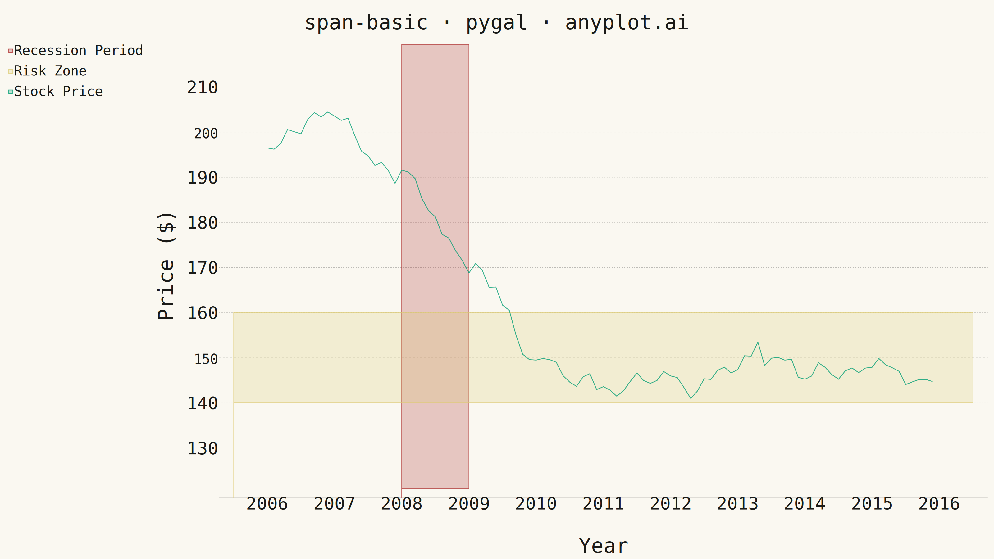
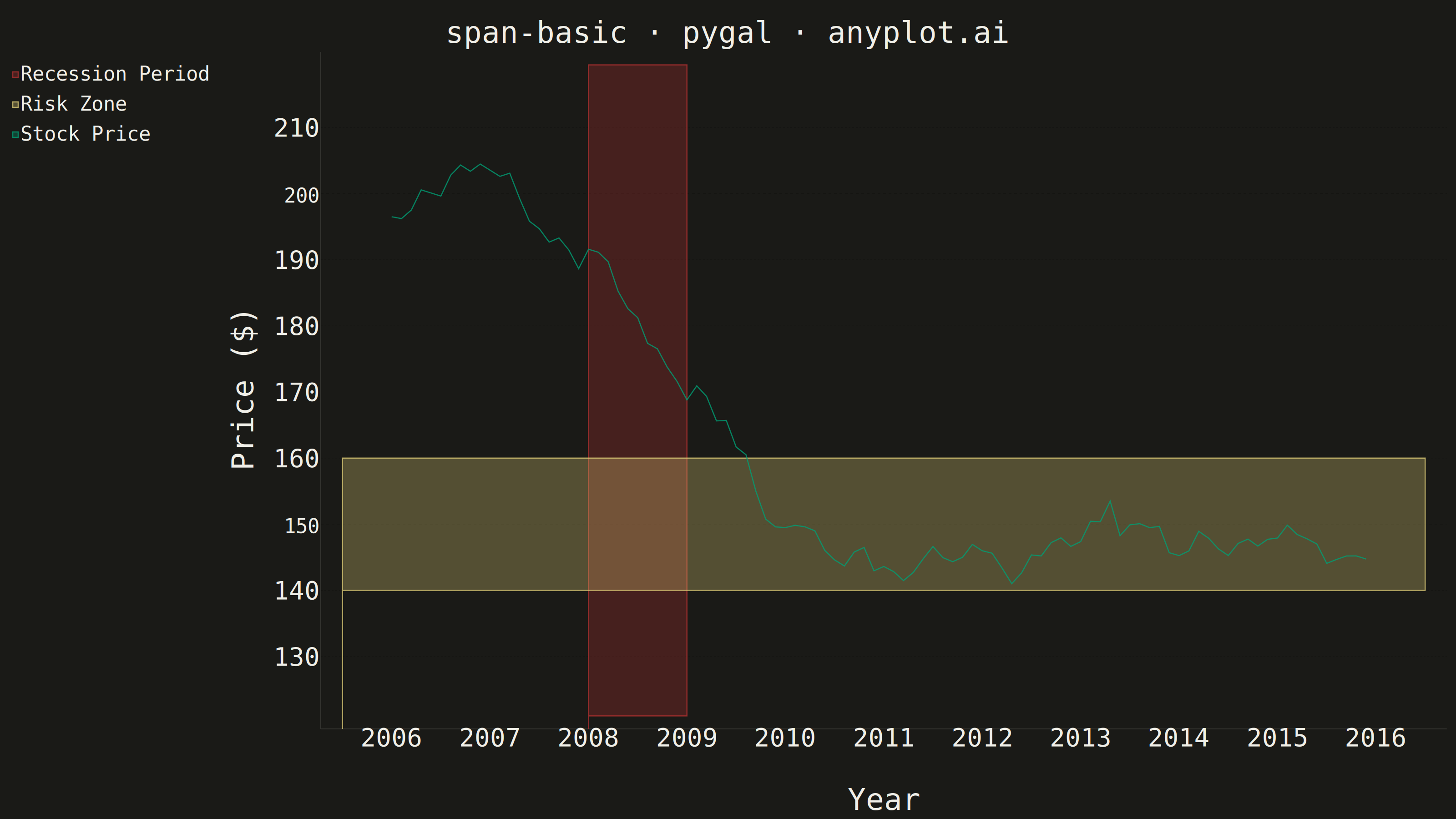
A span plot highlights a specific region of interest on a chart using a shaded rectangular area that spans the full height or width of the plot. Vertical spans mark ranges along the x-axis (e.g., time periods), while horizontal spans mark ranges along the y-axis (e.g., value thresholds). The semi-transparent fill allows underlying data to remain visible while drawing attention to the highlighted region.
""" anyplot.ai
span-basic: Basic Span Plot (Highlighted Region)
Library: pygal 3.1.3 | Python 3.13.14
Quality: 88/100 | Created: 2026-07-25
"""

import os
import sys

import numpy as np


# Pop script dir so this file (pygal.py) doesn't shadow the installed pygal package
_script_dir = sys.path.pop(0)
import pygal
from pygal.style import Style


sys.path.insert(0, _script_dir)

# Theme tokens
THEME = os.getenv("ANYPLOT_THEME", "light")
PAGE_BG = "#FAF8F1" if THEME == "light" else "#1A1A17"
INK = "#1A1A17" if THEME == "light" else "#F0EFE8"
INK_MUTED = "#6B6A63" if THEME == "light" else "#A8A79F"

# Span fill opacity stays within the spec's 0.2-0.3 range on both themes
SPAN_OPACITY = ".3" if THEME == "dark" else ".25"

# Semantic colors (style guide's semantic-exception rule): the recession span is a
# negative economic event (matte red), the risk zone is a warning threshold (amber),
# freeing brand green for the primary stock-price line rather than a secondary span
RECESSION_COLOR = "#AE3030"  # Imprint position 5 - loss / bad-event anchor
RISK_COLOR = "#DDCC77"  # amber semantic anchor - warning / caution
PRICE_COLOR = "#009E73"  # brand green - primary data series

# Data - Stock prices with highlighted events
np.random.seed(42)
dates = np.arange(2006, 2016, 0.1)
price = 100 + np.cumsum(np.random.randn(len(dates)) * 2)
recession_mask = (dates >= 2008) & (dates < 2010)
price[recession_mask] -= np.linspace(0, 30, recession_mask.sum())
price[dates >= 2010] -= 30
price = price + np.abs(price.min()) + 50

# Tight range around the actual price floor/ceiling (~141-204) to avoid dead canvas space
y_min = float(price.min()) - 20
y_max = float(price.max()) + 15

# Risk Zone sits inside the observed price range (not below it) so it visibly
# intersects the line near the recession trough and the post-2010 plateau
risk_low, risk_high = 140.0, 160.0

# Style
custom_style = Style(
    background=PAGE_BG,
    plot_background=PAGE_BG,
    foreground=INK,
    foreground_strong=INK,
    foreground_subtle=INK_MUTED,
    colors=(RECESSION_COLOR, RISK_COLOR, PRICE_COLOR),
    opacity=SPAN_OPACITY,
    opacity_hover=".5",
    title_font_size=66,
    label_font_size=56,
    major_label_font_size=44,
    legend_font_size=44,
    value_font_size=36,
    stroke_width=2.5,
)

# Plot — x-guides disabled for a cleaner grid; human_readable for polished tooltips;
# truncate_legend=-1 keeps "Recession Period" from being clipped in the legend;
# spacing (pygal's uniform title/legend/axis padding knob) is raised from the
# native 10px default so the legend isn't flush against the canvas edge; the
# inline css softens pygal's default solid axis box lines to match the subtle
# gridline treatment (opacity ~0.25) instead of a hard foreground_strong outline
chart = pygal.XY(
    style=custom_style,
    width=3200,
    height=1800,
    title="span-basic · pygal · anyplot.ai",
    x_title="Year",
    y_title="Price ($)",
    show_dots=False,
    show_x_guides=False,
    show_y_guides=True,
    range=(y_min, y_max),
    xrange=(2005.5, 2016.5),
    fill=True,
    stroke=True,
    truncate_legend=-1,
    human_readable=True,
    spacing=28,
    css=("file://style.css", "file://graph.css", "inline:.axis .line { stroke-opacity: .25; }"),
)

# Vertical span: Recession Period (2008-2009) — closed polygon
recession_span = [(2008, y_min), (2008, y_max), (2009, y_max), (2009, y_min), (2008, y_min)]
chart.add("Recession Period", recession_span)

# Horizontal span: Risk Zone (price 140-160) — closed polygon
risk_span = [(2005.5, risk_low), (2005.5, risk_high), (2016.5, risk_high), (2016.5, risk_low), (2005.5, risk_low)]
chart.add("Risk Zone", risk_span)

# Main line — dict format enables per-point custom tooltip labels (pygal interactive feature)
main_data = [{"value": (float(x), float(y)), "label": f"${y:.0f}"} for x, y in zip(dates, price, strict=True)]
chart.add("Stock Price", main_data, fill=False, stroke=True)

# Save
chart.render_to_png(f"plot-{THEME}.png")
with open(f"plot-{THEME}.html", "wb") as f:
    f.write(chart.render())
Runnable source as JSON, for any HTTP client: https://api.anyplot.ai/specs/span-basic/pygal/code. Any spec id and library id listed in llms-full.txt fit the same URL shape; every URL below is complete and callable.
{
  "spec_id": "span-basic",
  "language": "python",
  "library": "pygal",
  "page": "https://anyplot.ai/span-basic/python/pygal",
  "hub": "https://anyplot.ai/span-basic",
  "code_json": "https://api.anyplot.ai/specs/span-basic/pygal/code",
  "spec_json": "https://api.anyplot.ai/specs/span-basic",
  "render_light_png": "https://storage.googleapis.com/anyplot-images/plots/span-basic/python/pygal/plot-light.png",
  "render_dark_png": "https://storage.googleapis.com/anyplot-images/plots/span-basic/python/pygal/plot-dark.png",
  "interactive_light_html": "https://storage.googleapis.com/anyplot-images/plots/span-basic/python/pygal/plot-light.html",
  "interactive_dark_html": "https://storage.googleapis.com/anyplot-images/plots/span-basic/python/pygal/plot-dark.html",
  "quality_score": 88.0,
  "license": "MIT",
  "guide": "https://anyplot.ai/llms.txt"
}
Part of Basic Span Plot (Highlighted Region) on anyplot.ai.