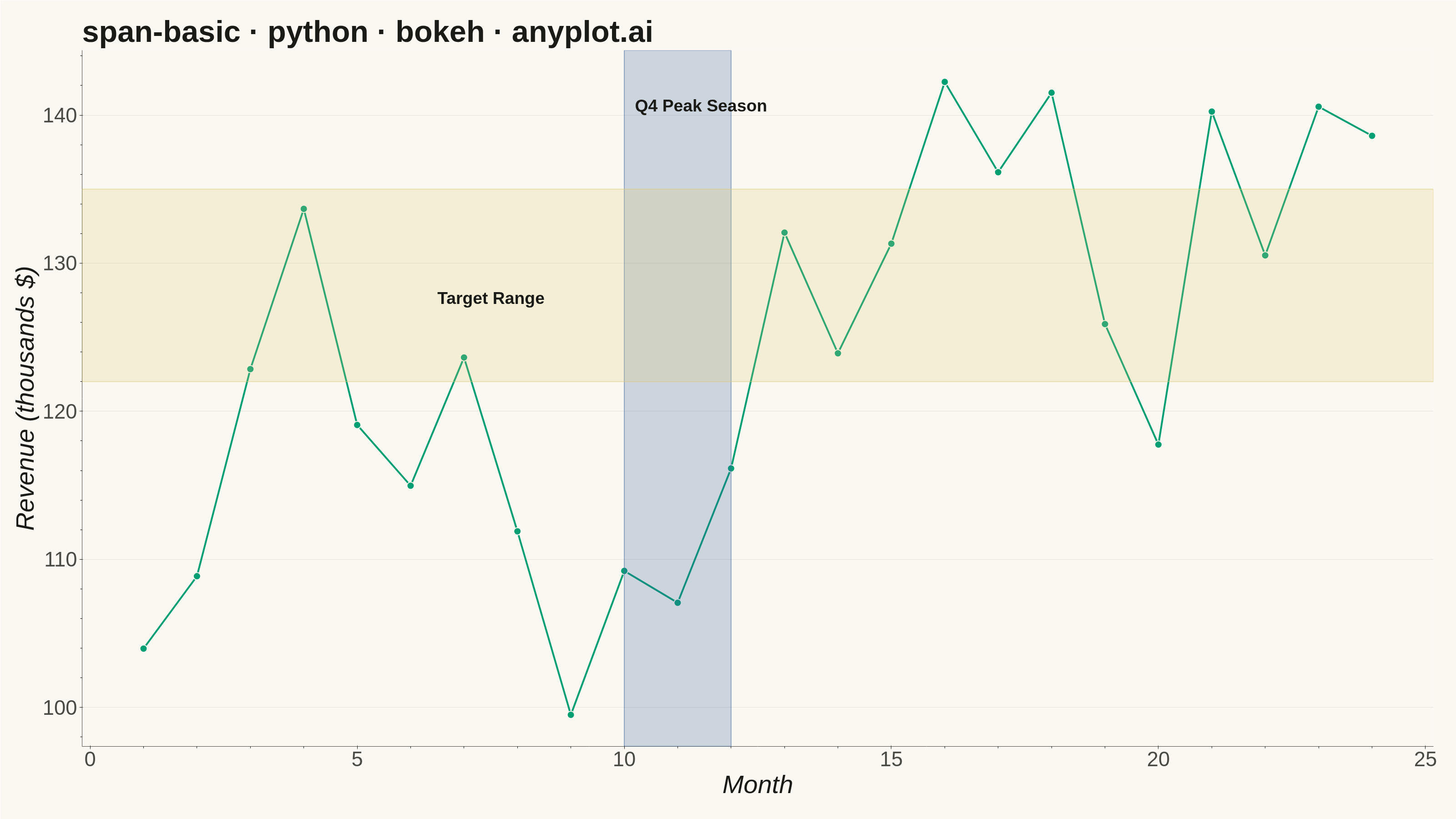
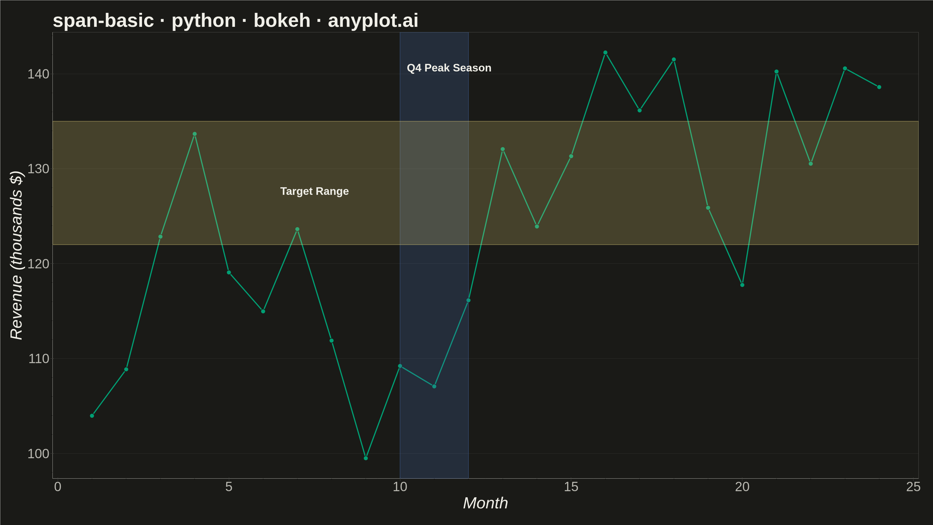
A span plot highlights a specific region of interest on a chart using a shaded rectangular area that spans the full height or width of the plot. Vertical spans mark ranges along the x-axis (e.g., time periods), while horizontal spans mark ranges along the y-axis (e.g., value thresholds). The semi-transparent fill allows underlying data to remain visible while drawing attention to the highlighted region.
""" anyplot.ai
span-basic: Basic Span Plot (Highlighted Region)
Library: bokeh 3.9.1 | Python 3.13.14
Quality: 94/100 | Updated: 2026-07-25
"""

import os
import time
from pathlib import Path

import numpy as np
from bokeh.io import output_file, save
from bokeh.models import BoxAnnotation, ColumnDataSource, HoverTool, Label
from bokeh.plotting import figure
from selenium import webdriver
from selenium.webdriver.chrome.options import Options


# Theme tokens
THEME = os.getenv("ANYPLOT_THEME", "light")
PAGE_BG = "#FAF8F1" if THEME == "light" else "#1A1A17"
INK = "#1A1A17" if THEME == "light" else "#F0EFE8"
INK_SOFT = "#4A4A44" if THEME == "light" else "#B8B7B0"
BRAND = "#009E73"  # Imprint palette position 1 — always first series

# Data - Monthly revenue over 2 years with spans highlighting key periods
np.random.seed(42)
months = np.arange(1, 25)
base_revenue = 100 + np.linspace(0, 50, 24) + 15 * np.sin(np.linspace(0, 4 * np.pi, 24))
noise = np.random.randn(24) * 8
revenue = base_revenue + noise

# Create ColumnDataSource
source = ColumnDataSource(data={"x": months, "y": revenue})

# Create figure (3200 × 1800 px — Step 0 canonical canvas)
p = figure(
    width=3200,
    height=1800,
    title="span-basic · python · bokeh · anyplot.ai",
    x_axis_label="Month",
    y_axis_label="Revenue (thousands $)",
    toolbar_location=None,  # bokeh's default toolbar adds ~30-50px, shrinking the saved PNG
    min_border_bottom=160,
    min_border_left=180,
    min_border_top=110,
    min_border_right=50,
)

# Add vertical span - highlight Q4 of Year 1 (months 10-12)
vertical_span = BoxAnnotation(
    left=10, right=12, fill_alpha=0.25, fill_color="#4467A3", line_color="#4467A3", line_width=2, line_alpha=0.5
)
p.add_layout(vertical_span)

# Add horizontal span - highlight target revenue range (122-135) using Imprint amber
horizontal_span = BoxAnnotation(
    bottom=122, top=135, fill_alpha=0.22, fill_color="#DDCC77", line_color="#DDCC77", line_width=2, line_alpha=0.5
)
p.add_layout(horizontal_span)

# Plot line with markers (Imprint palette position 1)
p.line(x="x", y="y", source=source, line_width=4, line_color=BRAND)
p.scatter(x="x", y="y", source=source, size=16, fill_color=BRAND, line_color=PAGE_BG, line_width=2)

# HoverTool — showcases Bokeh's interactive HTML output
hover = HoverTool(tooltips=[("Month", "@x"), ("Revenue", "@y{0.1} K$")])
p.add_tools(hover)

# Add labels for spans — INK keeps full contrast against either theme,
# independent of the span's own tint (unlike the span-colored text used before)
vertical_label = Label(
    x=10.2, y=140, text="Q4 Peak Season", text_font_size="28pt", text_color=INK, text_font_style="bold"
)
p.add_layout(vertical_label)

horizontal_label = Label(
    x=6.5, y=127, text="Target Range", text_font_size="28pt", text_color=INK, text_font_style="bold"
)
p.add_layout(horizontal_label)

# Apply theme-adaptive chrome
p.background_fill_color = PAGE_BG
p.border_fill_color = PAGE_BG
p.outline_line_color = None  # remove box border; L-shaped spines via xaxis/yaxis lines only

p.title.text_color = INK
p.title.text_font_size = "50pt"
p.xaxis.axis_label_text_color = INK
p.yaxis.axis_label_text_color = INK
p.xaxis.axis_label_text_font_size = "42pt"
p.yaxis.axis_label_text_font_size = "42pt"
p.xaxis.major_label_text_color = INK_SOFT
p.yaxis.major_label_text_color = INK_SOFT
p.xaxis.major_label_text_font_size = "34pt"
p.yaxis.major_label_text_font_size = "34pt"
p.xaxis.axis_line_color = INK_SOFT
p.yaxis.axis_line_color = INK_SOFT
p.xaxis.major_tick_line_color = INK_SOFT
p.yaxis.major_tick_line_color = INK_SOFT

p.xgrid.grid_line_color = None  # y-only grid preferred for line charts
p.ygrid.grid_line_color = INK
p.ygrid.grid_line_alpha = 0.10

# Save — write the interactive HTML, then screenshot it with headless Chrome
# (bokeh.io.export_png is unreliable in this environment's chromedriver setup)
output_file(f"plot-{THEME}.html")
save(p)

W, H = 3200, 1800
opts = Options()
for arg in (
    "--headless=new",
    "--no-sandbox",
    "--disable-dev-shm-usage",
    "--disable-gpu",
    f"--window-size={W},{H}",
    "--hide-scrollbars",
):
    opts.add_argument(arg)
driver = webdriver.Chrome(options=opts)
driver.set_window_size(W, H)
driver.get(f"file://{Path(f'plot-{THEME}.html').resolve()}")
driver.execute_cdp_cmd(
    "Emulation.setDeviceMetricsOverride", {"width": W, "height": H, "deviceScaleFactor": 1, "mobile": False}
)
time.sleep(3)  # let bokeh's JS render the canvas
driver.save_screenshot(f"plot-{THEME}.png")
driver.quit()
Runnable source as JSON, for any HTTP client: https://api.anyplot.ai/specs/span-basic/bokeh/code. Any spec id and library id listed in llms-full.txt fit the same URL shape; every URL below is complete and callable.
{
  "spec_id": "span-basic",
  "language": "python",
  "library": "bokeh",
  "page": "https://anyplot.ai/span-basic/python/bokeh",
  "hub": "https://anyplot.ai/span-basic",
  "code_json": "https://api.anyplot.ai/specs/span-basic/bokeh/code",
  "spec_json": "https://api.anyplot.ai/specs/span-basic",
  "render_light_png": "https://storage.googleapis.com/anyplot-images/plots/span-basic/python/bokeh/plot-light.png",
  "render_dark_png": "https://storage.googleapis.com/anyplot-images/plots/span-basic/python/bokeh/plot-dark.png",
  "interactive_light_html": "https://storage.googleapis.com/anyplot-images/plots/span-basic/python/bokeh/plot-light.html",
  "interactive_dark_html": "https://storage.googleapis.com/anyplot-images/plots/span-basic/python/bokeh/plot-dark.html",
  "quality_score": 94.0,
  "license": "MIT",
  "guide": "https://anyplot.ai/llms.txt"
}
Part of Basic Span Plot (Highlighted Region) on anyplot.ai.