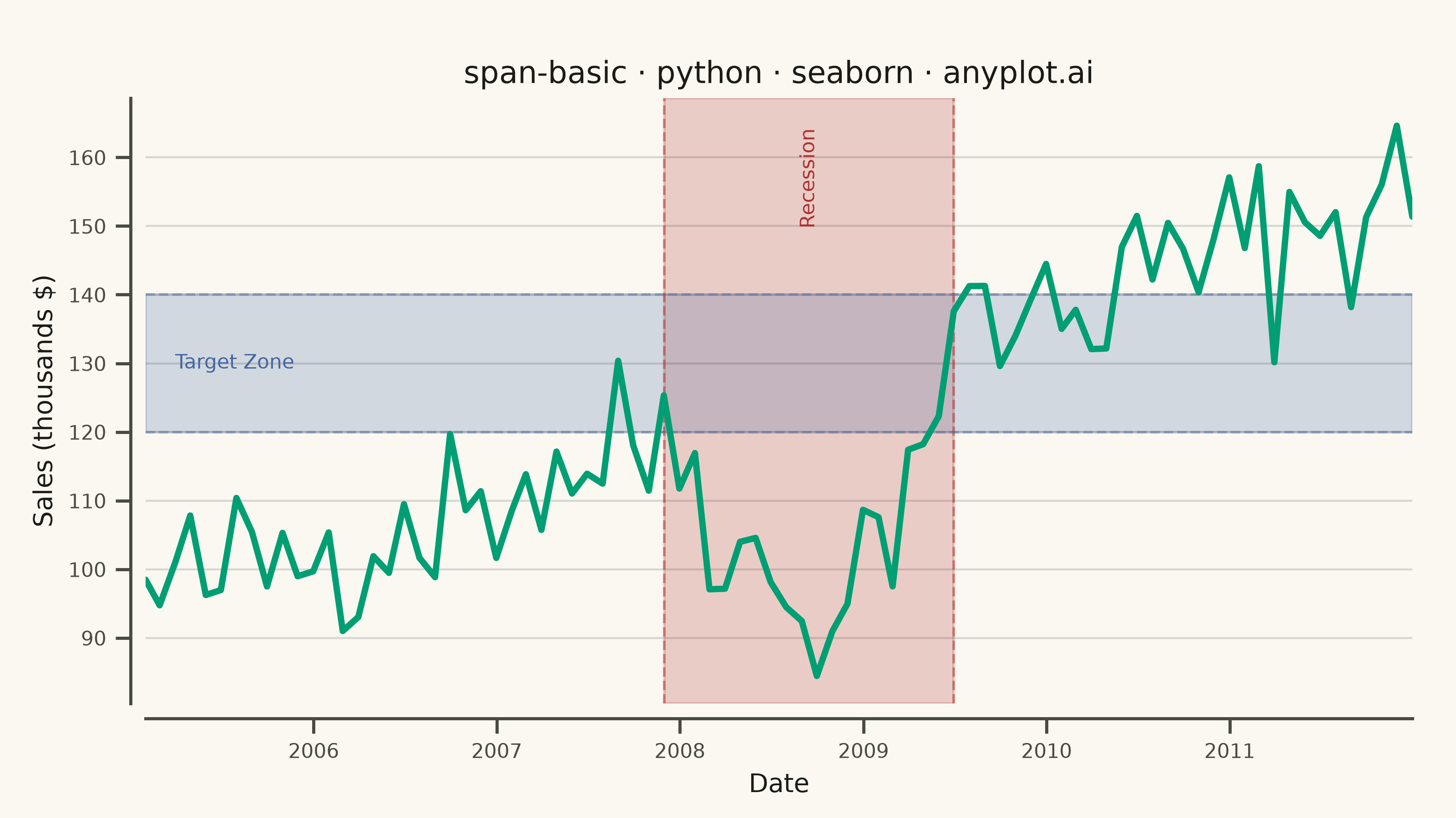
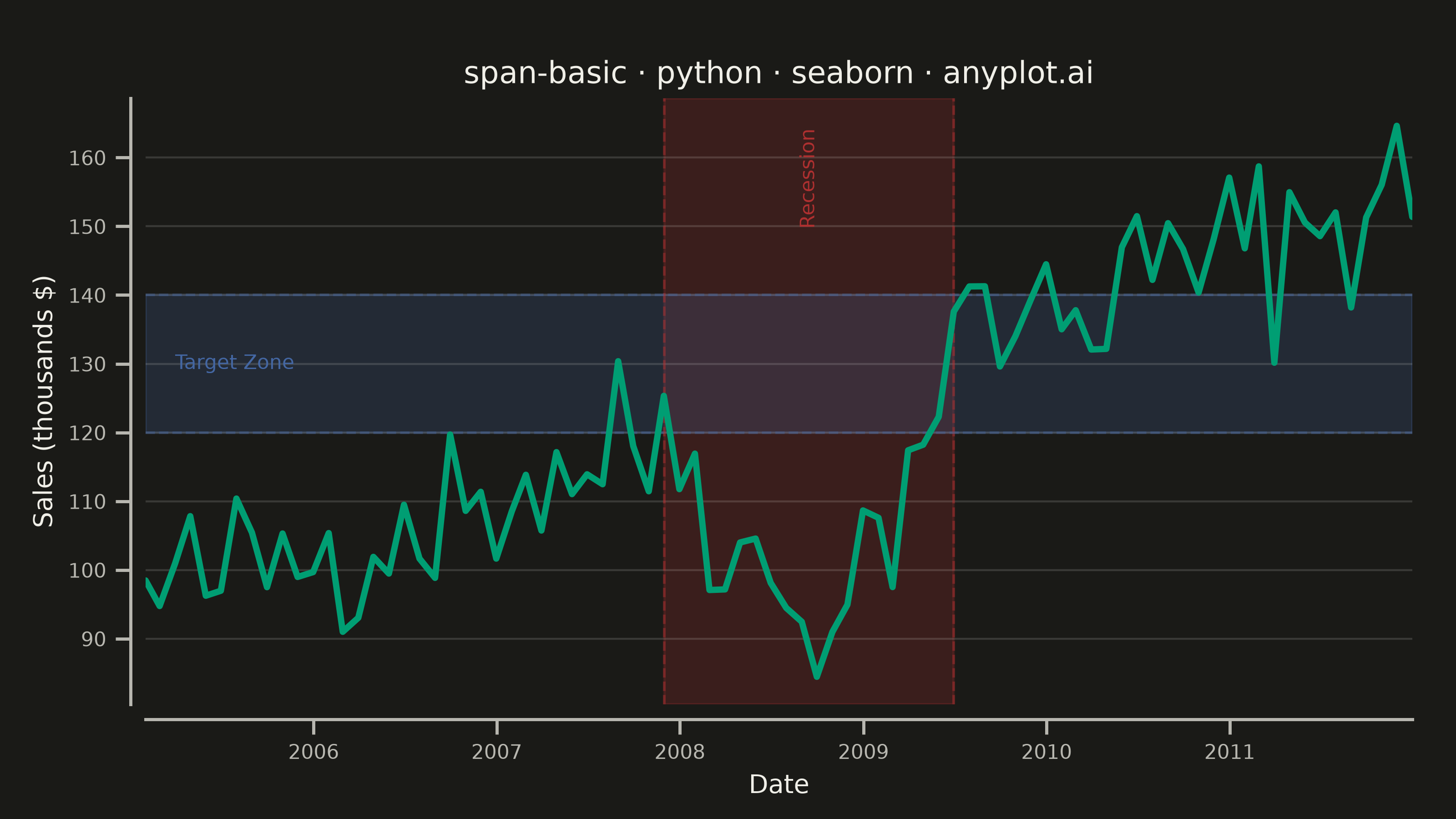
A span plot highlights a specific region of interest on a chart using a shaded rectangular area that spans the full height or width of the plot. Vertical spans mark ranges along the x-axis (e.g., time periods), while horizontal spans mark ranges along the y-axis (e.g., value thresholds). The semi-transparent fill allows underlying data to remain visible while drawing attention to the highlighted region.
""" anyplot.ai
span-basic: Basic Span Plot (Highlighted Region)
Library: seaborn 0.13.2 | Python 3.13.14
Quality: 91/100 | Updated: 2026-07-25
"""

import os

import matplotlib.dates as mdates
import matplotlib.pyplot as plt
import numpy as np
import pandas as pd
import seaborn as sns


# Theme tokens
THEME = os.getenv("ANYPLOT_THEME", "light")
PAGE_BG = "#FAF8F1" if THEME == "light" else "#1A1A17"
ELEVATED_BG = "#FFFDF6" if THEME == "light" else "#242420"
INK = "#1A1A17" if THEME == "light" else "#F0EFE8"
INK_SOFT = "#4A4A44" if THEME == "light" else "#B8B7B0"

# Imprint palette — canonical order, first series always #009E73
IMPRINT_PALETTE = ["#009E73", "#C475FD", "#4467A3", "#BD8233", "#AE3030", "#2ABCCD", "#954477", "#99B314"]
BRAND = IMPRINT_PALETTE[0]
SPAN_RECESSION = IMPRINT_PALETTE[4]  # matte red — semantic anchor for a "bad" economic period
SPAN_TARGET = IMPRINT_PALETTE[2]  # blue — neutral threshold band

sns.set_theme(
    style="ticks",
    rc={
        "figure.facecolor": PAGE_BG,
        "axes.facecolor": PAGE_BG,
        "axes.edgecolor": INK_SOFT,
        "axes.labelcolor": INK,
        "text.color": INK,
        "xtick.color": INK_SOFT,
        "ytick.color": INK_SOFT,
        "grid.color": INK,
        "grid.alpha": 0.15,
        "legend.facecolor": ELEVATED_BG,
        "legend.edgecolor": INK_SOFT,
    },
)

# Data - monthly sales revenue with the 2007-2009 recession and a target sales zone
np.random.seed(42)
months = pd.date_range(start="2005-01", periods=84, freq="ME")
recession_start, recession_end = pd.Timestamp("2007-12-01"), pd.Timestamp("2009-06-30")
in_recession = (months >= recession_start) & (months <= recession_end)
base_trend = np.linspace(95, 155, 84)
recession_effect = np.zeros(84)
recession_effect[in_recession] = -32 * np.sin(np.linspace(0, np.pi, in_recession.sum()))
sales = base_trend + recession_effect + np.random.randn(84) * 7
df = pd.DataFrame({"Month": months, "Sales": sales})

# Plot — see default-style-guide.md "Visual Sizing Defaults" for the canvas + sizing values
fig, ax = plt.subplots(figsize=(8, 4.5), dpi=400, facecolor=PAGE_BG)

# Vertical span — recession period, dashed edges mark the boundary precisely
ax.axvspan(recession_start, recession_end, alpha=0.22, color=SPAN_RECESSION, zorder=0)
ax.axvline(recession_start, color=SPAN_RECESSION, alpha=0.5, linewidth=1, linestyle="--")
ax.axvline(recession_end, color=SPAN_RECESSION, alpha=0.5, linewidth=1, linestyle="--")

# Horizontal span — target sales zone
ax.axhspan(120, 140, alpha=0.22, color=SPAN_TARGET, zorder=0)
ax.axhline(120, color=SPAN_TARGET, alpha=0.4, linewidth=1, linestyle="--")
ax.axhline(140, color=SPAN_TARGET, alpha=0.4, linewidth=1, linestyle="--")

# Line — semi-transparent spans keep it visible underneath
sns.lineplot(data=df, x="Month", y="Sales", ax=ax, linewidth=2.5, color=BRAND)

# Direct in-plot labels replace a legend — keeps the chart uncluttered
ax.set_xlim(months[0], months[-1])
y_min, y_max = ax.get_ylim()
ax.text(
    recession_start + (recession_end - recession_start) / 2,
    y_max - 0.05 * (y_max - y_min),
    "Recession",
    rotation=90,
    va="top",
    ha="center",
    fontsize=8,
    fontweight="medium",
    color=SPAN_RECESSION,
)
ax.text(months[2], 130, "Target Zone", va="center", ha="left", fontsize=8, fontweight="medium", color=SPAN_TARGET)

# Style
ax.set_title("span-basic · python · seaborn · anyplot.ai", fontsize=12, fontweight="medium", color=INK)
ax.set_xlabel("Date", fontsize=10, color=INK)
ax.set_ylabel("Sales (thousands $)", fontsize=10, color=INK)
ax.xaxis.set_major_locator(mdates.YearLocator())
ax.xaxis.set_major_formatter(mdates.DateFormatter("%Y"))
ax.tick_params(axis="both", labelsize=8, colors=INK_SOFT)
sns.despine(ax=ax, offset=6)
ax.yaxis.grid(True, alpha=0.15, linewidth=0.8, color=INK)

fig.subplots_adjust(left=0.10, right=0.97, top=0.88, bottom=0.14)
plt.savefig(f"plot-{THEME}.png", dpi=400, facecolor=PAGE_BG)
Runnable source as JSON, for any HTTP client: https://api.anyplot.ai/specs/span-basic/seaborn/code. Any spec id and library id listed in llms-full.txt fit the same URL shape; every URL below is complete and callable.
{
  "spec_id": "span-basic",
  "language": "python",
  "library": "seaborn",
  "page": "https://anyplot.ai/span-basic/python/seaborn",
  "hub": "https://anyplot.ai/span-basic",
  "code_json": "https://api.anyplot.ai/specs/span-basic/seaborn/code",
  "spec_json": "https://api.anyplot.ai/specs/span-basic",
  "render_light_png": "https://storage.googleapis.com/anyplot-images/plots/span-basic/python/seaborn/plot-light.png",
  "render_dark_png": "https://storage.googleapis.com/anyplot-images/plots/span-basic/python/seaborn/plot-dark.png",
  "quality_score": 91.0,
  "license": "MIT",
  "guide": "https://anyplot.ai/llms.txt"
}
Part of Basic Span Plot (Highlighted Region) on anyplot.ai.