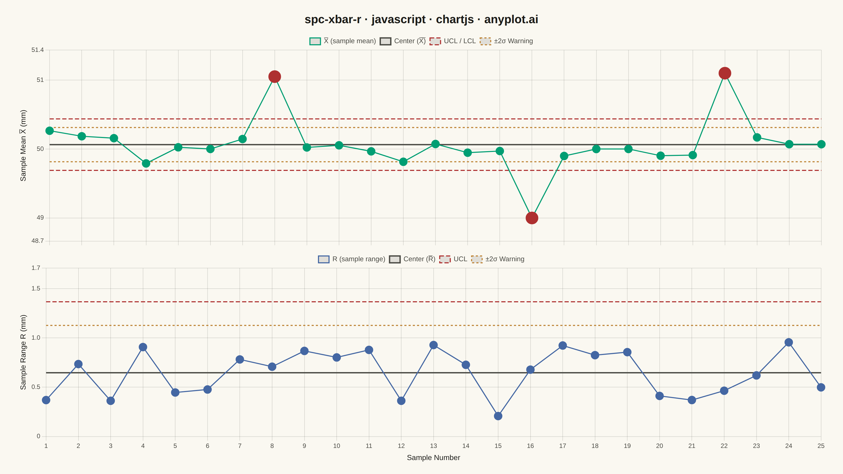
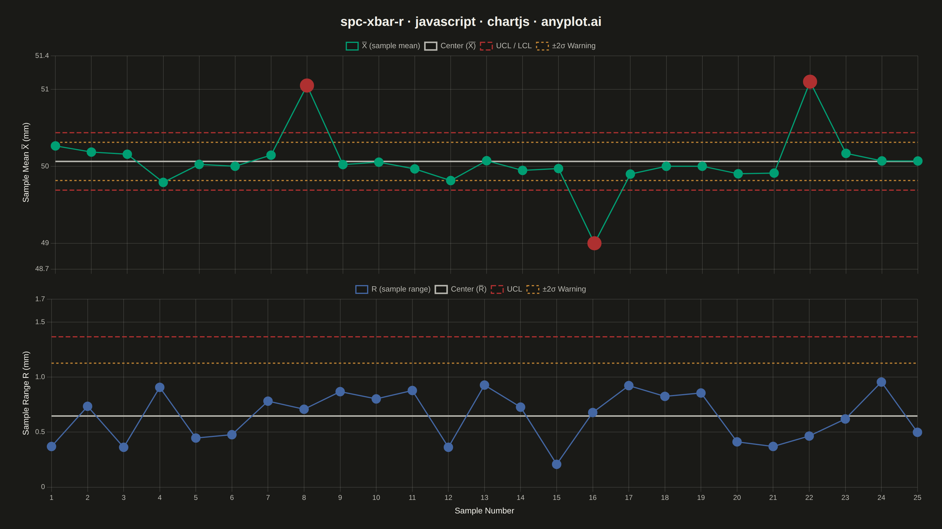
A Statistical Process Control (SPC) chart displaying sample means (X-bar) and ranges (R) plotted over time against control limits. The chart includes a center line representing the process mean, Upper Control Limit (UCL) and Lower Control Limit (LCL) at ±3 sigma, and optional warning limits at ±2 sigma. Out-of-control points are highlighted to signal process instability. This is a fundamental tool in manufacturing quality control and Six Sigma methodology for monitoring process stability.
// anyplot.ai
// spc-xbar-r: Statistical Process Control Chart (X-bar/R)
// Library: chartjs 4.4.7 | JavaScript 22.22.3
// Quality: 90/100 | Created: 2026-06-20

const t = window.ANYPLOT_TOKENS;

// SPC constants for subgroup size n=5
const A2 = 0.577, D3 = 0, D4 = 2.114;
const d2 = 2.326, d3c = 0.864;

// Deterministic LCG RNG (seeded, no Math.random)
let _seed = 42;
function rand() {
  _seed = (_seed * 1664525 + 1013904223) >>> 0;
  return _seed / 4294967295;
}
function randNorm() {
  const u = rand() + 1e-9;
  return Math.sqrt(-2 * Math.log(u)) * Math.cos(2 * Math.PI * rand());
}

// Generate 25 subgroups of n=5 shaft diameter measurements (mm)
const N_SAMPLES = 25, N_PER = 5;
const PROC_MEAN = 50.0, PROC_STD = 0.3;

const sampleMeans = [], sampleRanges = [];
for (let i = 0; i < N_SAMPLES; i++) {
  const vals = Array.from({ length: N_PER }, () => PROC_MEAN + PROC_STD * randNorm());
  sampleMeans.push(vals.reduce((a, b) => a + b) / N_PER);
  sampleRanges.push(Math.max(...vals) - Math.min(...vals));
}

// Inject 3 out-of-control points to demonstrate detection capability
sampleMeans[7]  = PROC_MEAN + 1.05;
sampleMeans[15] = PROC_MEAN - 1.0;
sampleMeans[21] = PROC_MEAN + 1.1;

// Compute process-level statistics and control limits
const xbarBar = sampleMeans.reduce((a, b) => a + b) / N_SAMPLES;
const rBar    = sampleRanges.reduce((a, b) => a + b) / N_SAMPLES;

// X-bar chart limits (±3σ UCL/LCL, ±2σ warning)
const xucl = xbarBar + A2 * rBar;
const xlcl = xbarBar - A2 * rBar;
const xuwl = xbarBar + (2 / 3) * A2 * rBar;
const xlwl = xbarBar - (2 / 3) * A2 * rBar;

// R chart limits (D4/D3 factors; n=5 → D3=0 so LCL=0)
const rucl = D4 * rBar;
const ruwl = rBar + 2 * (d3c / d2) * rBar;

const labels = sampleMeans.map((_, i) => String(i + 1));
const fmt    = v => Math.round(v * 10000) / 10000;

const OOC_CLR  = t.palette[4];  // #AE3030 matte red — error semantic
const XBAR_CLR = t.palette[0];  // #009E73 brand green — first series
const RANG_CLR = t.palette[2];  // #4467A3 blue

const xPointBg = sampleMeans.map(v  => (v  > xucl || v  < xlcl) ? OOC_CLR : XBAR_CLR);
const xPointR  = sampleMeans.map(v  => (v  > xucl || v  < xlcl) ? 11 : 7);
const rPointBg = sampleRanges.map(v => v > rucl ? OOC_CLR : RANG_CLR);
const rPointR  = sampleRanges.map(v => v > rucl ? 11 : 7);

const hline = val => Array(N_SAMPLES).fill(fmt(val));

// Shared dataset config for horizontal reference lines
function refLine(label, val, color, dash, order) {
  return {
    label, data: hline(val),
    borderColor: color, borderWidth: dash ? 2 : 2.5,
    borderDash: dash || [], pointRadius: 0, fill: false, tension: 0, order,
  };
}

// --- Mount: flex column with title + two chart panels ---
const container = document.getElementById("container");
container.style.cssText = `
  display:flex; flex-direction:column;
  background-color:${t.pageBg};
  padding:24px 32px 18px;
  box-sizing:border-box;
`;

const titleEl = document.createElement("div");
titleEl.textContent = "spc-xbar-r · javascript · chartjs · anyplot.ai";
titleEl.style.cssText = `
  color:${t.ink}; font-family:sans-serif; font-size:22px; font-weight:600;
  text-align:center; margin-bottom:14px; flex-shrink:0;
`;
container.appendChild(titleEl);

const topDiv = document.createElement("div");
topDiv.style.cssText = "flex:1; position:relative; min-height:0; margin-bottom:10px;";
const topCanvas = document.createElement("canvas");
topDiv.appendChild(topCanvas);
container.appendChild(topDiv);

const botDiv = document.createElement("div");
botDiv.style.cssText = "flex:1; position:relative; min-height:0;";
const botCanvas = document.createElement("canvas");
botDiv.appendChild(botCanvas);
container.appendChild(botDiv);

// Shared legend label filter — hides datasets with labels starting "_"
const legendFilter = item => !item.text.startsWith("_");

// Y-axis ranges with enough headroom for OOC points and limit labels
const xSpan = xucl - xlcl;
const xPad  = xSpan * 0.45;
const xMin  = Math.min(xlcl, ...sampleMeans) - xPad;
const xMax  = Math.max(xucl, ...sampleMeans) + xPad;
const rMax  = Math.max(rucl, ...sampleRanges) + rucl * 0.25;

// X-bar chart (top panel) — x-axis ticks/title suppressed; shared x-axis lives on bottom panel
new Chart(topCanvas, {
  type: "line",
  data: {
    labels,
    datasets: [
      refLine("±2σ Warning", xuwl, t.palette[3], [4, 4], 5),
      refLine("_xlwl",       xlwl, t.palette[3], [4, 4], 5),
      refLine("UCL / LCL",  xucl, OOC_CLR,      [8, 4], 4),
      refLine("_xlcl",       xlcl, OOC_CLR,      [8, 4], 4),
      refLine("Center (X̅̅)", xbarBar, t.inkSoft, null, 3),
      {
        label: "X̅ (sample mean)",
        data: sampleMeans.map(fmt),
        borderColor: XBAR_CLR, borderWidth: 2,
        pointBackgroundColor: xPointBg, pointBorderColor: xPointBg,
        pointRadius: xPointR, pointHoverRadius: xPointR,
        fill: false, tension: 0, order: 1,
      },
    ],
  },
  options: {
    responsive: true, maintainAspectRatio: false, animation: false,
    plugins: {
      title: { display: false },
      legend: { labels: { color: t.inkSoft, font: { size: 13 }, boxWidth: 20, padding: 8, filter: legendFilter } },
      tooltip: { enabled: false },
    },
    scales: {
      x: {
        ticks:  { display: false },
        grid:   { color: t.grid },
        border: { display: false },
        title:  { display: false },
      },
      y: {
        min: xMin, max: xMax,
        ticks:  { color: t.inkSoft, font: { size: 12 }, maxTicksLimit: 6 },
        grid:   { color: t.grid },
        border: { display: false },
        title:  { display: true, text: "Sample Mean X̅ (mm)", color: t.ink, font: { size: 14 } },
      },
    },
  },
});

// R chart (bottom panel)
new Chart(botCanvas, {
  type: "line",
  data: {
    labels,
    datasets: [
      refLine("±2σ Warning", ruwl, t.palette[3], [4, 4], 4),
      refLine("UCL",         rucl, OOC_CLR,      [8, 4], 3),
      refLine("Center (R̅)", rBar, t.inkSoft,    null,   2),
      {
        label: "R (sample range)",
        data: sampleRanges.map(fmt),
        borderColor: RANG_CLR, borderWidth: 2,
        pointBackgroundColor: rPointBg, pointBorderColor: rPointBg,
        pointRadius: rPointR, pointHoverRadius: rPointR,
        fill: false, tension: 0, order: 1,
      },
    ],
  },
  options: {
    responsive: true, maintainAspectRatio: false, animation: false,
    plugins: {
      title: { display: false },
      legend: { labels: { color: t.inkSoft, font: { size: 13 }, boxWidth: 20, padding: 8, filter: legendFilter } },
      tooltip: { enabled: false },
    },
    scales: {
      x: {
        ticks:  { color: t.inkSoft, font: { size: 12 } },
        grid:   { color: t.grid },
        border: { display: false },
        title:  { display: true, text: "Sample Number", color: t.ink, font: { size: 14 } },
      },
      y: {
        min: 0, max: rMax,
        ticks:  { color: t.inkSoft, font: { size: 12 }, maxTicksLimit: 6 },
        grid:   { color: t.grid },
        border: { display: false },
        title:  { display: true, text: "Sample Range R (mm)", color: t.ink, font: { size: 14 } },
      },
    },
  },
});
Runnable source as JSON, for any HTTP client: https://api.anyplot.ai/specs/spc-xbar-r/chartjs/code. Any spec id and library id listed in llms-full.txt fit the same URL shape; every URL below is complete and callable.
{
  "spec_id": "spc-xbar-r",
  "language": "javascript",
  "library": "chartjs",
  "page": "https://anyplot.ai/spc-xbar-r/javascript/chartjs",
  "hub": "https://anyplot.ai/spc-xbar-r",
  "code_json": "https://api.anyplot.ai/specs/spc-xbar-r/chartjs/code",
  "spec_json": "https://api.anyplot.ai/specs/spc-xbar-r",
  "render_light_png": "https://storage.googleapis.com/anyplot-images/plots/spc-xbar-r/javascript/chartjs/plot-light.png",
  "render_dark_png": "https://storage.googleapis.com/anyplot-images/plots/spc-xbar-r/javascript/chartjs/plot-dark.png",
  "interactive_light_html": "https://storage.googleapis.com/anyplot-images/plots/spc-xbar-r/javascript/chartjs/plot-light.html",
  "interactive_dark_html": "https://storage.googleapis.com/anyplot-images/plots/spc-xbar-r/javascript/chartjs/plot-dark.html",
  "quality_score": 90.0,
  "license": "MIT",
  "guide": "https://anyplot.ai/llms.txt"
}
Part of Statistical Process Control Chart (X-bar/R) on anyplot.ai.