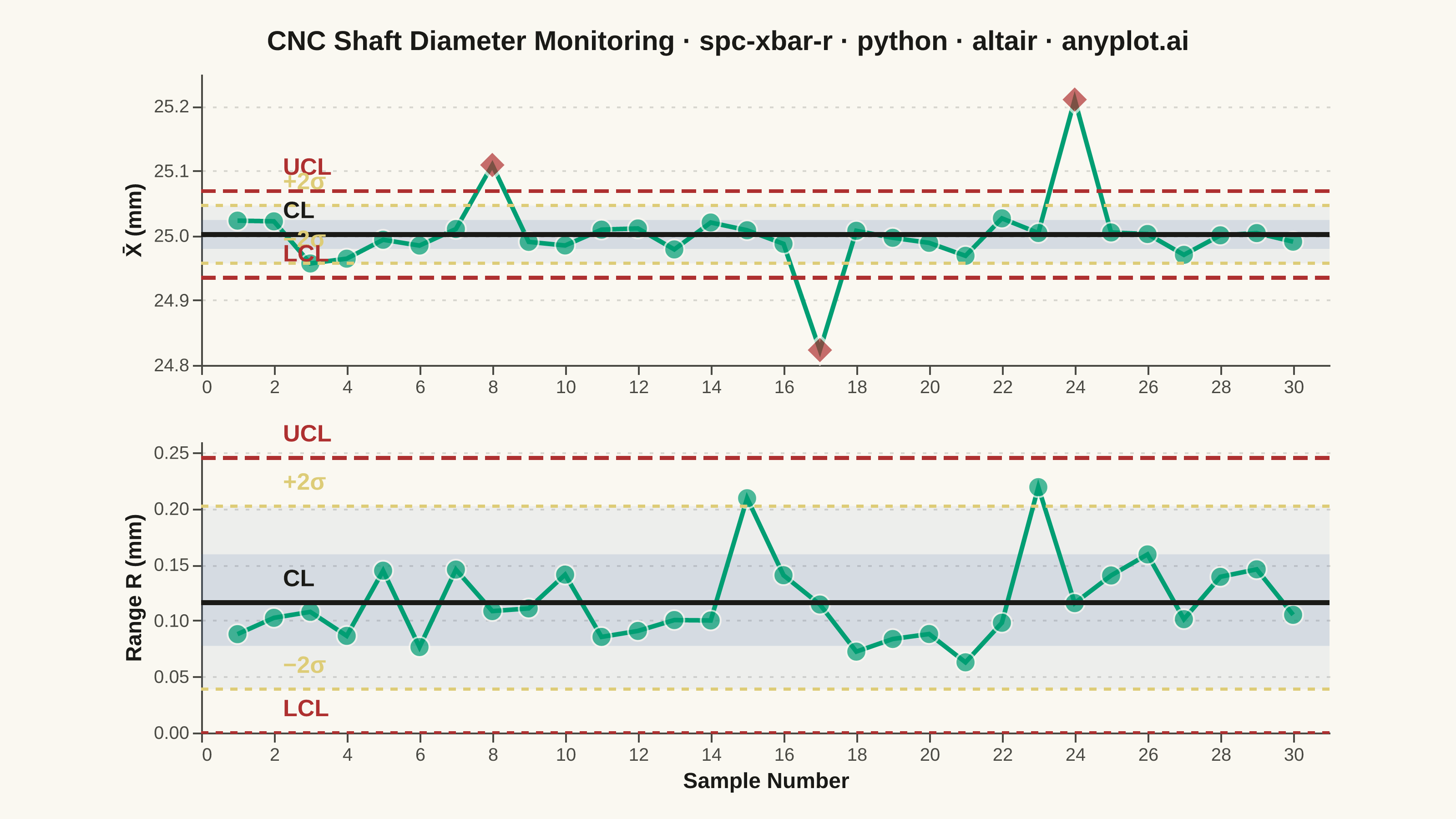
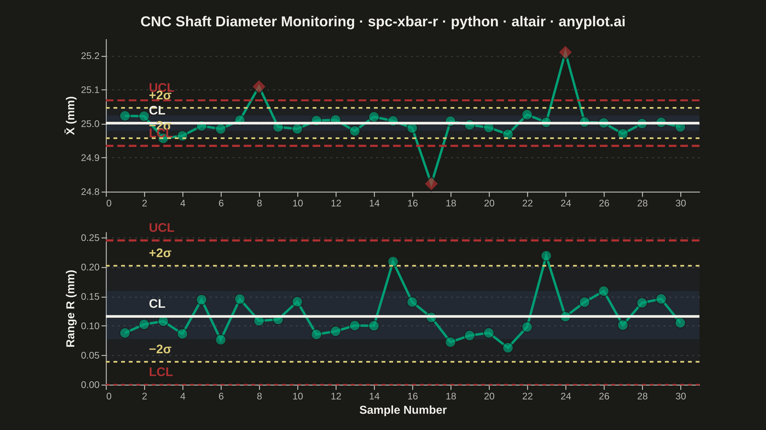
A Statistical Process Control (SPC) chart displaying sample means (X-bar) and ranges (R) plotted over time against control limits. The chart includes a center line representing the process mean, Upper Control Limit (UCL) and Lower Control Limit (LCL) at ±3 sigma, and optional warning limits at ±2 sigma. Out-of-control points are highlighted to signal process instability. This is a fundamental tool in manufacturing quality control and Six Sigma methodology for monitoring process stability.
""" anyplot.ai
spc-xbar-r: Statistical Process Control Chart (X-bar/R)
Library: altair 6.2.1 | Python 3.13.14
Quality: 90/100 | Updated: 2026-06-20
"""

import os

import altair as alt
import numpy as np
import pandas as pd
from PIL import Image


# Theme tokens — Imprint palette, theme-adaptive chrome
THEME = os.getenv("ANYPLOT_THEME", "light")
PAGE_BG = "#FAF8F1" if THEME == "light" else "#1A1A17"
INK = "#1A1A17" if THEME == "light" else "#F0EFE8"
INK_SOFT = "#4A4A44" if THEME == "light" else "#B8B7B0"

# Imprint palette — semantic roles for SPC chart
BRAND = "#009E73"  # in-control data series (first series)
OOC_COLOR = "#AE3030"  # out-of-control — semantic matte-red (bad/error)
WARN_COLOR = "#DDCC77"  # warning limits — semantic amber (caution)

# Data: CNC shaft diameter measurements, subgroups of n=5
np.random.seed(42)
n_samples = 30
n_per_sample = 5
target_diameter = 25.0  # mm
process_std = 0.05  # mm

measurements = np.random.normal(target_diameter, process_std, (n_samples, n_per_sample))
measurements[7] += 0.15
measurements[16] -= 0.18
measurements[23] += 0.20

sample_means = measurements.mean(axis=1)
sample_ranges = measurements.max(axis=1) - measurements.min(axis=1)

# Control chart constants for n=5 (Shewhart)
A2, D3, D4 = 0.577, 0.0, 2.114

xbar_bar = sample_means.mean()
r_bar = sample_ranges.mean()
xbar_ucl = xbar_bar + A2 * r_bar
xbar_lcl = xbar_bar - A2 * r_bar
xbar_uwarn = xbar_bar + (2 / 3) * A2 * r_bar
xbar_lwarn = xbar_bar - (2 / 3) * A2 * r_bar

r_ucl = D4 * r_bar
r_lcl = D3 * r_bar
r_uwarn = r_bar + (2 / 3) * (r_ucl - r_bar)
r_lwarn = r_bar - (2 / 3) * (r_bar - r_lcl)

samples = np.arange(1, n_samples + 1)
x_domain = [0, n_samples + 1]

df_xbar = pd.DataFrame(
    {
        "sample": samples,
        "value": sample_means,
        "ucl": xbar_ucl,
        "lcl": xbar_lcl,
        "center": xbar_bar,
        "uwarn": xbar_uwarn,
        "lwarn": xbar_lwarn,
    }
)
df_xbar["ooc"] = (df_xbar["value"] > xbar_ucl) | (df_xbar["value"] < xbar_lcl)

df_range = pd.DataFrame(
    {
        "sample": samples,
        "value": sample_ranges,
        "ucl": r_ucl,
        "lcl": r_lcl,
        "center": r_bar,
        "uwarn": r_uwarn,
        "lwarn": r_lwarn,
    }
)
df_range["ooc"] = (df_range["value"] > r_ucl) | (df_range["value"] < r_lcl)

# Zone shading bands (±1σ and ±2σ)
xbar_zone_2s = pd.DataFrame({"y": [xbar_lwarn], "y2": [xbar_uwarn]})
xbar_zone_1s = pd.DataFrame({"y": [xbar_bar - (1 / 3) * A2 * r_bar], "y2": [xbar_bar + (1 / 3) * A2 * r_bar]})
r_zone_2s = pd.DataFrame({"y": [r_lwarn], "y2": [r_uwarn]})
r_zone_1s = pd.DataFrame({"y": [r_bar - (1 / 3) * (r_bar - r_lcl)], "y2": [r_bar + (1 / 3) * (r_ucl - r_bar)]})

# Inline label data
xbar_labels_df = pd.DataFrame(
    {
        "sample": [2] * 5,
        "y": [xbar_ucl, xbar_uwarn, xbar_bar, xbar_lwarn, xbar_lcl],
        "label": ["UCL", "+2σ", "CL", "−2σ", "LCL"],
        "ltype": ["limit", "warn", "center", "warn", "limit"],
    }
)
r_labels_df = pd.DataFrame(
    {
        "sample": [2] * 5,
        "y": [r_ucl, r_uwarn, r_bar, r_lwarn, r_lcl],
        "label": ["UCL", "+2σ", "CL", "−2σ", "LCL"],
        "ltype": ["limit", "warn", "center", "warn", "limit"],
    }
)

label_color_scale = alt.Scale(domain=["limit", "warn", "center"], range=[OOC_COLOR, WARN_COLOR, INK])

# --- X-bar Chart ---
xbar_zone2 = alt.Chart(xbar_zone_2s).mark_rect(color="#4467A3", opacity=0.07).encode(y="y:Q", y2="y2:Q")
xbar_zone1 = alt.Chart(xbar_zone_1s).mark_rect(color="#4467A3", opacity=0.14).encode(y="y:Q", y2="y2:Q")
xbar_line = (
    alt.Chart(df_xbar)
    .mark_line(color=BRAND, strokeWidth=2.5)
    .encode(
        x=alt.X(
            "sample:Q", scale=alt.Scale(domain=x_domain, nice=False), axis=alt.Axis(title="", tickMinStep=1, grid=False)
        ),
        y=alt.Y("value:Q", scale=alt.Scale(zero=False), axis=alt.Axis(title="X̄  (mm)")),
    )
)
xbar_pts = (
    alt.Chart(df_xbar[~df_xbar["ooc"]])
    .mark_point(color=BRAND, size=120, filled=True, stroke=PAGE_BG, strokeWidth=1)
    .encode(
        x="sample:Q",
        y="value:Q",
        tooltip=[alt.Tooltip("sample:Q", title="Sample"), alt.Tooltip("value:Q", title="X̄", format=".4f")],
    )
)
xbar_ooc = (
    alt.Chart(df_xbar[df_xbar["ooc"]])
    .mark_point(color=OOC_COLOR, size=240, filled=True, stroke=PAGE_BG, strokeWidth=1.5, shape="diamond")
    .encode(
        x="sample:Q",
        y="value:Q",
        tooltip=[alt.Tooltip("sample:Q", title="Sample"), alt.Tooltip("value:Q", title="X̄ (OOC)", format=".4f")],
    )
)
xbar_ucl_rule = alt.Chart(df_xbar).mark_rule(color=OOC_COLOR, strokeDash=[8, 4], strokeWidth=2).encode(y="ucl:Q")
xbar_lcl_rule = alt.Chart(df_xbar).mark_rule(color=OOC_COLOR, strokeDash=[8, 4], strokeWidth=2).encode(y="lcl:Q")
xbar_cl_rule = alt.Chart(df_xbar).mark_rule(color=INK, strokeWidth=2.5).encode(y="center:Q")
xbar_uwarn_rule = (
    alt.Chart(df_xbar).mark_rule(color=WARN_COLOR, strokeDash=[4, 4], strokeWidth=1.5, opacity=0.85).encode(y="uwarn:Q")
)
xbar_lwarn_rule = (
    alt.Chart(df_xbar).mark_rule(color=WARN_COLOR, strokeDash=[4, 4], strokeWidth=1.5, opacity=0.85).encode(y="lwarn:Q")
)
xbar_labels = (
    alt.Chart(xbar_labels_df)
    .mark_text(align="left", dx=5, dy=-13, fontSize=13, fontWeight="bold")
    .encode(x="sample:Q", y="y:Q", text="label:N", color=alt.Color("ltype:N", scale=label_color_scale, legend=None))
)

xbar_chart = (
    xbar_zone2
    + xbar_zone1
    + xbar_line
    + xbar_pts
    + xbar_ooc
    + xbar_ucl_rule
    + xbar_lcl_rule
    + xbar_cl_rule
    + xbar_uwarn_rule
    + xbar_lwarn_rule
    + xbar_labels
).properties(width=620, height=160)

# --- R Chart ---
r_zone2 = alt.Chart(r_zone_2s).mark_rect(color="#4467A3", opacity=0.07).encode(y="y:Q", y2="y2:Q")
r_zone1 = alt.Chart(r_zone_1s).mark_rect(color="#4467A3", opacity=0.14).encode(y="y:Q", y2="y2:Q")
r_line = (
    alt.Chart(df_range)
    .mark_line(color=BRAND, strokeWidth=2.5)
    .encode(
        x=alt.X(
            "sample:Q",
            scale=alt.Scale(domain=x_domain, nice=False),
            axis=alt.Axis(title="Sample Number", tickMinStep=1, grid=False),
        ),
        y=alt.Y("value:Q", scale=alt.Scale(zero=False), axis=alt.Axis(title="Range R (mm)")),
    )
)
r_pts = (
    alt.Chart(df_range[~df_range["ooc"]])
    .mark_point(color=BRAND, size=120, filled=True, stroke=PAGE_BG, strokeWidth=1)
    .encode(
        x="sample:Q",
        y="value:Q",
        tooltip=[alt.Tooltip("sample:Q", title="Sample"), alt.Tooltip("value:Q", title="Range", format=".4f")],
    )
)
r_ooc = (
    alt.Chart(df_range[df_range["ooc"]])
    .mark_point(color=OOC_COLOR, size=240, filled=True, stroke=PAGE_BG, strokeWidth=1.5, shape="diamond")
    .encode(
        x="sample:Q",
        y="value:Q",
        tooltip=[alt.Tooltip("sample:Q", title="Sample"), alt.Tooltip("value:Q", title="Range (OOC)", format=".4f")],
    )
)
r_ucl_rule = alt.Chart(df_range).mark_rule(color=OOC_COLOR, strokeDash=[8, 4], strokeWidth=2).encode(y="ucl:Q")
r_lcl_rule = (
    alt.Chart(df_range).mark_rule(color=OOC_COLOR, strokeDash=[4, 4], strokeWidth=1.5, opacity=0.5).encode(y="lcl:Q")
)
r_cl_rule = alt.Chart(df_range).mark_rule(color=INK, strokeWidth=2.5).encode(y="center:Q")
r_uwarn_rule = (
    alt.Chart(df_range)
    .mark_rule(color=WARN_COLOR, strokeDash=[4, 4], strokeWidth=1.5, opacity=0.85)
    .encode(y="uwarn:Q")
)
r_lwarn_rule = (
    alt.Chart(df_range)
    .mark_rule(color=WARN_COLOR, strokeDash=[4, 4], strokeWidth=1.5, opacity=0.85)
    .encode(y="lwarn:Q")
)
r_labels = (
    alt.Chart(r_labels_df)
    .mark_text(align="left", dx=5, dy=-13, fontSize=13, fontWeight="bold")
    .encode(x="sample:Q", y="y:Q", text="label:N", color=alt.Color("ltype:N", scale=label_color_scale, legend=None))
)

r_chart = (
    r_zone2
    + r_zone1
    + r_line
    + r_pts
    + r_ooc
    + r_ucl_rule
    + r_lcl_rule
    + r_cl_rule
    + r_uwarn_rule
    + r_lwarn_rule
    + r_labels
).properties(width=620, height=160)

# Combined chart — title length-scaled fontSize (baseline 67 chars, default 16px)
title_text = "CNC Shaft Diameter Monitoring · spc-xbar-r · python · altair · anyplot.ai"
_n = len(title_text)
title_fontsize = max(11, round(16 * 67 / _n)) if _n > 67 else 16

combined = alt.vconcat(xbar_chart, r_chart, spacing=15).properties(
    background=PAGE_BG,
    title=alt.Title(title_text, fontSize=title_fontsize, anchor="middle", offset=10, fontWeight="bold", color=INK),
)

chart = (
    combined.configure_view(fill=PAGE_BG, strokeWidth=0)
    .configure_axis(
        domainColor=INK_SOFT,
        tickColor=INK_SOFT,
        gridColor=INK,
        gridOpacity=0.15,
        gridDash=[2, 4],
        labelColor=INK_SOFT,
        titleColor=INK,
        labelFontSize=10,
        titleFontSize=12,
    )
    .configure_title(color=INK)
)

# Save PNG then pad to exact 3200×1800
chart.save(f"plot-{THEME}.png", scale_factor=4.0)

TW, TH = 3200, 1800
_img = Image.open(f"plot-{THEME}.png").convert("RGB")
_w, _h = _img.size
if _w > TW or _h > TH:
    raise SystemExit(
        f"altair vl-convert produced {_w}×{_h}, exceeds {TW}×{TH}. Shrink chart width/height and re-render."
    )
if _w < TW or _h < TH:
    _canvas = Image.new("RGB", (TW, TH), PAGE_BG)
    _canvas.paste(_img, ((TW - _w) // 2, (TH - _h) // 2))
    _canvas.save(f"plot-{THEME}.png")

chart.save(f"plot-{THEME}.html")
Runnable source as JSON, for any HTTP client: https://api.anyplot.ai/specs/spc-xbar-r/altair/code. Any spec id and library id listed in llms-full.txt fit the same URL shape; every URL below is complete and callable.
{
  "spec_id": "spc-xbar-r",
  "language": "python",
  "library": "altair",
  "page": "https://anyplot.ai/spc-xbar-r/python/altair",
  "hub": "https://anyplot.ai/spc-xbar-r",
  "code_json": "https://api.anyplot.ai/specs/spc-xbar-r/altair/code",
  "spec_json": "https://api.anyplot.ai/specs/spc-xbar-r",
  "render_light_png": "https://storage.googleapis.com/anyplot-images/plots/spc-xbar-r/python/altair/plot-light.png",
  "render_dark_png": "https://storage.googleapis.com/anyplot-images/plots/spc-xbar-r/python/altair/plot-dark.png",
  "interactive_light_html": "https://storage.googleapis.com/anyplot-images/plots/spc-xbar-r/python/altair/plot-light.html",
  "interactive_dark_html": "https://storage.googleapis.com/anyplot-images/plots/spc-xbar-r/python/altair/plot-dark.html",
  "quality_score": 90.0,
  "license": "MIT",
  "guide": "https://anyplot.ai/llms.txt"
}
Part of Statistical Process Control Chart (X-bar/R) on anyplot.ai.