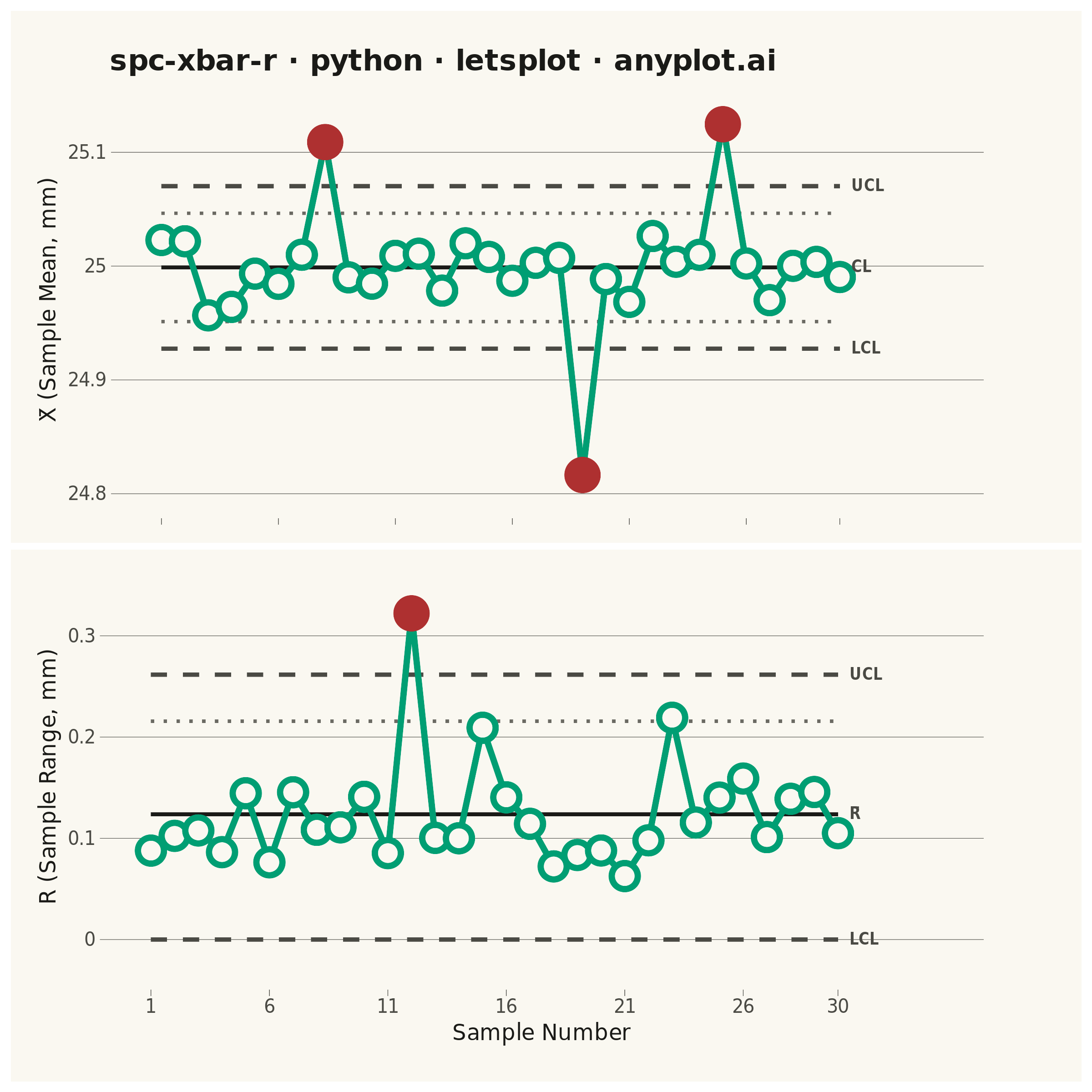
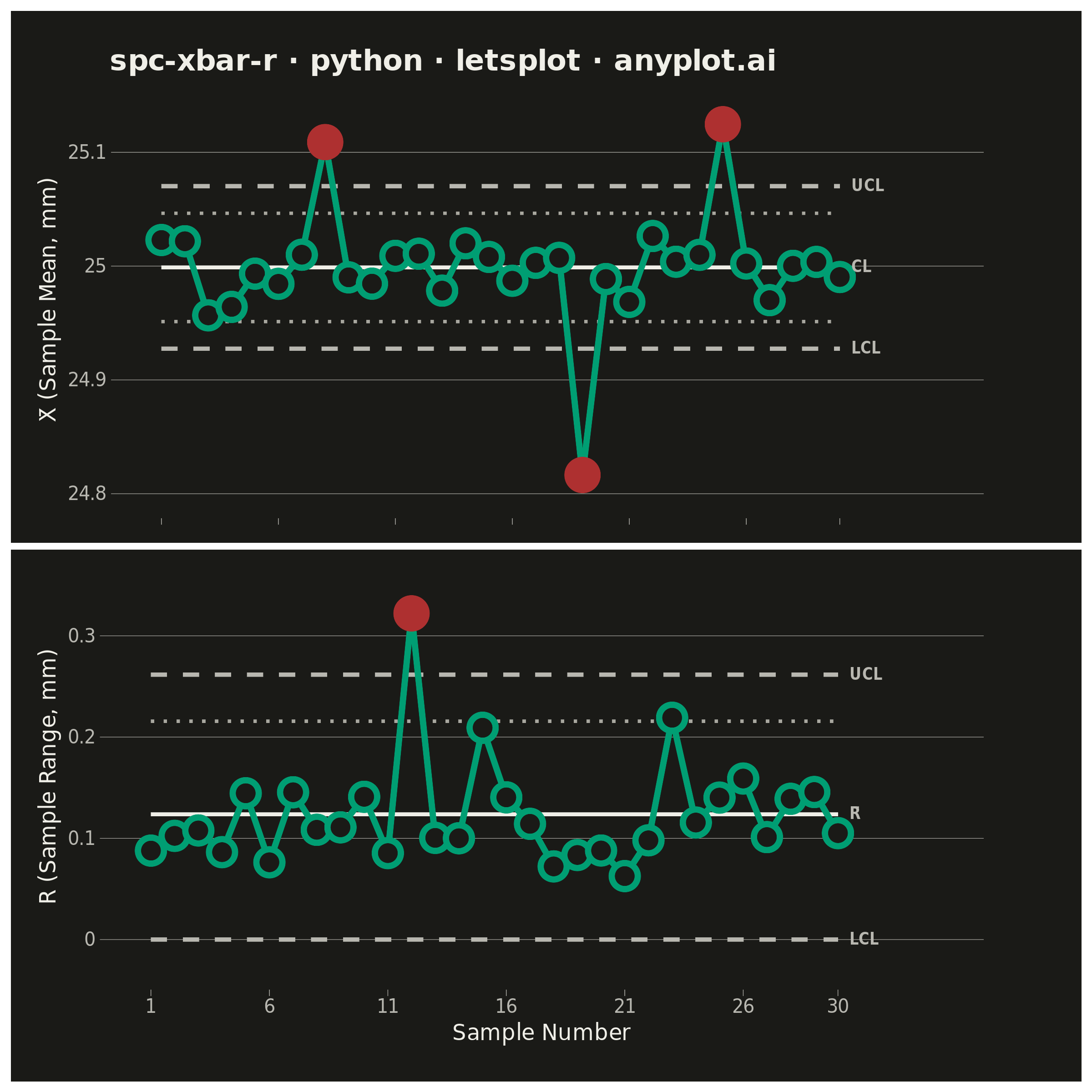
A Statistical Process Control (SPC) chart displaying sample means (X-bar) and ranges (R) plotted over time against control limits. The chart includes a center line representing the process mean, Upper Control Limit (UCL) and Lower Control Limit (LCL) at ±3 sigma, and optional warning limits at ±2 sigma. Out-of-control points are highlighted to signal process instability. This is a fundamental tool in manufacturing quality control and Six Sigma methodology for monitoring process stability.
""" anyplot.ai
spc-xbar-r: Statistical Process Control Chart (X-bar/R)
Library: letsplot 4.10.1 | Python 3.13.14
Quality: 91/100 | Updated: 2026-06-20
"""

import os

import numpy as np
import pandas as pd
from lets_plot import *


LetsPlot.setup_html()

# Theme tokens (Imprint palette — theme-adaptive chrome)
THEME = os.getenv("ANYPLOT_THEME", "light")
PAGE_BG = "#FAF8F1" if THEME == "light" else "#1A1A17"
ELEVATED_BG = "#FFFDF6" if THEME == "light" else "#242420"
INK = "#1A1A17" if THEME == "light" else "#F0EFE8"
INK_SOFT = "#4A4A44" if THEME == "light" else "#B8B7B0"
INK_MUTED = "#6B6A63" if THEME == "light" else "#A8A79F"

# Imprint palette — data colors (theme-independent)
DATA_COLOR = "#009E73"  # Imprint position 1 — always first series
OOC_COLOR = "#AE3030"  # Imprint position 5 — semantic red for out-of-control

# Data - CNC shaft diameter measurements (subgroups of n=5)
np.random.seed(42)
n_samples = 30
target_diameter = 25.0  # mm
process_std = 0.05  # mm

# Generate subgroup measurements
measurements = np.random.normal(target_diameter, process_std, (n_samples, 5))

# Inject mean shifts for X-bar out-of-control points
measurements[7] += 0.15  # sudden upward shift
measurements[18] -= 0.18  # sudden downward shift
measurements[24] += 0.12  # upward drift

# Inject extreme spread for R chart OOC at sample 12 (preserves mean, inflates range)
measurements[11, 0] -= 0.16
measurements[11, 4] += 0.16

sample_ids = np.arange(1, n_samples + 1)
sample_means = measurements.mean(axis=1)
sample_ranges = measurements.max(axis=1) - measurements.min(axis=1)

# Control chart constants for n=5 subgroups
A2 = 0.577
D3 = 0.0
D4 = 2.114

# X-bar chart limits
xbar_bar = sample_means.mean()
r_bar = sample_ranges.mean()
xbar_ucl = xbar_bar + A2 * r_bar
xbar_lcl = xbar_bar - A2 * r_bar
xbar_uwl = xbar_bar + (2 / 3) * A2 * r_bar
xbar_lwl = xbar_bar - (2 / 3) * A2 * r_bar

# R chart limits
r_ucl = D4 * r_bar
r_lcl = D3 * r_bar
r_uwl = r_bar + (2 / 3) * (r_ucl - r_bar)

# Classify in-control vs out-of-control
xbar_ooc = (sample_means > xbar_ucl) | (sample_means < xbar_lcl)
r_ooc = sample_ranges > r_ucl

# DataFrames
df_xbar = pd.DataFrame(
    {"sample": sample_ids, "mean": sample_means, "status": np.where(xbar_ooc, "Out of Control", "In Control")}
)

df_r = pd.DataFrame(
    {"sample": sample_ids, "range": sample_ranges, "status": np.where(r_ooc, "Out of Control", "In Control")}
)

# Limit line dataframes (each line = 2 rows: start and end sample)
xbar_limits = pd.DataFrame(
    {
        "sample": np.tile([1, n_samples], 5),
        "y": ([xbar_ucl] * 2 + [xbar_lcl] * 2 + [xbar_bar] * 2 + [xbar_uwl] * 2 + [xbar_lwl] * 2),
        "line": ["UCL"] * 2 + ["LCL"] * 2 + ["CL"] * 2 + ["UWL"] * 2 + ["LWL"] * 2,
    }
)

r_limits = pd.DataFrame(
    {
        "sample": np.tile([1, n_samples], 4),
        "y": [r_ucl] * 2 + [r_lcl] * 2 + [r_bar] * 2 + [r_uwl] * 2,
        "line": ["UCL"] * 2 + ["LCL"] * 2 + ["CL"] * 2 + ["UWL"] * 2,
    }
)

# Label annotations placed just past last data point (within x-axis range)
xbar_labels = pd.DataFrame(
    {"sample": [n_samples + 0.5] * 3, "y": [xbar_ucl, xbar_bar, xbar_lcl], "label": ["UCL", "CL", "LCL"]}
)

r_labels = pd.DataFrame({"sample": [n_samples + 0.5] * 3, "y": [r_ucl, r_bar, r_lcl], "label": ["UCL", "R̄", "LCL"]})

# Theme for top panel (X-bar chart — title here, no x-axis labels)
theme_top = theme(
    plot_title=element_text(size=16, color=INK, face="bold"),
    axis_title_y=element_text(size=12, color=INK),
    axis_text_y=element_text(size=10, color=INK_SOFT),
    axis_text_x=element_blank(),
    axis_title_x=element_blank(),
    panel_grid_major_x=element_blank(),
    panel_grid_minor=element_blank(),
    panel_grid_major_y=element_line(color=INK_SOFT, size=0.25),
    panel_background=element_rect(fill=PAGE_BG, color=PAGE_BG),
    plot_background=element_rect(fill=PAGE_BG, color=PAGE_BG),
    axis_line_x=element_line(color=INK_SOFT, size=0.6),
    axis_line_y=element_line(color=INK_SOFT, size=0.6),
    axis_ticks=element_line(color=INK_SOFT, size=0.3),
    legend_position="none",
    plot_margin=[20, 50, 5, 15],
)

# Theme for bottom panel (R chart — x-axis labels here)
theme_bottom = theme(
    axis_title=element_text(size=12, color=INK),
    axis_text=element_text(size=10, color=INK_SOFT),
    panel_grid_major_x=element_blank(),
    panel_grid_minor=element_blank(),
    panel_grid_major_y=element_line(color=INK_SOFT, size=0.25),
    panel_background=element_rect(fill=PAGE_BG, color=PAGE_BG),
    plot_background=element_rect(fill=PAGE_BG, color=PAGE_BG),
    axis_line_x=element_line(color=INK_SOFT, size=0.6),
    axis_line_y=element_line(color=INK_SOFT, size=0.6),
    axis_ticks=element_line(color=INK_SOFT, size=0.3),
    legend_position="none",
    plot_margin=[5, 50, 20, 15],
)

# X-bar chart
xbar_plot = (
    ggplot()
    + geom_line(
        data=xbar_limits[xbar_limits["line"].isin(["UWL", "LWL"])],
        mapping=aes(x="sample", y="y", group="line"),
        linetype="dotted",
        color=INK_MUTED,
        size=0.8,
    )
    + geom_line(
        data=xbar_limits[xbar_limits["line"].isin(["UCL", "LCL"])],
        mapping=aes(x="sample", y="y", group="line"),
        linetype="dashed",
        color=INK_SOFT,
        size=1.0,
    )
    + geom_line(
        data=xbar_limits[xbar_limits["line"] == "CL"],
        mapping=aes(x="sample", y="y"),
        linetype="solid",
        color=INK,
        size=0.9,
    )
    + geom_line(data=df_xbar, mapping=aes(x="sample", y="mean"), color=DATA_COLOR, size=1.5)
    + geom_point(
        data=df_xbar[df_xbar["status"] == "In Control"],
        mapping=aes(x="sample", y="mean"),
        color=DATA_COLOR,
        fill=PAGE_BG,
        size=5,
        shape=21,
        stroke=1.5,
    )
    + geom_point(
        data=df_xbar[df_xbar["status"] == "Out of Control"],
        mapping=aes(x="sample", y="mean"),
        color=OOC_COLOR,
        fill=OOC_COLOR,
        size=6,
        shape=21,
        stroke=1.5,
    )
    + geom_text(
        data=xbar_labels,
        mapping=aes(x="sample", y="y", label="label"),
        size=4,
        color=INK_SOFT,
        fontface="bold",
        hjust=0,
    )
    + scale_x_continuous(breaks=list(range(1, n_samples + 1, 5)) + [n_samples], limits=[0.5, n_samples + 4.5])
    + scale_y_continuous(expand=[0.12, 0])
    + labs(title="spc-xbar-r · python · letsplot · anyplot.ai", y="X̄ (Sample Mean, mm)", x="")
    + theme_top
    + ggsize(800, 260)
)

# R chart
r_plot = (
    ggplot()
    + geom_line(
        data=r_limits[r_limits["line"] == "UWL"],
        mapping=aes(x="sample", y="y"),
        linetype="dotted",
        color=INK_MUTED,
        size=0.8,
    )
    + geom_line(
        data=r_limits[r_limits["line"].isin(["UCL", "LCL"])],
        mapping=aes(x="sample", y="y", group="line"),
        linetype="dashed",
        color=INK_SOFT,
        size=1.0,
    )
    + geom_line(
        data=r_limits[r_limits["line"] == "CL"], mapping=aes(x="sample", y="y"), linetype="solid", color=INK, size=0.9
    )
    + geom_line(data=df_r, mapping=aes(x="sample", y="range"), color=DATA_COLOR, size=1.5)
    + geom_point(
        data=df_r[df_r["status"] == "In Control"],
        mapping=aes(x="sample", y="range"),
        color=DATA_COLOR,
        fill=PAGE_BG,
        size=5,
        shape=21,
        stroke=1.5,
    )
    + geom_point(
        data=df_r[df_r["status"] == "Out of Control"],
        mapping=aes(x="sample", y="range"),
        color=OOC_COLOR,
        fill=OOC_COLOR,
        size=6,
        shape=21,
        stroke=1.5,
    )
    + geom_text(
        data=r_labels, mapping=aes(x="sample", y="y", label="label"), size=4, color=INK_SOFT, fontface="bold", hjust=0
    )
    + scale_x_continuous(breaks=list(range(1, n_samples + 1, 5)) + [n_samples], limits=[0.5, n_samples + 4.5])
    + scale_y_continuous(expand=[0.15, 0])
    + labs(x="Sample Number", y="R (Sample Range, mm)")
    + theme_bottom
    + ggsize(800, 190)
)

# Add tooltip layers for HTML interactivity (lets-plot distinctive feature)
xbar_interactive = xbar_plot + geom_point(
    data=df_xbar,
    mapping=aes(x="sample", y="mean"),
    size=5,
    alpha=0.01,
    tooltips=layer_tooltips().line("Sample|@sample").line("X̄|@mean").line("Status|@status").format("mean", ".4f"),
)

r_interactive = r_plot + geom_point(
    data=df_r,
    mapping=aes(x="sample", y="range"),
    size=5,
    alpha=0.01,
    tooltips=layer_tooltips().line("Sample|@sample").line("Range|@range").line("Status|@status").format("range", ".4f"),
)

# Combine top (X-bar, 260) + bottom (R, 190) = 800×450 logical → 3200×1800 at scale=4
combined = gggrid([xbar_plot, r_plot], ncol=1)
combined_interactive = gggrid([xbar_interactive, r_interactive], ncol=1)

# Save
ggsave(combined, f"plot-{THEME}.png", scale=4, path=".")
ggsave(combined_interactive, f"plot-{THEME}.html", path=".")
Runnable source as JSON, for any HTTP client: https://api.anyplot.ai/specs/spc-xbar-r/letsplot/code. Any spec id and library id listed in llms-full.txt fit the same URL shape; every URL below is complete and callable.
{
  "spec_id": "spc-xbar-r",
  "language": "python",
  "library": "letsplot",
  "page": "https://anyplot.ai/spc-xbar-r/python/letsplot",
  "hub": "https://anyplot.ai/spc-xbar-r",
  "code_json": "https://api.anyplot.ai/specs/spc-xbar-r/letsplot/code",
  "spec_json": "https://api.anyplot.ai/specs/spc-xbar-r",
  "render_light_png": "https://storage.googleapis.com/anyplot-images/plots/spc-xbar-r/python/letsplot/plot-light.png",
  "render_dark_png": "https://storage.googleapis.com/anyplot-images/plots/spc-xbar-r/python/letsplot/plot-dark.png",
  "interactive_light_html": "https://storage.googleapis.com/anyplot-images/plots/spc-xbar-r/python/letsplot/plot-light.html",
  "interactive_dark_html": "https://storage.googleapis.com/anyplot-images/plots/spc-xbar-r/python/letsplot/plot-dark.html",
  "quality_score": 91.0,
  "license": "MIT",
  "guide": "https://anyplot.ai/llms.txt"
}
Part of Statistical Process Control Chart (X-bar/R) on anyplot.ai.