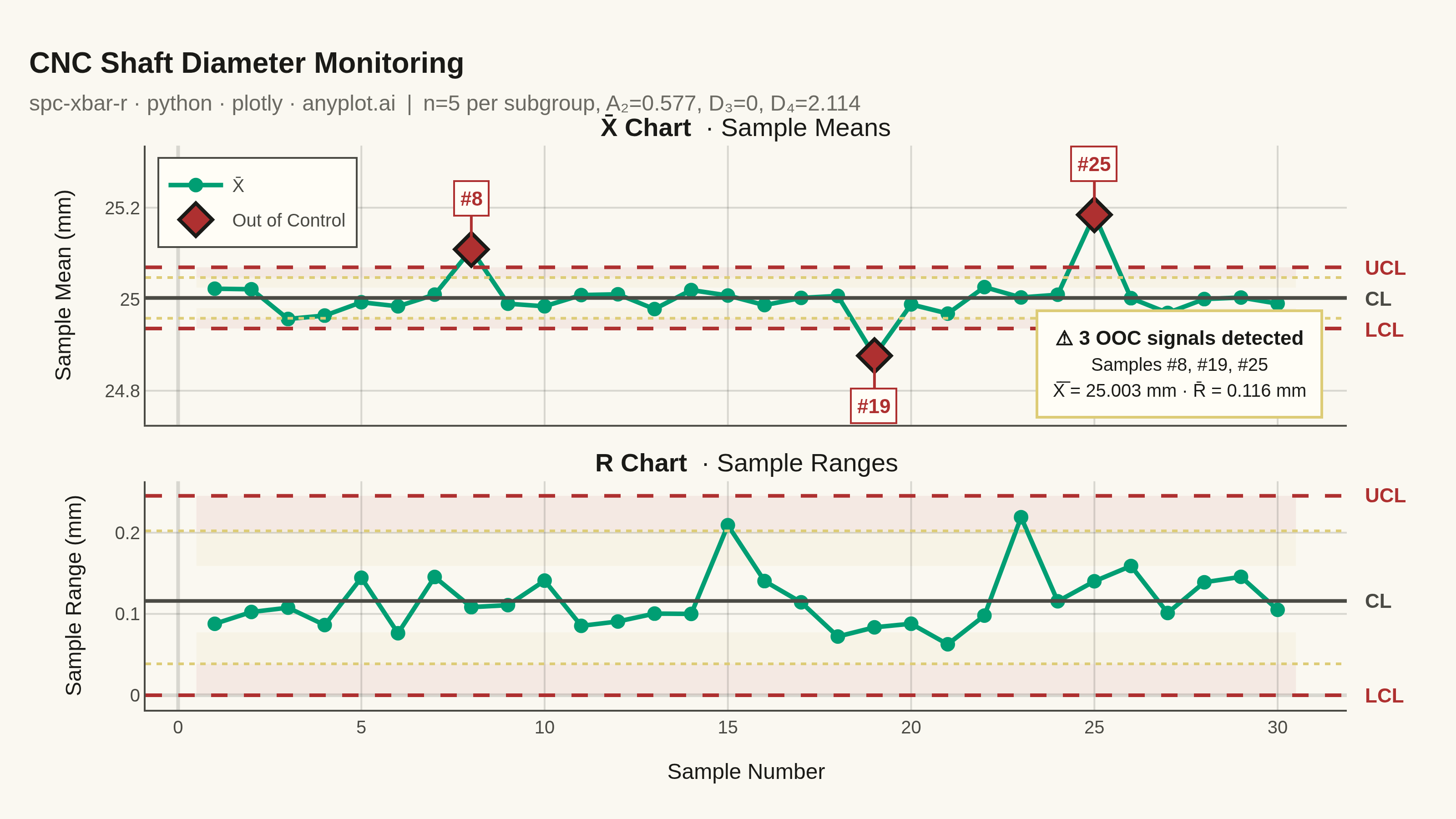
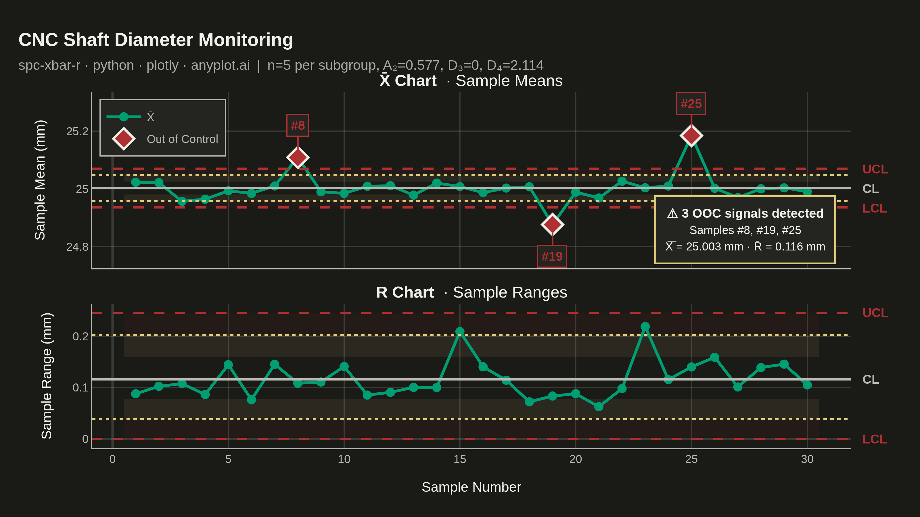
A Statistical Process Control (SPC) chart displaying sample means (X-bar) and ranges (R) plotted over time against control limits. The chart includes a center line representing the process mean, Upper Control Limit (UCL) and Lower Control Limit (LCL) at ±3 sigma, and optional warning limits at ±2 sigma. Out-of-control points are highlighted to signal process instability. This is a fundamental tool in manufacturing quality control and Six Sigma methodology for monitoring process stability.
""" anyplot.ai
spc-xbar-r: Statistical Process Control Chart (X-bar/R)
Library: plotly 6.8.0 | Python 3.13.14
Quality: 91/100 | Updated: 2026-06-20
"""

import os
import sys


# Prevent the local plotly.py from shadowing the installed plotly package
_this_dir = os.path.dirname(os.path.abspath(__file__))
sys.path = [p for p in sys.path if os.path.abspath(p) != _this_dir]

import numpy as np
import plotly.graph_objects as go
from plotly.subplots import make_subplots


# Theme setup — read before anything else
THEME = os.getenv("ANYPLOT_THEME", "light")

# Theme-adaptive chrome tokens (Imprint palette spec)
PAGE_BG = "#FAF8F1" if THEME == "light" else "#1A1A17"
ELEVATED_BG = "#FFFDF6" if THEME == "light" else "#242420"
INK = "#1A1A17" if THEME == "light" else "#F0EFE8"
INK_SOFT = "#4A4A44" if THEME == "light" else "#B8B7B0"
INK_MUTED = "#6B6A63" if THEME == "light" else "#A8A79F"
GRID = "rgba(26,26,23,0.15)" if THEME == "light" else "rgba(240,239,232,0.15)"

# Imprint palette — data colors
BRAND_GREEN = "#009E73"  # first categorical series — always
LIMIT_RED = "#AE3030"  # matte red — UCL/LCL alarm lines
WARN_AMBER = "#DDCC77"  # amber — warning limit lines (caution anchor)
OOC_COLOR = "#AE3030"  # matte red — out-of-control markers

# Zone fills (semi-transparent): alert near control limits, caution near warning limits
ZONE_ALERT = "rgba(174,48,48,0.07)"
ZONE_WARN = "rgba(221,204,119,0.09)"

# Data
np.random.seed(42)
n_samples = 30
subgroup_size = 5

# Control chart constants for subgroup size n=5
A2 = 0.577
D3 = 0.0
D4 = 2.114

# Realistic shaft diameter measurements (mm) from a CNC machining process
process_mean = 25.0
process_std = 0.05
measurements = np.random.normal(process_mean, process_std, (n_samples, subgroup_size))

# Inject out-of-control signals
measurements[7] += 0.15
measurements[18] -= 0.12
measurements[24] += 0.18

# Calculate X-bar and R for each subgroup
sample_means = measurements.mean(axis=1)
sample_ranges = measurements.max(axis=1) - measurements.min(axis=1)

# X-bar chart control limits
x_bar_bar = sample_means.mean()
r_bar = sample_ranges.mean()
ucl_xbar = x_bar_bar + A2 * r_bar
lcl_xbar = x_bar_bar - A2 * r_bar
upper_warn_xbar = x_bar_bar + (2 / 3) * A2 * r_bar
lower_warn_xbar = x_bar_bar - (2 / 3) * A2 * r_bar

# R chart control limits
ucl_r = D4 * r_bar
lcl_r = D3 * r_bar
upper_warn_r = r_bar + (2 / 3) * (ucl_r - r_bar)
lower_warn_r = max(0, r_bar - (2 / 3) * (r_bar - lcl_r))

sample_ids = np.arange(1, n_samples + 1)

# Identify out-of-control points
ooc_xbar = (sample_means > ucl_xbar) | (sample_means < lcl_xbar)
ooc_r = (sample_ranges > ucl_r) | (sample_ranges < lcl_r)
n_ooc = int(ooc_xbar.sum() + ooc_r.sum())
ooc_samples = ", ".join(f"#{s}" for s in sample_ids[ooc_xbar])

X_BAR = "X̄"  # X̄

# Figure with dual subplots (X-bar top, R bottom, shared x-axis)
fig = make_subplots(
    rows=2,
    cols=1,
    shared_xaxes=True,
    vertical_spacing=0.10,
    subplot_titles=[f"<b>{X_BAR} Chart</b>  · Sample Means", "<b>R Chart</b>  · Sample Ranges"],
    row_heights=[0.55, 0.45],
)

# Zone shading — X-bar chart
for y0, y1, color in [
    (upper_warn_xbar, ucl_xbar, ZONE_ALERT),
    (lcl_xbar, lower_warn_xbar, ZONE_ALERT),
    (x_bar_bar + (upper_warn_xbar - x_bar_bar) / 2, upper_warn_xbar, ZONE_WARN),
    (lower_warn_xbar, x_bar_bar - (x_bar_bar - lower_warn_xbar) / 2, ZONE_WARN),
]:
    fig.add_shape(
        type="rect",
        x0=0.5,
        x1=n_samples + 0.5,
        y0=min(y0, y1),
        y1=max(y0, y1),
        fillcolor=color,
        line={"width": 0},
        layer="below",
        xref="x",
        yref="y",
    )

# Zone shading — R chart
for y0, y1, color in [
    (upper_warn_r, ucl_r, ZONE_ALERT),
    (lcl_r, lower_warn_r, ZONE_ALERT),
    (r_bar + (upper_warn_r - r_bar) / 2, upper_warn_r, ZONE_WARN),
    (lower_warn_r, r_bar - (r_bar - lower_warn_r) / 2, ZONE_WARN),
]:
    fig.add_shape(
        type="rect",
        x0=0.5,
        x1=n_samples + 0.5,
        y0=min(y0, y1),
        y1=max(y0, y1),
        fillcolor=color,
        line={"width": 0},
        layer="below",
        xref="x2",
        yref="y2",
    )

# --- X-bar Chart traces ---
fig.add_trace(
    go.Scatter(
        x=sample_ids,
        y=sample_means,
        mode="lines+markers",
        marker={"size": 8, "color": BRAND_GREEN},
        line={"width": 2.5, "color": BRAND_GREEN},
        name=X_BAR,
        hovertemplate="Sample %{x}<br>Mean: %{y:.4f} mm<extra></extra>",
    ),
    row=1,
    col=1,
)

fig.add_trace(
    go.Scatter(
        x=sample_ids[ooc_xbar],
        y=sample_means[ooc_xbar],
        mode="markers",
        marker={"size": 14, "color": OOC_COLOR, "symbol": "diamond", "line": {"width": 2, "color": INK}},
        name="Out of Control",
        hovertemplate="Sample %{x} (OOC)<br>Mean: %{y:.4f} mm<extra></extra>",
    ),
    row=1,
    col=1,
)

# OOC annotations — X-bar
for idx in np.where(ooc_xbar)[0]:
    above = sample_means[idx] > x_bar_bar
    fig.add_annotation(
        x=sample_ids[idx],
        y=sample_means[idx],
        text=f"<b>#{sample_ids[idx]}</b>",
        font={"size": 11, "color": OOC_COLOR},
        showarrow=True,
        arrowhead=0,
        arrowwidth=1.5,
        arrowcolor=OOC_COLOR,
        ay=-28 if above else 28,
        ax=0,
        xref="x",
        yref="y",
        bgcolor=ELEVATED_BG,
        bordercolor=OOC_COLOR,
        borderwidth=1,
        borderpad=3,
    )

# X-bar control limit lines
fig.add_hline(y=x_bar_bar, line={"color": INK_SOFT, "width": 2}, row=1, col=1)
fig.add_hline(y=ucl_xbar, line={"color": LIMIT_RED, "width": 2, "dash": "dash"}, row=1, col=1)
fig.add_hline(y=lcl_xbar, line={"color": LIMIT_RED, "width": 2, "dash": "dash"}, row=1, col=1)
fig.add_hline(y=upper_warn_xbar, line={"color": WARN_AMBER, "width": 1.5, "dash": "dot"}, row=1, col=1)
fig.add_hline(y=lower_warn_xbar, line={"color": WARN_AMBER, "width": 1.5, "dash": "dot"}, row=1, col=1)

# X-bar limit labels (right side)
for y_val, label, color in [(ucl_xbar, "UCL", LIMIT_RED), (lcl_xbar, "LCL", LIMIT_RED), (x_bar_bar, "CL", INK_SOFT)]:
    fig.add_annotation(
        x=1.0,
        y=y_val,
        text=f"<b>{label}</b>",
        font={"size": 11, "color": color},
        showarrow=False,
        xref="x domain",
        yref="y",
        xanchor="left",
        xshift=8,
    )

# --- R Chart traces ---
fig.add_trace(
    go.Scatter(
        x=sample_ids,
        y=sample_ranges,
        mode="lines+markers",
        marker={"size": 8, "color": BRAND_GREEN},
        line={"width": 2.5, "color": BRAND_GREEN},
        name="Range",
        showlegend=False,
        hovertemplate="Sample %{x}<br>Range: %{y:.4f} mm<extra></extra>",
    ),
    row=2,
    col=1,
)

if ooc_r.any():
    fig.add_trace(
        go.Scatter(
            x=sample_ids[ooc_r],
            y=sample_ranges[ooc_r],
            mode="markers",
            marker={"size": 14, "color": OOC_COLOR, "symbol": "diamond", "line": {"width": 2, "color": INK}},
            name="Out of Control (R)",
            showlegend=False,
        ),
        row=2,
        col=1,
    )
    for idx in np.where(ooc_r)[0]:
        above = sample_ranges[idx] > r_bar
        fig.add_annotation(
            x=sample_ids[idx],
            y=sample_ranges[idx],
            text=f"<b>#{sample_ids[idx]}</b>",
            font={"size": 11, "color": OOC_COLOR},
            showarrow=True,
            arrowhead=0,
            arrowwidth=1.5,
            arrowcolor=OOC_COLOR,
            ay=-28 if above else 28,
            ax=0,
            xref="x2",
            yref="y2",
            bgcolor=ELEVATED_BG,
            bordercolor=OOC_COLOR,
            borderwidth=1,
            borderpad=3,
        )

# R chart control limit lines
fig.add_hline(y=r_bar, line={"color": INK_SOFT, "width": 2}, row=2, col=1)
fig.add_hline(y=ucl_r, line={"color": LIMIT_RED, "width": 2, "dash": "dash"}, row=2, col=1)
fig.add_hline(y=lcl_r, line={"color": LIMIT_RED, "width": 2, "dash": "dash"}, row=2, col=1)
fig.add_hline(y=upper_warn_r, line={"color": WARN_AMBER, "width": 1.5, "dash": "dot"}, row=2, col=1)
fig.add_hline(y=lower_warn_r, line={"color": WARN_AMBER, "width": 1.5, "dash": "dot"}, row=2, col=1)

# R chart limit labels
for y_val, label, color in [(ucl_r, "UCL", LIMIT_RED), (lcl_r, "LCL", LIMIT_RED), (r_bar, "CL", INK_SOFT)]:
    fig.add_annotation(
        x=1.0,
        y=y_val,
        text=f"<b>{label}</b>",
        font={"size": 11, "color": color},
        showarrow=False,
        xref="x2 domain",
        yref="y2",
        xanchor="left",
        xshift=8,
    )

# Process summary callout
fig.add_annotation(
    text=(
        f"<b>⚠ {n_ooc} OOC signal{'s' if n_ooc != 1 else ''} detected</b><br>"
        f"<span style='font-size:10px'>Samples {ooc_samples}<br>"
        f"{X_BAR}̅ = {x_bar_bar:.3f} mm · R̄ = {r_bar:.3f} mm</span>"
    ),
    xref="x domain",
    yref="y domain",
    x=0.98,
    y=0.02,
    xanchor="right",
    yanchor="bottom",
    font={"size": 11, "color": INK},
    bgcolor=ELEVATED_BG,
    bordercolor=WARN_AMBER,
    borderwidth=1.5,
    borderpad=8,
    showarrow=False,
)

# Layout
title_text = (
    "<b>CNC Shaft Diameter Monitoring</b>"
    f"<br><span style='font-size:12px;color:{INK_MUTED}'>"
    f"spc-xbar-r · python · plotly · anyplot.ai"
    f" | n=5 per subgroup, A₂=0.577, D₃=0, D₄=2.114</span>"
)

fig.update_layout(
    autosize=False,
    title={"text": title_text, "font": {"size": 16, "color": INK}, "x": 0.02, "xanchor": "left"},
    paper_bgcolor=PAGE_BG,
    plot_bgcolor=PAGE_BG,
    font={"color": INK},
    showlegend=True,
    legend={
        "font": {"size": 10, "color": INK_SOFT},
        "x": 0.01,
        "y": 0.98,
        "bgcolor": ELEVATED_BG,
        "bordercolor": INK_SOFT,
        "borderwidth": 1,
    },
    margin={"l": 80, "r": 60, "t": 80, "b": 60},
)

# Subplot title font — match INK color for theme adaptation
for ann in fig.layout.annotations:
    if "Chart" in (ann.text or ""):
        ann.font = {"size": 14, "color": INK}

# Spike lines for cross-chart sample comparison
fig.update_xaxes(
    tickfont={"size": 10, "color": INK_SOFT},
    gridcolor=GRID,
    linecolor=INK_SOFT,
    zerolinecolor=GRID,
    spikemode="across",
    spikethickness=1,
    spikecolor=INK_MUTED,
    spikedash="dot",
    row=1,
    col=1,
)
fig.update_xaxes(
    title={"text": "Sample Number", "font": {"size": 12, "color": INK}},
    tickfont={"size": 10, "color": INK_SOFT},
    gridcolor=GRID,
    linecolor=INK_SOFT,
    zerolinecolor=GRID,
    spikemode="across",
    spikethickness=1,
    spikecolor=INK_MUTED,
    spikedash="dot",
    row=2,
    col=1,
)
fig.update_yaxes(
    title={"text": "Sample Mean (mm)", "font": {"size": 12, "color": INK}},
    tickfont={"size": 10, "color": INK_SOFT},
    gridcolor=GRID,
    linecolor=INK_SOFT,
    zerolinecolor=GRID,
    row=1,
    col=1,
)
fig.update_yaxes(
    title={"text": "Sample Range (mm)", "font": {"size": 12, "color": INK}},
    tickfont={"size": 10, "color": INK_SOFT},
    gridcolor=GRID,
    linecolor=INK_SOFT,
    zerolinecolor=GRID,
    row=2,
    col=1,
)

# Save — canvas: 3200×1800 (landscape, 16:9)
fig.write_image(f"plot-{THEME}.png", width=800, height=450, scale=4)
fig.write_html(f"plot-{THEME}.html", include_plotlyjs="cdn", config={"displayModeBar": True, "scrollZoom": True})
Runnable source as JSON, for any HTTP client: https://api.anyplot.ai/specs/spc-xbar-r/plotly/code. Any spec id and library id listed in llms-full.txt fit the same URL shape; every URL below is complete and callable.
{
  "spec_id": "spc-xbar-r",
  "language": "python",
  "library": "plotly",
  "page": "https://anyplot.ai/spc-xbar-r/python/plotly",
  "hub": "https://anyplot.ai/spc-xbar-r",
  "code_json": "https://api.anyplot.ai/specs/spc-xbar-r/plotly/code",
  "spec_json": "https://api.anyplot.ai/specs/spc-xbar-r",
  "render_light_png": "https://storage.googleapis.com/anyplot-images/plots/spc-xbar-r/python/plotly/plot-light.png",
  "render_dark_png": "https://storage.googleapis.com/anyplot-images/plots/spc-xbar-r/python/plotly/plot-dark.png",
  "interactive_light_html": "https://storage.googleapis.com/anyplot-images/plots/spc-xbar-r/python/plotly/plot-light.html",
  "interactive_dark_html": "https://storage.googleapis.com/anyplot-images/plots/spc-xbar-r/python/plotly/plot-dark.html",
  "quality_score": 91.0,
  "license": "MIT",
  "guide": "https://anyplot.ai/llms.txt"
}
Part of Statistical Process Control Chart (X-bar/R) on anyplot.ai.