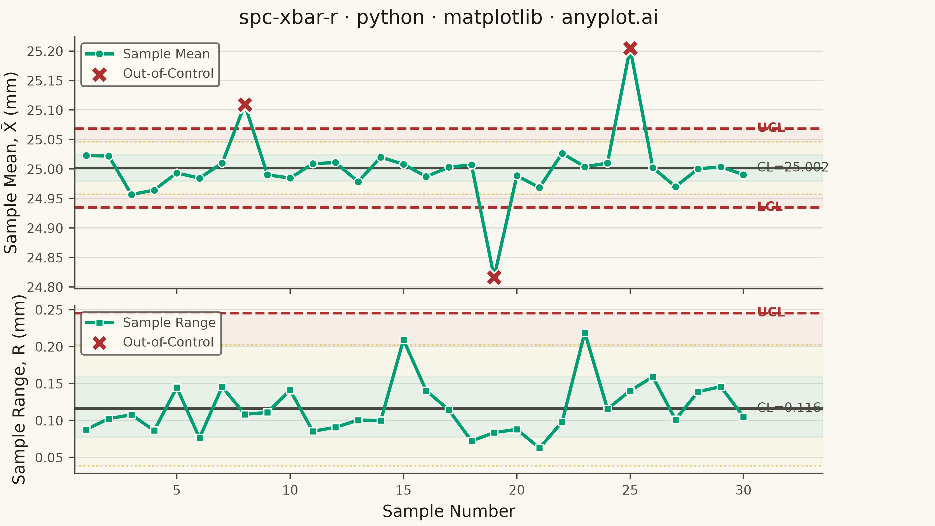
A Statistical Process Control (SPC) chart displaying sample means (X-bar) and ranges (R) plotted over time against control limits. The chart includes a center line representing the process mean, Upper Control Limit (UCL) and Lower Control Limit (LCL) at ±3 sigma, and optional warning limits at ±2 sigma. Out-of-control points are highlighted to signal process instability. This is a fundamental tool in manufacturing quality control and Six Sigma methodology for monitoring process stability.
""" anyplot.ai
spc-xbar-r: Statistical Process Control Chart (X-bar/R)
Library: matplotlib 3.11.0 | Python 3.13.14
Quality: 93/100 | Updated: 2026-06-20
"""

import os

import matplotlib.pyplot as plt
import matplotlib.ticker as ticker
import numpy as np


# Theme tokens (Imprint palette — theme-adaptive chrome)
THEME = os.getenv("ANYPLOT_THEME", "light")
PAGE_BG = "#FAF8F1" if THEME == "light" else "#1A1A17"
ELEVATED_BG = "#FFFDF6" if THEME == "light" else "#242420"
INK = "#1A1A17" if THEME == "light" else "#F0EFE8"
INK_SOFT = "#4A4A44" if THEME == "light" else "#B8B7B0"
INK_MUTED = "#6B6A63" if THEME == "light" else "#A8A79F"

# Imprint palette — semantic roles for SPC chart elements
BRAND = "#009E73"  # position 1: main data line (first series)
OOC_COLOR = "#AE3030"  # matte red: out-of-control points (semantic bad/error)
AMBER = "#DDCC77"  # semantic amber: warning limits

# Data — CNC shaft diameter measurements (subgroups of n=5)
np.random.seed(42)
n_samples = 30
subgroup_size = 5
target_diameter = 25.0
process_std = 0.05

# Control chart constants for n=5
A2 = 0.577
D3 = 0.0
D4 = 2.114

# Generate subgroup measurements (mostly in-control with injected shifts)
measurements = np.random.normal(target_diameter, process_std, (n_samples, subgroup_size))
measurements[7] += 0.15
measurements[18] -= 0.18
measurements[24] += 0.20

sample_ids = np.arange(1, n_samples + 1)
sample_means = measurements.mean(axis=1)
sample_ranges = measurements.max(axis=1) - measurements.min(axis=1)

# X-bar chart limits
xbar_bar = sample_means.mean()
r_bar = sample_ranges.mean()
xbar_ucl = xbar_bar + A2 * r_bar
xbar_lcl = xbar_bar - A2 * r_bar
xbar_upper_warn = xbar_bar + (2 / 3) * A2 * r_bar
xbar_lower_warn = xbar_bar - (2 / 3) * A2 * r_bar
xbar_1sigma_upper = xbar_bar + (1 / 3) * A2 * r_bar
xbar_1sigma_lower = xbar_bar - (1 / 3) * A2 * r_bar

# R chart limits
r_ucl = D4 * r_bar
r_lcl = D3 * r_bar
r_upper_warn = r_bar + (2 / 3) * (r_ucl - r_bar)
r_lower_warn = r_bar - (2 / 3) * (r_bar - r_lcl)
r_1sigma_upper = r_bar + (1 / 3) * (r_ucl - r_bar)
r_1sigma_lower = r_bar - (1 / 3) * (r_bar - r_lcl)

# Identify out-of-control points
xbar_ooc = (sample_means > xbar_ucl) | (sample_means < xbar_lcl)
r_ooc = (sample_ranges > r_ucl) | (sample_ranges < r_lcl)

# Plot — landscape 3200×1800 px (figsize × dpi, no bbox_inches='tight')
fig, (ax1, ax2) = plt.subplots(
    2, 1, figsize=(8, 4.5), dpi=400, sharex=True, facecolor=PAGE_BG, gridspec_kw={"height_ratios": [3, 2]}
)

# X-bar chart — zone shading (inlined, no helper function)
ax1.axhspan(xbar_1sigma_lower, xbar_1sigma_upper, color=BRAND, alpha=0.07, zorder=0)
ax1.axhspan(xbar_1sigma_upper, xbar_upper_warn, color=AMBER, alpha=0.06, zorder=0)
ax1.axhspan(xbar_lower_warn, xbar_1sigma_lower, color=AMBER, alpha=0.06, zorder=0)
ax1.axhspan(xbar_upper_warn, xbar_ucl, color=OOC_COLOR, alpha=0.05, zorder=0)
ax1.axhspan(xbar_lcl, xbar_lower_warn, color=OOC_COLOR, alpha=0.05, zorder=0)

ax1.plot(
    sample_ids,
    sample_means,
    color=BRAND,
    linewidth=2.0,
    marker="o",
    markersize=5,
    markerfacecolor=BRAND,
    markeredgecolor=PAGE_BG,
    markeredgewidth=0.8,
    zorder=3,
    label="Sample Mean",
)
ax1.scatter(
    sample_ids[xbar_ooc],
    sample_means[xbar_ooc],
    color=OOC_COLOR,
    marker="X",
    s=110,
    zorder=4,
    edgecolors=PAGE_BG,
    linewidth=1.0,
    label="Out-of-Control",
)

ax1.axhline(xbar_bar, color=INK_SOFT, linewidth=1.5, linestyle="-", zorder=2)
ax1.axhline(xbar_ucl, color=OOC_COLOR, linewidth=1.5, linestyle="--", zorder=2)
ax1.axhline(xbar_lcl, color=OOC_COLOR, linewidth=1.5, linestyle="--", zorder=2)
ax1.axhline(xbar_upper_warn, color=AMBER, linewidth=1.0, linestyle=":", alpha=0.9, zorder=2)
ax1.axhline(xbar_lower_warn, color=AMBER, linewidth=1.0, linestyle=":", alpha=0.9, zorder=2)

ax1.text(n_samples + 0.6, xbar_ucl, "UCL", fontsize=8, color=OOC_COLOR, va="center", fontweight="bold")
ax1.text(n_samples + 0.6, xbar_lcl, "LCL", fontsize=8, color=OOC_COLOR, va="center", fontweight="bold")
ax1.text(n_samples + 0.6, xbar_bar, f"CL={xbar_bar:.3f}", fontsize=8, color=INK_SOFT, va="center")

ax1.set_xlim(0.5, n_samples + 3.5)
ax1.set_ylabel("Sample Mean, X̄ (mm)", fontsize=10, color=INK)
ax1.set_title("spc-xbar-r · python · matplotlib · anyplot.ai", fontsize=12, fontweight="medium", color=INK, pad=8)
ax1.set_facecolor(PAGE_BG)
ax1.tick_params(axis="both", labelsize=8, colors=INK_SOFT, labelcolor=INK_SOFT)
ax1.spines["top"].set_visible(False)
ax1.spines["right"].set_visible(False)
for s in ("left", "bottom"):
    ax1.spines[s].set_color(INK_SOFT)
ax1.yaxis.grid(True, alpha=0.12, linewidth=0.7, color=INK)
ax1.yaxis.set_major_formatter(ticker.FormatStrFormatter("%.2f"))

leg1 = ax1.legend(fontsize=8, loc="upper left", facecolor=ELEVATED_BG, edgecolor=INK_SOFT)
if leg1:
    plt.setp(leg1.get_texts(), color=INK_SOFT)

# R chart — zone shading (inlined)
ax2.axhspan(max(r_1sigma_lower, 0), r_1sigma_upper, color=BRAND, alpha=0.07, zorder=0)
ax2.axhspan(r_1sigma_upper, r_upper_warn, color=AMBER, alpha=0.06, zorder=0)
ax2.axhspan(max(r_lower_warn, 0), max(r_1sigma_lower, 0), color=AMBER, alpha=0.06, zorder=0)
ax2.axhspan(r_upper_warn, r_ucl, color=OOC_COLOR, alpha=0.05, zorder=0)
if r_lcl > 0:
    ax2.axhspan(r_lcl, max(r_lower_warn, 0), color=OOC_COLOR, alpha=0.05, zorder=0)

ax2.plot(
    sample_ids,
    sample_ranges,
    color=BRAND,
    linewidth=2.0,
    marker="s",
    markersize=4.5,
    markerfacecolor=BRAND,
    markeredgecolor=PAGE_BG,
    markeredgewidth=0.8,
    zorder=3,
    label="Sample Range",
)
ax2.scatter(
    sample_ids[r_ooc],
    sample_ranges[r_ooc],
    color=OOC_COLOR,
    marker="X",
    s=100,
    zorder=4,
    edgecolors=PAGE_BG,
    linewidth=1.0,
    label="Out-of-Control",
)

ax2.axhline(r_bar, color=INK_SOFT, linewidth=1.5, linestyle="-", zorder=2)
ax2.axhline(r_ucl, color=OOC_COLOR, linewidth=1.5, linestyle="--", zorder=2)
if r_lcl > 0:
    ax2.axhline(r_lcl, color=OOC_COLOR, linewidth=1.5, linestyle="--", zorder=2)
ax2.axhline(r_upper_warn, color=AMBER, linewidth=1.0, linestyle=":", alpha=0.9, zorder=2)
if r_lower_warn > 0:
    ax2.axhline(r_lower_warn, color=AMBER, linewidth=1.0, linestyle=":", alpha=0.9, zorder=2)

ax2.text(n_samples + 0.6, r_ucl, "UCL", fontsize=8, color=OOC_COLOR, va="center", fontweight="bold")
ax2.text(n_samples + 0.6, r_bar, f"CL={r_bar:.3f}", fontsize=8, color=INK_SOFT, va="center")

ax2.set_xlabel("Sample Number", fontsize=10, color=INK)
ax2.set_ylabel("Sample Range, R (mm)", fontsize=10, color=INK)
ax2.set_facecolor(PAGE_BG)
ax2.tick_params(axis="both", labelsize=8, colors=INK_SOFT, labelcolor=INK_SOFT)
ax2.spines["top"].set_visible(False)
ax2.spines["right"].set_visible(False)
for s in ("left", "bottom"):
    ax2.spines[s].set_color(INK_SOFT)
ax2.yaxis.grid(True, alpha=0.12, linewidth=0.7, color=INK)
ax2.yaxis.set_major_formatter(ticker.FormatStrFormatter("%.2f"))

leg2 = ax2.legend(fontsize=8, loc="upper left", facecolor=ELEVATED_BG, edgecolor=INK_SOFT)
if leg2:
    plt.setp(leg2.get_texts(), color=INK_SOFT)

fig.subplots_adjust(left=0.08, right=0.88, top=0.93, bottom=0.10, hspace=0.08)
plt.savefig(f"plot-{THEME}.png", dpi=400, facecolor=PAGE_BG)
Runnable source as JSON, for any HTTP client: https://api.anyplot.ai/specs/spc-xbar-r/matplotlib/code. Any spec id and library id listed in llms-full.txt fit the same URL shape; every URL below is complete and callable.
{
  "spec_id": "spc-xbar-r",
  "language": "python",
  "library": "matplotlib",
  "page": "https://anyplot.ai/spc-xbar-r/python/matplotlib",
  "hub": "https://anyplot.ai/spc-xbar-r",
  "code_json": "https://api.anyplot.ai/specs/spc-xbar-r/matplotlib/code",
  "spec_json": "https://api.anyplot.ai/specs/spc-xbar-r",
  "render_light_png": "https://storage.googleapis.com/anyplot-images/plots/spc-xbar-r/python/matplotlib/plot-light.png",
  "render_dark_png": "https://storage.googleapis.com/anyplot-images/plots/spc-xbar-r/python/matplotlib/plot-dark.png",
  "quality_score": 93.0,
  "license": "MIT",
  "guide": "https://anyplot.ai/llms.txt"
}
Part of Statistical Process Control Chart (X-bar/R) on anyplot.ai.