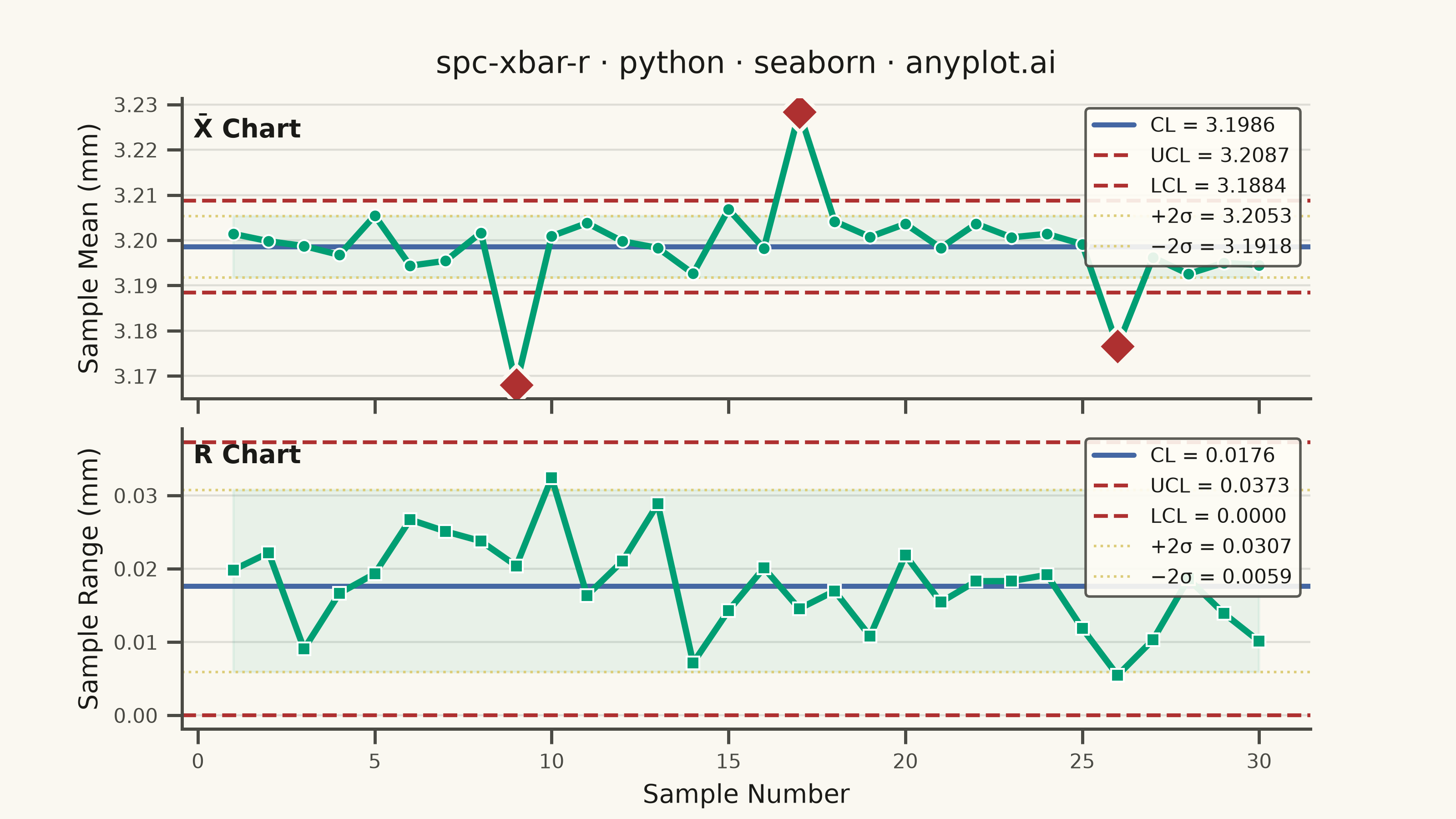
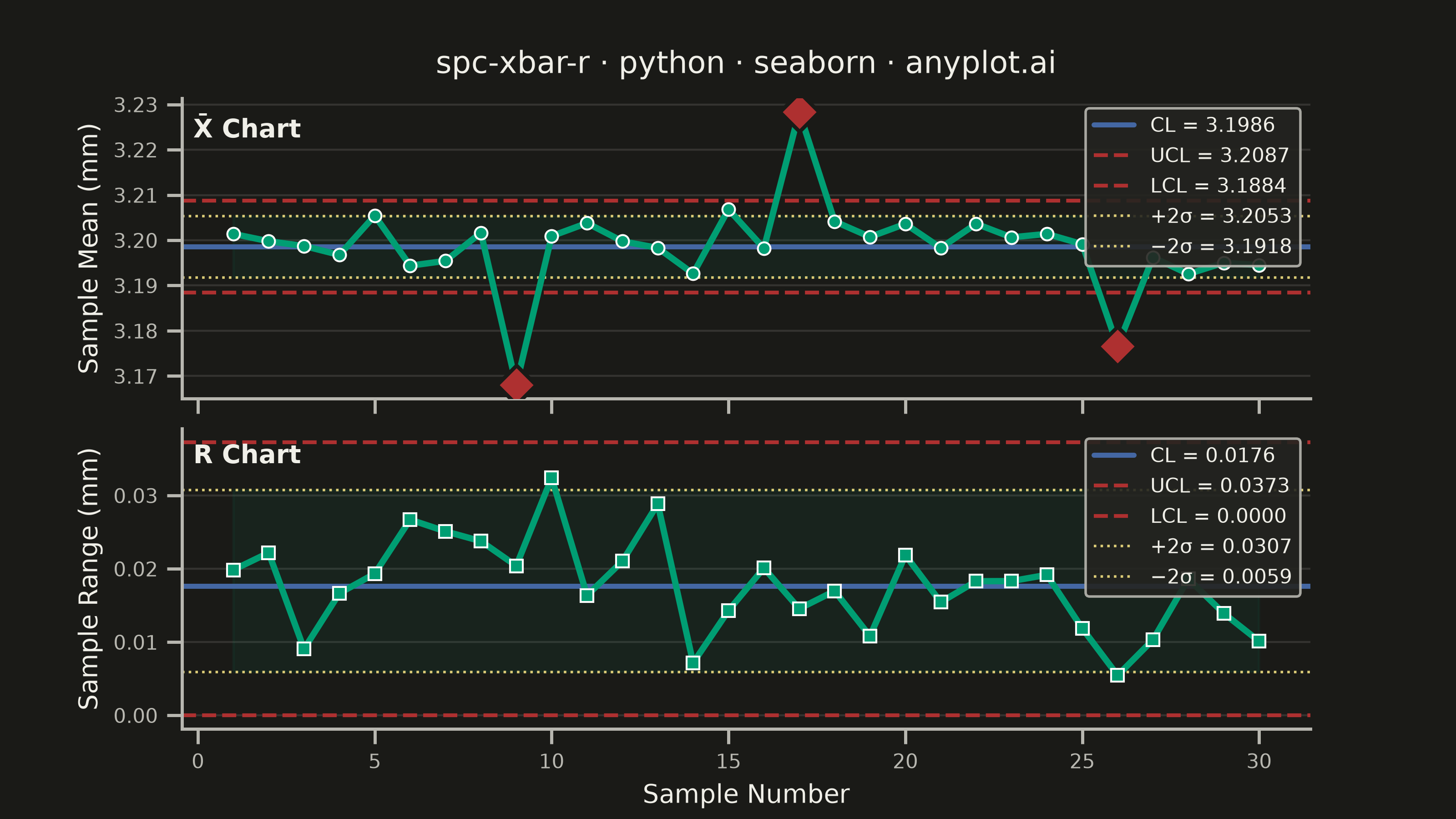
A Statistical Process Control (SPC) chart displaying sample means (X-bar) and ranges (R) plotted over time against control limits. The chart includes a center line representing the process mean, Upper Control Limit (UCL) and Lower Control Limit (LCL) at ±3 sigma, and optional warning limits at ±2 sigma. Out-of-control points are highlighted to signal process instability. This is a fundamental tool in manufacturing quality control and Six Sigma methodology for monitoring process stability.
""" anyplot.ai
spc-xbar-r: Statistical Process Control Chart (X-bar/R)
Library: seaborn 0.13.2 | Python 3.13.14
Quality: 87/100 | Updated: 2026-06-20
"""

import os

import matplotlib.pyplot as plt
import numpy as np
import pandas as pd
import seaborn as sns


# Theme tokens — Imprint palette + adaptive chrome
THEME = os.getenv("ANYPLOT_THEME", "light")
PAGE_BG = "#FAF8F1" if THEME == "light" else "#1A1A17"
ELEVATED_BG = "#FFFDF6" if THEME == "light" else "#242420"
INK = "#1A1A17" if THEME == "light" else "#F0EFE8"
INK_SOFT = "#4A4A44" if THEME == "light" else "#B8B7B0"

BRAND = "#009E73"  # Imprint pos 1 — primary data series
BLUE = "#4467A3"  # Imprint pos 3 — center line
OOC_COLOR = "#AE3030"  # Imprint semantic red — out-of-control / error
WARN_COLOR = "#DDCC77"  # Imprint semantic amber — warning / caution limits

# Seaborn theme with Imprint chrome tokens
sns.set_theme(
    style="ticks",
    rc={
        "figure.facecolor": PAGE_BG,
        "axes.facecolor": PAGE_BG,
        "axes.edgecolor": INK_SOFT,
        "axes.labelcolor": INK,
        "text.color": INK,
        "xtick.color": INK_SOFT,
        "ytick.color": INK_SOFT,
        "grid.color": INK,
        "grid.alpha": 0.12,
        "legend.facecolor": ELEVATED_BG,
        "legend.edgecolor": INK_SOFT,
    },
)

# Data — injection molding thickness measurements (target: 3.200 mm)
np.random.seed(7)

n_samples = 30
subgroup_size = 5
target = 3.200
process_std = 0.008

# SPC constants for subgroup size 5
A2, D3, D4 = 0.577, 0.0, 2.114

measurements = np.random.normal(target, process_std, (n_samples, subgroup_size))

# OOC signals at samples 9/17/26 — down/up/down pattern (different from sibling impls)
measurements[8] -= 0.030  # sample 9: below LCL
measurements[16] += 0.027  # sample 17: above UCL
measurements[25] -= 0.028  # sample 26: below LCL

sample_means = measurements.mean(axis=1)
sample_ranges = measurements.max(axis=1) - measurements.min(axis=1)

# Control limits — X-bar chart
xbar_bar = sample_means.mean()
r_bar = sample_ranges.mean()
xbar_ucl = xbar_bar + A2 * r_bar
xbar_lcl = xbar_bar - A2 * r_bar
xbar_upper_warn = xbar_bar + (2 / 3) * A2 * r_bar
xbar_lower_warn = xbar_bar - (2 / 3) * A2 * r_bar

# Control limits — R chart
r_ucl = D4 * r_bar
r_lcl = D3 * r_bar
r_upper_warn = r_bar + (2 / 3) * (r_ucl - r_bar)
r_lower_warn = max(0.0, r_bar - (2 / 3) * (r_bar - r_lcl))

sample_ids = np.arange(1, n_samples + 1)

xbar_ooc = (sample_means > xbar_ucl) | (sample_means < xbar_lcl)
r_ooc = (sample_ranges > r_ucl) | (sample_ranges < r_lcl)

# Build tidy DataFrame — seaborn-idiomatic long format for FacetGrid
df = pd.DataFrame(
    {
        "Sample": np.tile(sample_ids, 2),
        "Value": np.concatenate([sample_means, sample_ranges]),
        "Chart": np.repeat(["X̄ Chart", "R Chart"], n_samples),
        "OOC": np.concatenate([xbar_ooc, r_ooc]),
    }
)

# FacetGrid — seaborn's multi-panel layout API (dual-panel, shared x-axis)
g = sns.FacetGrid(
    df, row="Chart", row_order=["X̄ Chart", "R Chart"], height=2.25, aspect=8 / 2.25, sharex=True, sharey=False
)
g.figure.set_dpi(400)
g.figure.patch.set_facecolor(PAGE_BG)

# Map data lines via seaborn's map_dataframe
g.map_dataframe(
    sns.lineplot, x="Sample", y="Value", color=BRAND, linewidth=2.5, marker="o", markersize=5, zorder=3, errorbar=None
)


# Map OOC markers via sns.scatterplot for out-of-control detection
def plot_ooc(data, **kwargs):
    ax = plt.gca()
    ooc = data[data["OOC"]]
    if not ooc.empty:
        sns.scatterplot(
            data=ooc,
            x="Sample",
            y="Value",
            ax=ax,
            color=OOC_COLOR,
            s=120,
            zorder=5,
            marker="D",
            edgecolor=PAGE_BG,
            linewidth=1.5,
            legend=False,
        )


g.map_dataframe(plot_ooc)

# Suppress default FacetGrid row labels (added manually as ax.text below)
g.set_titles(template="")

# Per-panel control limits, labels, and annotations
panels = [
    (g.axes[0, 0], "X̄ Chart", xbar_bar, xbar_ucl, xbar_lcl, xbar_upper_warn, xbar_lower_warn, "Sample Mean (mm)"),
    (g.axes[1, 0], "R Chart", r_bar, r_ucl, r_lcl, r_upper_warn, r_lower_warn, "Sample Range (mm)"),
]

for ax, label, cl, ucl, lcl, uw, lw, ylabel in panels:
    ax.set_facecolor(PAGE_BG)
    ax.fill_between(sample_ids, lw, uw, alpha=0.11, color=BRAND, zorder=1)
    ax.axhline(cl, color=BLUE, linewidth=2, label=f"CL = {cl:.4f}")
    ax.axhline(ucl, color=OOC_COLOR, linewidth=1.5, linestyle="--", label=f"UCL = {ucl:.4f}")
    ax.axhline(lcl, color=OOC_COLOR, linewidth=1.5, linestyle="--", label=f"LCL = {lcl:.4f}")
    ax.axhline(uw, color=WARN_COLOR, linewidth=1, linestyle=":", label=f"+2σ = {uw:.4f}")
    ax.axhline(lw, color=WARN_COLOR, linewidth=1, linestyle=":", label=f"−2σ = {lw:.4f}")
    ax.set_ylabel(ylabel, fontsize=10, color=INK)
    ax.legend(fontsize=8, loc="upper right", framealpha=0.9)
    ax.tick_params(axis="both", labelsize=8)
    ax.text(0.01, 0.95, label, transform=ax.transAxes, fontsize=10, fontweight="bold", va="top", color=INK)
    ax.yaxis.grid(True, alpha=0.12, linewidth=0.8)

# Main title on top panel; x-axis label on bottom panel only
title = "spc-xbar-r · python · seaborn · anyplot.ai"
g.axes[0, 0].set_title(title, fontsize=12, fontweight="medium", pad=10, color=INK)
g.axes[1, 0].set_xlabel("Sample Number", fontsize=10, color=INK)
g.axes[0, 0].set_xlabel("")

# Spine cleanup and canvas finalization — 3200×1800 px (figsize=(8,4.5), dpi=400)
sns.despine(fig=g.figure, top=True, right=True)
g.figure.set_size_inches(8, 4.5)
plt.subplots_adjust(hspace=0.12, left=0.11, right=0.97, top=0.92, bottom=0.11)

# Save
plt.savefig(f"plot-{THEME}.png", dpi=400, facecolor=PAGE_BG)
plt.close()
Runnable source as JSON, for any HTTP client: https://api.anyplot.ai/specs/spc-xbar-r/seaborn/code. Any spec id and library id listed in llms-full.txt fit the same URL shape; every URL below is complete and callable.
{
  "spec_id": "spc-xbar-r",
  "language": "python",
  "library": "seaborn",
  "page": "https://anyplot.ai/spc-xbar-r/python/seaborn",
  "hub": "https://anyplot.ai/spc-xbar-r",
  "code_json": "https://api.anyplot.ai/specs/spc-xbar-r/seaborn/code",
  "spec_json": "https://api.anyplot.ai/specs/spc-xbar-r",
  "render_light_png": "https://storage.googleapis.com/anyplot-images/plots/spc-xbar-r/python/seaborn/plot-light.png",
  "render_dark_png": "https://storage.googleapis.com/anyplot-images/plots/spc-xbar-r/python/seaborn/plot-dark.png",
  "quality_score": 87.0,
  "license": "MIT",
  "guide": "https://anyplot.ai/llms.txt"
}
Part of Statistical Process Control Chart (X-bar/R) on anyplot.ai.