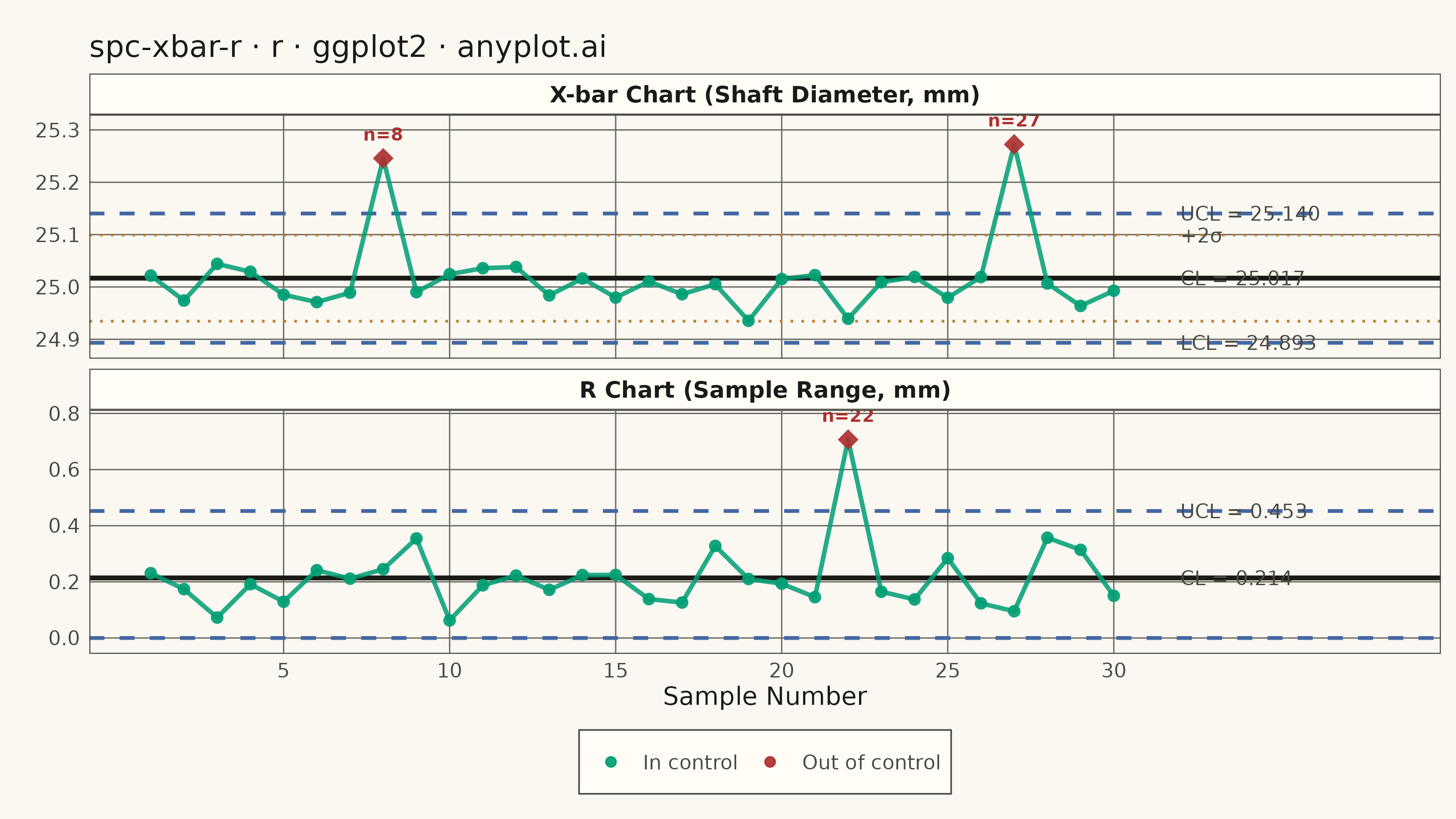
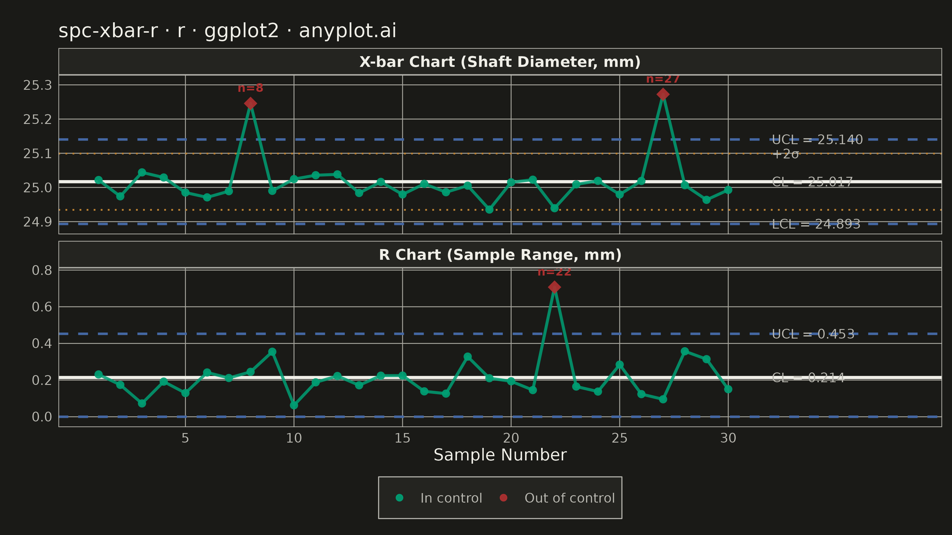
A Statistical Process Control (SPC) chart displaying sample means (X-bar) and ranges (R) plotted over time against control limits. The chart includes a center line representing the process mean, Upper Control Limit (UCL) and Lower Control Limit (LCL) at ±3 sigma, and optional warning limits at ±2 sigma. Out-of-control points are highlighted to signal process instability. This is a fundamental tool in manufacturing quality control and Six Sigma methodology for monitoring process stability.
#' anyplot.ai
#' spc-xbar-r: Statistical Process Control Chart (X-bar/R)
#' Library: ggplot2 3.5.1 | R 4.4.1
#' Quality: 88/100 | Created: 2026-06-20

library(ggplot2)
library(ragg)

set.seed(42)

# Theme tokens (Imprint palette + theme-adaptive chrome)
THEME       <- Sys.getenv("ANYPLOT_THEME", "light")
PAGE_BG     <- if (THEME == "light") "#FAF8F1" else "#1A1A17"
ELEVATED_BG <- if (THEME == "light") "#FFFDF6" else "#242420"
INK         <- if (THEME == "light") "#1A1A17" else "#F0EFE8"
INK_SOFT    <- if (THEME == "light") "#4A4A44" else "#B8B7B0"
INK_MUTED   <- if (THEME == "light") "#6B6A63" else "#A8A79F"

IMPRINT_PALETTE <- c(
  "#009E73",  # 1 brand green  — in-control data
  "#C475FD",  # 2 lavender
  "#4467A3",  # 3 blue         — UCL / LCL lines
  "#BD8233",  # 4 ochre        — warning limits (+/-2 sigma)
  "#AE3030",  # 5 matte red    — out-of-control signal
  "#2ABCCD", "#954477", "#99B314"
)

# Data: CNC shaft diameter (mm), subgroup size n = 5
n_obs     <- 5L
n_samples <- 30L

# Standard SPC constants for n = 5
A2 <- 0.577
D3 <- 0.000
D4 <- 2.114

meas <- matrix(
  rnorm(n_samples * n_obs, mean = 25.0, sd = 0.080),
  nrow = n_samples, ncol = n_obs
)

# Inject assignable-cause events to demonstrate detection capability
meas[8,  ] <- meas[8,  ] + 0.300             # mean shift
meas[22, ] <- rnorm(n_obs, mean = 25.0, sd = 0.260)  # elevated range
meas[27, ] <- meas[27, ] + 0.285             # mean shift

xbar <- rowMeans(meas)
rng  <- apply(meas, 1L, function(row) max(row) - min(row))

xbar_bar <- mean(xbar)
rbar     <- mean(rng)

ucl_x <- xbar_bar + A2 * rbar
lcl_x <- xbar_bar - A2 * rbar
uwl_x <- xbar_bar + (2.0 / 3.0) * A2 * rbar  # +2 sigma warning
lwl_x <- xbar_bar - (2.0 / 3.0) * A2 * rbar  # -2 sigma warning

ucl_r <- D4 * rbar
lcl_r <- D3 * rbar  # = 0 for n <= 6

ooc_x <- xbar > ucl_x | xbar < lcl_x
ooc_r <- rng  > ucl_r

# Long-format data for faceting
CHART_X      <- "X-bar Chart (Shaft Diameter, mm)"
CHART_R      <- "R Chart (Sample Range, mm)"
CHART_LEVELS <- c(CHART_X, CHART_R)

df_all <- data.frame(
  sample_id = rep(seq_len(n_samples), 2L),
  value     = c(xbar, rng),
  status    = factor(
    ifelse(c(ooc_x, ooc_r), "Out of control", "In control"),
    levels = c("In control", "Out of control")
  ),
  chart = factor(
    c(rep(CHART_X, n_samples), rep(CHART_R, n_samples)),
    levels = CHART_LEVELS
  )
)

# Reference lines per facet (center line, bounds, warning limits)
ref_lines <- data.frame(
  chart = factor(c(
    rep(CHART_X, 5L), rep(CHART_R, 3L)
  ), levels = CHART_LEVELS),
  yval = c(xbar_bar, ucl_x, lcl_x, uwl_x, lwl_x,
            rbar, ucl_r, lcl_r),
  role = c("cl", "bound", "bound", "warn", "warn",
           "cl", "bound", "bound")
)

# Right-side text annotations (UCL / +2σ / CL / LCL; skip -2σ — too close to LCL)
N_RIGHT   <- n_samples + 2L
X_LIM_MAX <- n_samples + 8L  # reduced from +10 to cut wasted horizontal space

ann_data <- data.frame(
  chart = factor(
    c(rep(CHART_X, 4L), rep(CHART_R, 2L)),
    levels = CHART_LEVELS
  ),
  x     = N_RIGHT,
  y     = c(ucl_x, uwl_x, xbar_bar, lcl_x, ucl_r, rbar),
  label = c(
    sprintf("UCL = %.3f", ucl_x),
    "+2σ",
    sprintf("CL = %.3f",  xbar_bar),
    sprintf("LCL = %.3f", lcl_x),
    sprintf("UCL = %.3f", ucl_r),
    sprintf("CL = %.3f",  rbar)
  )
)

# OOC callout annotations — label each flagged sample with its number
ooc_x_ids <- which(ooc_x)
ooc_r_ids <- which(ooc_r)

ooc_callouts <- data.frame(
  chart = factor(
    c(rep(CHART_X, length(ooc_x_ids)), rep(CHART_R, length(ooc_r_ids))),
    levels = CHART_LEVELS
  ),
  sample_id = c(ooc_x_ids, ooc_r_ids),
  y         = c(xbar[ooc_x_ids], rng[ooc_r_ids]),
  label     = paste0("n=", c(ooc_x_ids, ooc_r_ids))
)

title_str <- "spc-xbar-r · r · ggplot2 · anyplot.ai"

p <- ggplot(df_all, aes(x = sample_id, y = value)) +
  # Center lines — solid neutral ink
  geom_hline(
    data      = ref_lines[ref_lines$role == "cl", ],
    aes(yintercept = yval),
    color     = INK, linewidth = 0.9, linetype = "solid"
  ) +
  # Control limits UCL / LCL — dashed blue
  geom_hline(
    data      = ref_lines[ref_lines$role == "bound", ],
    aes(yintercept = yval),
    color     = IMPRINT_PALETTE[3], linewidth = 0.7, linetype = "dashed"
  ) +
  # Warning limits +/-2 sigma — dotted ochre (X-bar chart only)
  geom_hline(
    data      = ref_lines[ref_lines$role == "warn", ],
    aes(yintercept = yval),
    color     = IMPRINT_PALETTE[4], linewidth = 0.5, linetype = "dotted"
  ) +
  # Data line (always brand green)
  geom_line(color = IMPRINT_PALETTE[1], linewidth = 0.85, alpha = 0.85) +
  # Points colored and shaped by control status
  geom_point(aes(color = status, size = status, shape = status), alpha = 0.92) +
  scale_color_manual(
    values = c("In control" = IMPRINT_PALETTE[1], "Out of control" = IMPRINT_PALETTE[5]),
    name   = NULL
  ) +
  scale_size_manual(
    values = c("In control" = 2.0, "Out of control" = 3.5),
    guide  = "none"
  ) +
  scale_shape_manual(
    values = c("In control" = 16L, "Out of control" = 18L),
    guide  = "none"
  ) +
  # OOC callout labels — sample number above each flagged diamond
  geom_text(
    data     = ooc_callouts,
    aes(x = sample_id, y = y, label = label),
    color    = IMPRINT_PALETTE[5],
    size     = 2.5,
    vjust    = -1.4,
    fontface = "bold"
  ) +
  # Right-side limit annotations
  geom_text(
    data  = ann_data,
    aes(x = x, y = y, label = label),
    hjust = 0, size = 2.8, color = INK_SOFT
  ) +
  facet_wrap(~ chart, ncol = 1L, scales = "free_y") +
  scale_x_continuous(
    breaks = seq(5L, n_samples, 5L),
    limits = c(1L, X_LIM_MAX)
  ) +
  scale_y_continuous(expand = expansion(mult = c(0.08, 0.15))) +
  labs(x = "Sample Number", y = NULL, title = title_str) +
  theme_minimal(base_size = 8) +
  theme(
    plot.background   = element_rect(fill = PAGE_BG, color = PAGE_BG),
    panel.background  = element_rect(fill = PAGE_BG, color = NA),
    panel.grid.major  = element_line(color = INK_MUTED, linewidth = 0.25),
    panel.grid.minor  = element_blank(),
    panel.border      = element_rect(color = INK_SOFT, fill = NA, linewidth = 0.4),
    strip.background  = element_rect(fill = ELEVATED_BG, color = INK_SOFT, linewidth = 0.4),
    strip.text        = element_text(color = INK, size = 9, face = "bold",
                                     margin = margin(t = 4, b = 4)),
    axis.title.x      = element_text(color = INK, size = 10),
    axis.text         = element_text(color = INK_SOFT, size = 8),
    legend.position   = "bottom",
    legend.background = element_rect(fill = ELEVATED_BG, color = INK_SOFT, linewidth = 0.3),
    legend.text       = element_text(color = INK_SOFT, size = 8),
    legend.key        = element_rect(fill = NA),
    plot.title        = element_text(color = INK, size = 12, face = "plain"),
    plot.margin       = margin(t = 14, r = 6, b = 10, l = 14)
  )

# Save
ggsave(
  filename = sprintf("plot-%s.png", THEME),
  plot     = p,
  device   = ragg::agg_png,
  width    = 8,
  height   = 4.5,
  units    = "in",
  dpi      = 400
)
Runnable source as JSON, for any HTTP client: https://api.anyplot.ai/specs/spc-xbar-r/ggplot2/code. Any spec id and library id listed in llms-full.txt fit the same URL shape; every URL below is complete and callable.
{
  "spec_id": "spc-xbar-r",
  "language": "r",
  "library": "ggplot2",
  "page": "https://anyplot.ai/spc-xbar-r/r/ggplot2",
  "hub": "https://anyplot.ai/spc-xbar-r",
  "code_json": "https://api.anyplot.ai/specs/spc-xbar-r/ggplot2/code",
  "spec_json": "https://api.anyplot.ai/specs/spc-xbar-r",
  "render_light_png": "https://storage.googleapis.com/anyplot-images/plots/spc-xbar-r/r/ggplot2/plot-light.png",
  "render_dark_png": "https://storage.googleapis.com/anyplot-images/plots/spc-xbar-r/r/ggplot2/plot-dark.png",
  "quality_score": 88.0,
  "license": "MIT",
  "guide": "https://anyplot.ai/llms.txt"
}
Part of Statistical Process Control Chart (X-bar/R) on anyplot.ai.