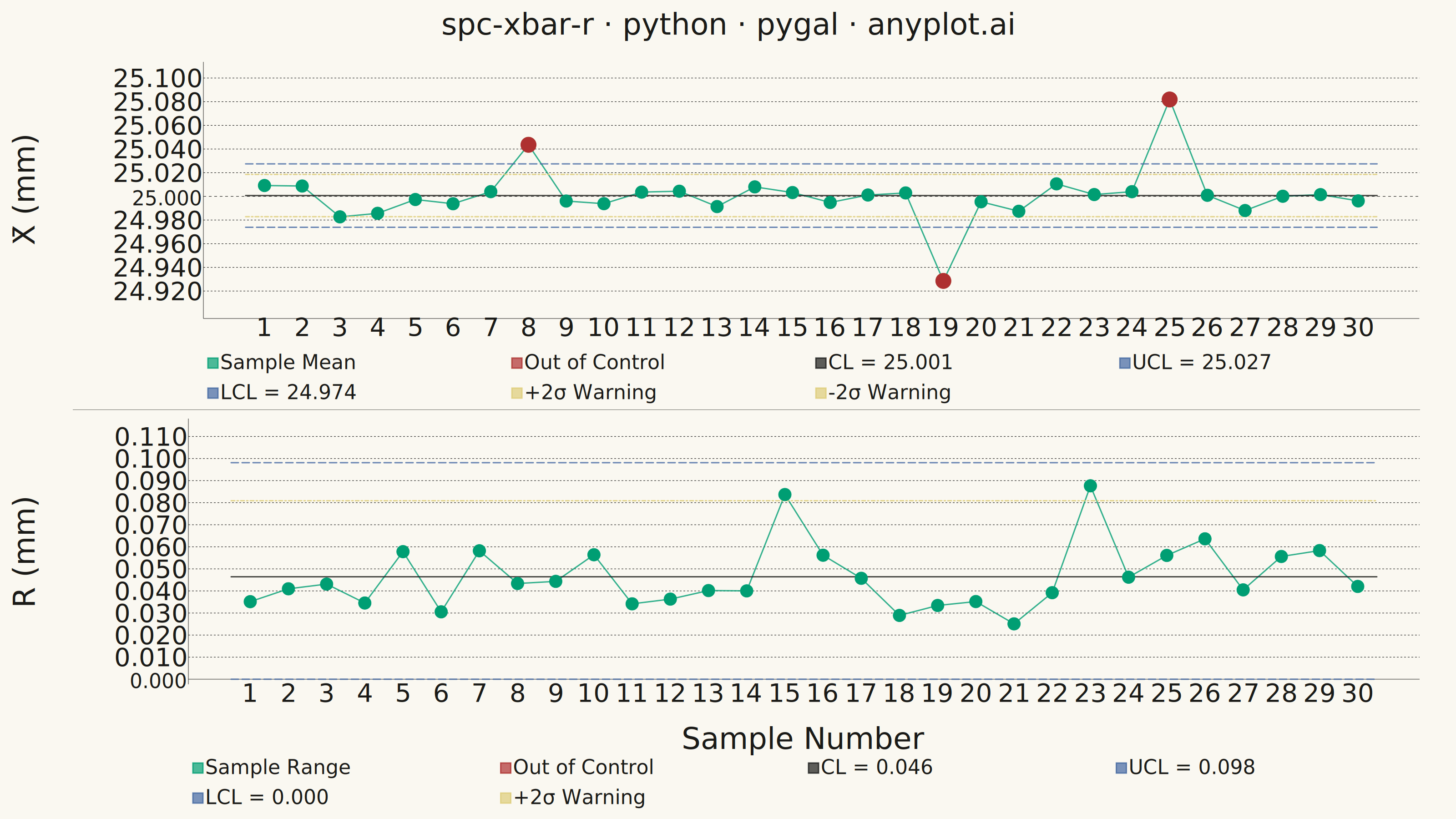
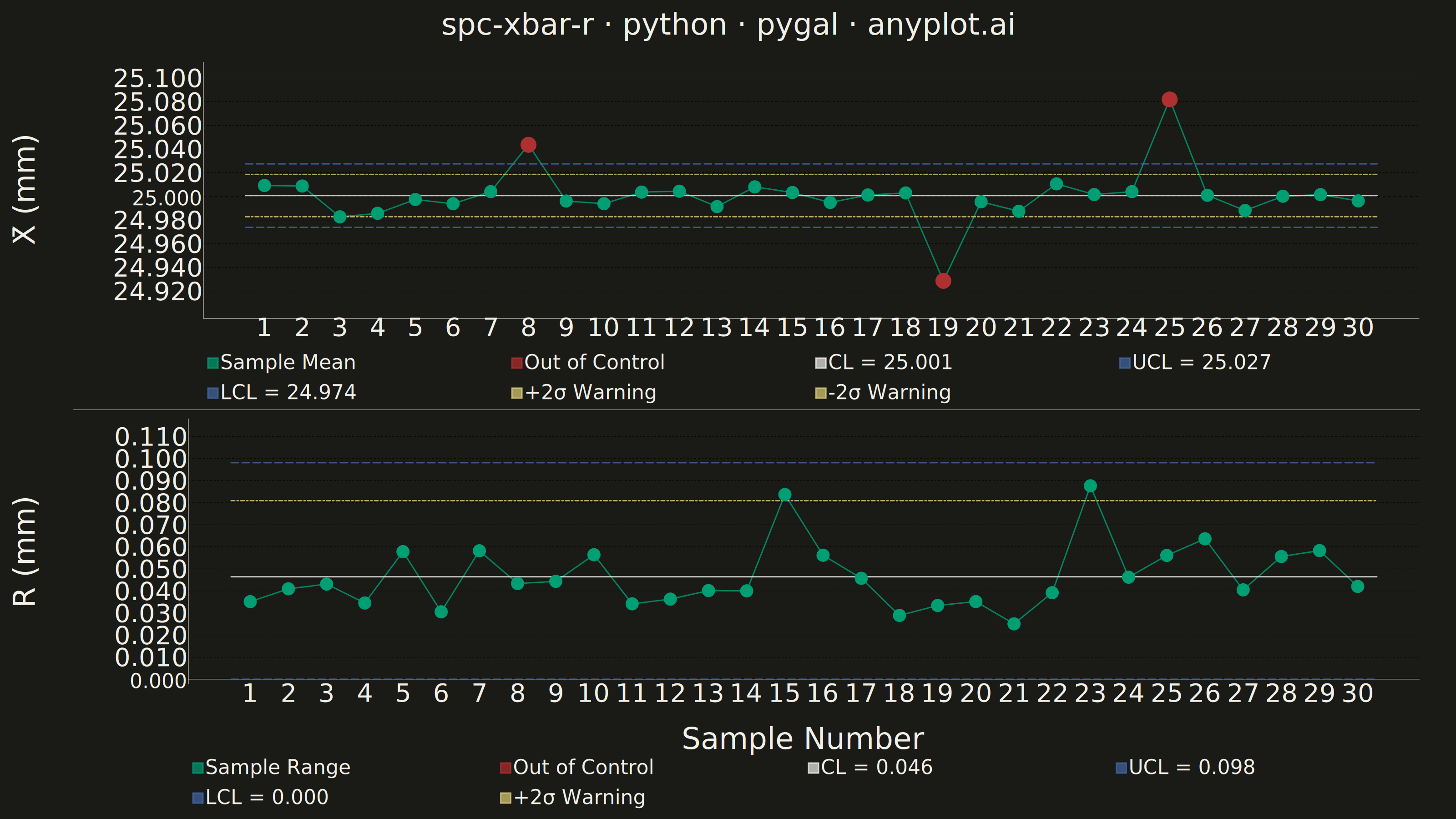
A Statistical Process Control (SPC) chart displaying sample means (X-bar) and ranges (R) plotted over time against control limits. The chart includes a center line representing the process mean, Upper Control Limit (UCL) and Lower Control Limit (LCL) at ±3 sigma, and optional warning limits at ±2 sigma. Out-of-control points are highlighted to signal process instability. This is a fundamental tool in manufacturing quality control and Six Sigma methodology for monitoring process stability.
""" anyplot.ai
spc-xbar-r: Statistical Process Control Chart (X-bar/R)
Library: pygal 3.1.3 | Python 3.13.14
Quality: 90/100 | Updated: 2026-06-20
"""

import io
import os
import sys


# Script filename shadows the installed `pygal` package when run as `python pygal.py`;
# dropping the script directory from sys.path lets the real package resolve.
sys.path.pop(0)

import cairosvg
import numpy as np
import pygal
from PIL import Image, ImageColor, ImageDraw
from pygal.style import Style


# Theme tokens
THEME = os.getenv("ANYPLOT_THEME", "light")
PAGE_BG = "#FAF8F1" if THEME == "light" else "#1A1A17"
INK = "#1A1A17" if THEME == "light" else "#F0EFE8"
INK_MUTED = "#6B6A63" if THEME == "light" else "#A8A79F"

# Imprint palette — data colors are theme-independent
C_NORMAL = "#009E73"  # brand green — in-control data (Imprint pos. 1)
C_OOC = "#AE3030"  # matte red — out-of-control (semantic anchor: error)
C_UCL_LCL = "#4467A3"  # blue — control limit lines (Imprint pos. 3)
C_WARN = "#DDCC77"  # amber — warning limits (semantic anchor: caution)

# Data — CNC shaft diameter measurements, subgroup size n=5
np.random.seed(42)
n_samples = 30
subgroup_size = 5

# SPC constants for n=5
A2 = 0.577
D3 = 0.0
D4 = 2.114

target = 25.00
process_std = 0.02
measurements = np.random.normal(target, process_std, (n_samples, subgroup_size))

# Inject out-of-control scenarios
measurements[7] += 0.06  # tool wear — upward shift
measurements[18] -= 0.07  # recalibration overshoot — downward shift
measurements[24] += 0.08  # material batch change — upward shift

sample_means = measurements.mean(axis=1)
sample_ranges = measurements.max(axis=1) - measurements.min(axis=1)

x_bar_bar = sample_means.mean()
r_bar = sample_ranges.mean()

xbar_ucl = x_bar_bar + A2 * r_bar
xbar_lcl = x_bar_bar - A2 * r_bar
xbar_uw = x_bar_bar + (2 / 3) * A2 * r_bar
xbar_lw = x_bar_bar - (2 / 3) * A2 * r_bar

r_ucl = D4 * r_bar
r_lcl = D3 * r_bar
r_uw = r_bar + (2 / 3) * (r_ucl - r_bar)

xbar_ooc = (sample_means > xbar_ucl) | (sample_means < xbar_lcl)
r_ooc = sample_ranges > r_ucl

# Title — length-aware font scaling (baseline 67 chars = font size 66)
title_str = "spc-xbar-r · python · pygal · anyplot.ai"
n_title = len(title_str)
title_font_size = round(66 * 67 / n_title) if n_title > 67 else 66

# Series color order must match chart.add() call order exactly:
# slot 1=normal data, 2=OOC overlay, 3=center line, 4=UCL, 5=LCL, 6=+2σ, 7=-2σ
chart_colors = (C_NORMAL, C_OOC, INK, C_UCL_LCL, C_UCL_LCL, C_WARN, C_WARN)

custom_style = Style(
    background=PAGE_BG,
    plot_background=PAGE_BG,
    foreground=INK,
    foreground_strong=INK,
    foreground_subtle=INK_MUTED,
    colors=chart_colors,
    title_font_size=title_font_size,
    label_font_size=56,
    major_label_font_size=44,
    legend_font_size=44,
    value_font_size=36,
    stroke_width=3,
    font_family="'Helvetica Neue', 'Segoe UI', sans-serif",
)

sample_ids = list(range(1, n_samples + 1))

common_config = {
    "width": 3200,
    "height": 900,
    "style": custom_style,
    "show_y_guides": True,
    "show_x_guides": False,
    "margin": 40,
    "margin_left": 160,
    "margin_right": 80,
    "print_values": False,
    "legend_at_bottom": True,
    "legend_at_bottom_columns": 4,
    "legend_box_size": 22,
    "js": [],
    "explicit_size": True,
    "dots_size": 14,
    "stroke_style": {"width": 4, "linecap": "round", "linejoin": "round"},
    "truncate_label": -1,
    "truncate_legend": -1,
}

# X-bar Chart (top panel)
xbar_y_min = min(sample_means.min(), xbar_lcl)
xbar_y_max = max(sample_means.max(), xbar_ucl)
xbar_y_pad = (xbar_y_max - xbar_y_min) * 0.18

xbar_chart = pygal.XY(
    **common_config,
    title=title_str,
    x_title="",
    y_title="X̄ (mm)",
    margin_bottom=80,
    margin_top=60,
    range=(xbar_y_min - xbar_y_pad, xbar_y_max + xbar_y_pad),
    xrange=(0, n_samples + 1),
    value_formatter=lambda y: f"{y:.3f}" if isinstance(y, (int, float)) else str(y),
)
xbar_chart.x_labels = [float(i) for i in sample_ids]

# Normal data line with per-point OOC dot color override (slot 1 = C_NORMAL)
xbar_data = [
    {"value": (float(i + 1), float(sample_means[i])), **({"color": C_OOC, "dots_size": 17} if xbar_ooc[i] else {})}
    for i in range(n_samples)
]
xbar_chart.add("Sample Mean", xbar_data, stroke_style={"width": 4, "linecap": "round"}, show_dots=True)

# OOC overlay — explicit legend entry; empty list keeps color slot 2 = C_OOC
ooc_xbar_pts = [(float(i + 1), float(sample_means[i])) for i in range(n_samples) if xbar_ooc[i]]
xbar_chart.add("Out of Control", ooc_xbar_pts, stroke=False, show_dots=True, dots_size=17)

# Center line (slot 3 = INK)
xbar_chart.add(
    f"CL = {x_bar_bar:.3f}",
    [(0.5, x_bar_bar), (n_samples + 0.5, x_bar_bar)],
    show_dots=False,
    stroke_style={"width": 4, "linecap": "round"},
)

# UCL / LCL (slots 4, 5 = C_UCL_LCL — distinct blue, not reusing OOC red)
xbar_chart.add(
    f"UCL = {xbar_ucl:.3f}",
    [(0.5, xbar_ucl), (n_samples + 0.5, xbar_ucl)],
    show_dots=False,
    stroke_style={"width": 3, "dasharray": "16, 8", "linecap": "round"},
)
xbar_chart.add(
    f"LCL = {xbar_lcl:.3f}",
    [(0.5, xbar_lcl), (n_samples + 0.5, xbar_lcl)],
    show_dots=False,
    stroke_style={"width": 3, "dasharray": "16, 8", "linecap": "round"},
)

# Warning limits (slots 6, 7 = C_WARN amber)
xbar_chart.add(
    "+2σ Warning",
    [(0.5, xbar_uw), (n_samples + 0.5, xbar_uw)],
    show_dots=False,
    stroke_style={"width": 2.5, "dasharray": "8, 5, 3, 5", "linecap": "round"},
)
xbar_chart.add(
    "-2σ Warning",
    [(0.5, xbar_lw), (n_samples + 0.5, xbar_lw)],
    show_dots=False,
    stroke_style={"width": 2.5, "dasharray": "8, 5, 3, 5", "linecap": "round"},
)

# R Chart (bottom panel) — same series order keeps color slots aligned
r_y_max = max(sample_ranges.max(), r_ucl)
r_y_pad = r_y_max * 0.18

r_chart = pygal.XY(
    **common_config,
    title="",
    x_title="Sample Number",
    y_title="R (mm)",
    margin_bottom=100,
    margin_top=20,
    range=(0, r_y_max + r_y_pad),
    xrange=(0, n_samples + 1),
    value_formatter=lambda y: f"{y:.3f}" if isinstance(y, (int, float)) else str(y),
)
r_chart.x_labels = [float(i) for i in sample_ids]

range_pts = [
    {"value": (float(i + 1), float(sample_ranges[i])), **({"color": C_OOC, "dots_size": 17} if r_ooc[i] else {})}
    for i in range(n_samples)
]
r_chart.add("Sample Range", range_pts, stroke_style={"width": 4, "linecap": "round"}, show_dots=True)

# Always add OOC series to keep color slot 2 = C_OOC aligned
ooc_r_pts = [(float(i + 1), float(sample_ranges[i])) for i in range(n_samples) if r_ooc[i]]
r_chart.add("Out of Control", ooc_r_pts, stroke=False, show_dots=True, dots_size=17)

r_chart.add(
    f"CL = {r_bar:.3f}",
    [(0.5, r_bar), (n_samples + 0.5, r_bar)],
    show_dots=False,
    stroke_style={"width": 4, "linecap": "round"},
)
r_chart.add(
    f"UCL = {r_ucl:.3f}",
    [(0.5, r_ucl), (n_samples + 0.5, r_ucl)],
    show_dots=False,
    stroke_style={"width": 3, "dasharray": "16, 8", "linecap": "round"},
)
r_chart.add(
    f"LCL = {r_lcl:.3f}",
    [(0.5, r_lcl), (n_samples + 0.5, r_lcl)],
    show_dots=False,
    stroke_style={"width": 3, "dasharray": "16, 8", "linecap": "round"},
)
r_chart.add(
    "+2σ Warning",
    [(0.5, r_uw), (n_samples + 0.5, r_uw)],
    show_dots=False,
    stroke_style={"width": 2.5, "dasharray": "8, 5, 3, 5", "linecap": "round"},
)

# Render and composite into 3200×1800 PNG
chart_h = 900
png_xbar = cairosvg.svg2png(bytestring=xbar_chart.render(), output_width=3200, output_height=chart_h)
png_r = cairosvg.svg2png(bytestring=r_chart.render(), output_width=3200, output_height=chart_h)

xbar_img = Image.open(io.BytesIO(png_xbar))
r_img = Image.open(io.BytesIO(png_r))

bg_rgb = ImageColor.getrgb(PAGE_BG)
combined = Image.new("RGB", (3200, 1800), bg_rgb)
combined.paste(xbar_img, (0, 0))
combined.paste(r_img, (0, chart_h))

draw = ImageDraw.Draw(combined)
draw.line([(160, chart_h), (3120, chart_h)], fill=ImageColor.getrgb(INK_MUTED), width=1)

combined.save(f"plot-{THEME}.png", dpi=(300, 300))

# HTML — both charts as interactive SVG stacked vertically
xbar_svg = xbar_chart.render().decode("utf-8")
r_svg = r_chart.render().decode("utf-8")
html_content = (
    "<!DOCTYPE html>\n<html>\n<head>\n"
    '<meta charset="utf-8">\n<style>\n'
    f"body{{background:{PAGE_BG};margin:0;padding:20px;font-family:sans-serif;}}\n"
    ".spc{{width:100%;max-width:1400px;display:block;margin:0 auto;}}\n"
    "</style>\n</head>\n<body>\n"
    f'<div class="spc">{xbar_svg}</div>\n'
    f'<div class="spc">{r_svg}</div>\n'
    "</body>\n</html>"
)
with open(f"plot-{THEME}.html", "w", encoding="utf-8") as f:
    f.write(html_content)
Runnable source as JSON, for any HTTP client: https://api.anyplot.ai/specs/spc-xbar-r/pygal/code. Any spec id and library id listed in llms-full.txt fit the same URL shape; every URL below is complete and callable.
{
  "spec_id": "spc-xbar-r",
  "language": "python",
  "library": "pygal",
  "page": "https://anyplot.ai/spc-xbar-r/python/pygal",
  "hub": "https://anyplot.ai/spc-xbar-r",
  "code_json": "https://api.anyplot.ai/specs/spc-xbar-r/pygal/code",
  "spec_json": "https://api.anyplot.ai/specs/spc-xbar-r",
  "render_light_png": "https://storage.googleapis.com/anyplot-images/plots/spc-xbar-r/python/pygal/plot-light.png",
  "render_dark_png": "https://storage.googleapis.com/anyplot-images/plots/spc-xbar-r/python/pygal/plot-dark.png",
  "interactive_light_html": "https://storage.googleapis.com/anyplot-images/plots/spc-xbar-r/python/pygal/plot-light.html",
  "interactive_dark_html": "https://storage.googleapis.com/anyplot-images/plots/spc-xbar-r/python/pygal/plot-dark.html",
  "quality_score": 90.0,
  "license": "MIT",
  "guide": "https://anyplot.ai/llms.txt"
}
Part of Statistical Process Control Chart (X-bar/R) on anyplot.ai.