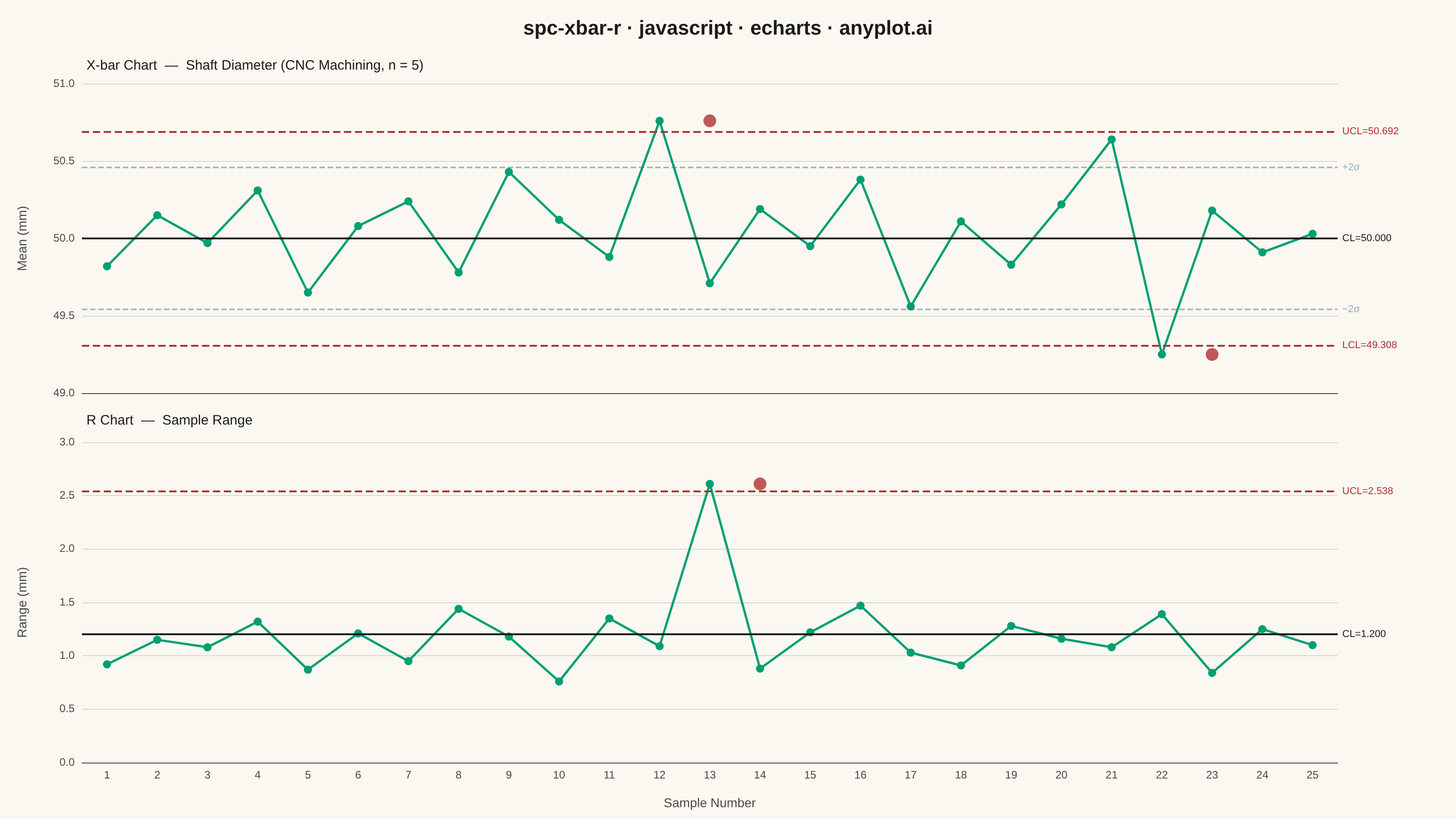
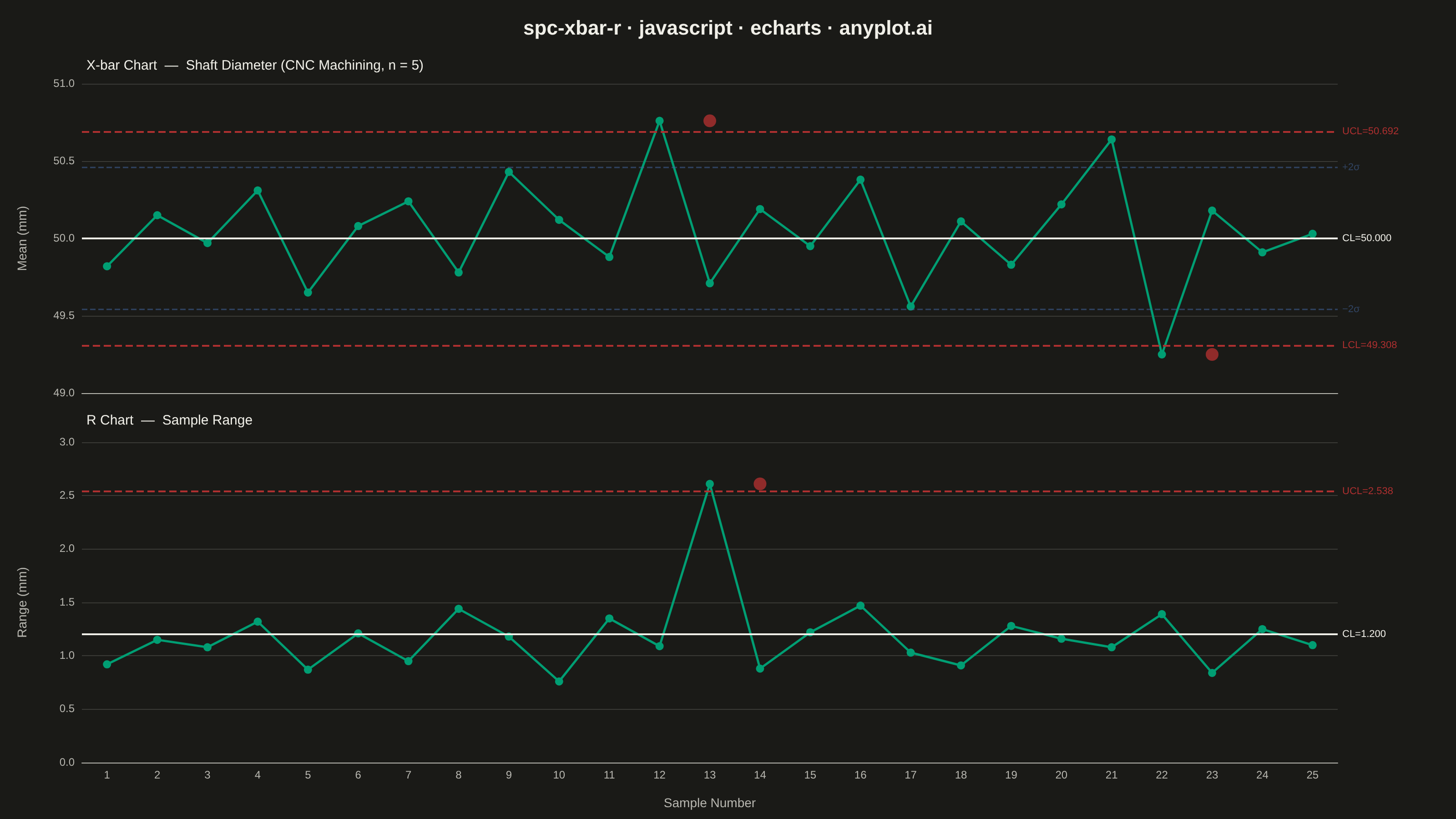
A Statistical Process Control (SPC) chart displaying sample means (X-bar) and ranges (R) plotted over time against control limits. The chart includes a center line representing the process mean, Upper Control Limit (UCL) and Lower Control Limit (LCL) at ±3 sigma, and optional warning limits at ±2 sigma. Out-of-control points are highlighted to signal process instability. This is a fundamental tool in manufacturing quality control and Six Sigma methodology for monitoring process stability.
// anyplot.ai
// spc-xbar-r: Statistical Process Control Chart (X-bar/R)
// Library: echarts 5.5.1 | JavaScript 22.22.3
// Quality: 91/100 | Created: 2026-06-20

const t = window.ANYPLOT_TOKENS;

// SPC constants for subgroup size n=5: A2=0.577, D3=0, D4=2.115
const A2 = 0.577, D3 = 0, D4 = 2.115;
const xbarBar = 50.0;
const rBar = 1.20;

const UCL_x = +(xbarBar + A2 * rBar).toFixed(4);          // 50.6924
const LCL_x = +(xbarBar - A2 * rBar).toFixed(4);          // 49.3076
const UWL_x = +(xbarBar + (2 / 3) * A2 * rBar).toFixed(4); // +2σ warning
const LWL_x = +(xbarBar - (2 / 3) * A2 * rBar).toFixed(4); // -2σ warning
const UCL_r = +(D4 * rBar).toFixed(4);                    // 2.538 (LCL_r=0 for n=5)

// Shaft diameter sample means and ranges — CNC machining process, 25 subgroups of n=5
// Samples 12 and 22 breach X-bar control limits; sample 13 breaches R UCL
const xbarData = [
  49.82, 50.15, 49.97, 50.31, 49.65,
  50.08, 50.24, 49.78, 50.43, 50.12,
  49.88, 50.76, 49.71, 50.19, 49.95,
  50.38, 49.56, 50.11, 49.83, 50.22,
  50.64, 49.25, 50.18, 49.91, 50.03,
];
const rData = [
  0.92, 1.15, 1.08, 1.32, 0.87,
  1.21, 0.95, 1.44, 1.18, 0.76,
  1.35, 1.09, 2.61, 0.88, 1.22,
  1.47, 1.03, 0.91, 1.28, 1.16,
  1.08, 1.39, 0.84, 1.25, 1.10,
];
const sampleNums = Array.from({ length: 25 }, (_, i) => i + 1);

// Isolate out-of-control points for red scatter overlay
const xbarOOC = sampleNums
  .map((s, i) => (xbarData[i] > UCL_x || xbarData[i] < LCL_x ? [s, xbarData[i]] : null))
  .filter(Boolean);
const rOOC = sampleNums
  .map((s, i) => (rData[i] > UCL_r ? [s, rData[i]] : null))
  .filter(Boolean);

// --- Init
const chart = echarts.init(document.getElementById("container"));

chart.setOption({
  animation: false,
  color: t.palette,
  backgroundColor: "transparent",

  title: [
    {
      text: "spc-xbar-r · javascript · echarts · anyplot.ai",
      left: "center",
      top: 16,
      textStyle: { color: t.ink, fontSize: 22, fontWeight: "bold" },
    },
    {
      text: "X-bar Chart  —  Shaft Diameter (CNC Machining, n = 5)",
      left: 90,
      top: 60,
      textStyle: { color: t.ink, fontSize: 15, fontWeight: "normal" },
    },
    {
      text: "R Chart  —  Sample Range",
      left: 90,
      top: "50%",
      textStyle: { color: t.ink, fontSize: 15, fontWeight: "normal" },
    },
  ],

  grid: [
    { left: 90, right: 130, top: 92, bottom: "52%" },
    { left: 90, right: 130, top: "54%", bottom: 62 },
  ],

  xAxis: [
    {
      gridIndex: 0,
      type: "category",
      data: sampleNums,
      axisLabel: { show: false },
      axisLine: { lineStyle: { color: t.inkSoft } },
      axisTick: { show: false },
      splitLine: { show: false },
    },
    {
      gridIndex: 1,
      type: "category",
      data: sampleNums,
      name: "Sample Number",
      nameLocation: "middle",
      nameGap: 38,
      nameTextStyle: { color: t.inkSoft, fontSize: 14 },
      axisLabel: { color: t.inkSoft, fontSize: 12 },
      axisLine: { lineStyle: { color: t.inkSoft } },
      axisTick: { show: false },
      splitLine: { show: false },
    },
  ],

  yAxis: [
    {
      gridIndex: 0,
      type: "value",
      name: "Mean (mm)",
      nameLocation: "middle",
      nameGap: 58,
      nameTextStyle: { color: t.inkSoft, fontSize: 14 },
      min: 49.0,
      max: 51.0,
      axisLabel: { color: t.inkSoft, fontSize: 12, formatter: (v) => v.toFixed(1) },
      axisLine: { show: false },
      axisTick: { show: false },
      splitLine: { lineStyle: { color: t.grid } },
    },
    {
      gridIndex: 1,
      type: "value",
      name: "Range (mm)",
      nameLocation: "middle",
      nameGap: 58,
      nameTextStyle: { color: t.inkSoft, fontSize: 14 },
      min: 0,
      max: 3.0,
      axisLabel: { color: t.inkSoft, fontSize: 12, formatter: (v) => v.toFixed(1) },
      axisLine: { show: false },
      axisTick: { show: false },
      splitLine: { lineStyle: { color: t.grid } },
    },
  ],

  series: [
    // X-bar line with control limit markLines
    {
      name: "X-bar",
      type: "line",
      xAxisIndex: 0,
      yAxisIndex: 0,
      data: xbarData,
      symbol: "circle",
      symbolSize: 9,
      lineStyle: { color: t.palette[0], width: 2.5 },
      itemStyle: { color: t.palette[0] },
      markLine: {
        silent: true,
        symbol: "none",
        label: { show: true, position: "end", fontSize: 11 },
        data: [
          {
            yAxis: UCL_x,
            label: { formatter: `UCL=${UCL_x.toFixed(3)}`, color: t.palette[4], fontSize: 11 },
            lineStyle: { color: t.palette[4], type: "dashed", width: 2 },
          },
          {
            yAxis: LCL_x,
            label: { formatter: `LCL=${LCL_x.toFixed(3)}`, color: t.palette[4], fontSize: 11 },
            lineStyle: { color: t.palette[4], type: "dashed", width: 2 },
          },
          {
            yAxis: xbarBar,
            label: { formatter: `CL=${xbarBar.toFixed(3)}`, color: t.ink, fontSize: 11 },
            lineStyle: { color: t.ink, type: "solid", width: 2 },
          },
          {
            yAxis: UWL_x,
            label: { formatter: "+2σ", color: t.palette[2], fontSize: 11 },
            lineStyle: { color: t.palette[2], type: "dashed", width: 1.5, opacity: 0.55 },
          },
          {
            yAxis: LWL_x,
            label: { formatter: "−2σ", color: t.palette[2], fontSize: 11 },
            lineStyle: { color: t.palette[2], type: "dashed", width: 1.5, opacity: 0.55 },
          },
        ],
      },
    },
    // X-bar out-of-control points (red scatter overlay)
    {
      type: "scatter",
      xAxisIndex: 0,
      yAxisIndex: 0,
      data: xbarOOC,
      symbolSize: 14,
      symbol: "circle",
      itemStyle: { color: t.palette[4] },
      z: 10,
    },
    // R chart line with control limit markLines
    {
      name: "Range",
      type: "line",
      xAxisIndex: 1,
      yAxisIndex: 1,
      data: rData,
      symbol: "circle",
      symbolSize: 9,
      lineStyle: { color: t.palette[0], width: 2.5 },
      itemStyle: { color: t.palette[0] },
      markLine: {
        silent: true,
        symbol: "none",
        label: { show: true, position: "end", fontSize: 11 },
        data: [
          {
            yAxis: UCL_r,
            label: { formatter: `UCL=${UCL_r.toFixed(3)}`, color: t.palette[4], fontSize: 11 },
            lineStyle: { color: t.palette[4], type: "dashed", width: 2 },
          },
          {
            yAxis: rBar,
            label: { formatter: `CL=${rBar.toFixed(3)}`, color: t.ink, fontSize: 11 },
            lineStyle: { color: t.ink, type: "solid", width: 2 },
          },
        ],
      },
    },
    // R chart out-of-control points (red scatter overlay)
    {
      type: "scatter",
      xAxisIndex: 1,
      yAxisIndex: 1,
      data: rOOC,
      symbolSize: 14,
      symbol: "circle",
      itemStyle: { color: t.palette[4] },
      z: 10,
    },
  ],
});
Runnable source as JSON, for any HTTP client: https://api.anyplot.ai/specs/spc-xbar-r/echarts/code. Any spec id and library id listed in llms-full.txt fit the same URL shape; every URL below is complete and callable.
{
  "spec_id": "spc-xbar-r",
  "language": "javascript",
  "library": "echarts",
  "page": "https://anyplot.ai/spc-xbar-r/javascript/echarts",
  "hub": "https://anyplot.ai/spc-xbar-r",
  "code_json": "https://api.anyplot.ai/specs/spc-xbar-r/echarts/code",
  "spec_json": "https://api.anyplot.ai/specs/spc-xbar-r",
  "render_light_png": "https://storage.googleapis.com/anyplot-images/plots/spc-xbar-r/javascript/echarts/plot-light.png",
  "render_dark_png": "https://storage.googleapis.com/anyplot-images/plots/spc-xbar-r/javascript/echarts/plot-dark.png",
  "interactive_light_html": "https://storage.googleapis.com/anyplot-images/plots/spc-xbar-r/javascript/echarts/plot-light.html",
  "interactive_dark_html": "https://storage.googleapis.com/anyplot-images/plots/spc-xbar-r/javascript/echarts/plot-dark.html",
  "quality_score": 91.0,
  "license": "MIT",
  "guide": "https://anyplot.ai/llms.txt"
}
Part of Statistical Process Control Chart (X-bar/R) on anyplot.ai.