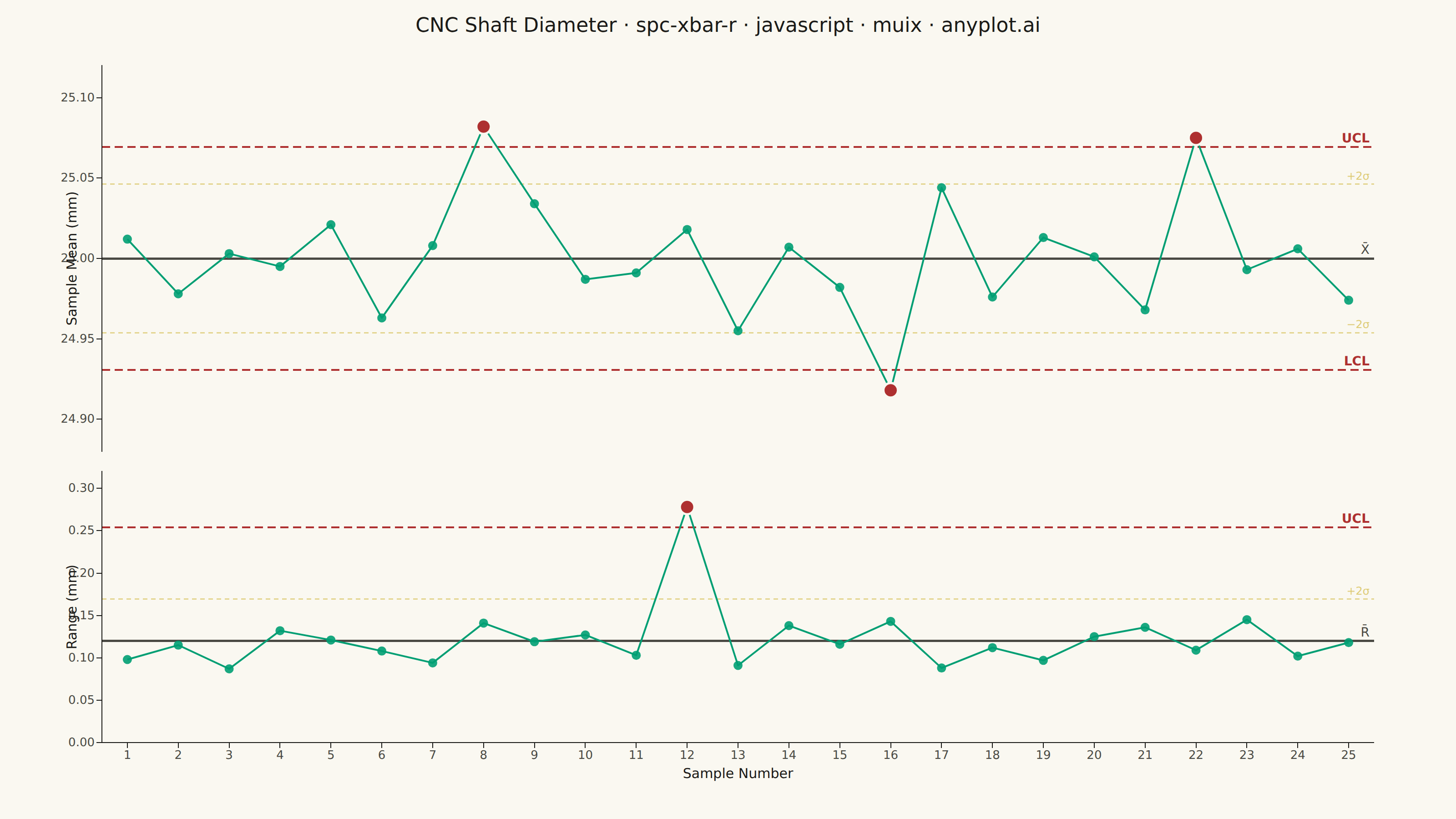
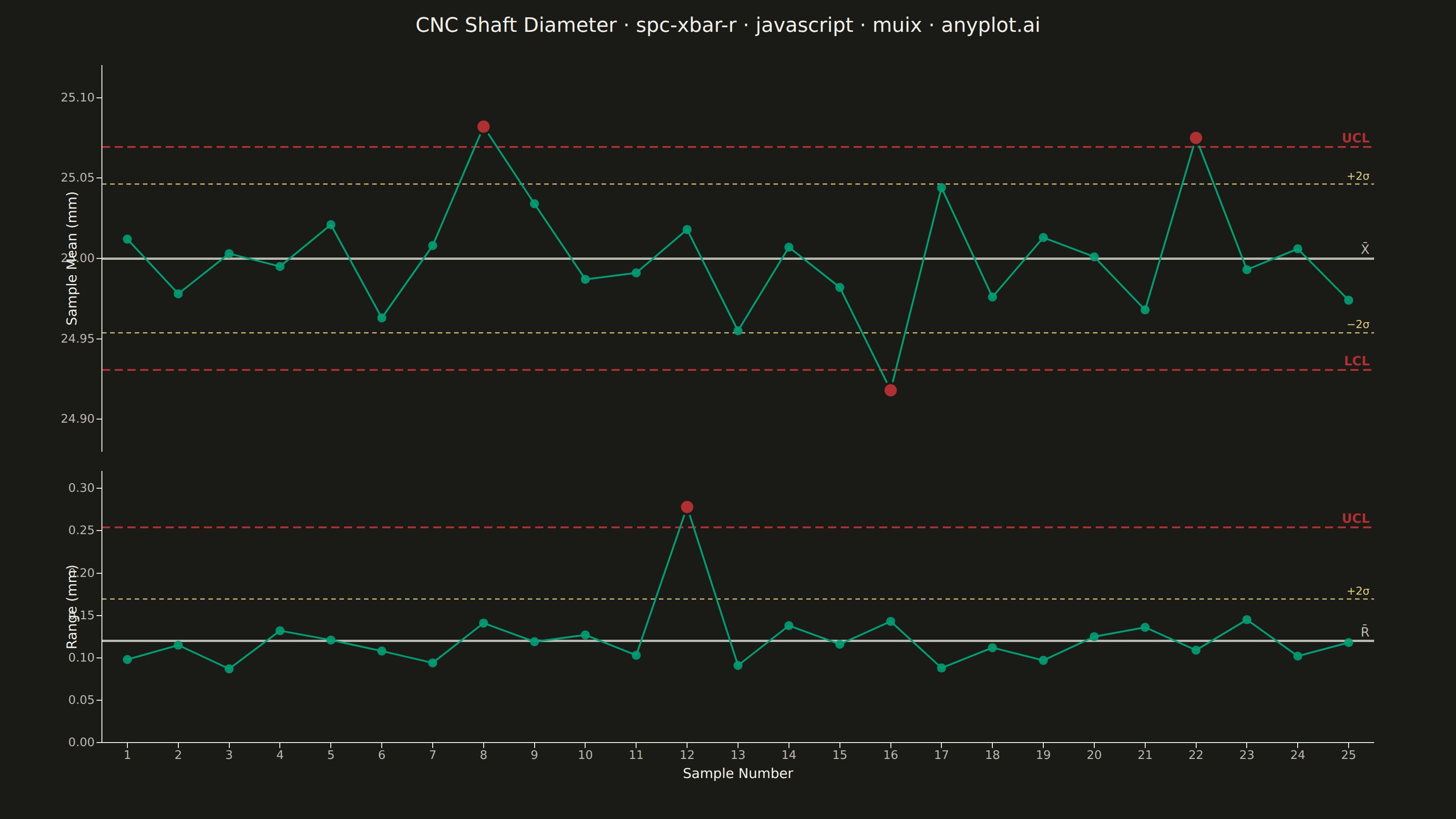
A Statistical Process Control (SPC) chart displaying sample means (X-bar) and ranges (R) plotted over time against control limits. The chart includes a center line representing the process mean, Upper Control Limit (UCL) and Lower Control Limit (LCL) at ±3 sigma, and optional warning limits at ±2 sigma. Out-of-control points are highlighted to signal process instability. This is a fundamental tool in manufacturing quality control and Six Sigma methodology for monitoring process stability.
// anyplot.ai
// spc-xbar-r: Statistical Process Control Chart (X-bar/R)
// Library: muix 7.29.1 | JavaScript 22.22.3
// Quality: 92/100 | Created: 2026-06-20

import { ChartContainer } from "@mui/x-charts/ChartContainer";
import { LinePlot } from "@mui/x-charts/LineChart";
import { ChartsXAxis } from "@mui/x-charts/ChartsXAxis";
import { ChartsYAxis } from "@mui/x-charts/ChartsYAxis";
import { ChartsReferenceLine } from "@mui/x-charts/ChartsReferenceLine";
import { useDrawingArea } from "@mui/x-charts/hooks";
import Box from "@mui/material/Box";
import Typography from "@mui/material/Typography";

const t = window.ANYPLOT_TOKENS;
const FONT = "system-ui, -apple-system, sans-serif";

// SPC control chart constants for subgroup size n=5
const A2 = 0.577;
const D3 = 0.000;
const D4 = 2.115;

const N = 25;             // number of subgroups
const XBAR_BAR = 25.000; // process grand mean (CNC shaft diameter, mm)
const R_BAR = 0.120;     // average range (mm)

const XBAR_UCL = XBAR_BAR + A2 * R_BAR;            // ≈ 25.069
const XBAR_LCL = XBAR_BAR - A2 * R_BAR;            // ≈ 24.931
const XBAR_UWL = XBAR_BAR + (2 / 3) * A2 * R_BAR;  // ≈ 25.046
const XBAR_LWL = XBAR_BAR - (2 / 3) * A2 * R_BAR;  // ≈ 24.954

const R_UCL = D4 * R_BAR;                           // ≈ 0.254
const R_LCL = D3 * R_BAR;                           // = 0.000
const R_UWL = (2 / 3) * D4 * R_BAR;                // ≈ 0.169

// 25 synthetic subgroup means — OOC at indices 7 (25.082), 15 (24.918), 21 (25.075)
const sampleIds = Array.from({ length: N }, (_, i) => i + 1);
const sampleMeans = [
  25.012, 24.978, 25.003, 24.995, 25.021,
  24.963, 25.008, 25.082, 25.034, 24.987,
  24.991, 25.018, 24.955, 25.007, 24.982,
  24.918, 25.044, 24.976, 25.013, 25.001,
  24.968, 25.075, 24.993, 25.006, 24.974,
];

// 25 synthetic subgroup ranges — OOC at index 11 (0.278)
const sampleRanges = [
  0.098, 0.115, 0.087, 0.132, 0.121,
  0.108, 0.094, 0.141, 0.119, 0.127,
  0.103, 0.278, 0.091, 0.138, 0.116,
  0.143, 0.088, 0.112, 0.097, 0.125,
  0.136, 0.109, 0.145, 0.102, 0.118,
];

// x-axis domain with half-unit padding on each side
const X_MIN = 0.5;
const X_MAX = N + 0.5;

// Custom SVG layer: renders green dots for in-control points, larger red for OOC
function OOCMarkers({ data, yMin, yMax, UCL, LCL }) {
  const { left, top, width, height } = useDrawingArea();
  const toX = (i) => left + (i + 1 - X_MIN) / (X_MAX - X_MIN) * width;
  const toY = (v) => top + (yMax - v) / (yMax - yMin) * height;

  return (
    <g>
      {data.map((v, i) =>
        v > UCL || v < LCL ? null : (
          <circle key={i} cx={toX(i)} cy={toY(v)} r={5}
            fill={t.palette[0]} opacity={0.9} />
        )
      )}
      {data.map((v, i) =>
        v <= UCL && v >= LCL ? null : (
          <circle key={`ooc${i}`} cx={toX(i)} cy={toY(v)} r={8}
            fill={t.palette[4]} stroke={t.pageBg} strokeWidth={2.5} />
        )
      )}
    </g>
  );
}

const ML = { left: 112, right: 90, top: 28, bottom: 12 };
const MR = { left: 112, right: 90, top: 10, bottom: 72 };

function XBarPanel({ width, height }) {
  const yMin = 24.88;
  const yMax = 25.12;

  return (
    <ChartContainer
      width={width} height={height} margin={ML}
      series={[{ type: "line", data: sampleMeans, color: t.palette[0], showMark: false, curve: "linear" }]}
      xAxis={[{ data: sampleIds, scaleType: "linear", min: X_MIN, max: X_MAX }]}
      yAxis={[{ min: yMin, max: yMax, tickNumber: 5 }]}
    >
      <ChartsReferenceLine y={XBAR_BAR}
        lineStyle={{ stroke: t.inkSoft, strokeWidth: 2.5 }}
        label="X̄" labelAlign="end"
        labelStyle={{ fill: t.inkSoft, fontSize: 14, fontFamily: FONT }} />
      <ChartsReferenceLine y={XBAR_UWL}
        lineStyle={{ stroke: t.amber, strokeWidth: 1.5, strokeDasharray: "5 4", opacity: 0.8 }}
        label="+2σ" labelAlign="end"
        labelStyle={{ fill: t.amber, fontSize: 12, fontFamily: FONT }} />
      <ChartsReferenceLine y={XBAR_LWL}
        lineStyle={{ stroke: t.amber, strokeWidth: 1.5, strokeDasharray: "5 4", opacity: 0.8 }}
        label="−2σ" labelAlign="end"
        labelStyle={{ fill: t.amber, fontSize: 12, fontFamily: FONT }} />
      <ChartsReferenceLine y={XBAR_UCL}
        lineStyle={{ stroke: t.palette[4], strokeWidth: 2, strokeDasharray: "9 5" }}
        label="UCL" labelAlign="end"
        labelStyle={{ fill: t.palette[4], fontSize: 14, fontWeight: "600", fontFamily: FONT }} />
      <ChartsReferenceLine y={XBAR_LCL}
        lineStyle={{ stroke: t.palette[4], strokeWidth: 2, strokeDasharray: "9 5" }}
        label="LCL" labelAlign="end"
        labelStyle={{ fill: t.palette[4], fontSize: 14, fontWeight: "600", fontFamily: FONT }} />
      <LinePlot skipAnimation />
      <OOCMarkers data={sampleMeans} yMin={yMin} yMax={yMax} UCL={XBAR_UCL} LCL={XBAR_LCL} />
      <ChartsYAxis
        label="Sample Mean (mm)"
        tickLabelStyle={{ fontSize: 13, fill: t.inkSoft, fontFamily: FONT }}
        labelStyle={{ fontSize: 15, fill: t.ink, fontFamily: FONT }} />
    </ChartContainer>
  );
}

function RPanel({ width, height }) {
  const yMin = 0;
  const yMax = 0.32;

  return (
    <ChartContainer
      width={width} height={height} margin={MR}
      series={[{ type: "line", data: sampleRanges, color: t.palette[0], showMark: false, curve: "linear" }]}
      xAxis={[{ data: sampleIds, scaleType: "linear", min: X_MIN, max: X_MAX }]}
      yAxis={[{ min: yMin, max: yMax, tickNumber: 5 }]}
    >
      <ChartsReferenceLine y={R_BAR}
        lineStyle={{ stroke: t.inkSoft, strokeWidth: 2.5 }}
        label="R̄" labelAlign="end"
        labelStyle={{ fill: t.inkSoft, fontSize: 14, fontFamily: FONT }} />
      <ChartsReferenceLine y={R_UWL}
        lineStyle={{ stroke: t.amber, strokeWidth: 1.5, strokeDasharray: "5 4", opacity: 0.8 }}
        label="+2σ" labelAlign="end"
        labelStyle={{ fill: t.amber, fontSize: 12, fontFamily: FONT }} />
      <ChartsReferenceLine y={R_UCL}
        lineStyle={{ stroke: t.palette[4], strokeWidth: 2, strokeDasharray: "9 5" }}
        label="UCL" labelAlign="end"
        labelStyle={{ fill: t.palette[4], fontSize: 14, fontWeight: "600", fontFamily: FONT }} />
      <LinePlot skipAnimation />
      <OOCMarkers data={sampleRanges} yMin={yMin} yMax={yMax} UCL={R_UCL} LCL={R_LCL} />
      <ChartsXAxis
        label="Sample Number"
        tickLabelStyle={{ fontSize: 13, fill: t.inkSoft, fontFamily: FONT }}
        labelStyle={{ fontSize: 15, fill: t.ink, fontFamily: FONT }} />
      <ChartsYAxis
        label="Range (mm)"
        tickLabelStyle={{ fontSize: 13, fill: t.inkSoft, fontFamily: FONT }}
        labelStyle={{ fontSize: 15, fill: t.ink, fontFamily: FONT }} />
    </ChartContainer>
  );
}

export default function Chart() {
  const { width, height } = window.ANYPLOT_SIZE;
  const TITLE_H = 56;
  const CHART_H = height - TITLE_H;
  const XBAR_H = Math.round(CHART_H * 0.55);
  const R_H = CHART_H - XBAR_H;

  return (
    <Box sx={{
      width, height,
      bgcolor: t.pageBg,
      display: "flex",
      flexDirection: "column",
      pt: "18px",
      boxSizing: "border-box",
    }}>
      <Typography sx={{
        color: t.ink,
        fontSize: 22,
        fontWeight: 500,
        textAlign: "center",
        fontFamily: FONT,
        lineHeight: 1,
        mb: "4px",
      }}>
        CNC Shaft Diameter · spc-xbar-r · javascript · muix · anyplot.ai
      </Typography>
      <XBarPanel width={width} height={XBAR_H} />
      <RPanel width={width} height={R_H} />
    </Box>
  );
}
Runnable source as JSON, for any HTTP client: https://api.anyplot.ai/specs/spc-xbar-r/muix/code. Any spec id and library id listed in llms-full.txt fit the same URL shape; every URL below is complete and callable.
{
  "spec_id": "spc-xbar-r",
  "language": "javascript",
  "library": "muix",
  "page": "https://anyplot.ai/spc-xbar-r/javascript/muix",
  "hub": "https://anyplot.ai/spc-xbar-r",
  "code_json": "https://api.anyplot.ai/specs/spc-xbar-r/muix/code",
  "spec_json": "https://api.anyplot.ai/specs/spc-xbar-r",
  "render_light_png": "https://storage.googleapis.com/anyplot-images/plots/spc-xbar-r/javascript/muix/plot-light.png",
  "render_dark_png": "https://storage.googleapis.com/anyplot-images/plots/spc-xbar-r/javascript/muix/plot-dark.png",
  "interactive_light_html": "https://storage.googleapis.com/anyplot-images/plots/spc-xbar-r/javascript/muix/plot-light.html",
  "interactive_dark_html": "https://storage.googleapis.com/anyplot-images/plots/spc-xbar-r/javascript/muix/plot-dark.html",
  "quality_score": 92.0,
  "license": "MIT",
  "guide": "https://anyplot.ai/llms.txt"
}
Part of Statistical Process Control Chart (X-bar/R) on anyplot.ai.