The same plot in 14 other libraries — JavaScript: Chart.js, D3.js, Apache ECharts, MUI X Charts; Python: Altair, Bokeh, lets-plot, Matplotlib, Plotly, plotnine, Pygal, Seaborn; R: ggplot2; Julia: Makie.jl. Compare all 15 side by side: Basic Swarm Plot in Python, R, Julia and JavaScript.
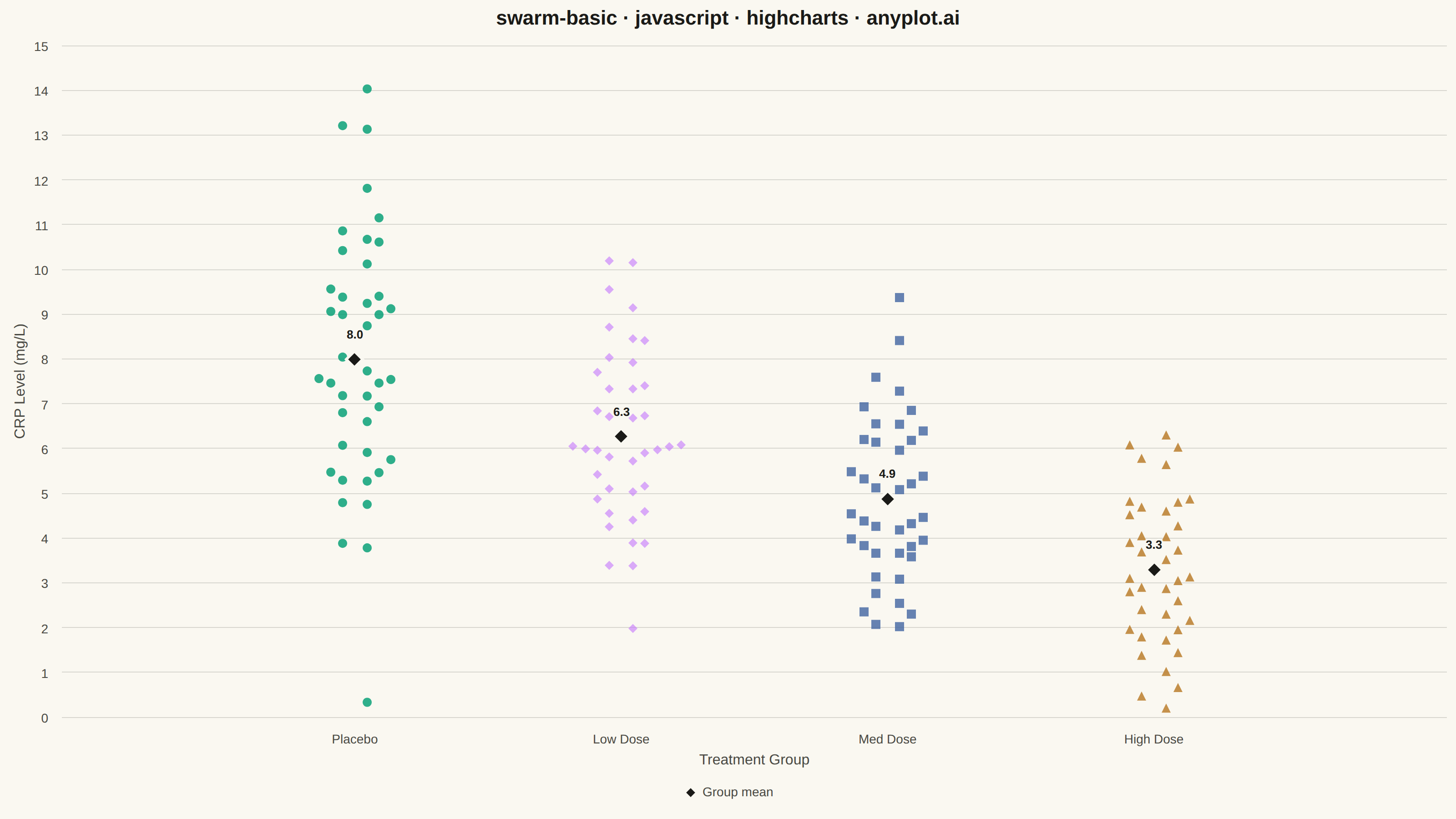
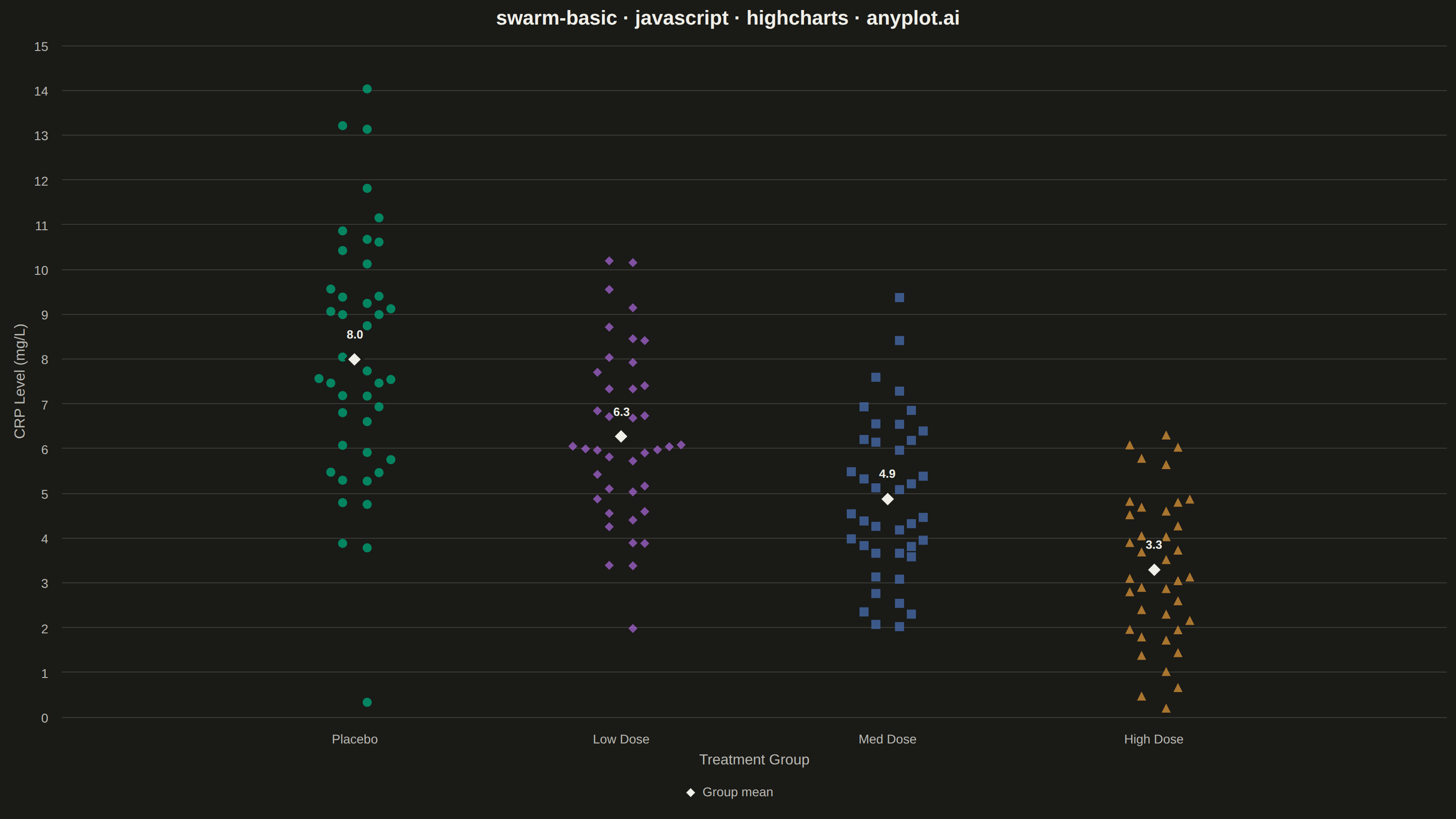
A swarm plot (beeswarm plot) displays individual data points for categorical comparisons, with points spread horizontally to avoid overlap. This reveals the full distribution shape and density while preserving exact values - combining the benefits of strip plots (individual points) and violin plots (density visualization). Ideal when you need to see every observation rather than just summary statistics.
// anyplot.ai
// swarm-basic: Basic Swarm Plot
// Library: highcharts 12.6.0 | JavaScript 22.23.1
// Quality: 91/100 | Created: 2026-07-26

const t = window.ANYPLOT_TOKENS;

// --- Deterministic PRNG (mulberry32) + Box-Muller normal -------------------
function mulberry32(seed) {
  return function () {
    seed |= 0;
    seed = (seed + 0x6d2b79f5) | 0;
    let x = Math.imul(seed ^ (seed >>> 15), 1 | seed);
    x = (x + Math.imul(x ^ (x >>> 7), 61 | x)) ^ x;
    return ((x ^ (x >>> 14)) >>> 0) / 4294967296;
  };
}

const rand = mulberry32(42);
function randNormal(mean, sd) {
  const u1 = Math.max(rand(), 1e-9);
  const u2 = rand();
  const z = Math.sqrt(-2 * Math.log(u1)) * Math.cos(2 * Math.PI * u2);
  return mean + z * sd;
}

// --- Data: CRP biomarker levels (mg/L) across treatment groups -------------
const groups = [
  { name: "Placebo", mean: 8.2, sd: 2.4, n: 42 },
  { name: "Low Dose", mean: 6.5, sd: 2.1, n: 40 },
  { name: "Med Dose", mean: 4.8, sd: 1.9, n: 40 },
  { name: "High Dose", mean: 3.1, sd: 1.6, n: 38 },
];
const categories = groups.map((g) => g.name);

groups.forEach((g) => {
  g.values = Array.from({ length: g.n }, () => Math.max(0.2, randNormal(g.mean, g.sd)));
  g.sampleMean = g.values.reduce((a, b) => a + b, 0) / g.values.length;
});

// --- Beeswarm layout: bin points by value, fan them out from center-out ----
// Also reports the densest bin size so denser groups can render more
// transparent, easing within-bin overlap where points stack up the most.
function beeswarmOffsets(values, binWidth, gap) {
  const order = values.map((v, i) => i).sort((a, b) => values[a] - values[b]);
  const offsets = new Array(values.length).fill(0);
  let bin = [];
  let binStart = null;
  let maxBinSize = 0;

  const flushBin = () => {
    maxBinSize = Math.max(maxBinSize, bin.length);
    bin.forEach((idx, k) => {
      const side = k % 2 === 0 ? 1 : -1;
      const rank = Math.ceil((k + 1) / 2);
      offsets[idx] = side * rank * gap;
    });
    bin = [];
  };

  order.forEach((i) => {
    const v = values[i];
    if (binStart === null || v - binStart > binWidth) {
      flushBin();
      binStart = v;
    }
    bin.push(i);
  });
  flushBin();

  return { offsets, maxBinSize };
}

const BIN_WIDTH = 0.5; // mg/L — points within this range share a swarm bin
const SWARM_GAP = 0.045; // category-axis units between adjacent swarm points

groups.forEach((g, i) => {
  const { offsets, maxBinSize } = beeswarmOffsets(g.values, BIN_WIDTH, SWARM_GAP);
  g.points = g.values.map((v, k) => ({ x: i + offsets[k], y: Number(v.toFixed(2)) }));
  g.maxBinSize = maxBinSize;
});

// Denser groups (bigger densest-bin stacks) render more transparent so
// overlapping points stay individually readable; sparser groups stay opaque.
const densestBin = Math.max(...groups.map((g) => g.maxBinSize));
const sparsestBin = Math.min(...groups.map((g) => g.maxBinSize));
const binRange = densestBin - sparsestBin || 1;
groups.forEach((g) => {
  const density = (g.maxBinSize - sparsestBin) / binRange;
  g.opacity = 0.88 - density * 0.28; // 0.88 (sparsest) down to 0.60 (densest)
});

// --- Chart -------------------------------------------------------------------
Highcharts.chart("container", {
  chart: {
    type: "scatter",
    backgroundColor: "transparent",
    animation: false,
    style: { fontFamily: "inherit" },
  },
  credits: { enabled: false },
  colors: t.palette,
  title: {
    text: "swarm-basic · javascript · highcharts · anyplot.ai",
    style: { color: t.ink, fontSize: "22px", fontWeight: "600" },
  },
  xAxis: {
    categories,
    min: -0.6,
    max: categories.length - 1 + 0.6,
    tickPositions: categories.map((_, i) => i),
    lineWidth: 0,
    tickColor: t.inkSoft,
    gridLineWidth: 0,
    labels: { style: { color: t.inkSoft, fontSize: "14px" } },
    title: { text: "Treatment Group", style: { color: t.inkSoft, fontSize: "16px" } },
  },
  yAxis: {
    title: { text: "CRP Level (mg/L)", style: { color: t.inkSoft, fontSize: "16px" } },
    lineWidth: 0,
    gridLineColor: t.grid,
    labels: { style: { color: t.inkSoft, fontSize: "14px" } },
  },
  legend: {
    itemStyle: { color: t.inkSoft, fontSize: "14px" },
    itemHoverStyle: { color: t.ink },
  },
  plotOptions: {
    series: { animation: false },
    scatter: { marker: { radius: 5, lineWidth: 0 } },
  },
  series: [
    ...groups.map((g, i) => ({
      name: g.name,
      type: "scatter",
      color: t.palette[i],
      data: g.points,
      opacity: g.opacity,
      showInLegend: false,
    })),
    {
      name: "Group mean",
      type: "scatter",
      color: t.ink,
      zIndex: 5,
      data: groups.map((g, i) => ({ x: i, y: Number(g.sampleMean.toFixed(2)) })),
      marker: { symbol: "diamond", radius: 9, lineColor: t.pageBg, lineWidth: 3 },
      dataLabels: {
        enabled: true,
        format: "{point.y:.1f}",
        y: -16,
        style: {
          color: t.ink,
          fontSize: "13px",
          fontWeight: "600",
          textOutline: "2px " + t.pageBg,
        },
      },
      showInLegend: true,
    },
  ],
});
Runnable source as JSON, for any HTTP client: https://api.anyplot.ai/specs/swarm-basic/highcharts/code. Any spec id and library id listed in llms-full.txt fit the same URL shape; every URL below is complete and callable.
{
  "spec_id": "swarm-basic",
  "language": "javascript",
  "library": "highcharts",
  "page": "https://anyplot.ai/swarm-basic/javascript/highcharts",
  "hub": "https://anyplot.ai/swarm-basic",
  "code_json": "https://api.anyplot.ai/specs/swarm-basic/highcharts/code",
  "spec_json": "https://api.anyplot.ai/specs/swarm-basic",
  "render_light_png": "https://storage.googleapis.com/anyplot-images/plots/swarm-basic/javascript/highcharts/plot-light.png",
  "render_dark_png": "https://storage.googleapis.com/anyplot-images/plots/swarm-basic/javascript/highcharts/plot-dark.png",
  "interactive_light_html": "https://storage.googleapis.com/anyplot-images/plots/swarm-basic/javascript/highcharts/plot-light.html",
  "interactive_dark_html": "https://storage.googleapis.com/anyplot-images/plots/swarm-basic/javascript/highcharts/plot-dark.html",
  "quality_score": 91.0,
  "license": "MIT",
  "guide": "https://anyplot.ai/llms.txt"
}
Part of Basic Swarm Plot on anyplot.ai.