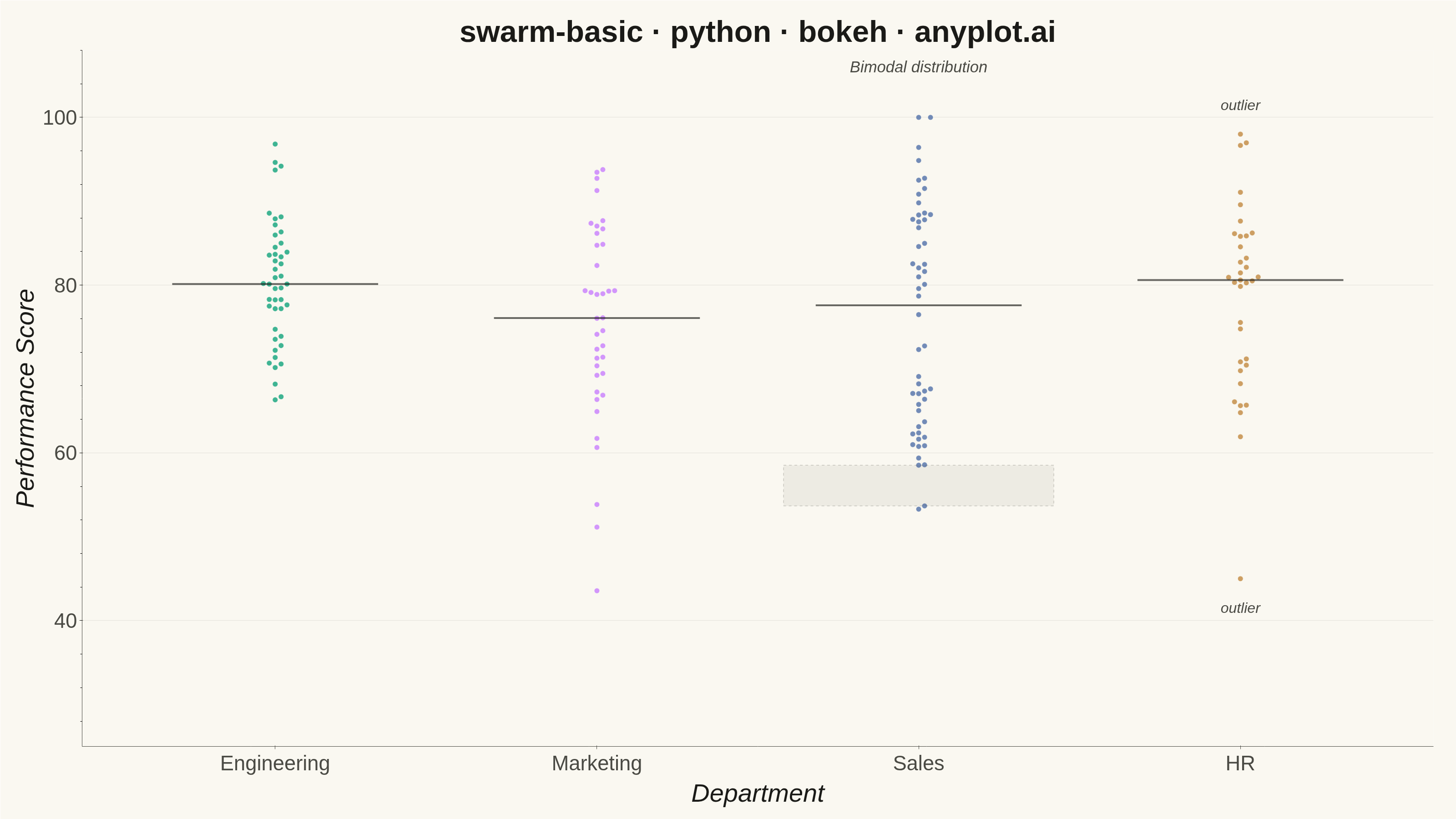
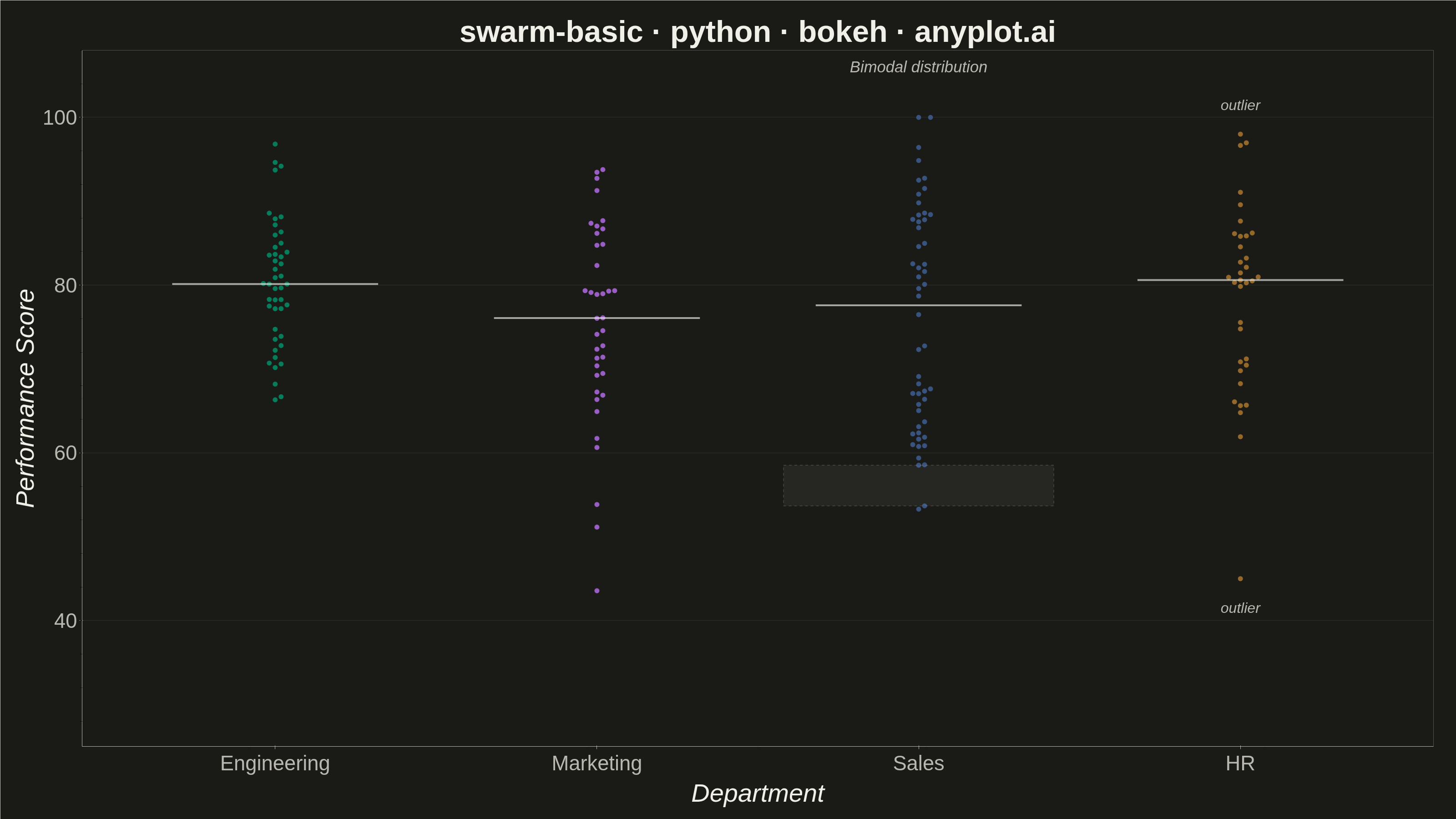
A swarm plot (beeswarm plot) displays individual data points for categorical comparisons, with points spread horizontally to avoid overlap. This reveals the full distribution shape and density while preserving exact values - combining the benefits of strip plots (individual points) and violin plots (density visualization). Ideal when you need to see every observation rather than just summary statistics.
""" anyplot.ai
swarm-basic: Basic Swarm Plot
Library: bokeh 3.9.2 | Python 3.13.14
Quality: 94/100 | Updated: 2026-07-26
"""

import os
import time
from pathlib import Path

import numpy as np
from bokeh.io import output_file, save
from bokeh.models import BoxAnnotation, ColumnDataSource, HoverTool, Label
from bokeh.plotting import figure
from selenium import webdriver
from selenium.webdriver.chrome.options import Options


# Theme tokens
THEME = os.getenv("ANYPLOT_THEME", "light")
PAGE_BG = "#FAF8F1" if THEME == "light" else "#1A1A17"
INK = "#1A1A17" if THEME == "light" else "#F0EFE8"
INK_SOFT = "#4A4A44" if THEME == "light" else "#B8B7B0"

# Imprint palette — first series always #009E73
IMPRINT = ["#009E73", "#C475FD", "#4467A3", "#BD8233"]

# Data — employee performance scores by department
np.random.seed(42)

departments = ["Engineering", "Marketing", "Sales", "HR"]
n_per_group = [45, 38, 52, 35]

categories = []
values = []

for dept, n in zip(departments, n_per_group, strict=False):
    categories.extend([dept] * n)
    if dept == "Engineering":
        scores = np.random.normal(82, 8, n)
    elif dept == "Marketing":
        scores = np.random.normal(75, 12, n)
    elif dept == "Sales":
        scores = np.concatenate([np.random.normal(65, 8, n // 2), np.random.normal(88, 6, n - n // 2)])
    else:  # HR
        scores = np.random.normal(78, 10, n)
        scores[0] = 45
        scores[1] = 98
    values.extend(np.clip(scores, 30, 100))

values = np.array(values)
categories = np.array(categories)

# Canvas geometry (must match the figure() call below) - used to convert
# the swarm dodge into real screen-pixel distances.
CANVAS_W, CANVAS_H = 3200, 1800
BORDER_L, BORDER_R, BORDER_T, BORDER_B = 180, 50, 110, 160
X_RANGE = (-0.6, len(departments) - 0.4)
Y_RANGE = (25, 108)
PX_PER_X = (CANVAS_W - BORDER_L - BORDER_R) / (X_RANGE[1] - X_RANGE[0])
PX_PER_Y = (CANVAS_H - BORDER_T - BORDER_B) / (Y_RANGE[1] - Y_RANGE[0])

MARKER_SIZE = 12
MIN_GAP_PX = MARKER_SIZE + 1  # marker diameter + a hairline so edges never touch
MAX_OFFSET = 0.42  # stays clear of the neighboring category's column


def swarm_dodge(dept_values, px_per_x, px_per_y, min_gap_px, max_offset):
    """Greedy incremental beeswarm: points are placed lowest-to-highest value,
    and each one claims the offset closest to zero whose pixel-space distance
    clears every already-placed point in the category. Unlike a density-window
    heuristic with a hard cap, this checks against ALL prior points, so no two
    points ever end up within one marker-width of each other."""
    order = np.argsort(dept_values)
    offsets = np.zeros(len(dept_values))
    placed = []  # (offset, value) of points already positioned
    step = min_gap_px / px_per_x

    for idx in order:
        y = dept_values[idx]
        k = 0
        chosen = None
        while chosen is None:
            candidates = [0.0] if k == 0 else [k * step, -k * step]
            for c in candidates:
                if abs(c) > max_offset:
                    continue
                if all((c - ox) ** 2 * px_per_x**2 + (y - oy) ** 2 * px_per_y**2 >= min_gap_px**2 for ox, oy in placed):
                    chosen = c
                    break
            if chosen is None:
                k += 1
                if k * step > max_offset:
                    # Column is denser than min_gap_px allows within max_offset -
                    # fall back to the farthest allowed offset, alternating sides.
                    chosen = max_offset if len(placed) % 2 == 0 else -max_offset
        offsets[idx] = chosen
        placed.append((chosen, y))
    return offsets


x_jitter = np.zeros(len(values))
for dept in departments:
    mask = categories == dept
    x_jitter[mask] = swarm_dodge(values[mask], PX_PER_X, PX_PER_Y, MIN_GAP_PX, MAX_OFFSET)

x_positions = np.array([departments.index(cat) + x_jitter[i] for i, cat in enumerate(categories)])

color_map = {dept: IMPRINT[i] for i, dept in enumerate(departments)}
colors = [color_map[cat] for cat in categories]

# Plot
source = ColumnDataSource(data={"x": x_positions, "y": values, "category": categories, "color": colors})

hover = HoverTool(tooltips=[("Department", "@category"), ("Score", "@y{0.0}")])

p = figure(
    width=CANVAS_W,
    height=CANVAS_H,
    title="swarm-basic · python · bokeh · anyplot.ai",
    x_axis_label="Department",
    y_axis_label="Performance Score",
    x_range=X_RANGE,
    y_range=Y_RANGE,
    tools=[hover],
    toolbar_location=None,
    min_border_bottom=BORDER_B,
    min_border_left=BORDER_L,
    min_border_top=BORDER_T,
    min_border_right=BORDER_R,
)

p.scatter(x="x", y="y", source=source, size=MARKER_SIZE, color="color", alpha=0.75, line_color=PAGE_BG, line_width=1.2)

# Median markers for each category
for i, dept in enumerate(departments):
    mask = categories == dept
    median_val = np.median(values[mask])
    p.line(x=[i - 0.32, i + 0.32], y=[median_val, median_val], line_width=4, line_color=INK, line_alpha=0.65)

# Data-storytelling callouts: highlight the bimodal Sales distribution (found
# via the largest gap between sorted values, not a hardcoded threshold) and
# label the two HR outliers - the most visually interesting features in the
# dataset. BoxAnnotation is a bokeh-distinctive annotation, not a generic
# scatter/hover feature every interactive library shares.
sales_idx = departments.index("Sales")
sales_sorted = np.sort(values[categories == "Sales"])
split = np.argmax(np.diff(sales_sorted))
gap_bottom, gap_top = sales_sorted[split], sales_sorted[split + 1]
p.add_layout(
    BoxAnnotation(
        left=sales_idx - 0.42,
        right=sales_idx + 0.42,
        bottom=gap_bottom,
        top=gap_top,
        fill_color=INK,
        fill_alpha=0.06,
        line_color=INK_SOFT,
        line_alpha=0.4,
        line_dash="dashed",
    )
)
p.add_layout(
    Label(
        x=sales_idx,
        y=105,
        text="Bimodal distribution",
        text_align="center",
        text_font_size="26pt",
        text_font_style="italic",
        text_color=INK_SOFT,
    )
)

hr_idx = departments.index("HR")
hr_values = values[categories == "HR"]
lo_val, hi_val = hr_values.min(), hr_values.max()
p.add_layout(
    Label(
        x=hr_idx,
        y=hi_val + 2.5,
        text="outlier",
        text_align="center",
        text_baseline="bottom",
        text_font_size="24pt",
        text_font_style="italic",
        text_color=INK_SOFT,
    )
)
p.add_layout(
    Label(
        x=hr_idx,
        y=lo_val - 2.5,
        text="outlier",
        text_align="center",
        text_baseline="top",
        text_font_size="24pt",
        text_font_style="italic",
        text_color=INK_SOFT,
    )
)

# X-axis category labels
p.xaxis.ticker = list(range(len(departments)))
p.xaxis.major_label_overrides = dict(enumerate(departments))

# Style — theme-adaptive chrome
p.background_fill_color = PAGE_BG
p.border_fill_color = PAGE_BG
p.outline_line_color = None

p.title.text_color = INK
p.title.text_font_size = "50pt"
p.title.align = "center"

p.xaxis.axis_label_text_color = INK
p.yaxis.axis_label_text_color = INK
p.xaxis.axis_label_text_font_size = "42pt"
p.yaxis.axis_label_text_font_size = "42pt"

p.xaxis.major_label_text_color = INK_SOFT
p.yaxis.major_label_text_color = INK_SOFT
p.xaxis.major_label_text_font_size = "34pt"
p.yaxis.major_label_text_font_size = "34pt"

p.xaxis.axis_line_color = INK_SOFT
p.yaxis.axis_line_color = INK_SOFT
p.xaxis.major_tick_line_color = INK_SOFT
p.yaxis.major_tick_line_color = INK_SOFT

p.xgrid.visible = False
p.ygrid.grid_line_color = INK
p.ygrid.grid_line_alpha = 0.10

# Save HTML
output_file(f"plot-{THEME}.html")
save(p)

# Screenshot with headless Chrome (Selenium 4 / Selenium Manager)
W, H = CANVAS_W, CANVAS_H
opts = Options()
for arg in (
    "--headless=new",
    "--no-sandbox",
    "--disable-dev-shm-usage",
    "--disable-gpu",
    f"--window-size={W},{H}",
    "--hide-scrollbars",
):
    opts.add_argument(arg)
driver = webdriver.Chrome(options=opts)
driver.set_window_size(W, H)
driver.get(f"file://{Path(f'plot-{THEME}.html').resolve()}")
# Pin viewport exactly via CDP — headless --window-size still reserves a
# phantom title-bar height, which would otherwise shrink the screenshot below H.
driver.execute_cdp_cmd(
    "Emulation.setDeviceMetricsOverride", {"width": W, "height": H, "deviceScaleFactor": 1, "mobile": False}
)
time.sleep(3)
driver.save_screenshot(f"plot-{THEME}.png")
driver.quit()
Runnable source as JSON, for any HTTP client: https://api.anyplot.ai/specs/swarm-basic/bokeh/code. Any spec id and library id listed in llms-full.txt fit the same URL shape; every URL below is complete and callable.
{
  "spec_id": "swarm-basic",
  "language": "python",
  "library": "bokeh",
  "page": "https://anyplot.ai/swarm-basic/python/bokeh",
  "hub": "https://anyplot.ai/swarm-basic",
  "code_json": "https://api.anyplot.ai/specs/swarm-basic/bokeh/code",
  "spec_json": "https://api.anyplot.ai/specs/swarm-basic",
  "render_light_png": "https://storage.googleapis.com/anyplot-images/plots/swarm-basic/python/bokeh/plot-light.png",
  "render_dark_png": "https://storage.googleapis.com/anyplot-images/plots/swarm-basic/python/bokeh/plot-dark.png",
  "interactive_light_html": "https://storage.googleapis.com/anyplot-images/plots/swarm-basic/python/bokeh/plot-light.html",
  "interactive_dark_html": "https://storage.googleapis.com/anyplot-images/plots/swarm-basic/python/bokeh/plot-dark.html",
  "quality_score": 94.0,
  "license": "MIT",
  "guide": "https://anyplot.ai/llms.txt"
}
Part of Basic Swarm Plot on anyplot.ai.