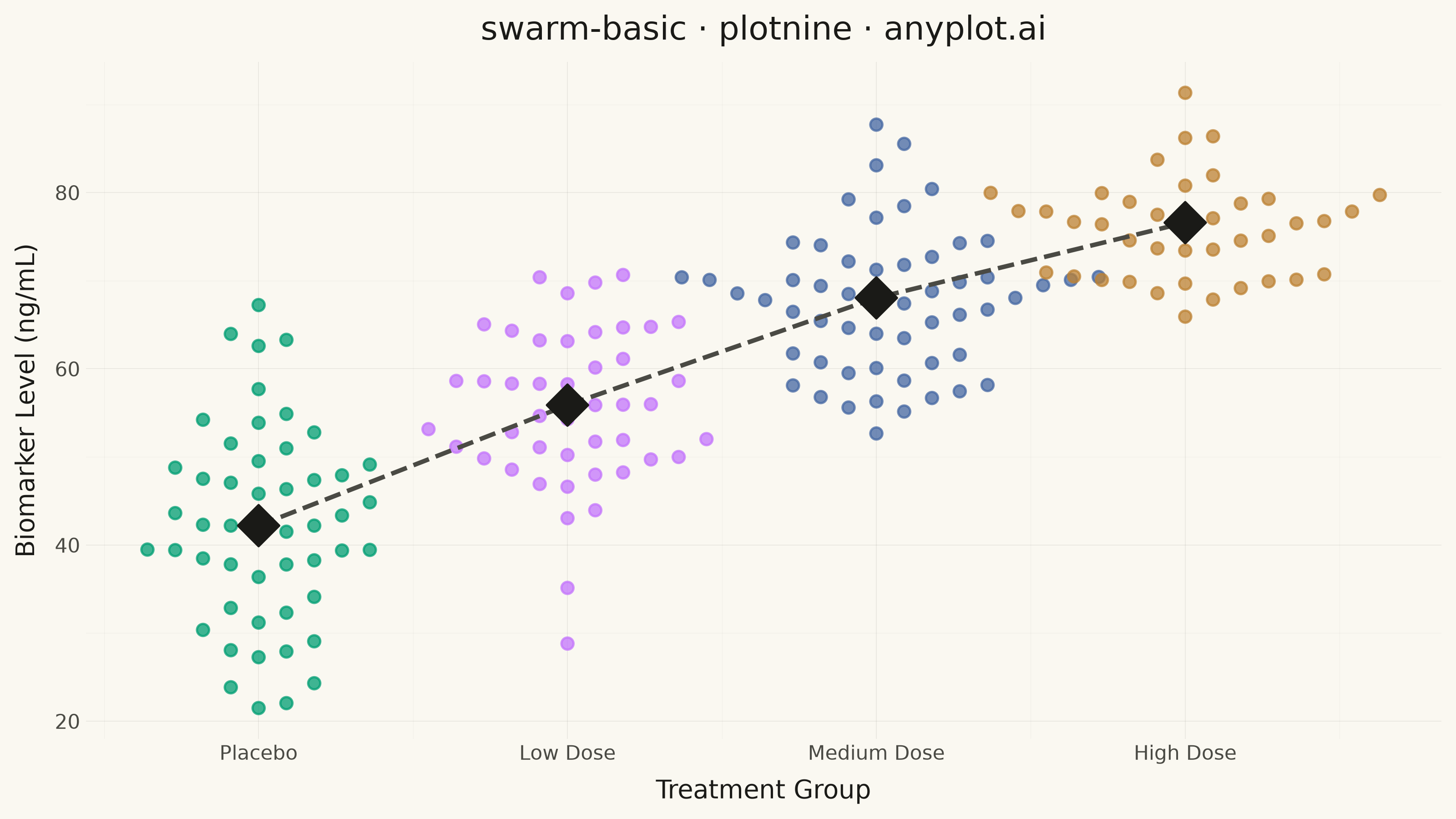
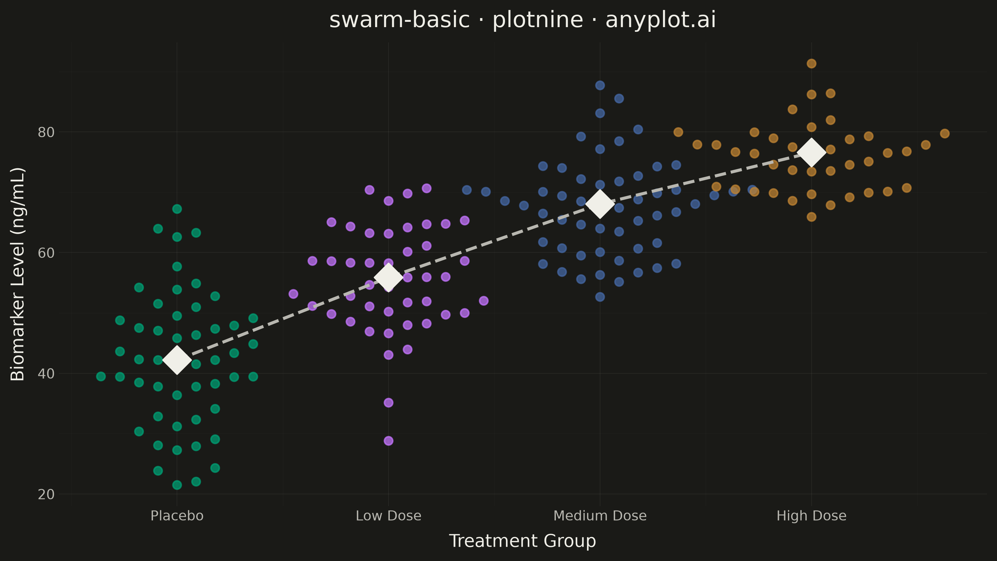
A swarm plot (beeswarm plot) displays individual data points for categorical comparisons, with points spread horizontally to avoid overlap. This reveals the full distribution shape and density while preserving exact values - combining the benefits of strip plots (individual points) and violin plots (density visualization). Ideal when you need to see every observation rather than just summary statistics.
""" anyplot.ai
swarm-basic: Basic Swarm Plot
Library: plotnine 0.15.7 | Python 3.13.14
Quality: 89/100 | Updated: 2026-07-26
"""

import sys


sys.path.pop(0)  # prevent this file from shadowing the installed plotnine package

import os

import numpy as np
import pandas as pd
from plotnine import (
    aes,
    element_blank,
    element_line,
    element_rect,
    element_text,
    geom_line,
    geom_point,
    ggplot,
    labs,
    scale_color_manual,
    scale_x_continuous,
    theme,
    theme_minimal,
)


THEME = os.getenv("ANYPLOT_THEME", "light")
PAGE_BG = "#FAF8F1" if THEME == "light" else "#1A1A17"
INK = "#1A1A17" if THEME == "light" else "#F0EFE8"
INK_SOFT = "#4A4A44" if THEME == "light" else "#B8B7B0"
IMPRINT = ["#009E73", "#C475FD", "#4467A3", "#BD8233"]

# Data - Patient biomarker levels across treatment groups
np.random.seed(42)

treatment_groups = ["Placebo", "Low Dose", "Medium Dose", "High Dose"]

distributions = {
    "Placebo": {"mean": 45, "std": 12, "n": 50},
    "Low Dose": {"mean": 55, "std": 10, "n": 45},
    "Medium Dose": {"mean": 68, "std": 8, "n": 55},
    "High Dose": {"mean": 75, "std": 6, "n": 40},
}

data = []
for group, params in distributions.items():
    values = np.random.normal(params["mean"], params["std"], params["n"])
    values = np.clip(values, 20, 100)
    data.extend([(group, value) for value in values])

df = pd.DataFrame(data, columns=["treatment", "biomarker"])
df["treatment"] = pd.Categorical(df["treatment"], categories=treatment_groups, ordered=True)
df["x_num"] = df["treatment"].cat.codes.astype(float)


# Deterministic beeswarm packing: sweep points in ascending value order and
# place each one in the nearest-to-center offset slot (alternating sides)
# whose most recent occupant already cleared a minimum vertical gap — a slot
# only frees up once its last point is far enough below the new one, so
# offsets keep growing in dense stretches instead of every sparse column
# resetting back to center and stacking near-concentrically with its neighbor.
# min_gap is fixed to the shared y-axis scale (not each group's own spread)
# since the marker's on-canvas footprint is the same regardless of group.
def beeswarm_offsets(values, min_gap, spacing=0.09):
    offsets = np.zeros(len(values))
    slot_last_y = {}  # offset slot (int) -> value of the last point placed there
    for idx in np.argsort(values):
        y = values[idx]
        step = 0
        while True:
            for slot in (0,) if step == 0 else (step, -step):
                last_y = slot_last_y.get(slot)
                if last_y is None or y - last_y >= min_gap:
                    offsets[idx] = slot * spacing
                    slot_last_y[slot] = y
                    step = None
                    break
            if step is None:
                break
            step += 1
    return offsets


swarm_min_gap = (df["biomarker"].max() - df["biomarker"].min()) * 0.05
for group in treatment_groups:
    mask = df["treatment"] == group
    df.loc[mask, "x_num"] += beeswarm_offsets(df.loc[mask, "biomarker"].to_numpy(), swarm_min_gap)

medians_df = df.groupby("treatment", observed=True)["biomarker"].median().reset_index()
medians_df["x_num"] = medians_df["treatment"].cat.codes.astype(float)

# Plot
plot = (
    ggplot(df, aes(x="x_num", y="biomarker", color="treatment"))
    + geom_point(size=2.2, alpha=0.75)
    + geom_line(
        medians_df,
        aes(x="x_num", y="biomarker", group=1),
        linetype="dashed",
        color=INK_SOFT,
        size=1.0,
        inherit_aes=False,
    )
    + geom_point(medians_df, aes(x="x_num", y="biomarker"), size=6, shape="D", color=INK, inherit_aes=False)
    + scale_color_manual(values=IMPRINT)
    + scale_x_continuous(breaks=list(range(len(treatment_groups))), labels=treatment_groups)
    + labs(x="Treatment Group", y="Biomarker Level (ng/mL)", title="swarm-basic · plotnine · anyplot.ai")
    + theme_minimal()
    + theme(
        figure_size=(8, 4.5),
        text=element_text(size=7),
        plot_background=element_rect(fill=PAGE_BG, color=PAGE_BG),
        panel_background=element_rect(fill=PAGE_BG),
        panel_border=element_blank(),
        panel_grid_major=element_line(color=INK, size=0.3, alpha=0.08),
        panel_grid_minor=element_line(color=INK, size=0.2, alpha=0.04),
        axis_ticks_major=element_blank(),
        axis_title=element_text(color=INK, size=10),
        axis_text=element_text(color=INK_SOFT, size=8),
        plot_title=element_text(color=INK, size=13),
        legend_position="none",
    )
)

# Save
plot.save(f"plot-{THEME}.png", dpi=400, width=8, height=4.5, units="in")
Runnable source as JSON, for any HTTP client: https://api.anyplot.ai/specs/swarm-basic/plotnine/code. Any spec id and library id listed in llms-full.txt fit the same URL shape; every URL below is complete and callable.
{
  "spec_id": "swarm-basic",
  "language": "python",
  "library": "plotnine",
  "page": "https://anyplot.ai/swarm-basic/python/plotnine",
  "hub": "https://anyplot.ai/swarm-basic",
  "code_json": "https://api.anyplot.ai/specs/swarm-basic/plotnine/code",
  "spec_json": "https://api.anyplot.ai/specs/swarm-basic",
  "render_light_png": "https://storage.googleapis.com/anyplot-images/plots/swarm-basic/python/plotnine/plot-light.png",
  "render_dark_png": "https://storage.googleapis.com/anyplot-images/plots/swarm-basic/python/plotnine/plot-dark.png",
  "quality_score": 89.0,
  "license": "MIT",
  "guide": "https://anyplot.ai/llms.txt"
}
Part of Basic Swarm Plot on anyplot.ai.