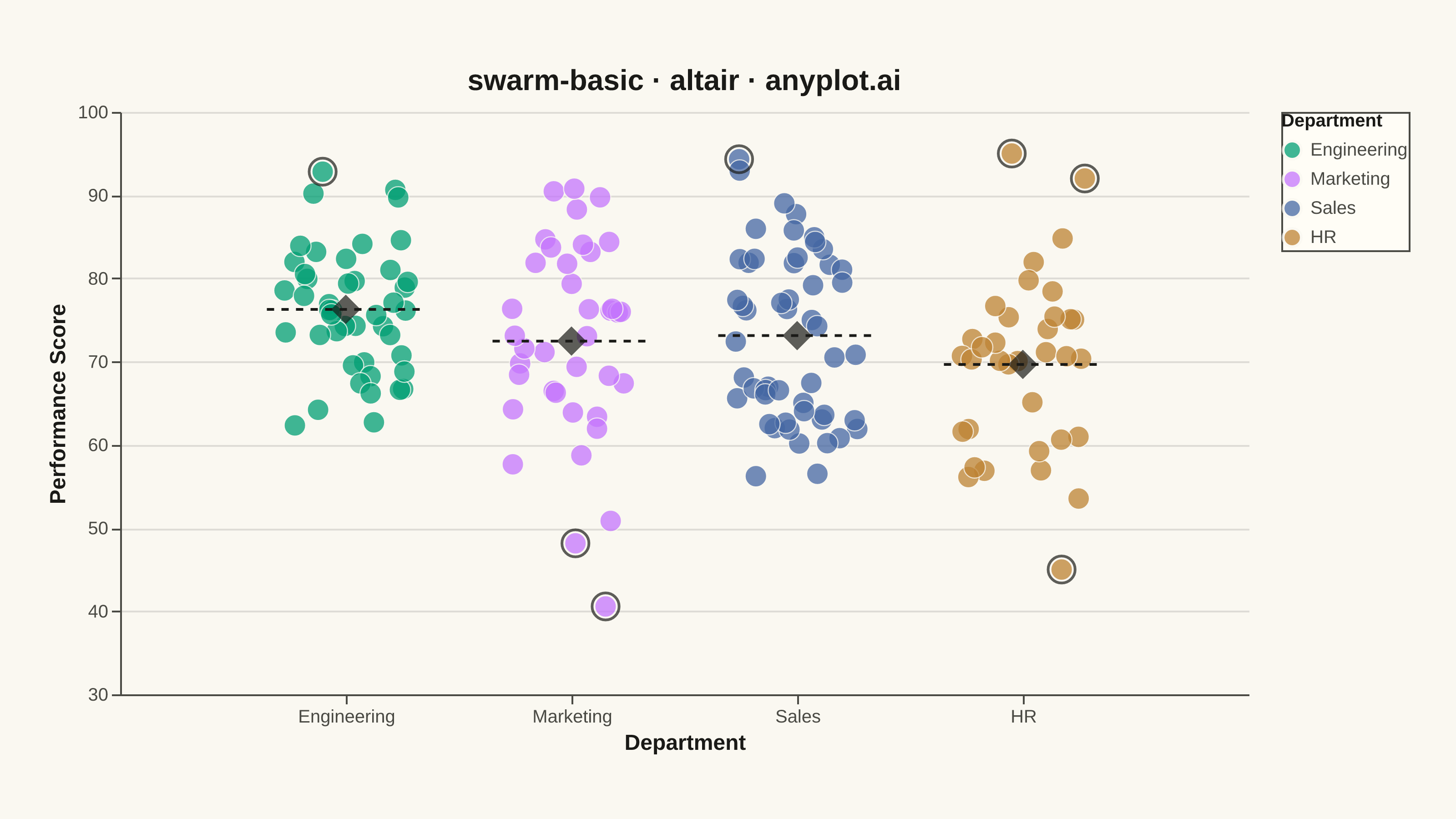
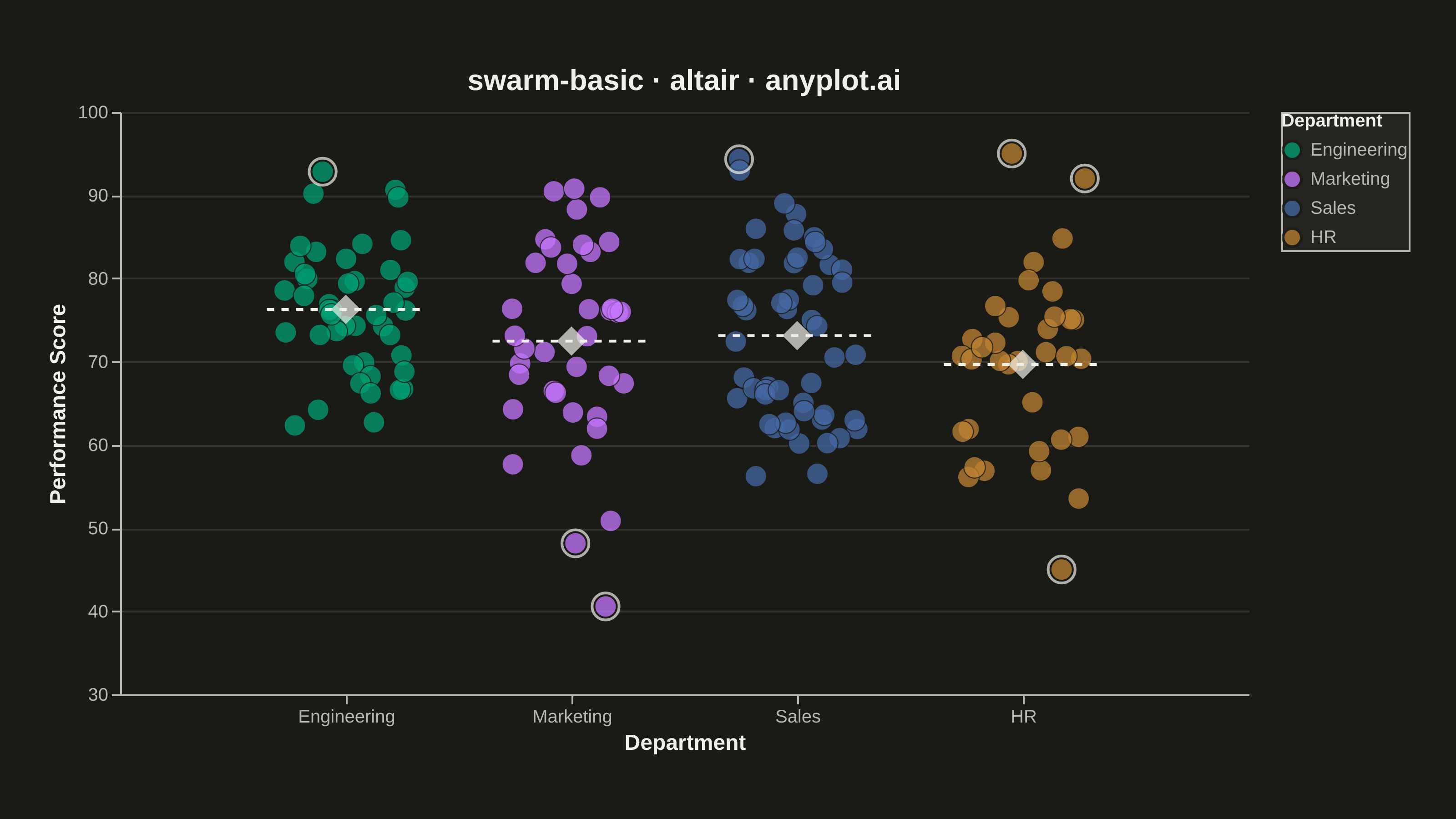
A swarm plot (beeswarm plot) displays individual data points for categorical comparisons, with points spread horizontally to avoid overlap. This reveals the full distribution shape and density while preserving exact values - combining the benefits of strip plots (individual points) and violin plots (density visualization). Ideal when you need to see every observation rather than just summary statistics.
""" anyplot.ai
swarm-basic: Basic Swarm Plot
Library: altair 6.2.2 | Python 3.13.14
Quality: 90/100 | Updated: 2026-07-26
"""

import os

import altair as alt
import numpy as np
import pandas as pd
from PIL import Image


# Theme tokens
THEME = os.getenv("ANYPLOT_THEME", "light")
PAGE_BG = "#FAF8F1" if THEME == "light" else "#1A1A17"
ELEVATED_BG = "#FFFDF6" if THEME == "light" else "#242420"
INK = "#1A1A17" if THEME == "light" else "#F0EFE8"
INK_SOFT = "#4A4A44" if THEME == "light" else "#B8B7B0"

IMPRINT = ["#009E73", "#C475FD", "#4467A3", "#BD8233"]

# Data - Employee performance scores across departments
np.random.seed(42)

departments = ["Engineering", "Marketing", "Sales", "HR"]
n_per_dept = [45, 38, 52, 35]

data = []
for dept, n in zip(departments, n_per_dept, strict=True):
    if dept == "Engineering":
        scores = np.random.normal(78, 8, n)
    elif dept == "Marketing":
        scores = np.random.normal(72, 12, n)
    elif dept == "Sales":
        scores = np.concatenate([np.random.normal(65, 6, n // 2), np.random.normal(82, 5, n - n // 2)])
    else:  # HR
        scores = np.concatenate([np.random.normal(68, 9, n - 3), np.array([45, 92, 95])])
    scores = np.clip(scores, 30, 100)
    for score in scores:
        data.append({"Department": dept, "Performance Score": score})

df = pd.DataFrame(data)

# Numeric x position per department, with jitter drawn from the same seeded
# generator as the scores above — deterministic across renders, unlike
# Vega-Lite's in-chart random() which reseeds on every render.
dept_positions = {dept: i for i, dept in enumerate(departments)}
df["x_pos"] = df["Department"].map(dept_positions)
df["x_jitter"] = df["x_pos"] + np.random.uniform(-0.28, 0.28, len(df))

# Calculate means
means = df.groupby("Department")["Performance Score"].mean().reset_index()
means["x_pos"] = means["Department"].map(dept_positions)

# Flag outliers (>2 std from the department mean) for a hierarchy-emphasis layer
df["dept_mean"] = df["Department"].map(means.set_index("Department")["Performance Score"])
df["dept_std"] = df["Department"].map(df.groupby("Department")["Performance Score"].std())
outliers = df[(df["Performance Score"] - df["dept_mean"]).abs() > 2 * df["dept_std"]]

# Swarm points — jitter precomputed in pandas (see above) for reproducibility.
# A thin background-matching stroke cuts a halo around each circle so dense
# clusters (Sales, Engineering) stay individually distinguishable.
swarm = (
    alt.Chart(df)
    .mark_circle(size=140, opacity=0.75, stroke=PAGE_BG, strokeWidth=0.6)
    .encode(
        x=alt.X(
            "x_jitter:Q",
            scale=alt.Scale(domain=[-0.65, 3.65]),
            axis=alt.Axis(
                values=list(range(4)),
                labelExpr="['Engineering', 'Marketing', 'Sales', 'HR'][datum.value]",
                title="Department",
                grid=False,
                labelAngle=0,
            ),
        ),
        y=alt.Y("Performance Score:Q", scale=alt.Scale(domain=[30, 100])),
        color=alt.Color(
            "Department:N", scale=alt.Scale(domain=departments, range=IMPRINT), legend=alt.Legend(orient="right")
        ),
        tooltip=["Department", "Performance Score"],
    )
)

# Mean diamond markers (theme-adaptive color)
mean_markers = (
    alt.Chart(means)
    .mark_point(shape="diamond", size=260, filled=True, color=INK, strokeWidth=1.5)
    .encode(
        x="x_pos:Q",
        y="Performance Score:Q",
        tooltip=[alt.Tooltip("Department"), alt.Tooltip("Performance Score:Q", title="Mean", format=".1f")],
    )
)

# Mean reference lines (theme-adaptive color)
mean_lines = (
    alt.Chart(means)
    .mark_rule(color=INK, strokeWidth=1.5, strokeDash=[4, 4])
    .encode(x=alt.X("x_start:Q"), x2="x_end:Q", y="Performance Score:Q")
    .transform_calculate(x_start="datum.x_pos - 0.35", x_end="datum.x_pos + 0.35")
)

# Outlier rings — unfilled ink-stroke circles emphasize the notable
# out-of-band observations (e.g. the HR 45/92/95 points) as a hierarchy cue
outlier_rings = (
    alt.Chart(outliers)
    .mark_point(shape="circle", size=220, filled=False, stroke=INK, strokeWidth=1.5)
    .encode(x="x_jitter:Q", y="Performance Score:Q")
)

# Compose and apply theme-adaptive chrome
chart = (
    (swarm + mean_lines + outlier_rings + mean_markers)
    .properties(
        width=620,
        height=320,
        background=PAGE_BG,
        title=alt.Title("swarm-basic · altair · anyplot.ai", fontSize=16, anchor="middle"),
    )
    .configure_axis(
        domainColor=INK_SOFT,
        tickColor=INK_SOFT,
        gridColor=INK,
        gridOpacity=0.12,
        labelColor=INK_SOFT,
        titleColor=INK,
        labelFontSize=10,
        titleFontSize=12,
    )
    .configure_view(fill=PAGE_BG, stroke=None)
    .configure_title(color=INK)
    .configure_legend(
        fillColor=ELEVATED_BG,
        strokeColor=INK_SOFT,
        labelColor=INK_SOFT,
        titleColor=INK,
        labelFontSize=10,
        titleFontSize=10,
    )
)

# Save — hard target 3200x1800 (landscape). vl-convert pads the small inner
# view with title/axis/legend extents, then we pad-only to the exact target.
chart.save(f"plot-{THEME}.png", scale_factor=4.0)

TW, TH = 3200, 1800
_img = Image.open(f"plot-{THEME}.png").convert("RGB")
_w, _h = _img.size
if _w > TW or _h > TH:
    raise SystemExit(f"altair vl-convert produced {_w}x{_h}, exceeds target {TW}x{TH}. Shrink chart dims.")
if _w < TW or _h < TH:
    _canvas = Image.new("RGB", (TW, TH), PAGE_BG)
    _canvas.paste(_img, ((TW - _w) // 2, (TH - _h) // 2))
    _canvas.save(f"plot-{THEME}.png")

chart.save(f"plot-{THEME}.html")
Runnable source as JSON, for any HTTP client: https://api.anyplot.ai/specs/swarm-basic/altair/code. Any spec id and library id listed in llms-full.txt fit the same URL shape; every URL below is complete and callable.
{
  "spec_id": "swarm-basic",
  "language": "python",
  "library": "altair",
  "page": "https://anyplot.ai/swarm-basic/python/altair",
  "hub": "https://anyplot.ai/swarm-basic",
  "code_json": "https://api.anyplot.ai/specs/swarm-basic/altair/code",
  "spec_json": "https://api.anyplot.ai/specs/swarm-basic",
  "render_light_png": "https://storage.googleapis.com/anyplot-images/plots/swarm-basic/python/altair/plot-light.png",
  "render_dark_png": "https://storage.googleapis.com/anyplot-images/plots/swarm-basic/python/altair/plot-dark.png",
  "interactive_light_html": "https://storage.googleapis.com/anyplot-images/plots/swarm-basic/python/altair/plot-light.html",
  "interactive_dark_html": "https://storage.googleapis.com/anyplot-images/plots/swarm-basic/python/altair/plot-dark.html",
  "quality_score": 90.0,
  "license": "MIT",
  "guide": "https://anyplot.ai/llms.txt"
}
Part of Basic Swarm Plot on anyplot.ai.