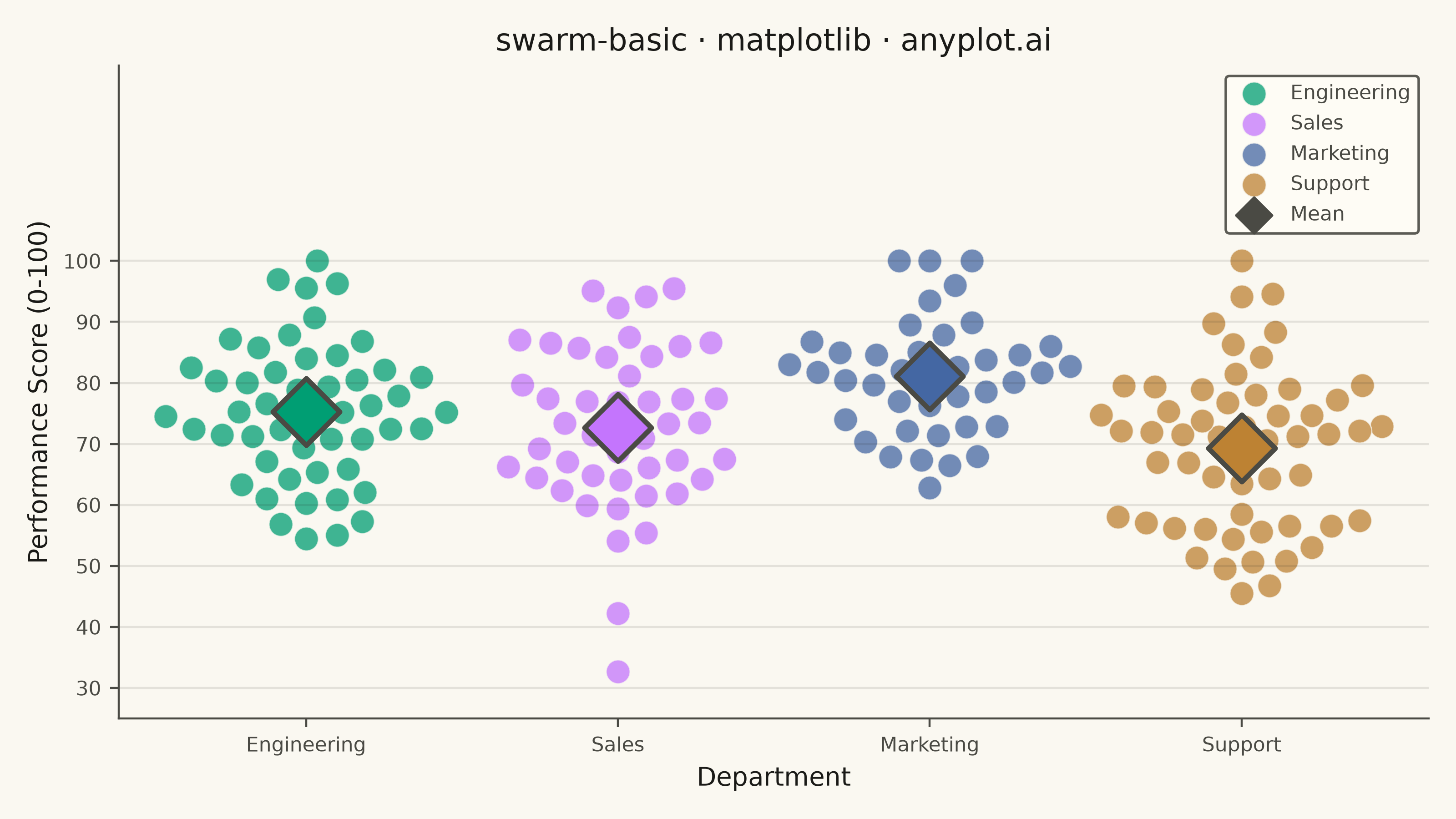
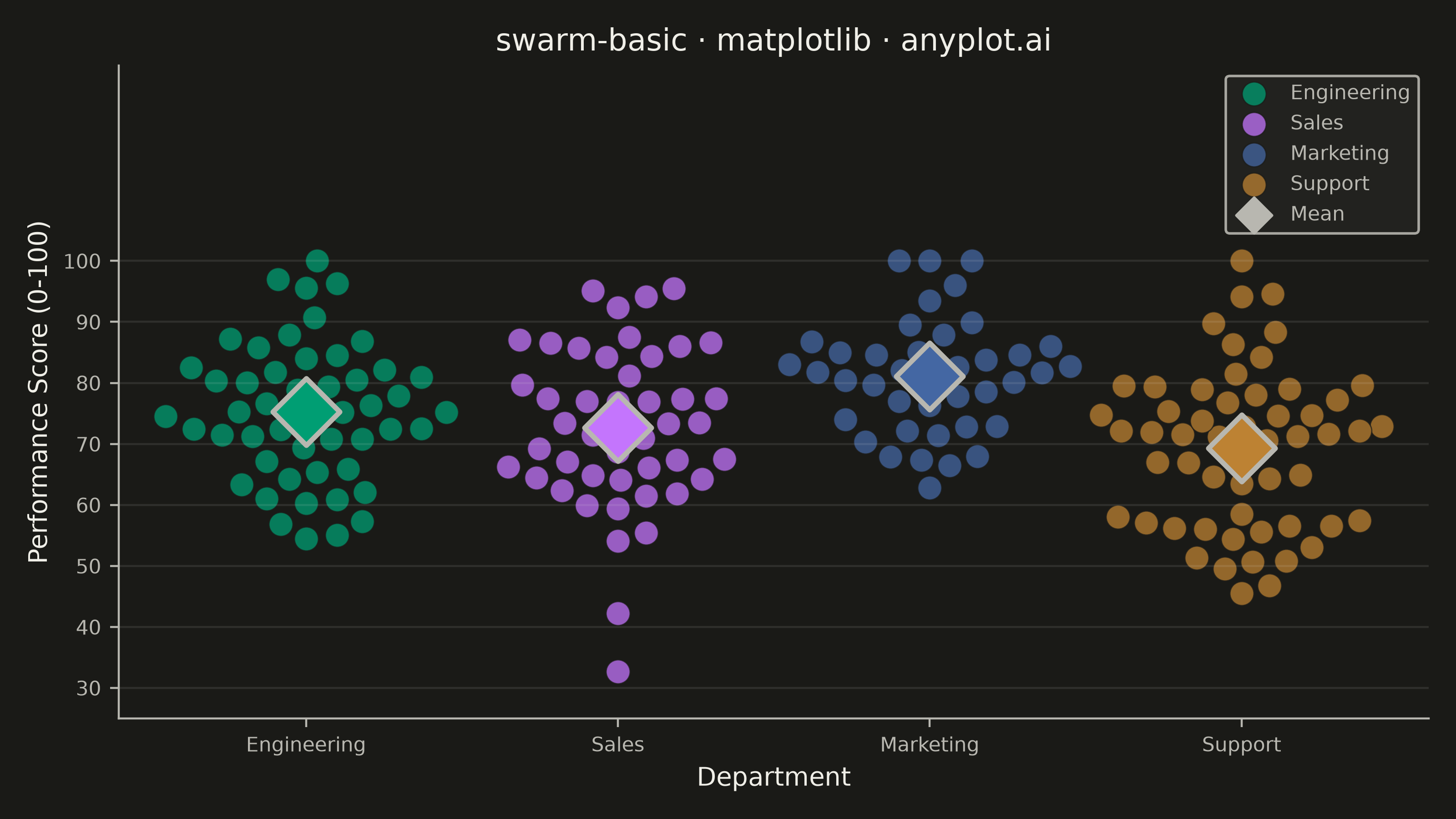
A swarm plot (beeswarm plot) displays individual data points for categorical comparisons, with points spread horizontally to avoid overlap. This reveals the full distribution shape and density while preserving exact values - combining the benefits of strip plots (individual points) and violin plots (density visualization). Ideal when you need to see every observation rather than just summary statistics.
""" anyplot.ai
swarm-basic: Basic Swarm Plot
Library: matplotlib 3.11.1 | Python 3.13.14
Quality: 90/100 | Updated: 2026-07-26
"""

import os

import matplotlib.pyplot as plt
import numpy as np


# Theme tokens
THEME = os.getenv("ANYPLOT_THEME", "light")
PAGE_BG = "#FAF8F1" if THEME == "light" else "#1A1A17"
ELEVATED_BG = "#FFFDF6" if THEME == "light" else "#242420"
INK = "#1A1A17" if THEME == "light" else "#F0EFE8"
INK_SOFT = "#4A4A44" if THEME == "light" else "#B8B7B0"

# Imprint palette — 4 departments
COLORS = ["#009E73", "#C475FD", "#4467A3", "#BD8233"]

# Data - Employee performance scores by department
np.random.seed(42)

departments = ["Engineering", "Sales", "Marketing", "Support"]
n_points = [50, 45, 40, 55]

scores_data = {
    "Engineering": np.clip(np.random.normal(78, 12, n_points[0]), 0, 100),
    "Sales": np.clip(np.random.normal(72, 15, n_points[1]), 0, 100),
    "Marketing": np.clip(np.random.normal(82, 10, n_points[2]), 0, 100),
    "Support": np.clip(np.random.normal(68, 14, n_points[3]), 0, 100),
}

# Plot
fig, ax = plt.subplots(figsize=(8, 4.5), dpi=400, facecolor=PAGE_BG)
ax.set_facecolor(PAGE_BG)

ax.set_xlabel("Department", fontsize=10, color=INK)
ax.set_ylabel("Performance Score (0-100)", fontsize=10, color=INK)
ax.set_title("swarm-basic · matplotlib · anyplot.ai", fontsize=12, fontweight="medium", color=INK)
ax.set_xticks(range(len(departments)))
ax.set_xticklabels(departments, fontsize=8)
ax.tick_params(axis="both", labelsize=8, colors=INK_SOFT)
ax.set_ylim(25, 132)
ax.set_yticks(np.arange(30, 101, 10))
ax.set_xlim(-0.6, 3.6)

ax.yaxis.grid(True, alpha=0.10, linewidth=0.8, color=INK)
ax.spines["top"].set_visible(False)
ax.spines["right"].set_visible(False)
for spine in ("left", "bottom"):
    ax.spines[spine].set_color(INK_SOFT)

# Finalize the layout before computing swarm offsets: title/labels/ticks are
# already set, so the axes box below is the real one (the in-plot legend
# added after data plotting sits inside it and doesn't shift it further).
plt.tight_layout()
fig.canvas.draw()

# Pixel-per-data-unit scale factors from the actual transData transform.
# Category slots (x) and 0-100 scores (y) live on very different scales, so
# collision testing must compare real on-screen distances, not raw
# data-space deltas mixing incompatible units.
origin_px = ax.transData.transform((0, 0))
x_unit_px = ax.transData.transform((1, 0))[0] - origin_px[0]
y_unit_px = ax.transData.transform((0, 1))[1] - origin_px[1]

MARKER_SIZE = 90  # scatter `s` (points^2 area) for individual swarm points
MEAN_SIZE = 350
marker_diameter_px = 2 * np.sqrt(MARKER_SIZE / np.pi) * (fig.dpi / 72)
min_gap_px = marker_diameter_px * 1.05
max_offset = 0.45

# Candidate x-offsets, nearest-to-center first: 0, then +/-step at
# increasing radius up to max_offset.
steps = np.linspace(max_offset / 50, max_offset, 50)
candidate_offsets = np.concatenate([[0.0], np.column_stack([steps, -steps]).ravel()])

for i, dept in enumerate(departments):
    vals = scores_data[dept]
    sorted_idx = np.argsort(vals)
    offsets = np.zeros(len(vals))
    placed_offsets = np.array([])
    placed_vals = np.array([])

    for idx in sorted_idx:
        val = vals[idx]
        best_offset, best_dist = 0.0, -np.inf

        for test_x in candidate_offsets:
            if placed_offsets.size:
                dist = np.hypot((test_x - placed_offsets) * x_unit_px, (val - placed_vals) * y_unit_px).min()
            else:
                dist = np.inf

            if dist > best_dist:
                best_offset, best_dist = test_x, dist
            if dist >= min_gap_px:
                break

        offsets[idx] = best_offset
        placed_offsets = np.append(placed_offsets, best_offset)
        placed_vals = np.append(placed_vals, val)

    ax.scatter(
        i + offsets, vals, s=MARKER_SIZE, alpha=0.75, color=COLORS[i], edgecolors=PAGE_BG, linewidth=0.5, label=dept
    )

    mean_val = np.mean(vals)
    ax.scatter(i, mean_val, s=MEAN_SIZE, color=COLORS[i], marker="D", edgecolors=INK_SOFT, linewidth=2, zorder=5)

# Invisible mean-marker entry for legend (smaller than the on-plot marker so it doesn't crowd the legend rows)
ax.scatter([], [], s=100, color=INK_SOFT, marker="D", edgecolors=INK_SOFT, linewidth=1, label="Mean")

leg = ax.legend(fontsize=8, loc="upper right", framealpha=0.9)
leg.get_frame().set_facecolor(ELEVATED_BG)
leg.get_frame().set_edgecolor(INK_SOFT)
plt.setp(leg.get_texts(), color=INK_SOFT)

plt.savefig(f"plot-{THEME}.png", dpi=400, facecolor=PAGE_BG)
Runnable source as JSON, for any HTTP client: https://api.anyplot.ai/specs/swarm-basic/matplotlib/code. Any spec id and library id listed in llms-full.txt fit the same URL shape; every URL below is complete and callable.
{
  "spec_id": "swarm-basic",
  "language": "python",
  "library": "matplotlib",
  "page": "https://anyplot.ai/swarm-basic/python/matplotlib",
  "hub": "https://anyplot.ai/swarm-basic",
  "code_json": "https://api.anyplot.ai/specs/swarm-basic/matplotlib/code",
  "spec_json": "https://api.anyplot.ai/specs/swarm-basic",
  "render_light_png": "https://storage.googleapis.com/anyplot-images/plots/swarm-basic/python/matplotlib/plot-light.png",
  "render_dark_png": "https://storage.googleapis.com/anyplot-images/plots/swarm-basic/python/matplotlib/plot-dark.png",
  "quality_score": 90.0,
  "license": "MIT",
  "guide": "https://anyplot.ai/llms.txt"
}
Part of Basic Swarm Plot on anyplot.ai.