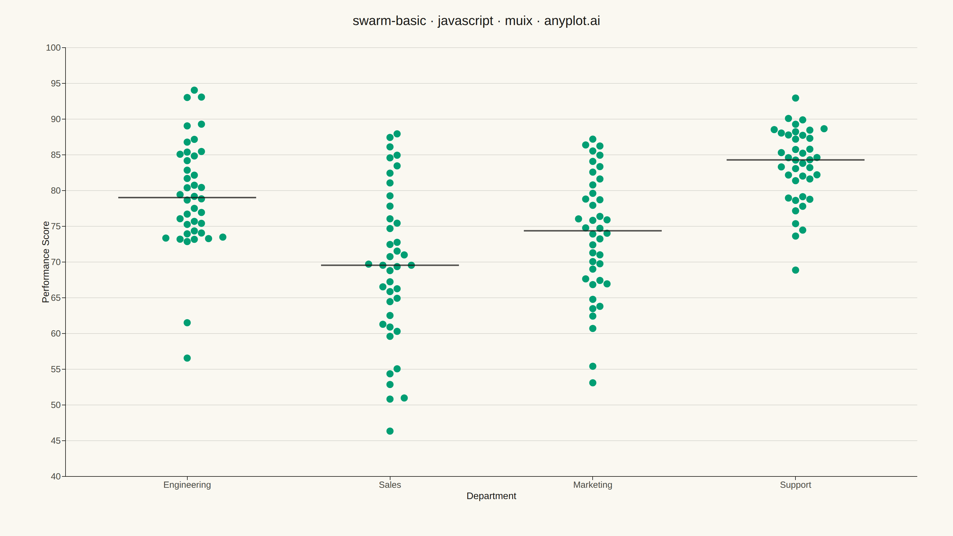
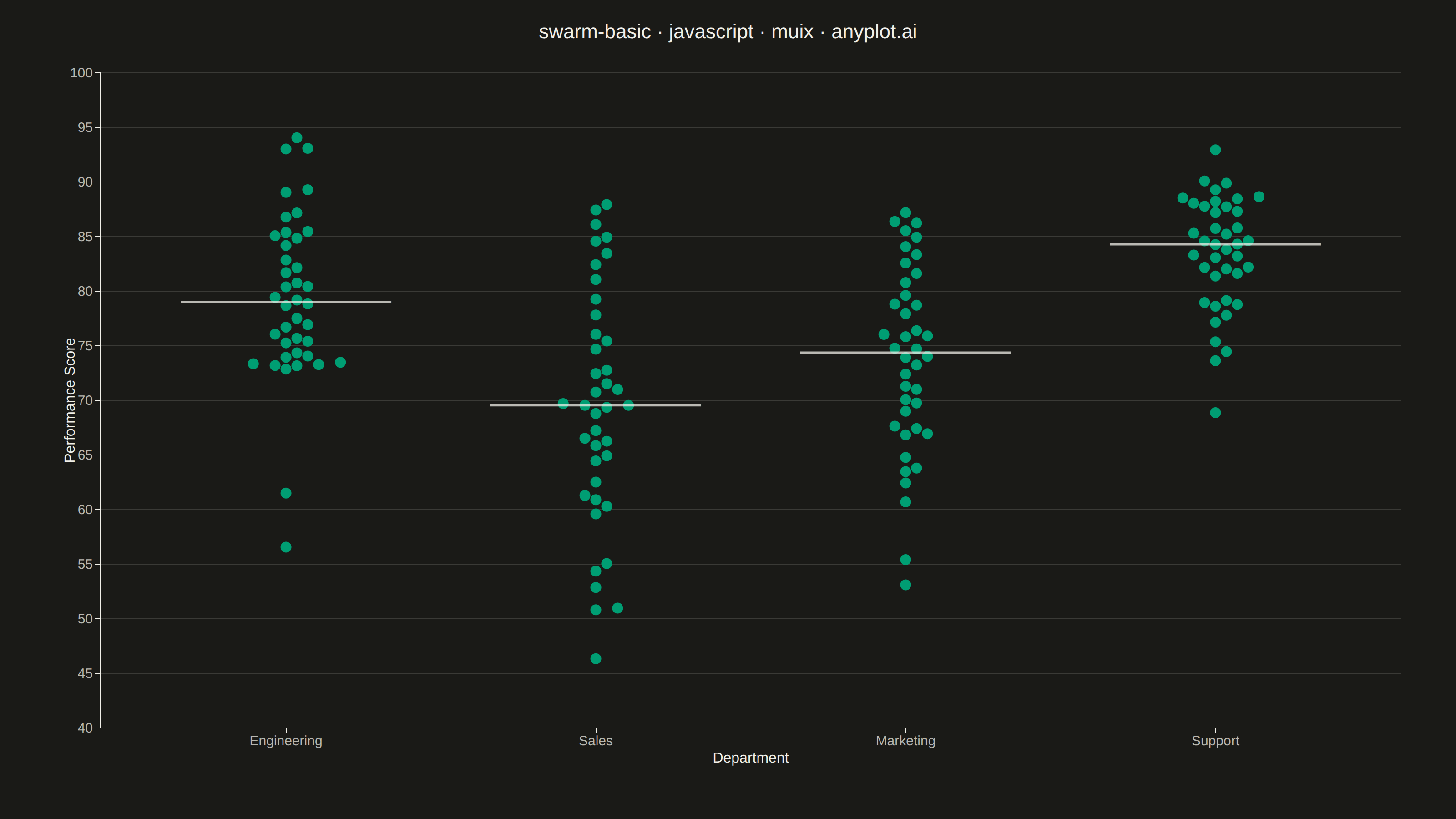
The same plot in 14 other libraries — JavaScript: Chart.js, D3.js, Apache ECharts, Highcharts; Python: Altair, Bokeh, lets-plot, Matplotlib, Plotly, plotnine, Pygal, Seaborn; R: ggplot2; Julia: Makie.jl. Compare all 15 side by side: Basic Swarm Plot in Python, R, Julia and JavaScript.
A swarm plot (beeswarm plot) displays individual data points for categorical comparisons, with points spread horizontally to avoid overlap. This reveals the full distribution shape and density while preserving exact values - combining the benefits of strip plots (individual points) and violin plots (density visualization). Ideal when you need to see every observation rather than just summary statistics.
// anyplot.ai
// swarm-basic: Basic Swarm Plot
// Library: muix 7.29.1 | JavaScript 22.23.1
// Quality: 90/100 | Created: 2026-07-26
//# anyplot-orientation: landscape

import { ChartContainer } from "@mui/x-charts/ChartContainer";
import { ChartsXAxis } from "@mui/x-charts/ChartsXAxis";
import { ChartsYAxis } from "@mui/x-charts/ChartsYAxis";
import { ChartsGrid } from "@mui/x-charts/ChartsGrid";
import { ScatterPlot } from "@mui/x-charts/ScatterChart";
import { useXScale, useYScale } from "@mui/x-charts/hooks";

const t = window.ANYPLOT_TOKENS;

// --- Deterministic PRNG (LCG) + Box-Muller for approx-normal samples --------
let seed = 42;
function nextUniform() {
  seed = (seed * 1664525 + 1013904223) % 4294967296;
  return seed / 4294967296;
}
function nextNormal(mean, stdDev) {
  const u1 = Math.max(nextUniform(), 1e-9);
  const u2 = nextUniform();
  const z = Math.sqrt(-2 * Math.log(u1)) * Math.cos(2 * Math.PI * u2);
  return mean + z * stdDev;
}

// --- Data: quarterly performance review scores by department ---------------
const DEPARTMENTS = ["Engineering", "Sales", "Marketing", "Support"];
const MEANS = [78, 70, 74, 83];
const STD_DEVS = [8, 12, 9, 6];
const POINTS_PER_DEPT = 40;

const rawPoints = DEPARTMENTS.flatMap((department, categoryIndex) =>
  Array.from({ length: POINTS_PER_DEPT }, () => ({
    department,
    categoryIndex,
    score: Math.min(99, Math.max(45, nextNormal(MEANS[categoryIndex], STD_DEVS[categoryIndex]))),
  })),
);

const median = (values) => {
  const sorted = [...values].sort((a, b) => a - b);
  const mid = Math.floor(sorted.length / 2);
  return sorted.length % 2 === 0 ? (sorted[mid - 1] + sorted[mid]) / 2 : sorted[mid];
};

const medianByDept = DEPARTMENTS.map((_, i) =>
  median(rawPoints.filter((p) => p.categoryIndex === i).map((p) => p.score)),
);

// --- Layout geometry — must stay in sync with the ChartContainer margin ----
const MARGIN = { left: 110, right: 60, top: 80, bottom: 100 };
const SCORE_MIN = 40;
const SCORE_MAX = 100;
const X_MIN = -0.6;
const X_MAX = DEPARTMENTS.length - 1 + 0.6;
const MARKER_SIZE = 6; // circle radius, px
const MARKER_DIAMETER_PX = MARKER_SIZE * 2 + 1;

// --- Beeswarm packing: spread points horizontally within each department so
// none overlap. Collisions are resolved in on-screen pixels (rather than data
// units) so the spread looks even regardless of the score axis' range. Each
// point keeps its true score on the y-axis; only the x-offset is adjusted.
function layoutSwarm(plotWidthPx, plotHeightPx) {
  const pxPerScore = plotHeightPx / (SCORE_MAX - SCORE_MIN);
  const pxPerX = plotWidthPx / (X_MAX - X_MIN);

  return DEPARTMENTS.flatMap((department, categoryIndex) => {
    const points = rawPoints
      .filter((p) => p.categoryIndex === categoryIndex)
      .sort((a, b) => a.score - b.score);

    const placed = [];
    points.forEach((point) => {
      const nearby = placed.filter(
        (p) => Math.abs((point.score - p.score) * pxPerScore) < MARKER_DIAMETER_PX,
      );
      let offsetPx = 0;
      if (nearby.length > 0) {
        const step = MARKER_DIAMETER_PX * 0.92;
        let k = 0;
        let resolved = false;
        while (!resolved && k < 200) {
          const candidate = k === 0 ? 0 : (k % 2 === 1 ? Math.ceil(k / 2) : -Math.ceil(k / 2)) * step;
          if (
            nearby.every(
              (p) => Math.hypot(candidate - p.offsetPx, (point.score - p.score) * pxPerScore) >= MARKER_DIAMETER_PX * 0.95,
            )
          ) {
            offsetPx = candidate;
            resolved = true;
          }
          k += 1;
        }
      }
      placed.push({ ...point, offsetPx });
    });

    return placed.map((p) => ({
      id: `${department}-${p.score.toFixed(3)}-${p.offsetPx.toFixed(2)}`,
      x: categoryIndex + p.offsetPx / pxPerX,
      y: p.score,
    }));
  });
}

// Short reference ticks at each department's median score. Rendered inside
// ChartContainer so it can read the live D3 scales.
function MedianTicks() {
  const xScale = useXScale();
  const yScale = useYScale();
  const halfWidth = 0.34;

  return (
    <g>
      {DEPARTMENTS.map((department, i) => {
        const x1 = xScale(i - halfWidth) ?? 0;
        const x2 = xScale(i + halfWidth) ?? 0;
        const y = yScale(medianByDept[i]) ?? 0;
        return (
          <line
            key={department}
            x1={x1}
            y1={y}
            x2={x2}
            y2={y}
            stroke={t.ink}
            strokeWidth={2.5}
            strokeOpacity={0.75}
          />
        );
      })}
    </g>
  );
}

const TITLE = "swarm-basic · javascript · muix · anyplot.ai";

export default function Chart() {
  const W = window.ANYPLOT_SIZE.width;
  const H = window.ANYPLOT_SIZE.height;
  const plotWidthPx = W - MARGIN.left - MARGIN.right;
  const plotHeightPx = H - MARGIN.top - MARGIN.bottom;
  const scoreData = layoutSwarm(plotWidthPx, plotHeightPx);

  return (
    <ChartContainer
      width={W}
      height={H}
      skipAnimation
      series={[
        {
          type: "scatter",
          id: "scores",
          label: "Performance Score",
          data: scoreData,
          color: t.palette[0],
          markerSize: MARKER_SIZE,
        },
      ]}
      xAxis={[
        {
          id: "xAxis",
          min: X_MIN,
          max: X_MAX,
          tickMinStep: 1,
          valueFormatter: (v) => DEPARTMENTS[Math.round(v)] ?? "",
          tickLabelStyle: { fontSize: 15, fill: t.inkSoft },
          label: "Department",
          labelStyle: { fontSize: 16, fill: t.ink },
        },
      ]}
      yAxis={[
        {
          id: "yAxis",
          min: SCORE_MIN,
          max: SCORE_MAX,
          label: "Performance Score",
          tickLabelStyle: { fontSize: 15, fill: t.inkSoft },
          labelStyle: { fontSize: 16, fill: t.ink },
        },
      ]}
      margin={MARGIN}
    >
      <ChartsGrid horizontal />
      <ScatterPlot />
      <MedianTicks />
      <ChartsXAxis axisId="xAxis" />
      <ChartsYAxis axisId="yAxis" />
      <text x={W / 2} y={42} textAnchor="middle" fontSize={22} fontFamily="sans-serif" fontWeight="500" fill={t.ink}>
        {TITLE}
      </text>
    </ChartContainer>
  );
}
Runnable source as JSON, for any HTTP client: https://api.anyplot.ai/specs/swarm-basic/muix/code. Any spec id and library id listed in llms-full.txt fit the same URL shape; every URL below is complete and callable.
{
  "spec_id": "swarm-basic",
  "language": "javascript",
  "library": "muix",
  "page": "https://anyplot.ai/swarm-basic/javascript/muix",
  "hub": "https://anyplot.ai/swarm-basic",
  "code_json": "https://api.anyplot.ai/specs/swarm-basic/muix/code",
  "spec_json": "https://api.anyplot.ai/specs/swarm-basic",
  "render_light_png": "https://storage.googleapis.com/anyplot-images/plots/swarm-basic/javascript/muix/plot-light.png",
  "render_dark_png": "https://storage.googleapis.com/anyplot-images/plots/swarm-basic/javascript/muix/plot-dark.png",
  "interactive_light_html": "https://storage.googleapis.com/anyplot-images/plots/swarm-basic/javascript/muix/plot-light.html",
  "interactive_dark_html": "https://storage.googleapis.com/anyplot-images/plots/swarm-basic/javascript/muix/plot-dark.html",
  "quality_score": 90.0,
  "license": "MIT",
  "guide": "https://anyplot.ai/llms.txt"
}
Part of Basic Swarm Plot on anyplot.ai.