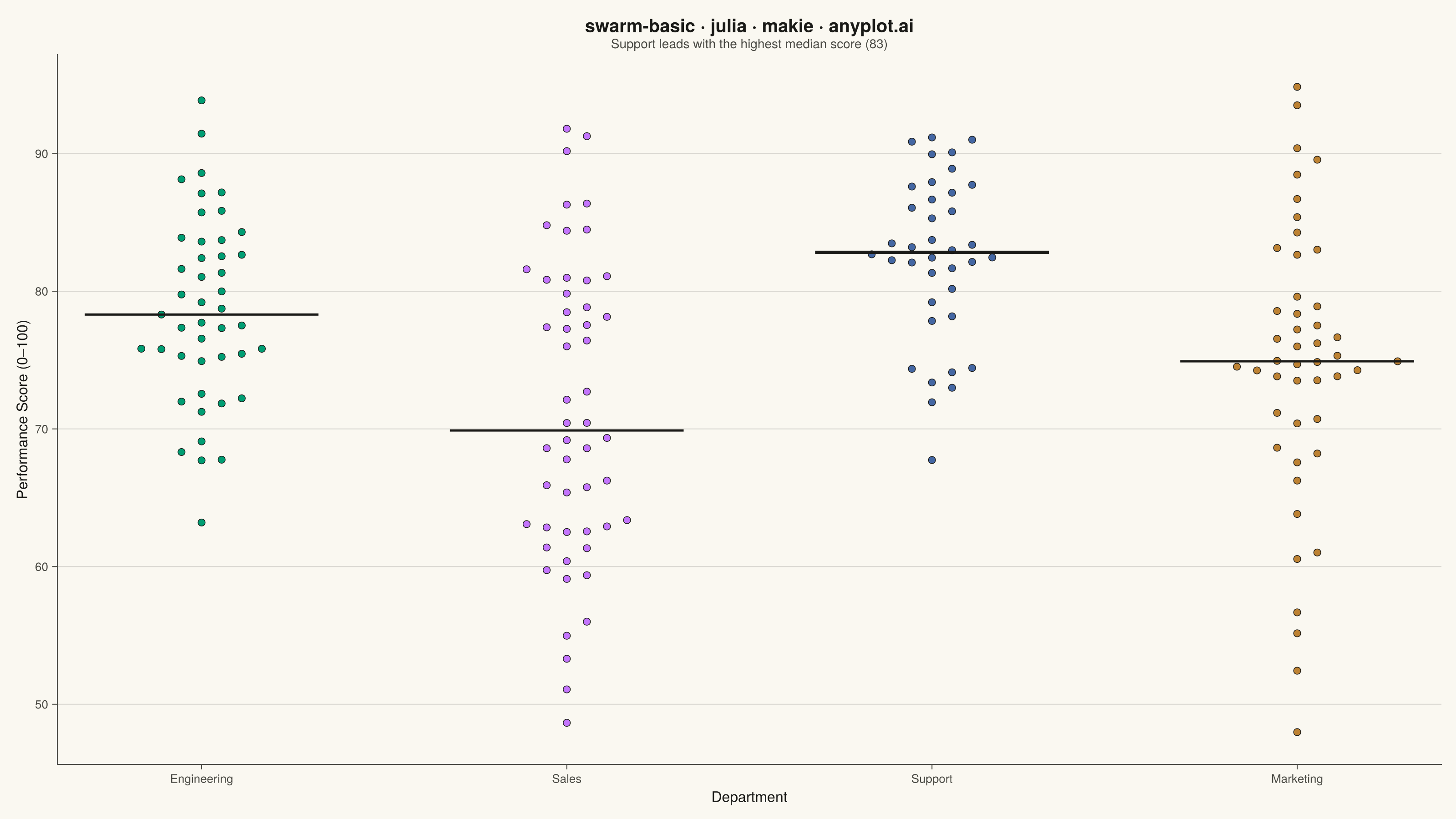
The same plot in 14 other libraries — Python: Altair, Bokeh, lets-plot, Matplotlib, Plotly, plotnine, Pygal, Seaborn; R: ggplot2; JavaScript: Chart.js, D3.js, Apache ECharts, Highcharts, MUI X Charts. Compare all 15 side by side: Basic Swarm Plot in Python, R, Julia and JavaScript.
A swarm plot (beeswarm plot) displays individual data points for categorical comparisons, with points spread horizontally to avoid overlap. This reveals the full distribution shape and density while preserving exact values - combining the benefits of strip plots (individual points) and violin plots (density visualization). Ideal when you need to see every observation rather than just summary statistics.
# anyplot.ai
# swarm-basic: Basic Swarm Plot
# Library: makie 0.21.9 | Julia 1.11.9
# Quality: 91/100 | Created: 2026-07-26

using CairoMakie
using Colors
using Random
using Statistics

Random.seed!(42)

# --- Theme tokens (see prompts/default-style-guide.md "Theme-adaptive Chrome") ----
const THEME    = get(ENV, "ANYPLOT_THEME", "light")
const PAGE_BG  = THEME == "light" ? colorant"#FAF8F1" : colorant"#1A1A17"
const INK      = THEME == "light" ? colorant"#1A1A17" : colorant"#F0EFE8"
const INK_SOFT = THEME == "light" ? colorant"#4A4A44" : colorant"#B8B7B0"

# Imprint categorical palette — first 4 positions used, one per department
const IMPRINT_PALETTE = [
    colorant"#009E73",  # 1 — brand green (always first series)
    colorant"#C475FD",  # 2 — lavender
    colorant"#4467A3",  # 3 — blue
    colorant"#BD8233",  # 4 — ochre
]

# --- Data ---------------------------------------------------------------------
# Employee performance scores by department
departments = ["Engineering", "Sales", "Support", "Marketing"]
group_sizes = [45, 52, 38, 47]
group_means = [78.0, 71.0, 82.0, 75.0]
group_stds  = [7.0, 11.0, 5.5, 9.0]

# Swarm layout: greedy nearest-free-slot placement so points spread
# horizontally (category axis) without overlapping, while keeping the
# true value on the vertical axis. Rectangular collision check (separate
# x/y thresholds) since the two axes carry different units.
min_dist_y = 1.1   # vertical threshold below which points compete for space (score points)
step_x     = 0.055 # horizontal offset increment (category-axis units)

swarm_x = Float64[]
swarm_y = Float64[]
swarm_color = eltype(IMPRINT_PALETTE)[]
group_medians = Float64[]
max_offset = 0.0

for (group_index, (department, n, group_mean, group_std)) in
        enumerate(zip(departments, group_sizes, group_means, group_stds))
    scores = clamp.(randn(n) .* group_std .+ group_mean, 0.0, 100.0)
    order = sortperm(scores)
    placed_offsets = Float64[]
    placed_scores = Float64[]
    offsets = zeros(n)

    for i in order
        score = scores[i]
        level = 0
        chosen_offset = 0.0
        while true
            candidates = level == 0 ? (0.0,) : (level * step_x, -level * step_x)
            free_slot = 0.0
            found = false
            for candidate in candidates
                conflict = false
                for j in eachindex(placed_scores)
                    if abs(placed_scores[j] - score) < min_dist_y &&
                       abs(placed_offsets[j] - candidate) < step_x
                        conflict = true
                        break
                    end
                end
                if !conflict
                    free_slot = candidate
                    found = true
                    break
                end
            end
            if found
                chosen_offset = free_slot
                break
            end
            level += 1
        end
        offsets[i] = chosen_offset
        push!(placed_offsets, chosen_offset)
        push!(placed_scores, score)
    end

    append!(swarm_x, group_index .+ offsets)
    append!(swarm_y, scores)
    append!(swarm_color, fill(IMPRINT_PALETTE[group_index], n))
    push!(group_medians, median(scores))
    global max_offset = max(max_offset, maximum(abs, offsets))
end

# Headline comparison for the subtitle + callout: the department with the
# highest median score drives the data story beyond the per-group medians.
best_idx = argmax(group_medians)
subtitle_text = "$(departments[best_idx]) leads with the highest median score " *
                "($(round(Int, group_medians[best_idx])))"

# --- Plot -----------------------------------------------------------------------
fig = Figure(
    resolution      = (1600, 900),
    fontsize        = 14,
    backgroundcolor = PAGE_BG,
)

ax = Axis(
    fig[1, 1];
    title             = "swarm-basic · julia · makie · anyplot.ai",
    titlesize         = 20,
    titlecolor        = INK,
    subtitle          = subtitle_text,
    subtitlesize      = 14,
    subtitlecolor     = INK_SOFT,
    xlabel            = "Department",
    ylabel            = "Performance Score (0–100)",
    xlabelsize        = 16,
    ylabelsize        = 16,
    xlabelcolor       = INK,
    ylabelcolor       = INK,
    xticklabelsize    = 13,
    yticklabelsize    = 13,
    xticklabelcolor   = INK_SOFT,
    yticklabelcolor   = INK_SOFT,
    xtickcolor        = INK_SOFT,
    ytickcolor        = INK_SOFT,
    backgroundcolor   = PAGE_BG,
    topspinevisible    = false,
    rightspinevisible  = false,
    leftspinecolor     = INK_SOFT,
    bottomspinecolor   = INK_SOFT,
    xgridvisible       = false,
    ygridcolor         = RGBAf(INK.r, INK.g, INK.b, 0.15),
    yminorgridvisible  = false,
    xticks             = (1:length(departments), departments),
)

scatter!(ax, swarm_x, swarm_y;
         color = swarm_color, markersize = 11,
         strokewidth = 0.75, strokecolor = INK)

# Median marker per department; the top performer gets a bolder line so the
# subtitle's callout has a visible anchor on the chart.
for (group_index, group_median) in enumerate(group_medians)
    lines!(ax, [group_index - 0.32, group_index + 0.32], [group_median, group_median];
           color = INK, linewidth = group_index == best_idx ? 3.5 : 2.5)
end

# Symmetric padding derived from the widest swarm actually placed, so the
# canvas margins stay balanced regardless of how far any one department spreads.
pad = max_offset + 0.12
xlims!(ax, 1 - pad, length(departments) + pad)

# --- Save -------------------------------------------------------------------
save("plot-$(THEME).png", fig; px_per_unit = 2)
Runnable source as JSON, for any HTTP client: https://api.anyplot.ai/specs/swarm-basic/makie/code. Any spec id and library id listed in llms-full.txt fit the same URL shape; every URL below is complete and callable.
{
  "spec_id": "swarm-basic",
  "language": "julia",
  "library": "makie",
  "page": "https://anyplot.ai/swarm-basic/julia/makie",
  "hub": "https://anyplot.ai/swarm-basic",
  "code_json": "https://api.anyplot.ai/specs/swarm-basic/makie/code",
  "spec_json": "https://api.anyplot.ai/specs/swarm-basic",
  "render_light_png": "https://storage.googleapis.com/anyplot-images/plots/swarm-basic/julia/makie/plot-light.png",
  "render_dark_png": "https://storage.googleapis.com/anyplot-images/plots/swarm-basic/julia/makie/plot-dark.png",
  "quality_score": 91.0,
  "license": "MIT",
  "guide": "https://anyplot.ai/llms.txt"
}
Part of Basic Swarm Plot on anyplot.ai.