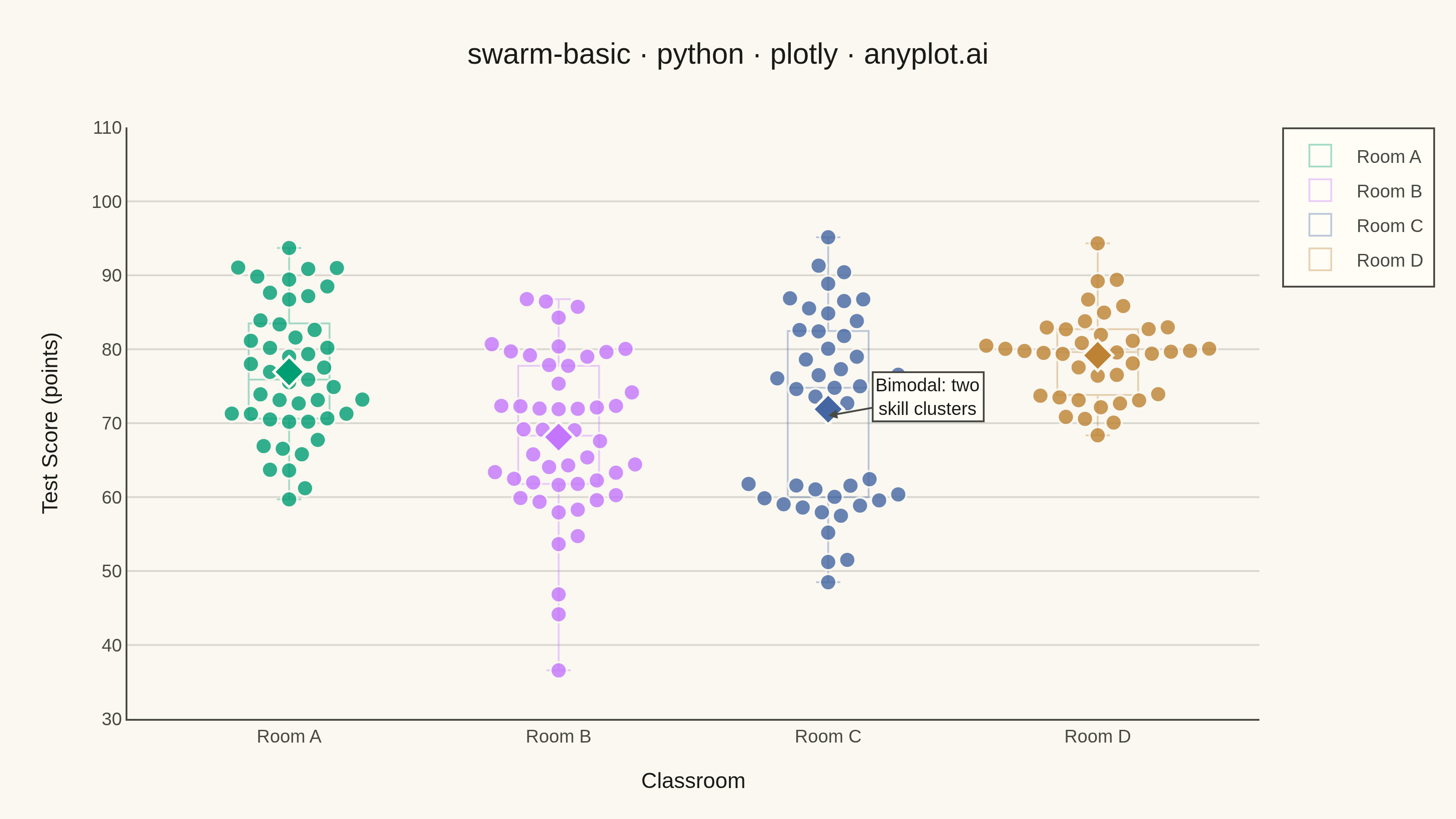
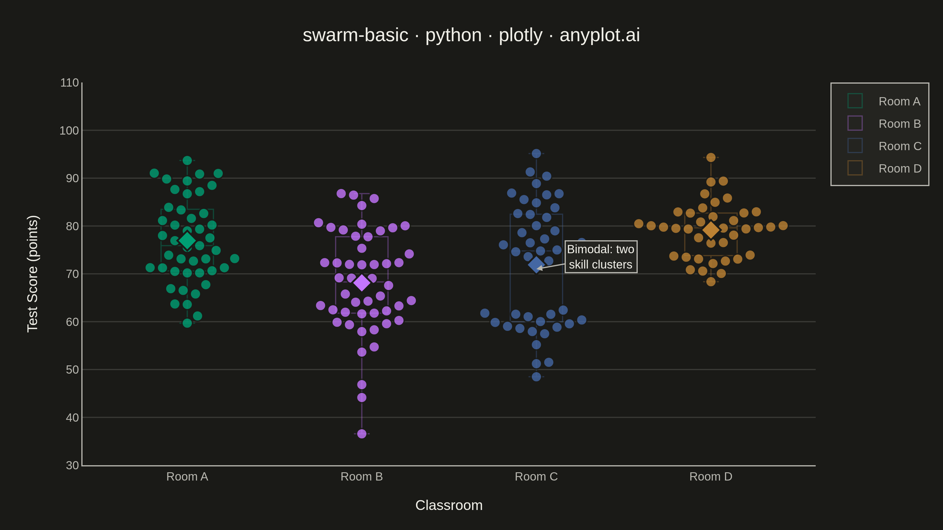
A swarm plot (beeswarm plot) displays individual data points for categorical comparisons, with points spread horizontally to avoid overlap. This reveals the full distribution shape and density while preserving exact values - combining the benefits of strip plots (individual points) and violin plots (density visualization). Ideal when you need to see every observation rather than just summary statistics.
""" anyplot.ai
swarm-basic: Basic Swarm Plot
Library: plotly 6.9.0 | Python 3.13.14
Quality: 90/100 | Updated: 2026-07-26
"""

import sys


# Remove the script directory from sys.path so this file (plotly.py) does not
# shadow the installed plotly package.
sys.path.pop(0)

import os

import numpy as np
import plotly.graph_objects as go


# Theme tokens
THEME = os.getenv("ANYPLOT_THEME", "light")
PAGE_BG = "#FAF8F1" if THEME == "light" else "#1A1A17"
ELEVATED_BG = "#FFFDF6" if THEME == "light" else "#242420"
INK = "#1A1A17" if THEME == "light" else "#F0EFE8"
INK_SOFT = "#4A4A44" if THEME == "light" else "#B8B7B0"
GRID = "rgba(26, 26, 23, 0.15)" if THEME == "light" else "rgba(240, 239, 232, 0.15)"

# Imprint categorical palette — first series always #009E73
IMPRINT = ["#009E73", "#C475FD", "#4467A3", "#BD8233"]
IMPRINT_RGB = [(0, 158, 115), (196, 117, 253), (68, 103, 163), (189, 130, 51)]

# Data - student test scores across 4 classrooms with varied distributions
np.random.seed(42)
classrooms = ["Room A", "Room B", "Room C", "Room D"]

scores_a = np.concatenate([np.random.normal(75, 8, 35), np.random.normal(90, 5, 10)])
scores_b = np.random.normal(68, 12, 50)
scores_c = np.concatenate([np.random.normal(60, 6, 20), np.random.normal(82, 6, 25)])
scores_d = np.random.normal(78, 6, 40)

all_scores = [scores_a, scores_b, scores_c, scores_d]

# Layout geometry (pre-scale coordinate space, matches write_image width=800/
# height=450 below; scale=4 is applied uniformly so pixel ratios are unaffected).
CANVAS_W, CANVAS_H = 800, 450
MARGIN = {"l": 70, "r": 90, "t": 70, "b": 55}
PLOT_W_PX = CANVAS_W - MARGIN["l"] - MARGIN["r"]
PLOT_H_PX = CANVAS_H - MARGIN["t"] - MARGIN["b"]

X_RANGE = (-0.6, len(classrooms) - 1 + 0.6)
Y_RANGE = (30, 110)
X_SCALE = PLOT_W_PX / (X_RANGE[1] - X_RANGE[0])  # px per 1 x-data-unit
Y_SCALE = PLOT_H_PX / (Y_RANGE[1] - Y_RANGE[0])  # px per 1 y-data-unit

MARKER_SIZE = 9
SEP_PX = MARKER_SIZE * 1.2  # min center-to-center pixel distance -> no overlap
MAX_OFFSET = 0.42  # data-units; keeps swarm clear of the neighboring category


def swarm_offsets(y_values, x_scale, y_scale, sep_px, max_offset):
    """Greedy beeswarm packing: place each point (sorted by y) at the offset
    closest to the category center whose rendered marker circle does not
    intersect any already-placed marker's circle, in true pixel space."""
    n = len(y_values)
    offsets = np.zeros(n)
    order = np.argsort(y_values)
    step = (sep_px / 6.0) / x_scale
    max_steps = int(np.ceil(max_offset / step)) + 1

    placed = []  # (offset, y)
    for idx in order:
        y = y_values[idx]
        chosen = None
        for k in range(max_steps + 1):
            for cand in [0.0] if k == 0 else [k * step, -k * step]:
                if abs(cand) > max_offset:
                    continue
                collides = False
                for off, py in placed:
                    dx_px = (cand - off) * x_scale
                    dy_px = (y - py) * y_scale
                    if dx_px * dx_px + dy_px * dy_px < sep_px * sep_px:
                        collides = True
                        break
                if not collides:
                    chosen = cand
                    break
            if chosen is not None:
                break
        if chosen is None:
            chosen = max_offset if (len(placed) % 2 == 0) else -max_offset
        placed.append((chosen, y))
        offsets[idx] = chosen
    return offsets


# Plot — go.Box (fully transparent fill, faint outline, no points) is kept as
# a de-emphasized quartile/spread guide; the actual beeswarm points are a
# separate go.Scatter trace whose x-offsets are computed by swarm_offsets()
# so marker circles never intersect, instead of relying on go.Box's
# uniform-random jitter.
fig = go.Figure()

for i, (classroom, scores) in enumerate(zip(classrooms, all_scores, strict=False)):
    color = IMPRINT[i]
    r, g, b = IMPRINT_RGB[i]

    fig.add_trace(
        go.Box(
            y=scores,
            x0=i,
            width=0.3,
            name=classroom,
            boxpoints=False,
            line={"color": f"rgba({r}, {g}, {b}, 0.35)", "width": 1},
            fillcolor="rgba(0, 0, 0, 0)",
            whiskerwidth=0.3,
            boxmean=False,
            hoverinfo="skip",
        )
    )

    offsets = swarm_offsets(scores, X_SCALE, Y_SCALE, SEP_PX, MAX_OFFSET)
    fig.add_trace(
        go.Scatter(
            x=i + offsets,
            y=scores,
            mode="markers",
            marker={"color": color, "size": MARKER_SIZE, "opacity": 0.8, "line": {"width": 1.2, "color": PAGE_BG}},
            showlegend=False,
            hovertemplate=f"{classroom}<br>Score: %{{y:.1f}}<extra></extra>",
        )
    )
    fig.add_trace(
        go.Scatter(
            x=[i],
            y=[float(np.mean(scores))],
            mode="markers",
            marker={"symbol": "diamond", "size": 13, "color": color, "line": {"width": 1.5, "color": PAGE_BG}},
            showlegend=False,
            hovertemplate=f"{classroom} mean<br>Score: %{{y:.1f}}<extra></extra>",
        )
    )

# Annotate Room C's bimodal shape — its most analytically interesting feature
fig.add_annotation(
    x=2,
    y=71,
    text="Bimodal: two<br>skill clusters",
    showarrow=True,
    arrowhead=2,
    arrowcolor=INK_SOFT,
    ax=55,
    ay=-10,
    font={"size": 10, "color": INK},
    bgcolor=ELEVATED_BG,
    bordercolor=INK_SOFT,
    borderwidth=1,
)

# Layout
fig.update_layout(
    autosize=False,
    width=CANVAS_W,
    height=CANVAS_H,
    paper_bgcolor=PAGE_BG,
    plot_bgcolor=PAGE_BG,
    font={"color": INK},
    title={
        "text": "swarm-basic · python · plotly · anyplot.ai",
        "font": {"size": 16, "color": INK},
        "x": 0.5,
        "xanchor": "center",
    },
    xaxis={
        "title": {"text": "Classroom", "font": {"size": 12, "color": INK}},
        "tickfont": {"size": 10, "color": INK_SOFT},
        "tickvals": list(range(len(classrooms))),
        "ticktext": classrooms,
        "range": list(X_RANGE),
        "gridcolor": GRID,
        "linecolor": INK_SOFT,
        "zeroline": False,
        "showgrid": False,
    },
    yaxis={
        "title": {"text": "Test Score (points)", "font": {"size": 12, "color": INK}},
        "tickfont": {"size": 10, "color": INK_SOFT},
        "gridcolor": GRID,
        "linecolor": INK_SOFT,
        "zerolinecolor": GRID,
        "range": list(Y_RANGE),
    },
    legend={"bgcolor": ELEVATED_BG, "bordercolor": INK_SOFT, "borderwidth": 1, "font": {"size": 10, "color": INK_SOFT}},
    showlegend=True,
    margin=MARGIN,
)

# Save
fig.write_image(f"plot-{THEME}.png", width=CANVAS_W, height=CANVAS_H, scale=4)
fig.write_html(f"plot-{THEME}.html", include_plotlyjs="cdn")
Runnable source as JSON, for any HTTP client: https://api.anyplot.ai/specs/swarm-basic/plotly/code. Any spec id and library id listed in llms-full.txt fit the same URL shape; every URL below is complete and callable.
{
  "spec_id": "swarm-basic",
  "language": "python",
  "library": "plotly",
  "page": "https://anyplot.ai/swarm-basic/python/plotly",
  "hub": "https://anyplot.ai/swarm-basic",
  "code_json": "https://api.anyplot.ai/specs/swarm-basic/plotly/code",
  "spec_json": "https://api.anyplot.ai/specs/swarm-basic",
  "render_light_png": "https://storage.googleapis.com/anyplot-images/plots/swarm-basic/python/plotly/plot-light.png",
  "render_dark_png": "https://storage.googleapis.com/anyplot-images/plots/swarm-basic/python/plotly/plot-dark.png",
  "interactive_light_html": "https://storage.googleapis.com/anyplot-images/plots/swarm-basic/python/plotly/plot-light.html",
  "interactive_dark_html": "https://storage.googleapis.com/anyplot-images/plots/swarm-basic/python/plotly/plot-dark.html",
  "quality_score": 90.0,
  "license": "MIT",
  "guide": "https://anyplot.ai/llms.txt"
}
Part of Basic Swarm Plot on anyplot.ai.