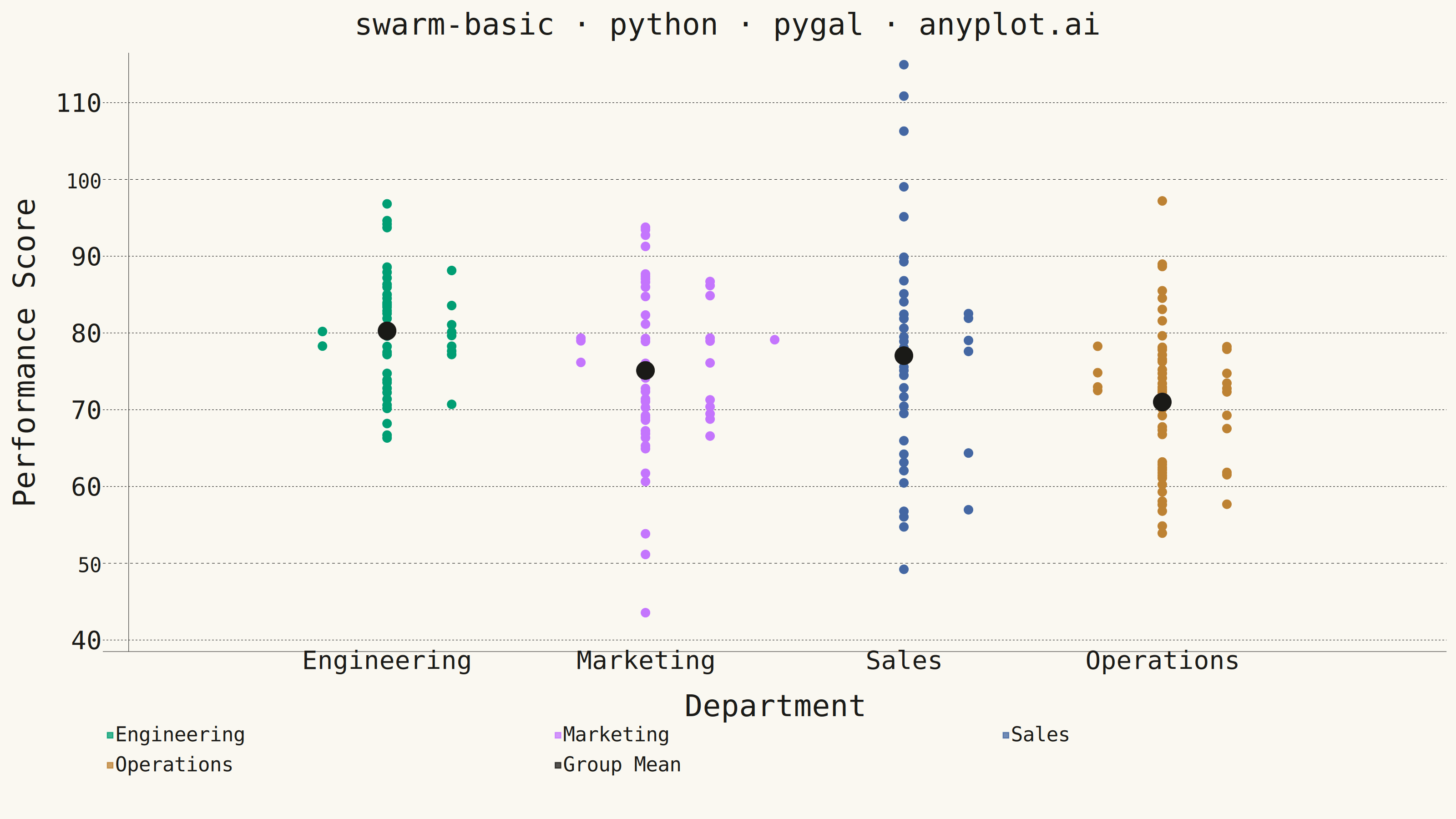
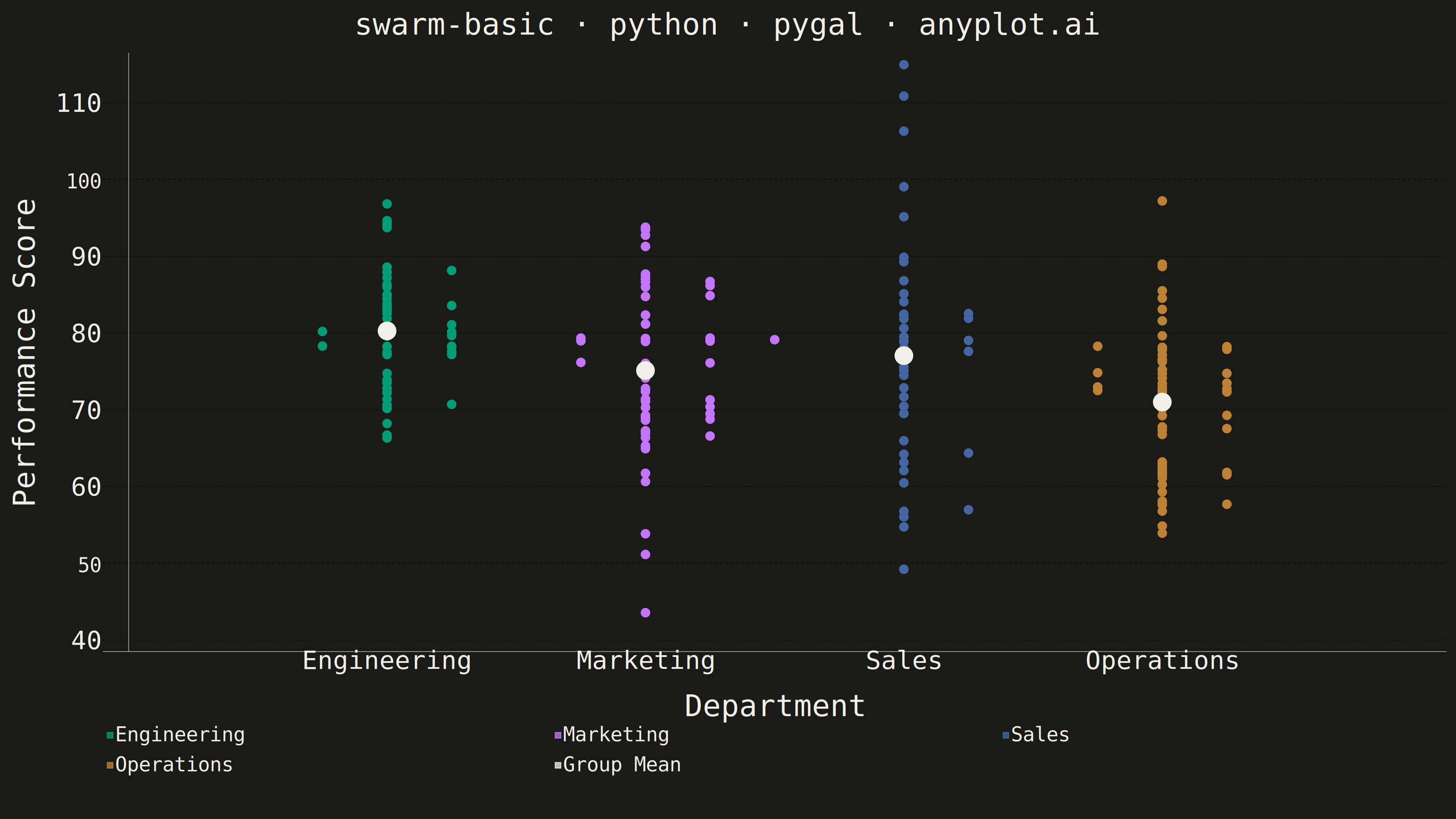
A swarm plot (beeswarm plot) displays individual data points for categorical comparisons, with points spread horizontally to avoid overlap. This reveals the full distribution shape and density while preserving exact values - combining the benefits of strip plots (individual points) and violin plots (density visualization). Ideal when you need to see every observation rather than just summary statistics.
""" anyplot.ai
swarm-basic: Basic Swarm Plot
Library: pygal 3.1.3 | Python 3.13.14
Quality: 88/100 | Updated: 2026-07-26
"""

import os

import numpy as np
import pygal
from pygal.style import Style


# Theme tokens (see prompts/default-style-guide.md "Theme-adaptive Chrome")
THEME = os.getenv("ANYPLOT_THEME", "light")
PAGE_BG = "#FAF8F1" if THEME == "light" else "#1A1A17"
INK = "#1A1A17" if THEME == "light" else "#F0EFE8"
INK_MUTED = "#6B6A63" if THEME == "light" else "#A8A79F"

IMPRINT_PALETTE = ("#009E73", "#C475FD", "#4467A3", "#BD8233")

# Data - employee performance scores by department (clamped to a plausible 0-100 scale)
np.random.seed(42)
categories = ["Engineering", "Marketing", "Sales", "Operations"]
data = {
    "Engineering": np.clip(np.random.normal(82, 7, 45), 0, 100),
    "Marketing": np.clip(np.random.normal(75, 9, 50), 0, 100),
    "Sales": np.clip(np.random.normal(78, 10, 40), 0, 100),
    "Operations": np.clip(np.random.normal(70, 8, 55), 0, 100),
}

all_values = np.concatenate(list(data.values()))
Y_MIN = 10 * np.floor(all_values.min() / 10)
Y_MAX = 10 * np.ceil(all_values.max() / 10)

# Style - source-pixel sizes for a 3200x1800 canvas (see prompts/library/pygal.md)
custom_style = Style(
    background=PAGE_BG,
    plot_background=PAGE_BG,
    foreground=INK,
    foreground_strong=INK,
    foreground_subtle=INK_MUTED,
    colors=IMPRINT_PALETTE + (INK,),  # last color reserved for the Group Mean marker
    title_font_size=66,
    label_font_size=56,
    major_label_font_size=44,
    legend_font_size=44,
    value_font_size=36,
    opacity=0.75,
    opacity_hover=1.0,
    stroke_width=2.5,
)

# Plot
chart = pygal.XY(
    width=3200,
    height=1800,
    style=custom_style,
    title="swarm-basic · python · pygal · anyplot.ai",
    x_title="Department",
    y_title="Performance Score",
    show_legend=True,
    legend_at_bottom=True,
    stroke=False,
    dots_size=10,
    show_x_guides=False,
    show_y_guides=True,
    xrange=(0, 5),
    range=(Y_MIN, Y_MAX),
    margin=40,
    margin_right=20,
)

# Beeswarm algorithm - spreads points horizontally to avoid overlap.
# Collision thresholds are derived per-axis from the actual rendered dot
# footprint (dots_size in px) against each axis's own data-unit-per-pixel
# scale, so a 10px dot compares correctly whether it's 0.03 x-units wide
# (category axis spans 5 units over ~2900 plot px) or ~0.6 y-units tall
# (value axis spans Y_MAX-Y_MIN over ~1270 plot px) - not one flat number
# for both axes.
PLOT_WIDTH_PX = 2900
PLOT_HEIGHT_PX = 1270
DOT_RADIUS_PX = 10
SPACING_PX = 4

x_unit_per_px = 5 / PLOT_WIDTH_PX
y_unit_per_px = (Y_MAX - Y_MIN) / PLOT_HEIGHT_PX
min_dist_x = 2 * DOT_RADIUS_PX * x_unit_per_px + SPACING_PX * x_unit_per_px
min_dist_y = 2 * DOT_RADIUS_PX * y_unit_per_px + SPACING_PX * y_unit_per_px
step_x = DOT_RADIUS_PX * x_unit_per_px + SPACING_PX * x_unit_per_px / 2

for cat_idx, (category, values) in enumerate(data.items()):
    center_x = cat_idx + 1

    sorted_indices = np.argsort(values)
    placed = []
    swarm_points = []

    for idx in sorted_indices:
        y = float(values[idx])
        x = center_x
        offset = 0
        direction = 1

        while True:
            test_x = center_x + offset * direction
            overlap = False
            for px, py in placed:
                dist_y = abs(y - py)
                dist_x = abs(test_x - px)
                if dist_y < min_dist_y and dist_x < min_dist_x:
                    overlap = True
                    break
            if not overlap:
                x = test_x
                break
            if direction == 1:
                direction = -1
            else:
                direction = 1
                offset += step_x

        placed.append((x, y))
        swarm_points.append((x, y))

    chart.add(category, swarm_points)

# Group mean markers - subtle reference points per category (neutral anchor color)
mean_points = [(cat_idx + 1, float(np.mean(values))) for cat_idx, (_, values) in enumerate(data.items())]
chart.add("Group Mean", mean_points, dots_size=20)

# x-axis category labels
chart.x_labels = ["", "Engineering", "Marketing", "Sales", "Operations", ""]

# Save
chart.render_to_png(f"plot-{THEME}.png")
with open(f"plot-{THEME}.html", "wb") as f:
    f.write(chart.render())
Runnable source as JSON, for any HTTP client: https://api.anyplot.ai/specs/swarm-basic/pygal/code. Any spec id and library id listed in llms-full.txt fit the same URL shape; every URL below is complete and callable.
{
  "spec_id": "swarm-basic",
  "language": "python",
  "library": "pygal",
  "page": "https://anyplot.ai/swarm-basic/python/pygal",
  "hub": "https://anyplot.ai/swarm-basic",
  "code_json": "https://api.anyplot.ai/specs/swarm-basic/pygal/code",
  "spec_json": "https://api.anyplot.ai/specs/swarm-basic",
  "render_light_png": "https://storage.googleapis.com/anyplot-images/plots/swarm-basic/python/pygal/plot-light.png",
  "render_dark_png": "https://storage.googleapis.com/anyplot-images/plots/swarm-basic/python/pygal/plot-dark.png",
  "interactive_light_html": "https://storage.googleapis.com/anyplot-images/plots/swarm-basic/python/pygal/plot-light.html",
  "interactive_dark_html": "https://storage.googleapis.com/anyplot-images/plots/swarm-basic/python/pygal/plot-dark.html",
  "quality_score": 88.0,
  "license": "MIT",
  "guide": "https://anyplot.ai/llms.txt"
}
Part of Basic Swarm Plot on anyplot.ai.