The same plot in 14 other libraries — Python: Bokeh, lets-plot, Matplotlib, Plotly, plotnine, Pygal, Seaborn; R: ggplot2; Julia: Makie.jl; JavaScript: Chart.js, D3.js, Apache ECharts, Highcharts, MUI X Charts. Compare all 15 side by side: UpSet Plot for Multi-Set Intersection Analysis in Python, R, Julia and JavaScript.
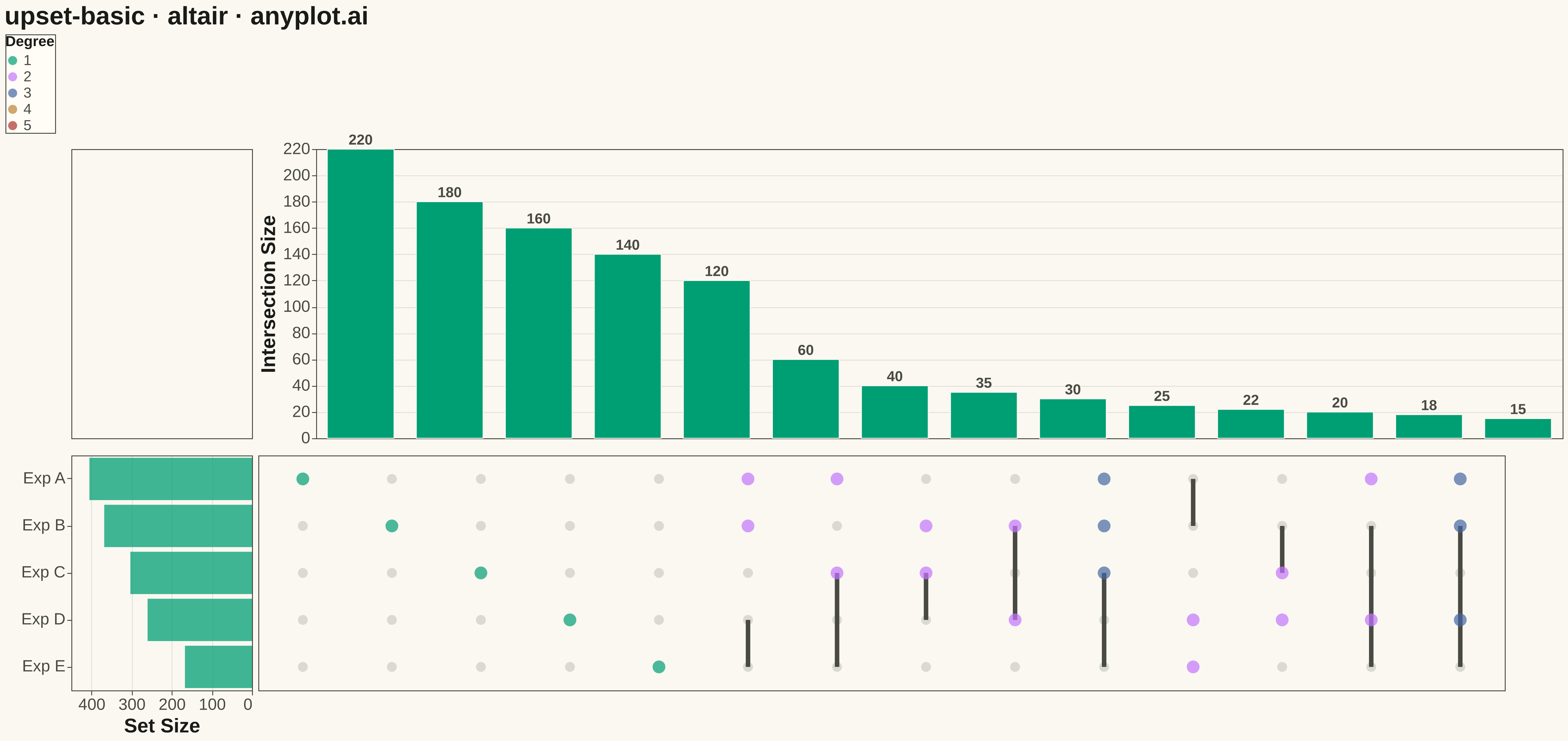
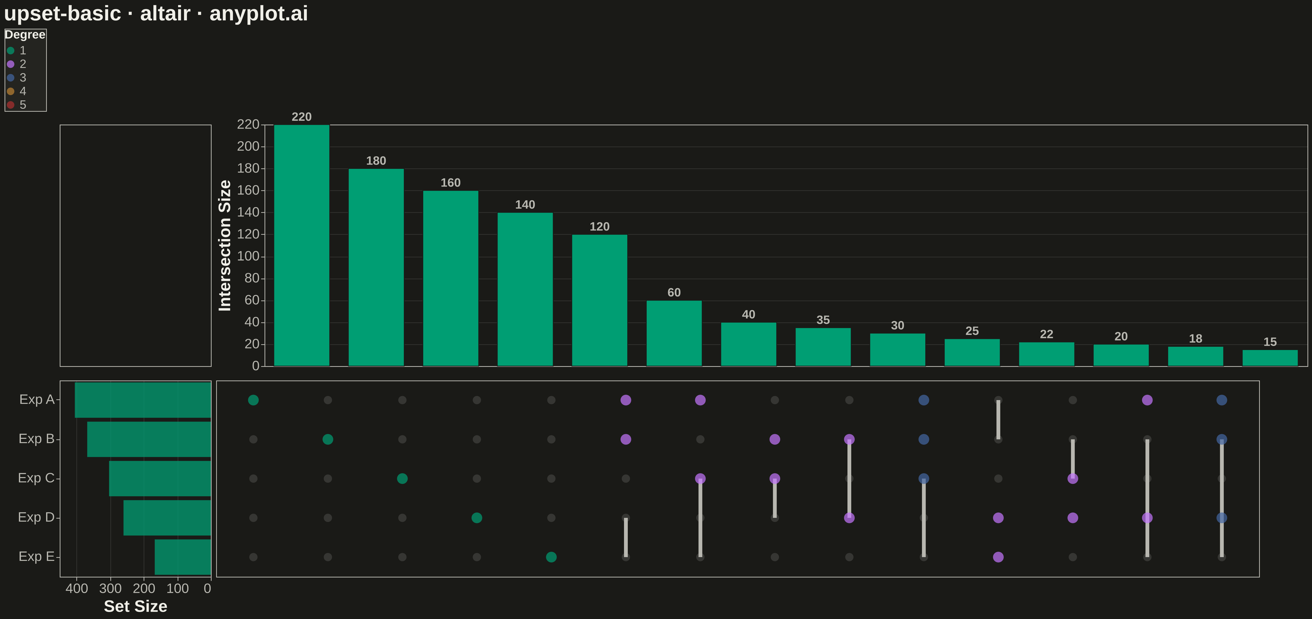
An UpSet plot visualizes intersections of multiple sets using a matrix-based layout that scales far better than Venn diagrams beyond 3 sets. A horizontal bar chart shows individual set sizes, a dot-matrix indicates which sets participate in each intersection, and a vertical bar chart above shows the intersection cardinality. This is the modern standard for set intersection analysis, making complex overlaps between many sets immediately readable.
""" anyplot.ai
upset-basic: UpSet Plot for Multi-Set Intersection Analysis
Library: altair 6.1.0 | Python 3.13.13
Quality: 84/100 | Created: 2026-05-13
"""

import os
import sys


# Remove script directory from sys.path to avoid importing local altair.py
script_dir = os.path.dirname(os.path.abspath(__file__))
if script_dir in sys.path:
    sys.path.remove(script_dir)

import altair as alt
import numpy as np
import pandas as pd


THEME = os.getenv("ANYPLOT_THEME", "light")
PAGE_BG = "#FAF8F1" if THEME == "light" else "#1A1A17"
ELEVATED_BG = "#FFFDF6" if THEME == "light" else "#242420"
INK = "#1A1A17" if THEME == "light" else "#F0EFE8"
INK_SOFT = "#4A4A44" if THEME == "light" else "#B8B7B0"
INK_MUTED = "#6B6A63" if THEME == "light" else "#A8A79F"
BRAND = "#009E73"
C2 = "#C475FD"
C3 = "#4467A3"
C4 = "#BD8233"
C5 = "#AE3030"

# Data — gene sets from 5 genomic experiments
np.random.seed(42)

set_names = ["Exp A", "Exp B", "Exp C", "Exp D", "Exp E"]
n_sets = len(set_names)

# Generate membership with realistic overlap structure
n_genes = 600
memberships = {s: set() for s in set_names}

# Seed unique members per set
base_sizes = [220, 180, 160, 140, 120]
gene_id = 0
for s, sz in zip(set_names, base_sizes, strict=True):
    for _ in range(sz):
        memberships[s].add(f"g{gene_id}")
        gene_id += 1

# Add overlapping genes
overlap_groups = [
    (["Exp A", "Exp B"], 60),
    (["Exp A", "Exp C"], 40),
    (["Exp B", "Exp C"], 35),
    (["Exp A", "Exp B", "Exp C"], 25),
    (["Exp B", "Exp D"], 30),
    (["Exp C", "Exp D"], 20),
    (["Exp A", "Exp D"], 18),
    (["Exp D", "Exp E"], 22),
    (["Exp A", "Exp B", "Exp D"], 15),
    (["Exp A", "Exp B", "Exp C", "Exp D"], 10),
    (["Exp A", "Exp E"], 12),
    (["Exp B", "Exp C", "Exp E"], 8),
    (["Exp A", "Exp B", "Exp C", "Exp D", "Exp E"], 5),
]

for sets_in_group, count in overlap_groups:
    for _ in range(count):
        gid = f"g{gene_id}"
        gene_id += 1
        for s in sets_in_group:
            memberships[s].add(gid)

# Build element→sets mapping
all_genes = set()
for s in set_names:
    all_genes |= memberships[s]

records = []
for g in all_genes:
    belongs = tuple(sorted(s for s in set_names if g in memberships[s]))
    records.append({"gene": g, "combo": belongs})

df_elements = pd.DataFrame(records)

# Compute intersection sizes
combo_counts = df_elements.groupby("combo").size().reset_index(name="size")
combo_counts = combo_counts.sort_values("size", ascending=False).reset_index(drop=True)
combo_counts["col_idx"] = range(len(combo_counts))

# Keep top 14 intersections for readability
top_n = 14
combo_counts = combo_counts.head(top_n).reset_index(drop=True)
combo_counts["col_idx"] = range(len(combo_counts))

# Compute set sizes
set_sizes = {s: len(memberships[s]) for s in set_names}
set_df = pd.DataFrame([{"set": s, "size": set_sizes[s]} for s in set_names])
set_df["row_idx"] = range(n_sets)

# Build dot matrix data
dot_rows = []
for _, row in combo_counts.iterrows():
    sets_in = set(row["combo"])
    for s_idx, s in enumerate(set_names):
        dot_rows.append(
            {"col_idx": row["col_idx"], "row_idx": s_idx, "set": s, "active": s in sets_in, "degree": len(sets_in)}
        )

dot_df = pd.DataFrame(dot_rows)

# Build connector (vertical line) data for each intersection column
conn_rows = []
for _, row in combo_counts.iterrows():
    sets_in = sorted([set_names.index(s) for s in row["combo"]])
    if len(sets_in) >= 2:
        conn_rows.append({"col_idx": row["col_idx"], "y_min": sets_in[0], "y_max": sets_in[-1]})

conn_df = pd.DataFrame(conn_rows)

# Add intersection labels for bar chart
combo_counts["label"] = combo_counts["combo"].apply(lambda c: " ∩ ".join(c) if len(c) <= 2 else f"{len(c)}-way")

# --- Chart dimensions ---
W = 1600
H = 900
bar_top_h = 320
matrix_h = 260
bar_left_w = 200
main_w = W - bar_left_w - 20

col_step = main_w // top_n
row_step = matrix_h // n_sets

# Altair uses data-space coordinates, so we work with col_idx / row_idx directly
# and set explicit step sizes via scale

# 1. Top intersection bar chart
bar_top = (
    alt.Chart(combo_counts)
    .mark_bar(color=BRAND, stroke=PAGE_BG, strokeWidth=1)
    .encode(
        x=alt.X("col_idx:O", axis=None, scale=alt.Scale(paddingInner=0.25)),
        y=alt.Y(
            "size:Q",
            title="Intersection Size",
            axis=alt.Axis(
                titleFontSize=22,
                labelFontSize=18,
                titleColor=INK,
                labelColor=INK_SOFT,
                domainColor=INK_SOFT,
                tickColor=INK_SOFT,
                gridColor=INK,
                gridOpacity=0.10,
            ),
        ),
        tooltip=[alt.Tooltip("label:N", title="Intersection"), alt.Tooltip("size:Q", title="Genes")],
    )
    .properties(width=main_w, height=bar_top_h)
)

# Count labels on top of each bar to highlight key intersections
bar_labels = (
    alt.Chart(combo_counts)
    .mark_text(dy=-10, fontSize=16, fontWeight="bold")
    .encode(
        x=alt.X("col_idx:O", axis=None, scale=alt.Scale(paddingInner=0.25)),
        y=alt.Y("size:Q"),
        text=alt.Text("size:Q", format="d"),
        color=alt.value(INK_SOFT),
    )
    .properties(width=main_w, height=bar_top_h)
)

bar_top_chart = alt.layer(bar_top, bar_labels)

# 2. Dot matrix — inactive dots
dot_inactive = (
    alt.Chart(dot_df[dot_df["active"] == False])
    .mark_circle(size=120, opacity=0.18)
    .encode(
        x=alt.X("col_idx:O", axis=None, scale=alt.Scale(paddingInner=0.25)),
        y=alt.Y("row_idx:O", scale=alt.Scale(reverse=False), axis=None),
        color=alt.value(INK_SOFT),
    )
    .properties(width=main_w, height=matrix_h)
)

# Active dots colored by degree
degree_colors = {1: BRAND, 2: C2, 3: C3, 4: C4, 5: C5}
dot_df["dot_color"] = dot_df["degree"].map(degree_colors)

dot_active = (
    alt.Chart(dot_df[dot_df["active"] == True])
    .mark_circle(size=200)
    .encode(
        x=alt.X("col_idx:O", axis=None, scale=alt.Scale(paddingInner=0.25)),
        y=alt.Y("row_idx:O", scale=alt.Scale(reverse=False), axis=None),
        color=alt.Color(
            "degree:O",
            scale=alt.Scale(domain=[1, 2, 3, 4, 5], range=[BRAND, C2, C3, C4, C5]),
            legend=alt.Legend(
                title="Degree",
                titleColor=INK,
                labelColor=INK_SOFT,
                fillColor=ELEVATED_BG,
                strokeColor=INK_SOFT,
                labelFontSize=16,
                titleFontSize=16,
                orient="bottom-right",
            ),
        ),
        tooltip=[alt.Tooltip("set:N", title="Set"), alt.Tooltip("degree:Q", title="Degree")],
    )
    .properties(width=main_w, height=matrix_h)
)

# Connector lines — thicker for visibility at canvas scale
conn_chart = (
    alt.Chart(conn_df)
    .mark_rule(strokeWidth=5)
    .encode(
        x=alt.X("col_idx:O", axis=None, scale=alt.Scale(paddingInner=0.25)),
        y=alt.Y("y_min:Q", axis=None, scale=alt.Scale(domain=[-0.5, n_sets - 0.5], reverse=False)),
        y2=alt.Y2("y_max:Q"),
        color=alt.value(INK_SOFT),
    )
    .properties(width=main_w, height=matrix_h)
)

matrix_layer = alt.layer(dot_inactive, conn_chart, dot_active)

# 3. Set size bar (horizontal, left side) — BRAND green to visually link to intersection bars
set_bar = (
    alt.Chart(set_df)
    .mark_bar(color=BRAND, opacity=0.75)
    .encode(
        y=alt.Y(
            "row_idx:O",
            scale=alt.Scale(reverse=False),
            axis=alt.Axis(
                labels=True,
                labelExpr="datum.value == 0 ? 'Exp A' : datum.value == 1 ? 'Exp B' : datum.value == 2 ? 'Exp C' : datum.value == 3 ? 'Exp D' : 'Exp E'",
                labelFontSize=18,
                labelColor=INK_SOFT,
                domainColor=INK_SOFT,
                tickColor=INK_SOFT,
                titleColor=INK,
                title=None,
            ),
        ),
        x=alt.X(
            "size:Q",
            title="Set Size",
            sort="descending",
            axis=alt.Axis(
                titleFontSize=22,
                labelFontSize=18,
                titleColor=INK,
                labelColor=INK_SOFT,
                domainColor=INK_SOFT,
                tickColor=INK_SOFT,
                gridColor=INK,
                gridOpacity=0.10,
            ),
            scale=alt.Scale(reverse=True),
        ),
        tooltip=[alt.Tooltip("set:N", title="Set"), alt.Tooltip("size:Q", title="Genes")],
    )
    .properties(width=bar_left_w, height=matrix_h)
)

# Set name labels on the right of the set bar (in the matrix row axis)
set_label = (
    alt.Chart(set_df)
    .mark_text(align="left", dx=4, fontSize=18)
    .encode(y=alt.Y("row_idx:O", axis=None), text=alt.Text("set:N"), color=alt.value(INK_SOFT))
    .properties(width=20, height=matrix_h)
)

# Spacer chart for top-left corner alignment
spacer_top = (
    alt.Chart(pd.DataFrame({"x": [0]}))
    .mark_point(opacity=0)
    .encode(x=alt.X("x:Q", axis=None))
    .properties(width=bar_left_w, height=bar_top_h)
)

# Compose layout: [spacer | bar_top] / [set_bar | matrix]
top_row = alt.hconcat(spacer_top, bar_top_chart, spacing=4)
bottom_row = alt.hconcat(set_bar, matrix_layer, spacing=4)

chart = (
    alt.vconcat(top_row, bottom_row, spacing=8)
    .properties(
        title=alt.Title("upset-basic · altair · anyplot.ai", fontSize=28, color=INK, anchor="start"), background=PAGE_BG
    )
    .configure_view(fill=PAGE_BG, stroke=INK_SOFT)
    .configure_concat(spacing=4)
)

# Save
chart.save(f"plot-{THEME}.png", scale_factor=3.0)
chart.save(f"plot-{THEME}.html")
Runnable source as JSON, for any HTTP client: https://api.anyplot.ai/specs/upset-basic/altair/code. Any spec id and library id listed in llms-full.txt fit the same URL shape; every URL below is complete and callable.
{
  "spec_id": "upset-basic",
  "language": "python",
  "library": "altair",
  "page": "https://anyplot.ai/upset-basic/python/altair",
  "hub": "https://anyplot.ai/upset-basic",
  "code_json": "https://api.anyplot.ai/specs/upset-basic/altair/code",
  "spec_json": "https://api.anyplot.ai/specs/upset-basic",
  "render_light_png": "https://storage.googleapis.com/anyplot-images/plots/upset-basic/python/altair/plot-light.png",
  "render_dark_png": "https://storage.googleapis.com/anyplot-images/plots/upset-basic/python/altair/plot-dark.png",
  "interactive_light_html": "https://storage.googleapis.com/anyplot-images/plots/upset-basic/python/altair/plot-light.html",
  "interactive_dark_html": "https://storage.googleapis.com/anyplot-images/plots/upset-basic/python/altair/plot-dark.html",
  "quality_score": 84.0,
  "license": "MIT",
  "guide": "https://anyplot.ai/llms.txt"
}
Part of UpSet Plot for Multi-Set Intersection Analysis on anyplot.ai.