The same plot in 14 other libraries — Python: Altair, Bokeh, lets-plot, Matplotlib, plotnine, Pygal, Seaborn; R: ggplot2; Julia: Makie.jl; JavaScript: Chart.js, D3.js, Apache ECharts, Highcharts, MUI X Charts. Compare all 15 side by side: UpSet Plot for Multi-Set Intersection Analysis in Python, R, Julia and JavaScript.
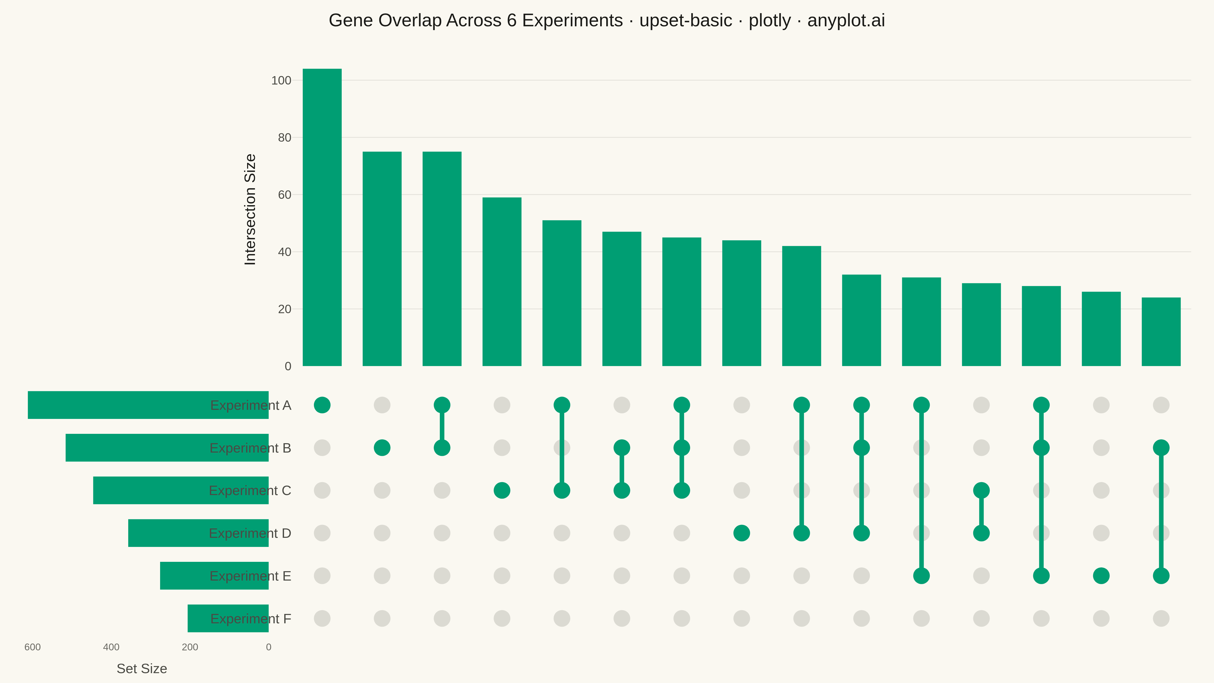
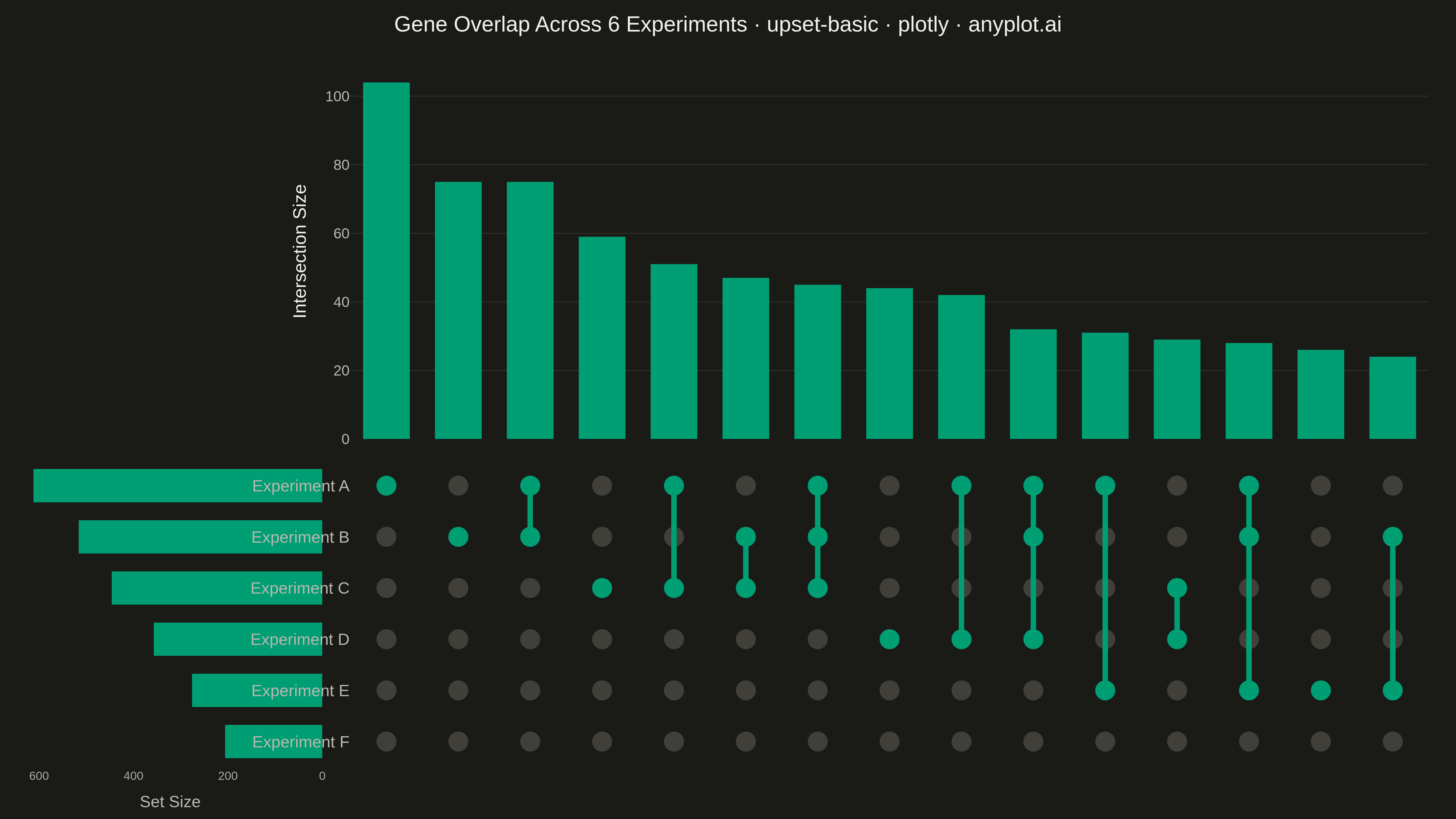
An UpSet plot visualizes intersections of multiple sets using a matrix-based layout that scales far better than Venn diagrams beyond 3 sets. A horizontal bar chart shows individual set sizes, a dot-matrix indicates which sets participate in each intersection, and a vertical bar chart above shows the intersection cardinality. This is the modern standard for set intersection analysis, making complex overlaps between many sets immediately readable.
""" anyplot.ai
upset-basic: UpSet Plot for Multi-Set Intersection Analysis
Library: plotly 6.7.0 | Python 3.13.13
Quality: 90/100 | Created: 2026-05-13
"""

import os
from collections import Counter

import numpy as np
import plotly.graph_objects as go
from plotly.subplots import make_subplots


THEME = os.getenv("ANYPLOT_THEME", "light")
PAGE_BG = "#FAF8F1" if THEME == "light" else "#1A1A17"
ELEVATED_BG = "#FFFDF6" if THEME == "light" else "#242420"
INK = "#1A1A17" if THEME == "light" else "#F0EFE8"
INK_SOFT = "#4A4A44" if THEME == "light" else "#B8B7B0"
INK_MUTED = "#6B6A63" if THEME == "light" else "#A8A79F"
GRID = "rgba(26,26,23,0.10)" if THEME == "light" else "rgba(240,239,232,0.10)"
BRAND = "#009E73"
DOT_INACTIVE = "rgba(150,148,140,0.30)" if THEME == "light" else "rgba(110,108,100,0.45)"

# Data — gene overlap across 6 genomic experiments
np.random.seed(42)
set_names = ["Experiment A", "Experiment B", "Experiment C", "Experiment D", "Experiment E", "Experiment F"]
n_sets = len(set_names)
n_genes = 1200
probs = [0.52, 0.44, 0.37, 0.29, 0.23, 0.17]

membership = np.column_stack([np.random.random(n_genes) < p for p in probs])
membership = membership[membership.any(axis=1)]

set_sizes = membership.sum(axis=0)
set_order = np.argsort(set_sizes)  # ascending: largest set at top (highest y)
set_names_ord = [set_names[i] for i in set_order]
set_sizes_ord = set_sizes[set_order]
membership_ord = membership[:, set_order]

patterns = Counter(map(tuple, membership_ord.tolist()))
top_n = 15
sorted_patterns = sorted(patterns.items(), key=lambda x: -x[1])[:top_n]
inter_sizes = [v for _, v in sorted_patterns]
inter_patterns = [k for k, _ in sorted_patterns]
n_inter = len(inter_patterns)

# Dot matrix and connecting lines
active_x, active_y, inactive_x, inactive_y = [], [], [], []
line_x, line_y = [], []
for col_i, pattern in enumerate(inter_patterns):
    active_rows = [r for r, m in enumerate(pattern) if m]
    for r, m in enumerate(pattern):
        if m:
            active_x.append(col_i)
            active_y.append(r)
        else:
            inactive_x.append(col_i)
            inactive_y.append(r)
    if len(active_rows) > 1:
        line_x.extend([col_i, col_i, None])
        line_y.extend([min(active_rows), max(active_rows), None])

# Plot — 2×2 grid: [empty | intersection bars] / [set bars | dot matrix]
fig = make_subplots(
    rows=2,
    cols=2,
    row_heights=[0.55, 0.45],
    column_widths=[0.22, 0.78],
    shared_xaxes=True,  # links (1,2) and (2,2) x-axes for column alignment
    shared_yaxes=False,
    vertical_spacing=0.03,
    horizontal_spacing=0.02,
)

# [1,2] Intersection size bars
fig.add_trace(
    go.Bar(
        x=list(range(n_inter)),
        y=inter_sizes,
        marker_color=BRAND,
        marker_line_width=0,
        showlegend=False,
        hovertemplate="Size: %{y} genes<extra></extra>",
    ),
    row=1,
    col=2,
)

# [2,1] Set size bars (horizontal, axis reversed → bars point toward matrix)
fig.add_trace(
    go.Bar(
        x=set_sizes_ord,
        y=list(range(n_sets)),
        orientation="h",
        marker_color=BRAND,
        marker_line_width=0,
        showlegend=False,
        customdata=set_names_ord,
        hovertemplate="%{customdata}: %{x} genes<extra></extra>",
    ),
    row=2,
    col=1,
)

# [2,2] Inactive dots (non-member sets)
fig.add_trace(
    go.Scatter(
        x=inactive_x,
        y=inactive_y,
        mode="markers",
        marker={"color": DOT_INACTIVE, "size": 22, "symbol": "circle"},
        showlegend=False,
        hoverinfo="skip",
    ),
    row=2,
    col=2,
)

# [2,2] Connecting lines (linking active dots in each intersection column)
fig.add_trace(
    go.Scatter(x=line_x, y=line_y, mode="lines", line={"color": BRAND, "width": 6}, showlegend=False, hoverinfo="skip"),
    row=2,
    col=2,
)

# [2,2] Active dots (member sets) — drawn on top of lines
fig.add_trace(
    go.Scatter(
        x=active_x,
        y=active_y,
        mode="markers",
        marker={"color": BRAND, "size": 22, "symbol": "circle"},
        showlegend=False,
        hoverinfo="skip",
    ),
    row=2,
    col=2,
)

# Global layout
fig.update_layout(
    paper_bgcolor=PAGE_BG,
    plot_bgcolor=PAGE_BG,
    font={"color": INK, "size": 16},
    title={
        "text": "Gene Overlap Across 6 Experiments · upset-basic · plotly · anyplot.ai",
        "font": {"size": 24, "color": INK},
        "x": 0.5,
        "xanchor": "center",
        "y": 0.98,
    },
    showlegend=False,
    bargap=0.35,
    margin={"l": 20, "r": 30, "t": 70, "b": 20},
)

# [1,1] Empty panel — suppress all chrome
fig.update_xaxes(showgrid=False, zeroline=False, showticklabels=False, showline=False, row=1, col=1)
fig.update_yaxes(showgrid=False, zeroline=False, showticklabels=False, showline=False, row=1, col=1)

# [1,2] Intersection bars — y-axis only
fig.update_yaxes(
    title={"text": "Intersection Size", "font": {"size": 20, "color": INK}},
    tickfont={"size": 16, "color": INK_SOFT},
    gridcolor=GRID,
    zeroline=False,
    showline=False,
    row=1,
    col=2,
)
fig.update_xaxes(showgrid=False, zeroline=False, showticklabels=False, showline=False, row=1, col=2)

# [2,1] Set size bars — reversed x, no tick labels on y
fig.update_xaxes(
    autorange="reversed",
    title={"text": "Set Size", "font": {"size": 18, "color": INK_SOFT}},
    tickfont={"size": 13, "color": INK_MUTED},
    showgrid=False,
    zeroline=False,
    showline=False,
    row=2,
    col=1,
)
fig.update_yaxes(
    showticklabels=False, showgrid=False, zeroline=False, showline=False, range=[-0.5, n_sets - 0.5], row=2, col=1
)

# [2,2] Dot matrix — set names on y-axis, clean x-axis
fig.update_xaxes(
    showgrid=False, zeroline=False, showticklabels=False, showline=False, range=[-0.5, n_inter - 0.5], row=2, col=2
)
fig.update_yaxes(
    tickmode="array",
    tickvals=list(range(n_sets)),
    ticktext=set_names_ord,
    tickfont={"size": 18, "color": INK_SOFT},
    showgrid=False,
    zeroline=False,
    showline=False,
    range=[-0.5, n_sets - 0.5],
    row=2,
    col=2,
)

# Save
fig.write_image(f"plot-{THEME}.png", width=1600, height=900, scale=3)
fig.write_html(f"plot-{THEME}.html", include_plotlyjs="cdn")
Runnable source as JSON, for any HTTP client: https://api.anyplot.ai/specs/upset-basic/plotly/code. Any spec id and library id listed in llms-full.txt fit the same URL shape; every URL below is complete and callable.
{
  "spec_id": "upset-basic",
  "language": "python",
  "library": "plotly",
  "page": "https://anyplot.ai/upset-basic/python/plotly",
  "hub": "https://anyplot.ai/upset-basic",
  "code_json": "https://api.anyplot.ai/specs/upset-basic/plotly/code",
  "spec_json": "https://api.anyplot.ai/specs/upset-basic",
  "render_light_png": "https://storage.googleapis.com/anyplot-images/plots/upset-basic/python/plotly/plot-light.png",
  "render_dark_png": "https://storage.googleapis.com/anyplot-images/plots/upset-basic/python/plotly/plot-dark.png",
  "interactive_light_html": "https://storage.googleapis.com/anyplot-images/plots/upset-basic/python/plotly/plot-light.html",
  "interactive_dark_html": "https://storage.googleapis.com/anyplot-images/plots/upset-basic/python/plotly/plot-dark.html",
  "quality_score": 90.0,
  "license": "MIT",
  "guide": "https://anyplot.ai/llms.txt"
}
Part of UpSet Plot for Multi-Set Intersection Analysis on anyplot.ai.