The same plot in 14 other libraries — JavaScript: Chart.js, Apache ECharts, Highcharts, MUI X Charts; Python: Altair, Bokeh, lets-plot, Matplotlib, Plotly, plotnine, Pygal, Seaborn; R: ggplot2; Julia: Makie.jl. Compare all 15 side by side: Basic Violin Plot in Python, R, Julia and JavaScript.
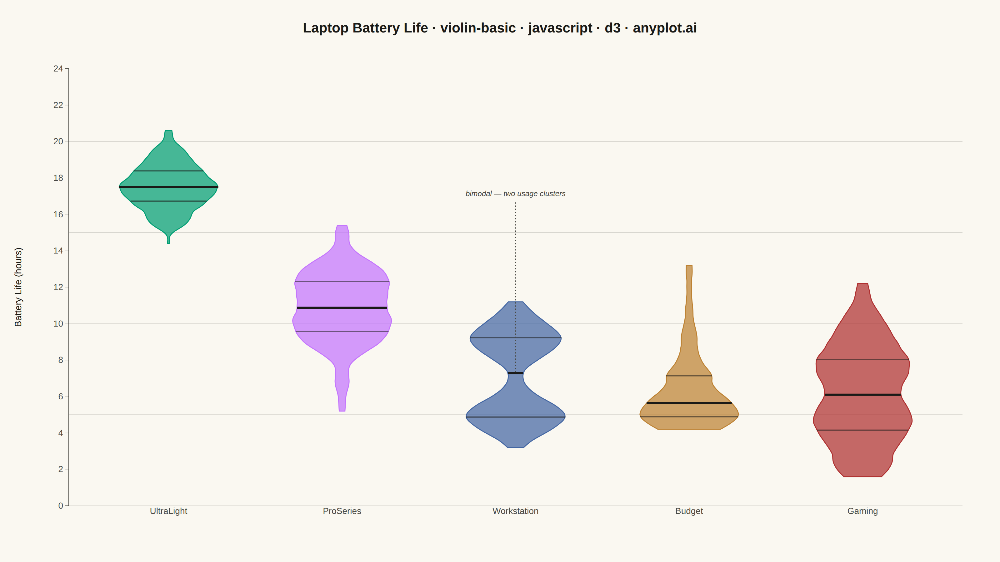
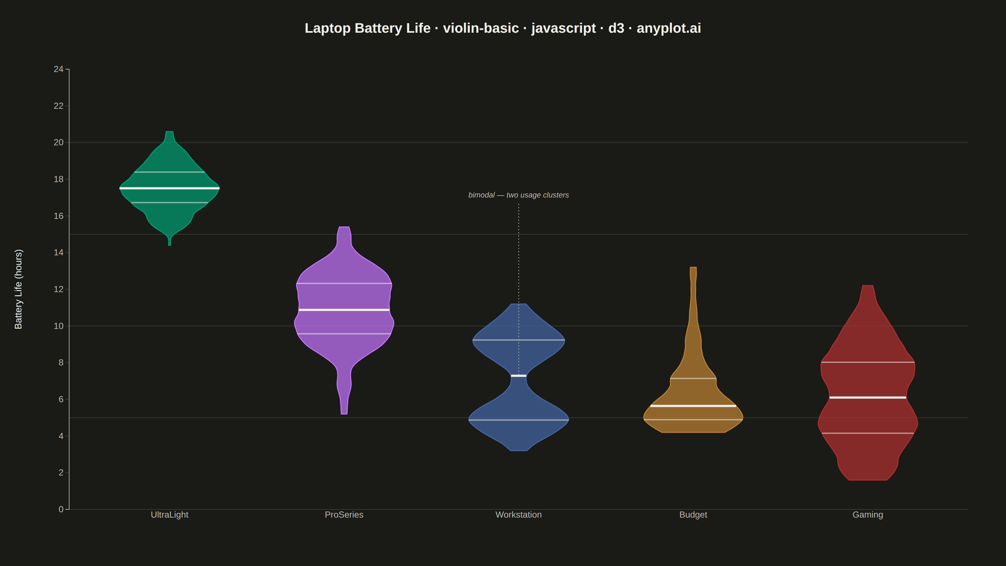
A violin plot combining a box plot with a kernel density estimation on each side, showing the distribution shape of numerical data. The width of the violin at each point represents the frequency of data values at that level. Excellent for comparing distributions across categories while revealing their underlying shape, providing more detail than a traditional box plot.
// anyplot.ai
// violin-basic: Basic Violin Plot
// Library: d3 7.9.0 | JavaScript 22.23.2
// Quality: 93/100 | Created: 2026-08-26

// --- Reproducible RNG (LCG + Box-Muller) ------------------------------------
let seed = 20260826;
const rng = () => {
  seed = (seed * 1664525 + 1013904223) % 4294967296;
  return seed / 4294967296;
};
const randomNormal = (mean, std) => {
  const u1 = Math.max(rng(), 1e-9);
  const u2 = rng();
  const z = Math.sqrt(-2 * Math.log(u1)) * Math.cos(2 * Math.PI * u2);
  return mean + z * std;
};

// --- Data: laptop battery life (hours) by product line ----------------------
// Each line has a distinct distribution shape to show what a violin reveals
// beyond a box plot: a tight cluster, a wide spread, a right-skewed tail, and
// a genuinely bimodal usage pattern.
const groups = [
  { category: "UltraLight", values: Array.from({ length: 160 }, () => randomNormal(17.5, 1.3)) },
  { category: "ProSeries", values: Array.from({ length: 160 }, () => randomNormal(11, 2) ) },
  {
    category: "Workstation",
    values: [
      ...Array.from({ length: 80 }, () => randomNormal(5, 0.8)),
      ...Array.from({ length: 80 }, () => randomNormal(9.5, 0.9)),
    ],
  },
  {
    category: "Budget",
    values: Array.from({ length: 160 }, () => 4 + -Math.log(Math.max(rng(), 1e-9)) * 2.2),
  },
  {
    category: "Gaming",
    values: Array.from({ length: 160 }, () => Math.max(1.5, randomNormal(6, 2.6))),
  },
];

const t = window.ANYPLOT_TOKENS;
const { width, height } = window.ANYPLOT_SIZE;
const margin = { top: 110, right: 60, bottom: 90, left: 110 };
const iw = width - margin.left - margin.right;
const ih = height - margin.top - margin.bottom;

const allValues = groups.flatMap((grp) => grp.values);
const x = d3.scaleBand()
  .domain(groups.map((grp) => grp.category))
  .range([0, iw])
  .paddingInner(0.35)
  .paddingOuter(0.25);

const y = d3.scaleLinear()
  .domain([0, d3.max(allValues) + 1.5])
  .nice()
  .range([ih, 0]);

const color = d3.scaleOrdinal()
  .domain(groups.map((grp) => grp.category))
  .range(t.palette);

// --- Kernel density estimation ----------------------------------------------
const kernelEpanechnikov = (bandwidth) => (v) =>
  Math.abs((v /= bandwidth)) <= 1 ? (0.75 * (1 - v * v)) / bandwidth : 0;

const kernelDensityEstimator = (kernel, thresholds) => (sample) =>
  thresholds.map((v) => [v, d3.mean(sample, (s) => kernel(v - s))]);

const thresholds = y.ticks(90);
const halfWidth = x.bandwidth() / 2;

// --- SVG mount ----------------------------------------------------------------
const svg = d3.select("#container").append("svg").attr("width", width).attr("height", height);
const g = svg.append("g").attr("transform", `translate(${margin.left},${margin.top})`);

// --- Horizontal gridlines (value axis) -----------------------------------------
g.append("g")
  .selectAll("line")
  .data(y.ticks(6))
  .join("line")
  .attr("x1", 0)
  .attr("x2", iw)
  .attr("y1", (d) => y(d))
  .attr("y2", (d) => y(d))
  .attr("stroke", t.grid)
  .attr("stroke-width", 1);

// --- Draw each category's mirrored violin ---------------------------------------
for (const grp of groups) {
  const cat = grp.category;
  const values = grp.values.slice().sort(d3.ascending);
  const fill = color(cat);
  const center = x(cat) + halfWidth;

  // 1.35x the Silverman rule-of-thumb factor: smooths sparse-tail bumpiness
  // (e.g. ProSeries) without over-flattening the bimodal Workstation shape.
  const bandwidth = 1.35 * d3.deviation(values) * Math.pow(values.length, -0.2);
  const kernel = kernelEpanechnikov(bandwidth);
  const kde = kernelDensityEstimator(kernel, thresholds);
  const density = kde(values).filter((d) => d[0] >= values[0] && d[0] <= values[values.length - 1]);
  const maxDensity = d3.max(density, (d) => d[1]) || 1;
  const widthScale = d3.scaleLinear().domain([0, maxDensity]).range([0, halfWidth * 0.88]);

  const violin = d3.area()
    .y((d) => y(d[0]))
    .x0((d) => center - widthScale(d[1]))
    .x1((d) => center + widthScale(d[1]))
    .curve(d3.curveBasis);

  g.append("path")
    .datum(density)
    .attr("d", violin)
    .attr("fill", fill)
    .attr("fill-opacity", 0.72)
    .attr("stroke", fill)
    .attr("stroke-width", 1.5);

  // Quartile markers inside the violin, matching its local width
  const densityAt = (v) => d3.mean(values, (s) => kernel(v - s));
  const q1 = d3.quantileSorted(values, 0.25);
  const median = d3.quantileSorted(values, 0.5);
  const q3 = d3.quantileSorted(values, 0.75);

  for (const [q, strokeWidth] of [[q1, 2], [q3, 2]]) {
    const w = widthScale(densityAt(q));
    g.append("line")
      .attr("x1", center - w)
      .attr("x2", center + w)
      .attr("y1", y(q))
      .attr("y2", y(q))
      .attr("stroke", t.ink)
      .attr("stroke-opacity", 0.55)
      .attr("stroke-width", strokeWidth);
  }

  const medianWidth = widthScale(densityAt(median));
  g.append("line")
    .attr("x1", center - medianWidth)
    .attr("x2", center + medianWidth)
    .attr("y1", y(median))
    .attr("y2", y(median))
    .attr("stroke", t.ink)
    .attr("stroke-width", 3.5);
}

// --- Focal-point annotation: call out the bimodal Workstation shape -------------
// Storytelling touch: a violin's advantage over a box plot is revealing shapes
// like this waisted, two-cluster distribution — worth a direct callout.
{
  const wsCenter = x("Workstation") + halfWidth;
  const waistValue = 7.25; // midpoint between the two generating means (5 and 9.5)
  const labelValue = 17; // clear of the violin's peak (~12h) and off the 15/20 gridlines

  g.append("line")
    .attr("x1", wsCenter)
    .attr("x2", wsCenter)
    .attr("y1", y(labelValue) + 10)
    .attr("y2", y(waistValue))
    .attr("stroke", t.inkSoft)
    .attr("stroke-width", 1)
    .attr("stroke-dasharray", "2,3");

  g.append("text")
    .attr("x", wsCenter)
    .attr("y", y(labelValue))
    .attr("text-anchor", "middle")
    .attr("fill", t.inkSoft)
    .style("font-size", "12px")
    .style("font-style", "italic")
    .text("bimodal — two usage clusters");
}

// --- Axes -----------------------------------------------------------------------
const xAxis = g.append("g").attr("transform", `translate(0,${ih})`).call(d3.axisBottom(x).tickSize(0));
const yAxis = g.append("g").call(d3.axisLeft(y));

for (const ax of [xAxis, yAxis]) {
  ax.selectAll("text").attr("fill", t.inkSoft).style("font-size", "14px");
  ax.selectAll("line").attr("stroke", t.grid);
  ax.select(".domain").attr("stroke", t.inkSoft);
}
xAxis.select(".domain").remove();

g.append("text")
  .attr("transform", `translate(${-margin.left + 34},${ih / 2}) rotate(-90)`)
  .attr("text-anchor", "middle")
  .attr("fill", t.ink)
  .style("font-size", "15px")
  .text("Battery Life (hours)");

// --- Title ------------------------------------------------------------------
svg.append("text")
  .attr("x", width / 2)
  .attr("y", 52)
  .attr("text-anchor", "middle")
  .attr("fill", t.ink)
  .style("font-size", "22px")
  .style("font-weight", "600")
  .text("Laptop Battery Life · violin-basic · javascript · d3 · anyplot.ai");
Runnable source as JSON, for any HTTP client: https://api.anyplot.ai/specs/violin-basic/d3/code. Any spec id and library id listed in llms-full.txt fit the same URL shape; every URL below is complete and callable.
{
  "spec_id": "violin-basic",
  "language": "javascript",
  "library": "d3",
  "page": "https://anyplot.ai/violin-basic/javascript/d3",
  "hub": "https://anyplot.ai/violin-basic",
  "code_json": "https://api.anyplot.ai/specs/violin-basic/d3/code",
  "spec_json": "https://api.anyplot.ai/specs/violin-basic",
  "render_light_png": "https://storage.googleapis.com/anyplot-images/plots/violin-basic/javascript/d3/plot-light.png",
  "render_dark_png": "https://storage.googleapis.com/anyplot-images/plots/violin-basic/javascript/d3/plot-dark.png",
  "interactive_light_html": "https://storage.googleapis.com/anyplot-images/plots/violin-basic/javascript/d3/plot-light.html",
  "interactive_dark_html": "https://storage.googleapis.com/anyplot-images/plots/violin-basic/javascript/d3/plot-dark.html",
  "quality_score": 93.0,
  "license": "MIT",
  "guide": "https://anyplot.ai/llms.txt"
}
Part of Basic Violin Plot on anyplot.ai.