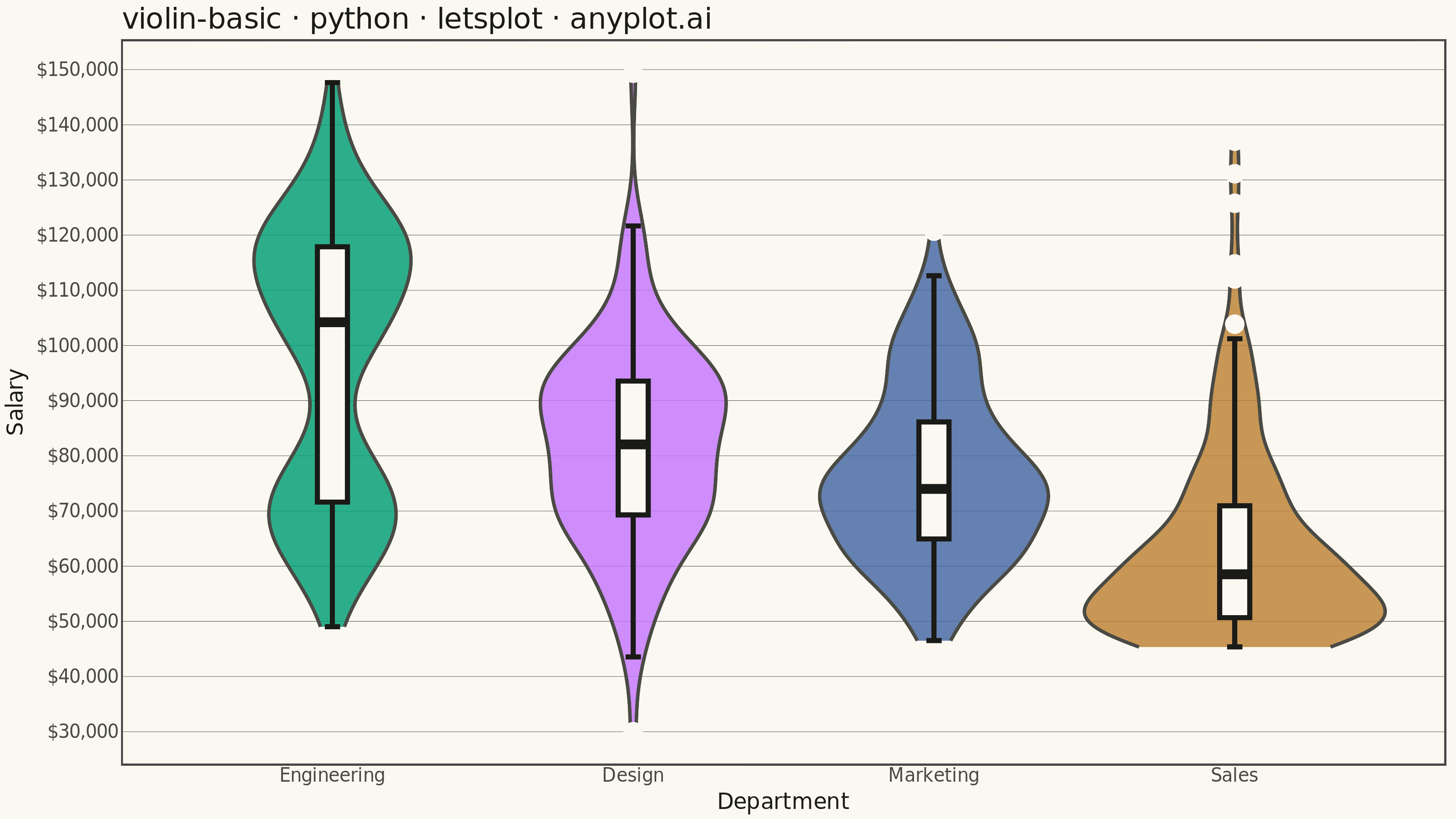
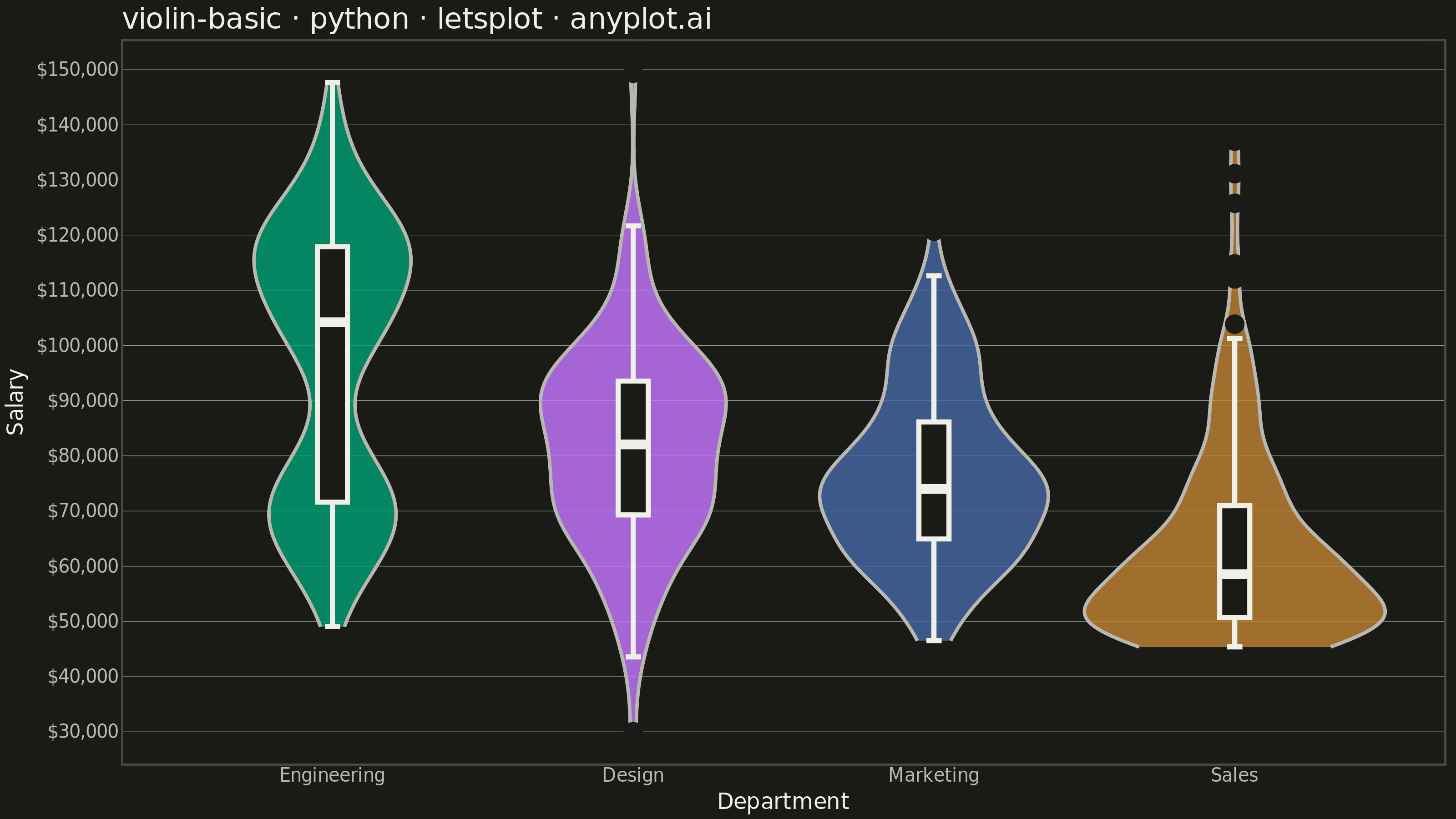
A violin plot combining a box plot with a kernel density estimation on each side, showing the distribution shape of numerical data. The width of the violin at each point represents the frequency of data values at that level. Excellent for comparing distributions across categories while revealing their underlying shape, providing more detail than a traditional box plot.
""" anyplot.ai
violin-basic: Basic Violin Plot
Library: letsplot 4.10.1 | Python 3.13.13
Quality: 91/100 | Updated: 2026-05-29
"""

import os

import numpy as np
import pandas as pd
from lets_plot import (
    LetsPlot,
    aes,
    element_blank,
    element_line,
    element_rect,
    element_text,
    geom_boxplot,
    geom_violin,
    ggplot,
    ggsave,
    ggsize,
    labs,
    layer_tooltips,
    scale_fill_manual,
    scale_x_discrete,
    scale_y_continuous,
    theme,
    theme_minimal,
)


LetsPlot.setup_html()

# Theme tokens
THEME = os.getenv("ANYPLOT_THEME", "light")
PAGE_BG = "#FAF8F1" if THEME == "light" else "#1A1A17"
ELEVATED_BG = "#FFFDF6" if THEME == "light" else "#242420"
INK = "#1A1A17" if THEME == "light" else "#F0EFE8"
INK_SOFT = "#4A4A44" if THEME == "light" else "#B8B7B0"

# Imprint palette — canonical positions 1-4
IMPRINT_PALETTE = ["#009E73", "#C475FD", "#4467A3", "#BD8233"]

# Data
np.random.seed(42)

# Ordered by median salary (high → low) for visual storytelling
dept_order = ["Engineering", "Design", "Marketing", "Sales"]

data = []

# Engineering: bimodal (junior ~$70k + senior ~$115k) — showcases violin strength
eng_junior = np.random.normal(70000, 8000, 80)
eng_senior = np.random.normal(115000, 12000, 120)
eng_values = np.clip(np.concatenate([eng_junior, eng_senior]), 30000, 200000)
for v in eng_values:
    data.append({"Department": "Engineering", "Salary": v})

# Design: moderate spread, roughly normal
design_values = np.clip(np.random.normal(80000, 18000, 120), 30000, 200000)
for v in design_values:
    data.append({"Department": "Design", "Salary": v})

# Marketing: narrower with a small cluster of high earners
mkt_base = np.random.normal(72000, 12000, 130)
mkt_high = np.random.normal(105000, 8000, 20)
mkt_values = np.clip(np.concatenate([mkt_base, mkt_high]), 30000, 200000)
for v in mkt_values:
    data.append({"Department": "Marketing", "Salary": v})

# Sales: right-skewed (many moderate earners, few top performers)
sales_values = np.clip(np.random.exponential(20000, 180) + 45000, 30000, 200000)
for v in sales_values:
    data.append({"Department": "Sales", "Salary": v})

df = pd.DataFrame(data)

title = "violin-basic · python · letsplot · anyplot.ai"

# Plot — violins colored by Imprint palette, thin boxplot overlay for clear quartile markers
plot = (
    ggplot(df, aes(x="Department", y="Salary", fill="Department"))
    + geom_violin(
        alpha=0.82,
        trim=True,
        color=INK_SOFT,
        size=0.8,
        tooltips=layer_tooltips().format("@Salary", "${,.0f}").line("^fill").line("Salary|@Salary"),
    )
    + geom_boxplot(
        width=0.10,
        fill=PAGE_BG,
        color=INK,
        size=1.2,
        outlier_color=PAGE_BG,
        outlier_fill=PAGE_BG,
        tooltips=layer_tooltips()
        .format("@{..middle..}", "${,.0f}")
        .format("@{..lower..}", "${,.0f}")
        .format("@{..upper..}", "${,.0f}")
        .line("^fill")
        .line("Median|@{..middle..}")
        .line("IQR|@{..lower..} – @{..upper..}"),
    )
    + scale_x_discrete(limits=dept_order)
    + scale_fill_manual(values=dict(zip(dept_order, IMPRINT_PALETTE, strict=True)))
    + scale_y_continuous(format="${,.0f}")
    + labs(x="Department", y="Salary", title=title)
    + theme_minimal()
    + theme(
        plot_background=element_rect(fill=PAGE_BG, color=PAGE_BG),
        panel_background=element_rect(fill=PAGE_BG),
        panel_grid_major_y=element_line(color=INK_SOFT, size=0.2),
        panel_grid_major_x=element_blank(),
        panel_grid_minor=element_blank(),
        axis_title=element_text(color=INK, size=12),
        axis_text=element_text(color=INK_SOFT, size=10),
        plot_title=element_text(color=INK, size=16),
        legend_position="none",
        axis_ticks=element_blank(),
        legend_background=element_rect(fill=ELEVATED_BG, color=INK_SOFT),
        legend_text=element_text(color=INK_SOFT),
    )
    + ggsize(800, 450)
)

# Save
ggsave(plot, f"plot-{THEME}.png", path=".", scale=4)
ggsave(plot, f"plot-{THEME}.html", path=".")
Runnable source as JSON, for any HTTP client: https://api.anyplot.ai/specs/violin-basic/letsplot/code. Any spec id and library id listed in llms-full.txt fit the same URL shape; every URL below is complete and callable.
{
  "spec_id": "violin-basic",
  "language": "python",
  "library": "letsplot",
  "page": "https://anyplot.ai/violin-basic/python/letsplot",
  "hub": "https://anyplot.ai/violin-basic",
  "code_json": "https://api.anyplot.ai/specs/violin-basic/letsplot/code",
  "spec_json": "https://api.anyplot.ai/specs/violin-basic",
  "render_light_png": "https://storage.googleapis.com/anyplot-images/plots/violin-basic/python/letsplot/plot-light.png",
  "render_dark_png": "https://storage.googleapis.com/anyplot-images/plots/violin-basic/python/letsplot/plot-dark.png",
  "interactive_light_html": "https://storage.googleapis.com/anyplot-images/plots/violin-basic/python/letsplot/plot-light.html",
  "interactive_dark_html": "https://storage.googleapis.com/anyplot-images/plots/violin-basic/python/letsplot/plot-dark.html",
  "quality_score": 91.0,
  "license": "MIT",
  "guide": "https://anyplot.ai/llms.txt"
}
Part of Basic Violin Plot on anyplot.ai.