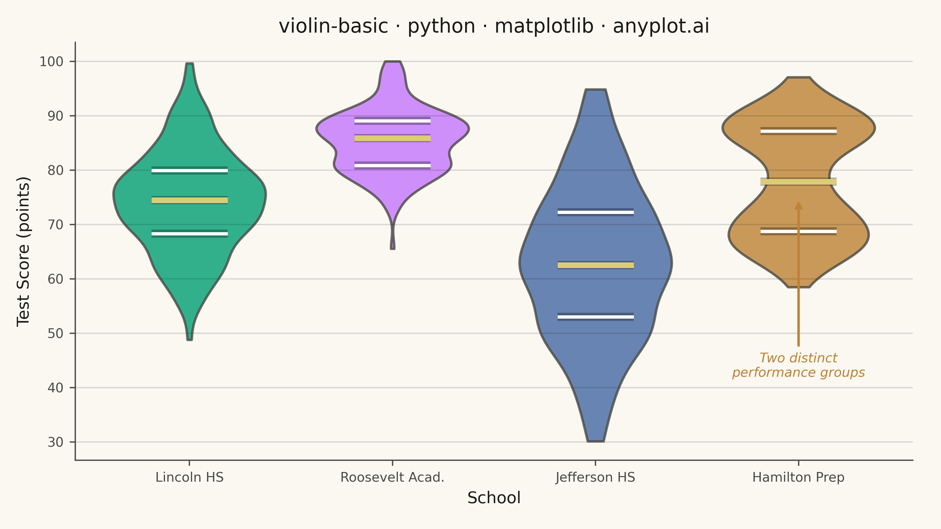
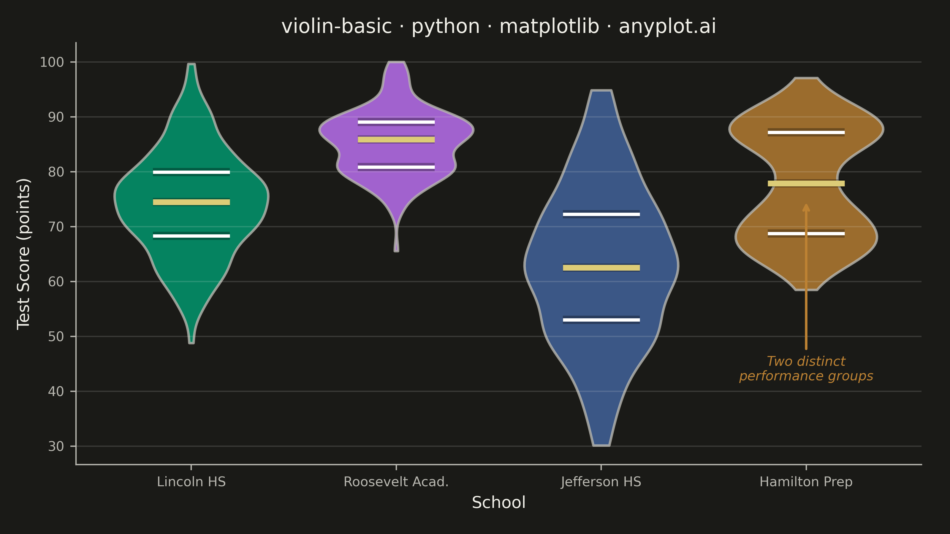
A violin plot combining a box plot with a kernel density estimation on each side, showing the distribution shape of numerical data. The width of the violin at each point represents the frequency of data values at that level. Excellent for comparing distributions across categories while revealing their underlying shape, providing more detail than a traditional box plot.
""" anyplot.ai
violin-basic: Basic Violin Plot
Library: matplotlib 3.10.9 | Python 3.13.13
Quality: 91/100 | Updated: 2026-05-29
"""

import os

import matplotlib.patheffects as pe
import matplotlib.pyplot as plt
import numpy as np


# Theme tokens — Imprint palette chrome layer
THEME = os.getenv("ANYPLOT_THEME", "light")
PAGE_BG = "#FAF8F1" if THEME == "light" else "#1A1A17"
ELEVATED_BG = "#FFFDF6" if THEME == "light" else "#242420"
INK = "#1A1A17" if THEME == "light" else "#F0EFE8"
INK_SOFT = "#4A4A44" if THEME == "light" else "#B8B7B0"
INK_MUTED = "#6B6A63" if THEME == "light" else "#A8A79F"

# Imprint palette — positions 1→4 for four categories
IMPRINT_PALETTE = ["#009E73", "#C475FD", "#4467A3", "#BD8233"]
ANYPLOT_AMBER = "#DDCC77"  # semantic anchor — used for median line emphasis

# Data — test scores (0-100) across four schools with distinct distribution shapes
np.random.seed(42)
categories = ["Lincoln HS", "Roosevelt Acad.", "Jefferson HS", "Hamilton Prep"]
data = [
    np.clip(np.random.normal(75, 10, 150), 0, 100),  # Lincoln: normal, centered ~75
    np.clip(np.random.normal(85, 6, 150), 0, 100),  # Roosevelt: high, tight cluster
    np.clip(np.random.normal(62, 15, 150), 0, 100),  # Jefferson: lower, wide spread
    np.clip(
        np.concatenate([np.random.normal(70, 5, 80), np.random.normal(88, 4, 70)]), 0, 100
    ),  # Hamilton: bimodal (two subgroups)
]

# Plot
fig, ax = plt.subplots(figsize=(8, 4.5), dpi=400, facecolor=PAGE_BG)
ax.set_facecolor(PAGE_BG)

parts = ax.violinplot(
    data,
    positions=range(len(categories)),
    quantiles=[[0.25, 0.5, 0.75]] * len(categories),
    showmeans=False,
    showmedians=False,
    showextrema=False,
    bw_method=0.3,
    widths=0.75,
)

# Style each violin body with Imprint palette colors
for i, pc in enumerate(parts["bodies"]):
    pc.set_facecolor(IMPRINT_PALETTE[i])
    pc.set_edgecolor(INK_SOFT)
    pc.set_alpha(0.8)
    pc.set_linewidth(1.5)

# Quantile lines — white Q1/Q3, amber median, path effects for legibility against colored bodies
q_colors = ["white", ANYPLOT_AMBER, "white"] * len(categories)
q_widths = [2.0, 3.5, 2.0] * len(categories)
parts["cquantiles"].set_colors(q_colors)
parts["cquantiles"].set_linewidths(q_widths)
parts["cquantiles"].set_path_effects([pe.Stroke(linewidth=5, foreground="black", alpha=0.3), pe.Normal()])

# Style
title = "violin-basic · python · matplotlib · anyplot.ai"
title_fontsize = max(8, round(12 * 67 / len(title))) if len(title) > 67 else 12

ax.set_xticks(range(len(categories)))
ax.set_xticklabels(categories)
ax.set_xlabel("School", fontsize=10, color=INK)
ax.set_ylabel("Test Score (points)", fontsize=10, color=INK)
ax.set_title(title, fontsize=title_fontsize, fontweight="medium", color=INK)
ax.tick_params(axis="both", labelsize=8, colors=INK_SOFT, labelcolor=INK_SOFT)

ax.spines["top"].set_visible(False)
ax.spines["right"].set_visible(False)
for s in ("left", "bottom"):
    ax.spines[s].set_color(INK_SOFT)

ax.yaxis.grid(True, alpha=0.15, linewidth=0.8, color=INK)

# Annotation highlighting Hamilton Prep's bimodal distribution
ax.annotate(
    "Two distinct\nperformance groups",
    xy=(3, 75),
    xytext=(3, 42),
    fontsize=8,
    color="#BD8233",
    fontstyle="italic",
    ha="center",
    arrowprops={"arrowstyle": "->", "color": "#BD8233", "lw": 1.5},
)

fig.subplots_adjust(left=0.08, right=0.97, top=0.92, bottom=0.13)
plt.savefig(f"plot-{THEME}.png", dpi=400, facecolor=PAGE_BG)
Runnable source as JSON, for any HTTP client: https://api.anyplot.ai/specs/violin-basic/matplotlib/code. Any spec id and library id listed in llms-full.txt fit the same URL shape; every URL below is complete and callable.
{
  "spec_id": "violin-basic",
  "language": "python",
  "library": "matplotlib",
  "page": "https://anyplot.ai/violin-basic/python/matplotlib",
  "hub": "https://anyplot.ai/violin-basic",
  "code_json": "https://api.anyplot.ai/specs/violin-basic/matplotlib/code",
  "spec_json": "https://api.anyplot.ai/specs/violin-basic",
  "render_light_png": "https://storage.googleapis.com/anyplot-images/plots/violin-basic/python/matplotlib/plot-light.png",
  "render_dark_png": "https://storage.googleapis.com/anyplot-images/plots/violin-basic/python/matplotlib/plot-dark.png",
  "quality_score": 91.0,
  "license": "MIT",
  "guide": "https://anyplot.ai/llms.txt"
}
Part of Basic Violin Plot on anyplot.ai.