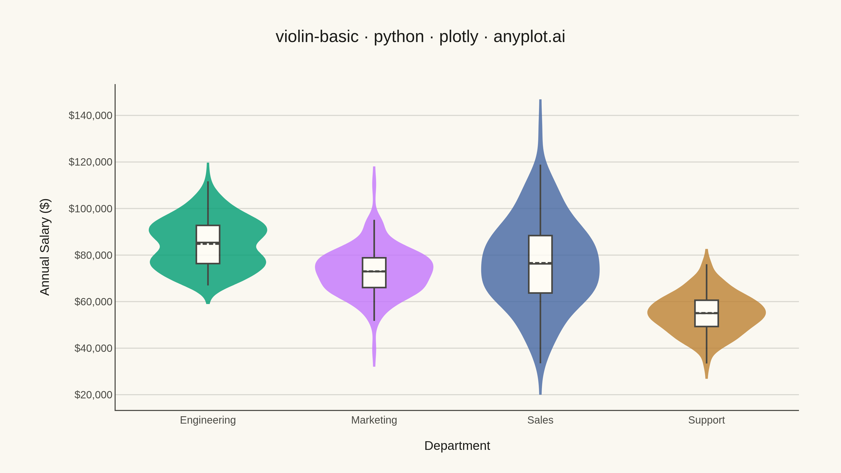
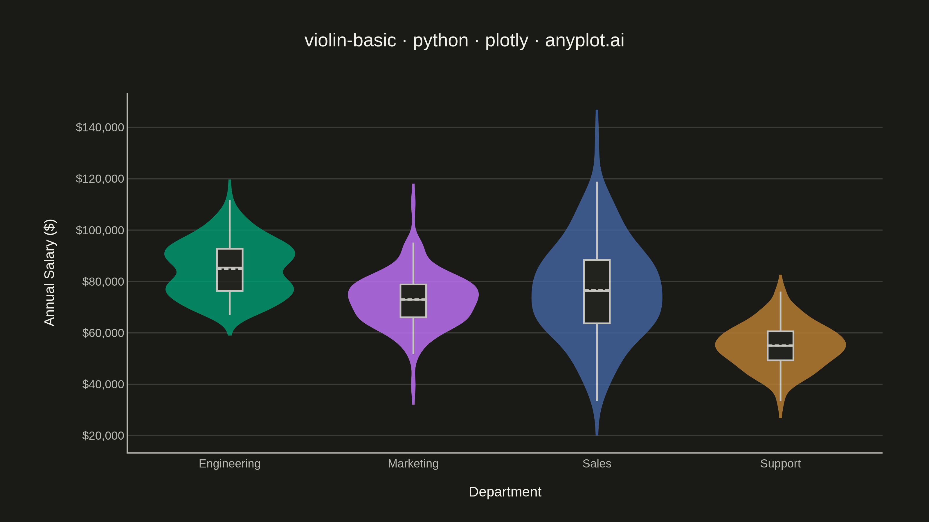
A violin plot combining a box plot with a kernel density estimation on each side, showing the distribution shape of numerical data. The width of the violin at each point represents the frequency of data values at that level. Excellent for comparing distributions across categories while revealing their underlying shape, providing more detail than a traditional box plot.
""" anyplot.ai
violin-basic: Basic Violin Plot
Library: plotly 6.7.0 | Python 3.13.13
Quality: 88/100 | Updated: 2026-05-29
"""

import os

import numpy as np
import plotly.graph_objects as go


# Theme tokens
THEME = os.getenv("ANYPLOT_THEME", "light")
PAGE_BG = "#FAF8F1" if THEME == "light" else "#1A1A17"
ELEVATED_BG = "#FFFDF6" if THEME == "light" else "#242420"
INK = "#1A1A17" if THEME == "light" else "#F0EFE8"
INK_SOFT = "#4A4A44" if THEME == "light" else "#B8B7B0"
GRID = "rgba(26,26,23,0.15)" if THEME == "light" else "rgba(240,239,232,0.15)"

# Imprint palette — 4 categorical colors (hybrid-v3 sort order)
IMPRINT_PALETTE = ["#009E73", "#C475FD", "#4467A3", "#BD8233"]

# Data — 4 departments with distinct salary distribution shapes
np.random.seed(42)
data = {
    "Engineering": np.concatenate([np.random.normal(92000, 8000, 120), np.random.normal(75000, 5000, 80)]),
    "Marketing": np.random.normal(72000, 10000, 180),
    "Sales": np.random.normal(78000, 18000, 220),
    "Support": np.random.normal(55000, 8000, 190),
}

# Plot
fig = go.Figure()

for i, (cat, values) in enumerate(data.items()):
    fig.add_trace(
        go.Violin(
            y=values,
            name=cat,
            line=dict(color=IMPRINT_PALETTE[i], width=2),
            fillcolor=IMPRINT_PALETTE[i],
            opacity=0.8,
            points=False,
            box=dict(visible=True, width=0.2, fillcolor=ELEVATED_BG, line=dict(color=INK, width=1.5)),
            meanline=dict(visible=True, color=INK, width=2),
            hoveron="violins+kde",
            hoverinfo="y+name",
            scalemode="width",
        )
    )

fig.update_traces(width=0.7, spanmode="soft")

# Annotate the bimodal Engineering distribution
fig.add_annotation(
    x="Engineering",
    y=106000,
    text="Bimodal: junior<br>vs senior tiers",
    showarrow=True,
    arrowhead=2,
    arrowsize=1,
    arrowwidth=1.5,
    arrowcolor=INK_SOFT,
    ax=55,
    ay=-30,
    font=dict(size=10, color=INK_SOFT),
    align="left",
)

# Style
title = "violin-basic · python · plotly · anyplot.ai"
fig.update_layout(
    autosize=False,
    margin=dict(l=110, r=80, t=80, b=60),
    title=dict(text=title, font=dict(size=16, color=INK, weight="bold"), x=0.5, xanchor="center"),
    xaxis=dict(
        title=dict(text="Department", font=dict(size=12, color=INK), standoff=12),
        tickfont=dict(size=10, color=INK_SOFT),
        linecolor=INK_SOFT,
        showline=True,
        mirror=False,
        showgrid=False,
    ),
    yaxis=dict(
        title=dict(text="Annual Salary ($)", font=dict(size=12, color=INK), standoff=12),
        tickfont=dict(size=10, color=INK_SOFT),
        tickformat=",.0f",
        tickprefix="$",
        gridcolor=GRID,
        gridwidth=1,
        linecolor=INK_SOFT,
        showline=True,
        mirror=False,
        zerolinecolor=INK_SOFT,
        zeroline=False,
    ),
    paper_bgcolor=PAGE_BG,
    plot_bgcolor=PAGE_BG,
    font=dict(color=INK),
    legend=dict(bgcolor=ELEVATED_BG, bordercolor=INK_SOFT, borderwidth=1, font=dict(color=INK_SOFT)),
    showlegend=False,
)

# Save
fig.write_image(f"plot-{THEME}.png", width=800, height=450, scale=4)
fig.write_html(f"plot-{THEME}.html", include_plotlyjs="cdn")
Runnable source as JSON, for any HTTP client: https://api.anyplot.ai/specs/violin-basic/plotly/code. Any spec id and library id listed in llms-full.txt fit the same URL shape; every URL below is complete and callable.
{
  "spec_id": "violin-basic",
  "language": "python",
  "library": "plotly",
  "page": "https://anyplot.ai/violin-basic/python/plotly",
  "hub": "https://anyplot.ai/violin-basic",
  "code_json": "https://api.anyplot.ai/specs/violin-basic/plotly/code",
  "spec_json": "https://api.anyplot.ai/specs/violin-basic",
  "render_light_png": "https://storage.googleapis.com/anyplot-images/plots/violin-basic/python/plotly/plot-light.png",
  "render_dark_png": "https://storage.googleapis.com/anyplot-images/plots/violin-basic/python/plotly/plot-dark.png",
  "interactive_light_html": "https://storage.googleapis.com/anyplot-images/plots/violin-basic/python/plotly/plot-light.html",
  "interactive_dark_html": "https://storage.googleapis.com/anyplot-images/plots/violin-basic/python/plotly/plot-dark.html",
  "quality_score": 88.0,
  "license": "MIT",
  "guide": "https://anyplot.ai/llms.txt"
}
Part of Basic Violin Plot on anyplot.ai.