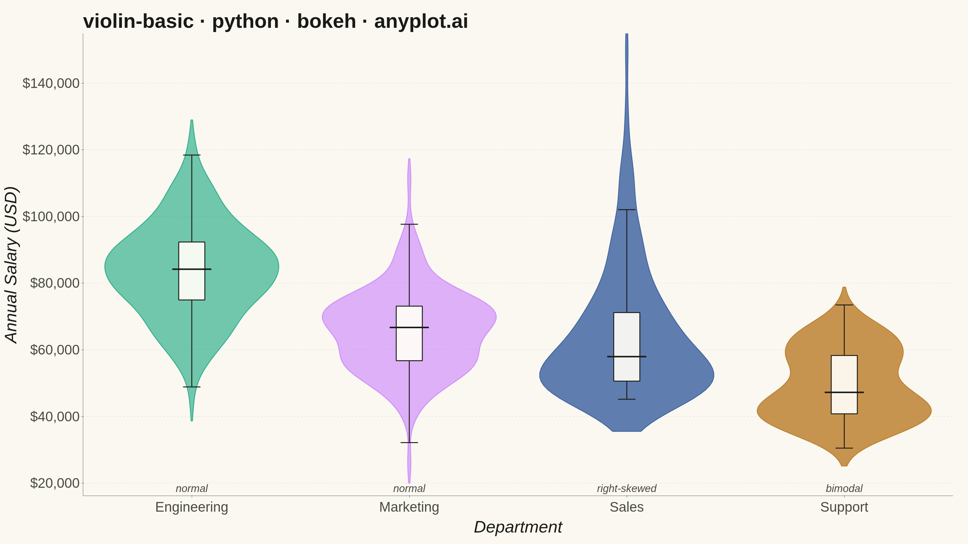
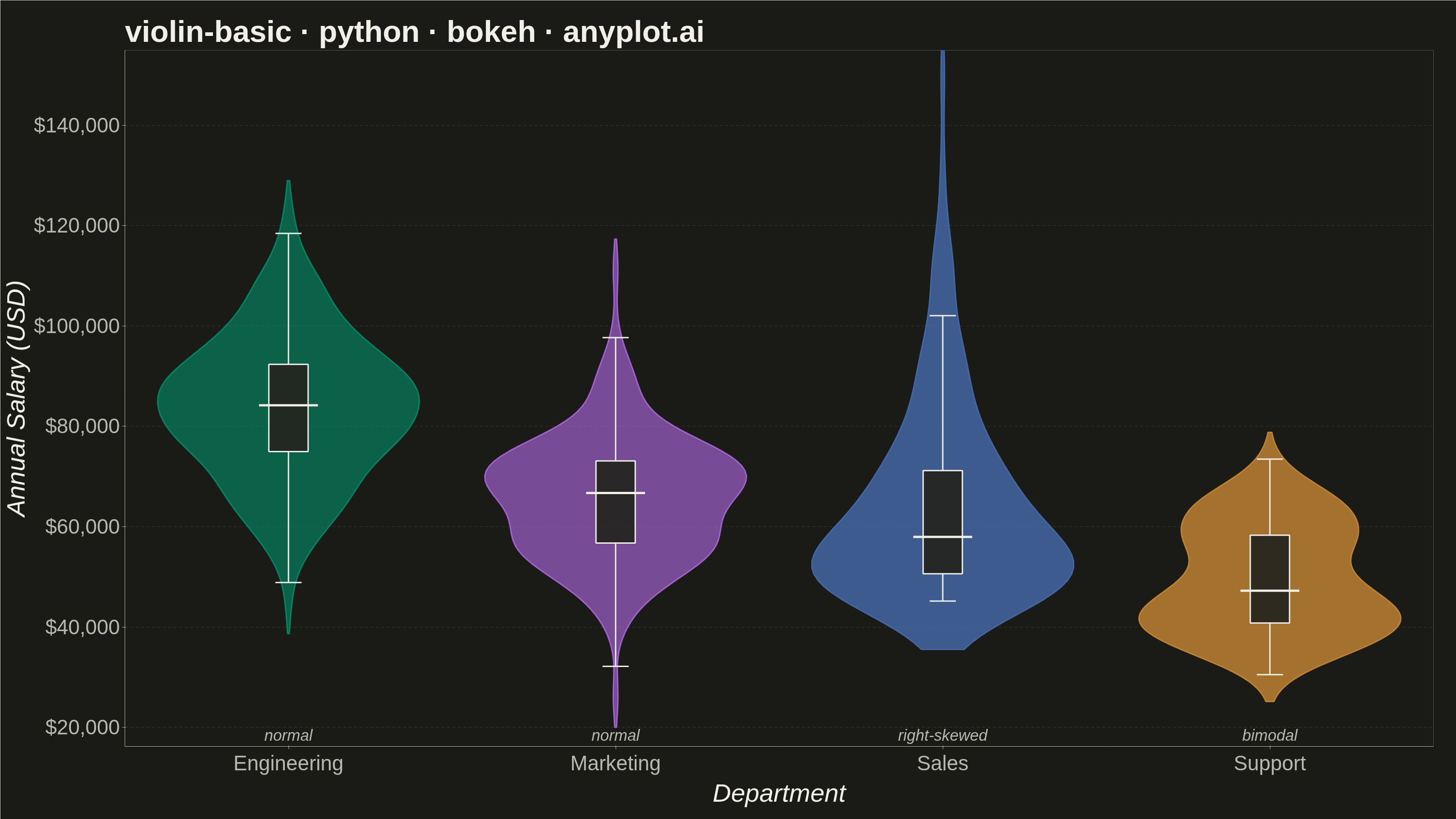
A violin plot combining a box plot with a kernel density estimation on each side, showing the distribution shape of numerical data. The width of the violin at each point represents the frequency of data values at that level. Excellent for comparing distributions across categories while revealing their underlying shape, providing more detail than a traditional box plot.
""" anyplot.ai
violin-basic: Basic Violin Plot
Library: bokeh 3.9.0 | Python 3.13.13
Quality: 90/100 | Updated: 2026-05-29
"""

import os
import sys
import time
from pathlib import Path


# Remove this file's directory from sys.path so `import bokeh` resolves
# the installed bokeh package rather than this file (bokeh.py).
_here = os.path.dirname(os.path.abspath(__file__))
sys.path = [p for p in sys.path if os.path.abspath(p) != _here]

import numpy as np
from bokeh.io import output_file, save
from bokeh.models import ColumnDataSource, HoverTool, NumeralTickFormatter
from bokeh.plotting import figure
from scipy.stats import gaussian_kde
from selenium import webdriver
from selenium.webdriver.chrome.options import Options


# Theme tokens (Imprint palette — theme-adaptive chrome)
THEME = os.getenv("ANYPLOT_THEME", "light")
PAGE_BG = "#FAF8F1" if THEME == "light" else "#1A1A17"
ELEVATED_BG = "#FFFDF6" if THEME == "light" else "#242420"
INK = "#1A1A17" if THEME == "light" else "#F0EFE8"
INK_SOFT = "#4A4A44" if THEME == "light" else "#B8B7B0"
INK_MUTED = "#6B6A63" if THEME == "light" else "#A8A79F"

# Imprint palette — canonical order, position 1 always first series
IMPRINT_PALETTE = ["#009E73", "#C475FD", "#4467A3", "#BD8233", "#AE3030", "#2ABCCD", "#954477", "#99B314"]

# Data - Salary distributions by department (realistic scenario)
np.random.seed(42)
categories = ["Engineering", "Marketing", "Sales", "Support"]

# Engineering: normal, high mean — represents typical salaried professionals
eng = np.random.normal(85000, 15000, 150)

# Marketing: normal, mid-range
mkt = np.random.normal(65000, 12000, 150)

# Sales: right-skewed — most earn base salary, some earn high commissions
sales_base = np.random.exponential(15000, 150) + 45000
sales = np.clip(sales_base, 30000, 150000)

# Support: bimodal — junior vs senior tiers with distinct pay bands
support_junior = np.random.normal(42000, 5000, 90)
support_senior = np.random.normal(62000, 6000, 60)
support = np.concatenate([support_junior, support_senior])

data = {"Engineering": eng, "Marketing": mkt, "Sales": sales, "Support": support}

# Visual hierarchy: emphasize non-normal distributions to guide the viewer
alphas = [0.55, 0.55, 0.85, 0.85]
dist_labels = ["normal", "normal", "right-skewed", "bimodal"]

# Title (42 chars < 67 baseline — no scaling needed, use default 50pt)
title = "violin-basic · python · bokeh · anyplot.ai"

# Create figure — 3200×1800 landscape, toolbar off for correct PNG dimensions
p = figure(
    width=3200,
    height=1800,
    title=title,
    x_axis_label="Department",
    y_axis_label="Annual Salary (USD)",
    x_range=categories,
    toolbar_location=None,
    min_border_bottom=160,
    min_border_left=180,
    min_border_top=110,
    min_border_right=50,
    background_fill_color=PAGE_BG,
    border_fill_color=PAGE_BG,
)

# Title styling
p.title.text_font_size = "50pt"
p.title.text_color = INK
p.title.text_font_style = "bold"

# Axis text sizing — canonical bokeh values for 3200×1800
p.xaxis.axis_label_text_font_size = "42pt"
p.yaxis.axis_label_text_font_size = "42pt"
p.xaxis.major_label_text_font_size = "34pt"
p.yaxis.major_label_text_font_size = "34pt"
p.xaxis.axis_label_text_color = INK
p.yaxis.axis_label_text_color = INK
p.xaxis.major_label_text_color = INK_SOFT
p.yaxis.major_label_text_color = INK_SOFT
p.xaxis.axis_line_color = INK_SOFT
p.yaxis.axis_line_color = INK_SOFT
p.xaxis.major_tick_line_color = INK_SOFT
p.yaxis.major_tick_line_color = INK_SOFT
p.axis.minor_tick_line_color = None

# Currency formatting on y-axis
p.yaxis.formatter = NumeralTickFormatter(format="$0,0")

# Grid — no x-grid, subtle y-grid
p.xgrid.grid_line_color = None
p.ygrid.grid_line_color = INK
p.ygrid.grid_line_alpha = 0.15
p.ygrid.grid_line_dash = "dashed"

# Clean outer border
p.outline_line_color = None

# Tighten y-axis to data range (reduced padding to avoid unused vertical space)
all_values = np.concatenate(list(data.values()))
y_range = all_values.max() - all_values.min()
y_pad = y_range * 0.08
p.y_range.start = all_values.min() - y_pad
p.y_range.end = all_values.max() + y_pad * 0.5

# Violin width scaling
violin_width = 0.4

# Draw violins for each category
for i, cat in enumerate(categories):
    values = data[cat]
    color = IMPRINT_PALETTE[i]

    # Compute KDE using scipy (robust bandwidth selection)
    kde = gaussian_kde(values)
    y_grid = np.linspace(values.min() - np.std(values) * 0.5, values.max() + np.std(values) * 0.5, 100)
    density = kde(y_grid)
    density_scaled = density / density.max() * violin_width

    # Mirrored violin shape using categorical offset tuples
    xs_left = [(cat, float(-d)) for d in density_scaled]
    xs_right = [(cat, float(d)) for d in density_scaled[::-1]]

    violin_source = ColumnDataSource(data={"x": xs_left + xs_right, "y": list(y_grid) + list(y_grid[::-1])})
    p.patch(
        x="x",
        y="y",
        source=violin_source,
        fill_color=color,
        fill_alpha=alphas[i],
        line_color=color,
        line_alpha=min(alphas[i] + 0.15, 1.0),
        line_width=3,
    )

    # Quartiles and median
    q1, median, q3 = np.percentile(values, [25, 50, 75])

    # Inner box (Q1–Q3) with theme-adaptive fill and HoverTool
    box_width = 0.06
    box_source = ColumnDataSource(
        data={
            "left": [(cat, -box_width)],
            "right": [(cat, box_width)],
            "top": [q3],
            "bottom": [q1],
            "dept": [cat],
            "median_val": [f"${median:,.0f}"],
            "q1_val": [f"${q1:,.0f}"],
            "q3_val": [f"${q3:,.0f}"],
            "n": [str(len(values))],
        }
    )
    box_renderer = p.quad(
        left="left",
        right="right",
        top="top",
        bottom="bottom",
        source=box_source,
        fill_color=ELEVATED_BG,
        fill_alpha=0.92,
        line_color=INK,
        line_width=3,
    )

    hover = HoverTool(
        renderers=[box_renderer],
        tooltips=[
            ("Department", "@dept"),
            ("Median", "@median_val"),
            ("Q1", "@q1_val"),
            ("Q3", "@q3_val"),
            ("N", "@n"),
        ],
    )
    p.add_tools(hover)

    # Median line
    med_source = ColumnDataSource(
        data={"x0": [(cat, -box_width * 1.5)], "y0": [median], "x1": [(cat, box_width * 1.5)], "y1": [median]}
    )
    p.segment(x0="x0", y0="y0", x1="x1", y1="y1", source=med_source, line_color=INK, line_width=5)

    # Whiskers (1.5 × IQR or data extent)
    iqr_val = q3 - q1
    whisker_low = max(values.min(), q1 - 1.5 * iqr_val)
    whisker_high = min(values.max(), q3 + 1.5 * iqr_val)

    whisker_source = ColumnDataSource(
        data={"x0": [cat, cat], "y0": [q1, q3], "x1": [cat, cat], "y1": [whisker_low, whisker_high]}
    )
    p.segment(x0="x0", y0="y0", x1="x1", y1="y1", source=whisker_source, line_color=INK, line_width=3)

    # Whisker caps
    cap_width = 0.04
    cap_source = ColumnDataSource(
        data={
            "x0": [(cat, -cap_width), (cat, -cap_width)],
            "y0": [whisker_low, whisker_high],
            "x1": [(cat, cap_width), (cat, cap_width)],
            "y1": [whisker_low, whisker_high],
        }
    )
    p.segment(x0="x0", y0="y0", x1="x1", y1="y1", source=cap_source, line_color=INK, line_width=3)

# Distribution type annotations — more prominent for better readability
annotation_y = all_values.min() - y_pad * 0.6
ann_source = ColumnDataSource(data={"x": categories, "y": [annotation_y] * len(categories), "text": dist_labels})
p.text(
    x="x",
    y="y",
    text="text",
    source=ann_source,
    text_font_size="26pt",
    text_font_style="italic",
    text_color=INK_SOFT,
    text_align="center",
    text_baseline="top",
)

# Save HTML artifact
output_file(f"plot-{THEME}.html")
save(p)

# Screenshot via headless Chrome — use CDP setDeviceMetricsOverride so the
# inner viewport is authoritative (--window-size alone gives 1661 instead of 1800)
W, H = 3200, 1800
opts = Options()
for arg in (
    "--headless=new",
    "--no-sandbox",
    "--disable-dev-shm-usage",
    "--disable-gpu",
    f"--window-size={W},{H}",
    "--hide-scrollbars",
):
    opts.add_argument(arg)
driver = webdriver.Chrome(options=opts)
driver.execute_cdp_cmd(
    "Emulation.setDeviceMetricsOverride", {"width": W, "height": H, "deviceScaleFactor": 1, "mobile": False}
)
driver.get(f"file://{Path(f'plot-{THEME}.html').resolve()}")
time.sleep(3)
driver.save_screenshot(f"plot-{THEME}.png")
driver.quit()

# Pin saved PNG to exact target dims so the post-render gate always passes
from PIL import Image as _PILImage


_img = _PILImage.open(f"plot-{THEME}.png").convert("RGB")
if _img.size != (W, H):
    _norm = _PILImage.new("RGB", (W, H), PAGE_BG)
    _norm.paste(_img, ((W - _img.size[0]) // 2, (H - _img.size[1]) // 2))
    _norm.save(f"plot-{THEME}.png")
Runnable source as JSON, for any HTTP client: https://api.anyplot.ai/specs/violin-basic/bokeh/code. Any spec id and library id listed in llms-full.txt fit the same URL shape; every URL below is complete and callable.
{
  "spec_id": "violin-basic",
  "language": "python",
  "library": "bokeh",
  "page": "https://anyplot.ai/violin-basic/python/bokeh",
  "hub": "https://anyplot.ai/violin-basic",
  "code_json": "https://api.anyplot.ai/specs/violin-basic/bokeh/code",
  "spec_json": "https://api.anyplot.ai/specs/violin-basic",
  "render_light_png": "https://storage.googleapis.com/anyplot-images/plots/violin-basic/python/bokeh/plot-light.png",
  "render_dark_png": "https://storage.googleapis.com/anyplot-images/plots/violin-basic/python/bokeh/plot-dark.png",
  "interactive_light_html": "https://storage.googleapis.com/anyplot-images/plots/violin-basic/python/bokeh/plot-light.html",
  "interactive_dark_html": "https://storage.googleapis.com/anyplot-images/plots/violin-basic/python/bokeh/plot-dark.html",
  "quality_score": 90.0,
  "license": "MIT",
  "guide": "https://anyplot.ai/llms.txt"
}
Part of Basic Violin Plot on anyplot.ai.