The same plot in 14 other libraries — JavaScript: Chart.js, D3.js, Apache ECharts, MUI X Charts; Python: Altair, Bokeh, lets-plot, Matplotlib, Plotly, plotnine, Pygal, Seaborn; R: ggplot2; Julia: Makie.jl. Compare all 15 side by side: Basic Violin Plot in Python, R, Julia and JavaScript.
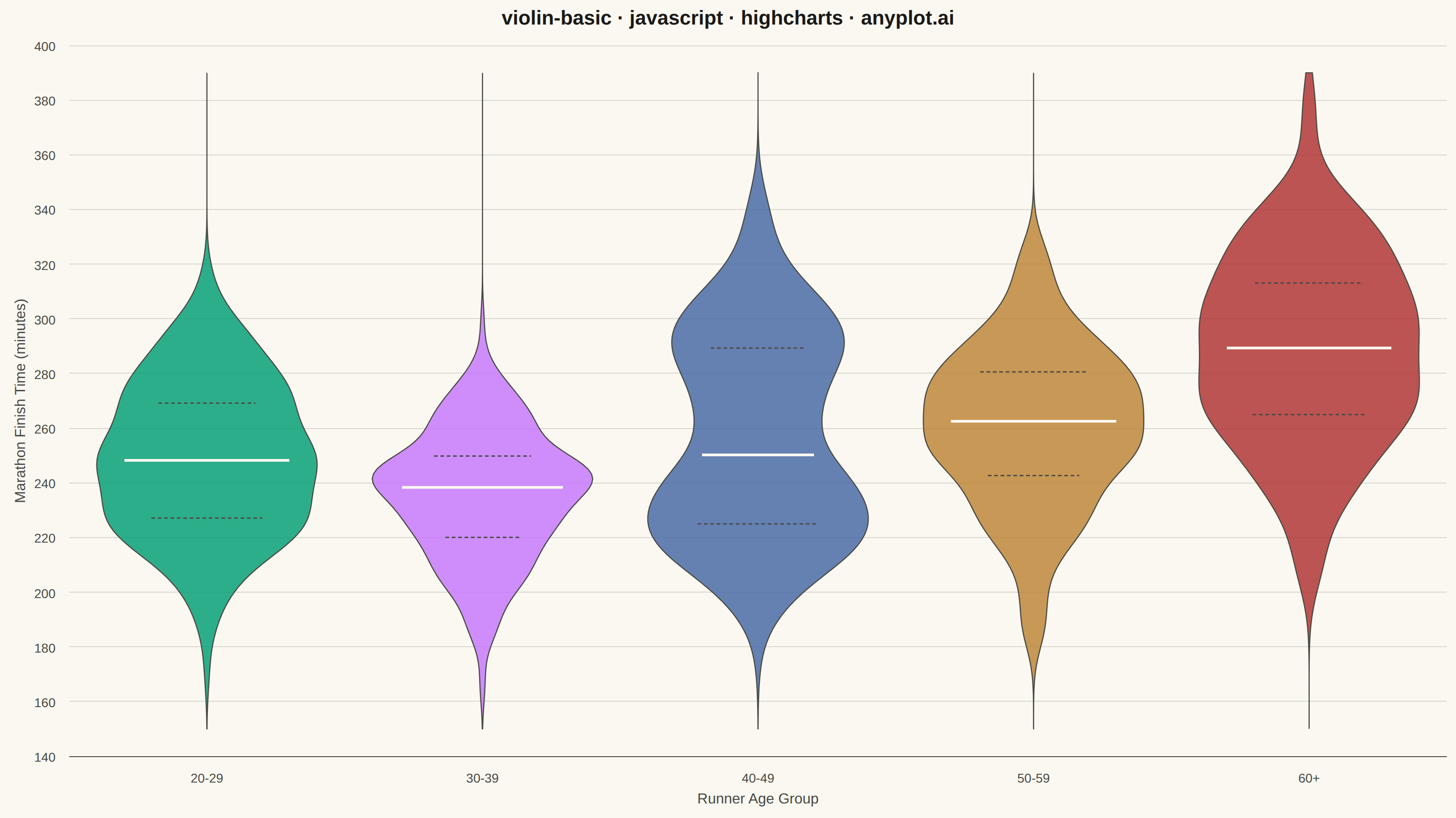
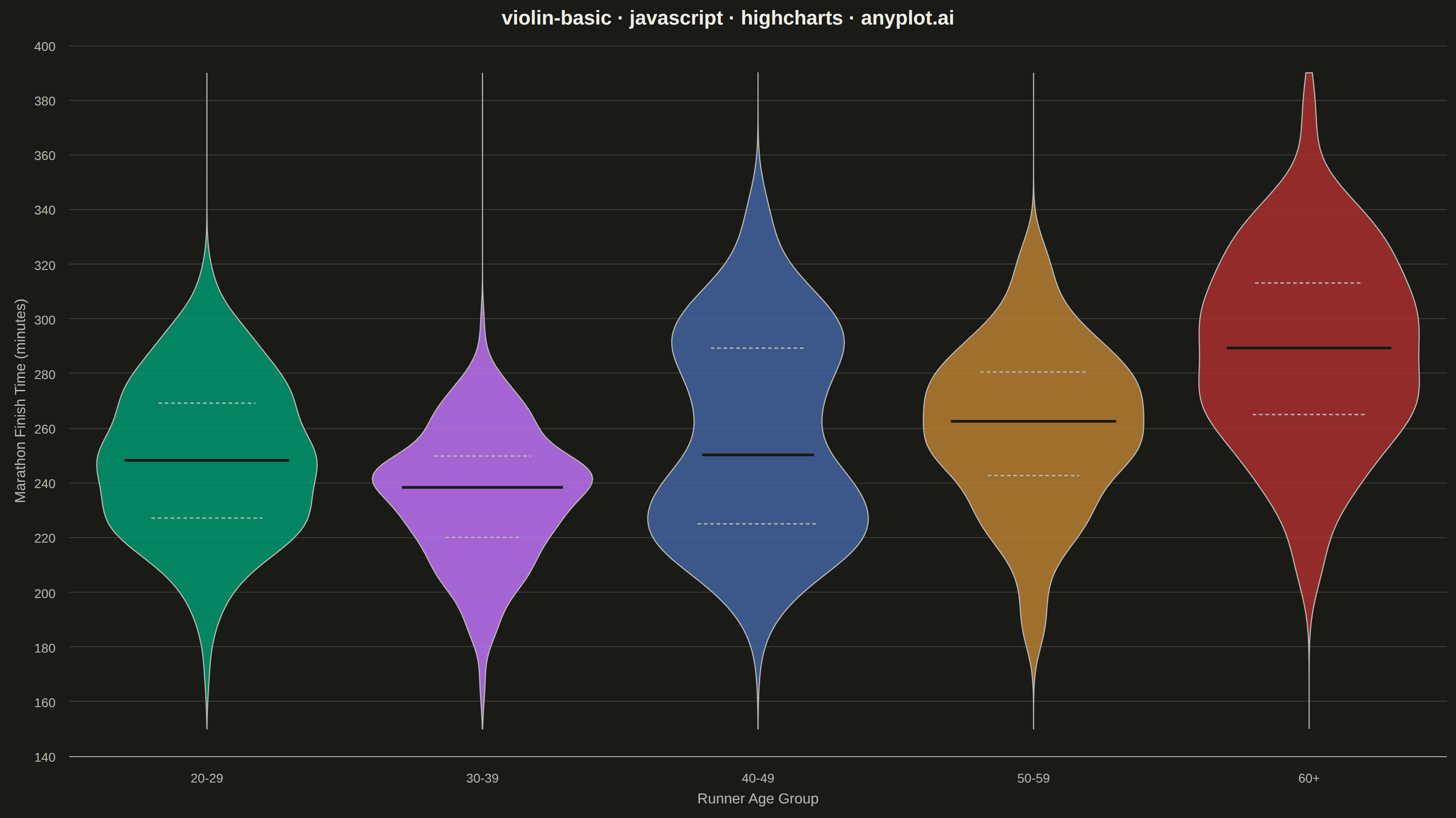
A violin plot combining a box plot with a kernel density estimation on each side, showing the distribution shape of numerical data. The width of the violin at each point represents the frequency of data values at that level. Excellent for comparing distributions across categories while revealing their underlying shape, providing more detail than a traditional box plot.
// anyplot.ai
// violin-basic: Basic Violin Plot
// Library: highcharts 12.6.0 | JavaScript 22.23.2
// Quality: 90/100 | Created: 2026-08-26

// The core bundle (no highcharts-more) has no "arearange"/"boxplot" series, so
// there is no native way to fill the area between two curves at each y-level —
// which is exactly what a violin silhouette needs. Instead the silhouette,
// quartile ticks, and median bar are drawn directly with chart.renderer.path()
// (the same public SVG-renderer API Highcharts uses internally for its own
// series shapes), converting KDE/quantile values to pixels via axis.toPixels()
// once the chart has laid out its axes (chart.events.load).
const t = window.ANYPLOT_TOKENS;

// --- Data (in-memory, deterministic LCG) ------------------------------------
let seed = 42;
function lcg() {
  seed = (seed * 1103515245 + 12345) & 0x7fffffff;
  return seed / 0x7fffffff;
}
function randNormal(mean, std) {
  const u1 = Math.max(lcg(), 1e-9);
  const u2 = lcg();
  const z = Math.sqrt(-2 * Math.log(u1)) * Math.cos(2 * Math.PI * u2);
  return mean + z * std;
}
function quantile(sorted, q) {
  const pos = (sorted.length - 1) * q;
  const base = Math.floor(pos);
  const rest = pos - base;
  return sorted[base + 1] !== undefined
    ? sorted[base] + rest * (sorted[base + 1] - sorted[base])
    : sorted[base];
}
function stdDev(values) {
  const mean = values.reduce((a, b) => a + b, 0) / values.length;
  const variance = values.reduce((a, b) => a + (b - mean) ** 2, 0) / values.length;
  return Math.sqrt(variance);
}
// Silverman's rule of thumb for a Gaussian KDE bandwidth.
function bandwidthOf(values, sorted) {
  const iqr = quantile(sorted, 0.75) - quantile(sorted, 0.25);
  const spread = iqr > 0 ? Math.min(stdDev(values), iqr / 1.34) : stdDev(values);
  return 0.9 * spread * Math.pow(values.length, -0.2);
}
function densityAt(y, values, bandwidth) {
  let sum = 0;
  for (const v of values) {
    const u = (y - v) / bandwidth;
    sum += Math.exp(-0.5 * u * u);
  }
  return sum / (values.length * bandwidth * Math.sqrt(2 * Math.PI));
}

// Marathon finish times (minutes) by age group — the 40-49 bracket mixes a
// competitive-masters cluster with a recreational cluster, giving it a visibly
// bimodal shape a box plot would flatten into one unremarkable box.
const AGE_GROUP_DEFS = [
  { name: "20-29", n: 220, mixture: [{ mean: 245, std: 28, weight: 1 }] },
  { name: "30-39", n: 260, mixture: [{ mean: 235, std: 24, weight: 1 }] },
  {
    name: "40-49",
    n: 300,
    mixture: [
      { mean: 224, std: 16, weight: 0.4 },
      { mean: 278, std: 26, weight: 0.6 },
    ],
  },
  { name: "50-59", n: 200, mixture: [{ mean: 262, std: 30, weight: 1 }] },
  { name: "60+", n: 140, mixture: [{ mean: 288, std: 34, weight: 1 }] },
];
const KDE_POINTS = 140;
const ageGroups = AGE_GROUP_DEFS.map((def) => {
  const cumWeights = [];
  let runningWeight = 0;
  def.mixture.forEach((m) => {
    runningWeight += m.weight;
    cumWeights.push(runningWeight);
  });
  const samples = Array.from({ length: def.n }, () => {
    const r = lcg() * runningWeight;
    const part = def.mixture[cumWeights.findIndex((c) => r <= c)] || def.mixture[def.mixture.length - 1];
    return Math.min(420, Math.max(140, randNormal(part.mean, part.std)));
  });
  const sorted = [...samples].sort((a, b) => a - b);
  return {
    name: def.name,
    samples,
    q1: quantile(sorted, 0.25),
    median: quantile(sorted, 0.5),
    q3: quantile(sorted, 0.75),
    bandwidth: bandwidthOf(samples, sorted),
  };
});
const categories = ageGroups.map((g) => g.name);

const allValues = ageGroups.flatMap((g) => g.samples);
const yMin = Math.floor((Math.min(...allValues) - 8) / 10) * 10;
const yMax = Math.ceil((Math.max(...allValues) + 8) / 10) * 10;
ageGroups.forEach((g) => {
  g.evalYs = Array.from({ length: KDE_POINTS }, (_, k) => yMin + (k / (KDE_POINTS - 1)) * (yMax - yMin));
  g.densities = g.evalYs.map((y) => densityAt(y, g.samples, g.bandwidth));
  g.maxDensity = Math.max(...g.densities);
});

// Draws the mirrored KDE silhouette plus quartile/median ticks for every
// category, once the axes are laid out and axis.toPixels() is meaningful.
function drawViolins(chart) {
  const xAxis = chart.xAxis[0];
  const yAxis = chart.yAxis[0];
  const unitPx = Math.abs(xAxis.toPixels(1, false) - xAxis.toPixels(0, false));
  const maxHalfWidthPx = unitPx * 0.4;

  ageGroups.forEach((g, i) => {
    const centerX = xAxis.toPixels(i, false);
    const color = t.palette[i % t.palette.length];

    // Highcharts 11+ renderer.path() takes an array of ["command", ...coords]
    // segment tuples, not a flat command/coordinate list.
    const path = [];
    g.evalYs.forEach((y, k) => {
      const px = centerX + (g.densities[k] / g.maxDensity) * maxHalfWidthPx;
      path.push([k === 0 ? "M" : "L", px, yAxis.toPixels(y, false)]);
    });
    for (let k = g.evalYs.length - 1; k >= 0; k--) {
      const px = centerX - (g.densities[k] / g.maxDensity) * maxHalfWidthPx;
      path.push(["L", px, yAxis.toPixels(g.evalYs[k], false)]);
    }
    path.push(["Z"]);
    chart.renderer
      .path(path)
      .attr({ fill: color, "fill-opacity": 0.82, stroke: t.inkSoft, "stroke-width": 1.25, zIndex: 5 })
      .add();

    // Quartile ticks (dashed, ink-soft) and median bar (solid, page-bg cut
    // for contrast against the fill) — each sized to the violin's local
    // half-width at that exact value, not the violin's overall max width.
    [
      { value: g.q1, widthFrac: 0.55, stroke: t.inkSoft, strokeWidth: 1.5, dash: "4,3" },
      { value: g.q3, widthFrac: 0.55, stroke: t.inkSoft, strokeWidth: 1.5, dash: "4,3" },
      { value: g.median, widthFrac: 0.75, stroke: t.pageBg, strokeWidth: 3 },
    ].forEach((mark) => {
      const localDensity = densityAt(mark.value, g.samples, g.bandwidth);
      const halfPx = Math.min(1, localDensity / g.maxDensity) * maxHalfWidthPx * mark.widthFrac;
      const py = yAxis.toPixels(mark.value, false);
      const attrs = { stroke: mark.stroke, "stroke-width": mark.strokeWidth, zIndex: 6, linecap: "round" };
      if (mark.dash) attrs["stroke-dasharray"] = mark.dash;
      chart.renderer
        .path([["M", centerX - halfPx, py], ["L", centerX + halfPx, py]])
        .attr(attrs)
        .add();
    });
  });
}

// --- Chart -------------------------------------------------------------------
Highcharts.chart("container", {
  chart: {
    backgroundColor: "transparent",
    animation: false,
    style: { fontFamily: "inherit" },
    events: { load: function () { drawViolins(this); } },
  },
  credits: { enabled: false },
  colors: t.palette,
  title: {
    text: "violin-basic · javascript · highcharts · anyplot.ai",
    style: { color: t.ink, fontSize: "22px", fontWeight: "600" },
  },
  xAxis: {
    categories,
    lineColor: t.inkSoft,
    tickColor: t.inkSoft,
    labels: { style: { color: t.inkSoft, fontSize: "14px" } },
    title: { text: "Runner Age Group", style: { color: t.inkSoft, fontSize: "16px" } },
  },
  yAxis: {
    min: yMin,
    max: yMax,
    title: { text: "Marathon Finish Time (minutes)", style: { color: t.inkSoft, fontSize: "16px" } },
    gridLineColor: t.grid,
    labels: { style: { color: t.inkSoft, fontSize: "14px" } },
  },
  legend: { enabled: false },
  tooltip: { enabled: false },
  plotOptions: { series: { animation: false } },
  // A real (if invisible) cartesian series — Highcharts only lays out axes
  // when at least one cartesian series is present; the violin bodies
  // themselves are drawn later via chart.renderer, not as series data.
  series: [
    {
      type: "scatter",
      data: ageGroups.map((g, i) => ({ x: i, y: g.median })),
      marker: { enabled: false },
      enableMouseTracking: false,
      showInLegend: false,
    },
  ],
});
Runnable source as JSON, for any HTTP client: https://api.anyplot.ai/specs/violin-basic/highcharts/code. Any spec id and library id listed in llms-full.txt fit the same URL shape; every URL below is complete and callable.
{
  "spec_id": "violin-basic",
  "language": "javascript",
  "library": "highcharts",
  "page": "https://anyplot.ai/violin-basic/javascript/highcharts",
  "hub": "https://anyplot.ai/violin-basic",
  "code_json": "https://api.anyplot.ai/specs/violin-basic/highcharts/code",
  "spec_json": "https://api.anyplot.ai/specs/violin-basic",
  "render_light_png": "https://storage.googleapis.com/anyplot-images/plots/violin-basic/javascript/highcharts/plot-light.png",
  "render_dark_png": "https://storage.googleapis.com/anyplot-images/plots/violin-basic/javascript/highcharts/plot-dark.png",
  "interactive_light_html": "https://storage.googleapis.com/anyplot-images/plots/violin-basic/javascript/highcharts/plot-light.html",
  "interactive_dark_html": "https://storage.googleapis.com/anyplot-images/plots/violin-basic/javascript/highcharts/plot-dark.html",
  "quality_score": 90.0,
  "license": "MIT",
  "guide": "https://anyplot.ai/llms.txt"
}
Part of Basic Violin Plot on anyplot.ai.