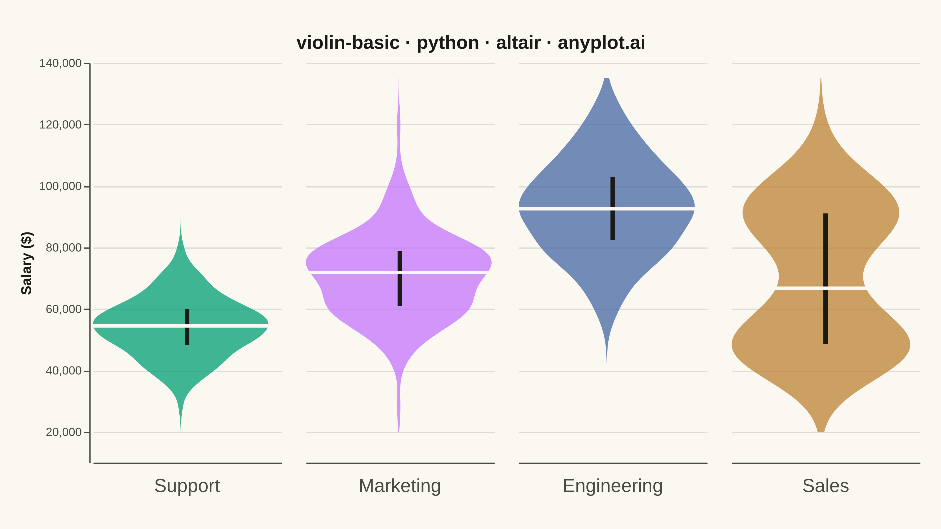
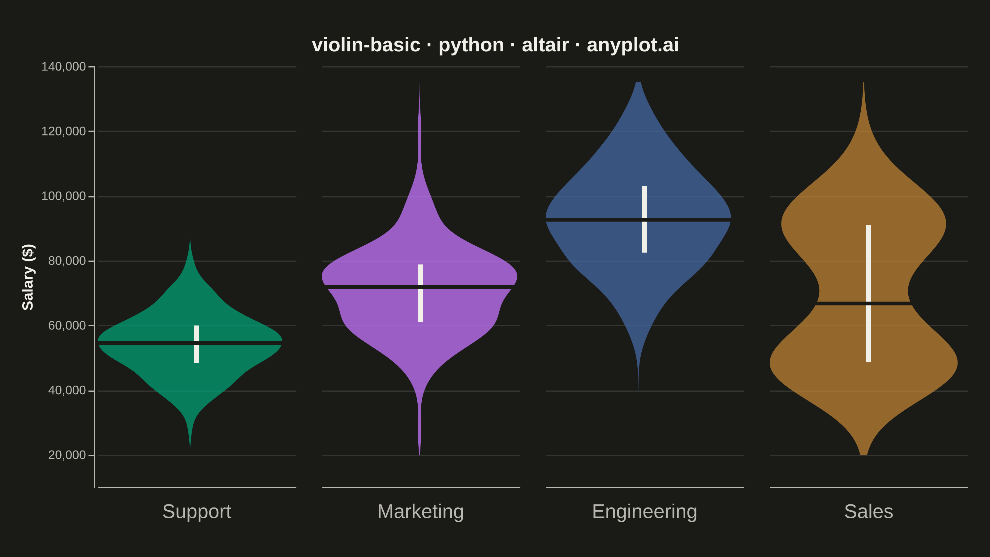
A violin plot combining a box plot with a kernel density estimation on each side, showing the distribution shape of numerical data. The width of the violin at each point represents the frequency of data values at that level. Excellent for comparing distributions across categories while revealing their underlying shape, providing more detail than a traditional box plot.
""" anyplot.ai
violin-basic: Basic Violin Plot
Library: altair 6.1.0 | Python 3.13.13
Quality: 92/100 | Updated: 2026-05-29
"""

import importlib
import os
import sys

import numpy as np
import pandas as pd
from PIL import Image


# Drop script directory from sys.path so `altair` resolves the package, not this file
sys.path[:] = [p for p in sys.path if os.path.abspath(p or ".") != os.path.dirname(os.path.abspath(__file__))]
alt = importlib.import_module("altair")

# Theme tokens — Imprint palette + theme-adaptive chrome
THEME = os.getenv("ANYPLOT_THEME", "light")
PAGE_BG = "#FAF8F1" if THEME == "light" else "#1A1A17"
ELEVATED_BG = "#FFFDF6" if THEME == "light" else "#242420"
INK = "#1A1A17" if THEME == "light" else "#F0EFE8"
INK_SOFT = "#4A4A44" if THEME == "light" else "#B8B7B0"

# Imprint categorical palette — positions 1-4 for four departments
IMPRINT_PALETTE = ["#009E73", "#C475FD", "#4467A3", "#BD8233"]

# Data — salary distributions by department with distinct shapes
np.random.seed(42)
dept_records = []
for dept, mu, sigma, n in [
    ("Support", 55000, 10000, 150),
    ("Marketing", 70000, 13000, 150),
    ("Engineering", 92000, 16000, 150),
]:
    for v in np.random.normal(mu, sigma, n):
        dept_records.append({"Department": dept, "Salary": v})

# Sales: bimodal — base salary + commission earners (highlights violin over box plot)
for v in np.concatenate([np.random.normal(50000, 8000, 75), np.random.normal(92000, 11000, 75)]):
    dept_records.append({"Department": "Sales", "Salary": v})

df = pd.DataFrame(dept_records)
dept_order = ["Support", "Marketing", "Engineering", "Sales"]
color_scale = alt.Scale(domain=dept_order, range=IMPRINT_PALETTE)

base = alt.Chart(df)

# Violin shape — KDE, mirrored via stack="center"
violin = (
    base.transform_density(
        density="Salary",
        as_=["Salary", "density"],
        groupby=["Department"],
        extent=[int(df["Salary"].min()) - 8000, int(df["Salary"].max()) + 8000],
    )
    .mark_area(orient="horizontal", opacity=0.75)
    .encode(
        y=alt.Y("Salary:Q", title="Salary ($)"),
        x=alt.X(
            "density:Q",
            stack="center",
            impute=None,
            title=None,
            axis=alt.Axis(labels=False, values=[0], grid=False, ticks=False),
        ),
        color=alt.Color("Department:N", scale=color_scale, legend=None),
        tooltip=[alt.Tooltip("Department:N"), alt.Tooltip("Salary:Q", format="$,.0f")],
    )
)

# IQR marker — thick vertical rule from Q1 to Q3
quartile_rule = (
    base.transform_aggregate(q1="q1(Salary)", q3="q3(Salary)", groupby=["Department"])
    .mark_rule(color=INK, strokeWidth=4)
    .encode(y="q1:Q", y2="q3:Q")
)

# Median line — horizontal rule at the median, contrasts against the IQR bar
median_line = (
    base.transform_aggregate(med="median(Salary)", groupby=["Department"])
    .mark_rule(color=PAGE_BG, strokeWidth=3)
    .encode(
        y=alt.Y("med:Q"),
        tooltip=[alt.Tooltip("Department:N"), alt.Tooltip("med:Q", title="Median Salary", format="$,.0f")],
    )
)

# Title — 43 chars, below 67-char threshold so fontSize=16 is fine
title_str = "violin-basic · python · altair · anyplot.ai"
n_chars = len(title_str)
ratio = 67 / n_chars if n_chars > 67 else 1.0
title_fontsize = max(11, round(16 * ratio))

# Chart — four violin panels faceted side-by-side; dept ordering tells salary story
chart = (
    alt.layer(violin, quartile_rule, median_line)
    .facet(
        column=alt.Column(
            "Department:N",
            header=alt.Header(labelFontSize=16, labelOrient="bottom", title=None, labelPadding=12, labelColor=INK_SOFT),
            sort=dept_order,
        )
    )
    .resolve_scale(x="independent")
    .properties(background=PAGE_BG, title=alt.Title(title_str, fontSize=title_fontsize, anchor="middle", color=INK))
    .configure_facet(spacing=15)
    .configure_view(stroke=None, fill=PAGE_BG, continuousWidth=160, continuousHeight=340)
    .configure_axis(
        labelFontSize=10,
        titleFontSize=12,
        labelColor=INK_SOFT,
        titleColor=INK,
        gridColor=INK,
        gridOpacity=0.12,
        domainColor=INK_SOFT,
        tickColor=INK_SOFT,
    )
    .configure_title(color=INK)
)

# Save PNG + pad to exact 3200 × 1800 target (vl-convert pads title/axis outside view dims)
TW, TH = 3200, 1800
chart.save(f"plot-{THEME}.png", scale_factor=4.0)

_img = Image.open(f"plot-{THEME}.png").convert("RGB")
_w, _h = _img.size
if _w > TW or _h > TH:
    raise SystemExit(
        f"altair vl-convert produced {_w}×{_h}, exceeds target {TW}×{TH}. "
        "Shrink continuousWidth/continuousHeight and re-render."
    )
if _w < TW or _h < TH:
    _canvas = Image.new("RGB", (TW, TH), PAGE_BG)
    _canvas.paste(_img, ((TW - _w) // 2, (TH - _h) // 2))
    _canvas.save(f"plot-{THEME}.png")

# Save HTML
chart.save(f"plot-{THEME}.html")
Runnable source as JSON, for any HTTP client: https://api.anyplot.ai/specs/violin-basic/altair/code. Any spec id and library id listed in llms-full.txt fit the same URL shape; every URL below is complete and callable.
{
  "spec_id": "violin-basic",
  "language": "python",
  "library": "altair",
  "page": "https://anyplot.ai/violin-basic/python/altair",
  "hub": "https://anyplot.ai/violin-basic",
  "code_json": "https://api.anyplot.ai/specs/violin-basic/altair/code",
  "spec_json": "https://api.anyplot.ai/specs/violin-basic",
  "render_light_png": "https://storage.googleapis.com/anyplot-images/plots/violin-basic/python/altair/plot-light.png",
  "render_dark_png": "https://storage.googleapis.com/anyplot-images/plots/violin-basic/python/altair/plot-dark.png",
  "interactive_light_html": "https://storage.googleapis.com/anyplot-images/plots/violin-basic/python/altair/plot-light.html",
  "interactive_dark_html": "https://storage.googleapis.com/anyplot-images/plots/violin-basic/python/altair/plot-dark.html",
  "quality_score": 92.0,
  "license": "MIT",
  "guide": "https://anyplot.ai/llms.txt"
}
Part of Basic Violin Plot on anyplot.ai.