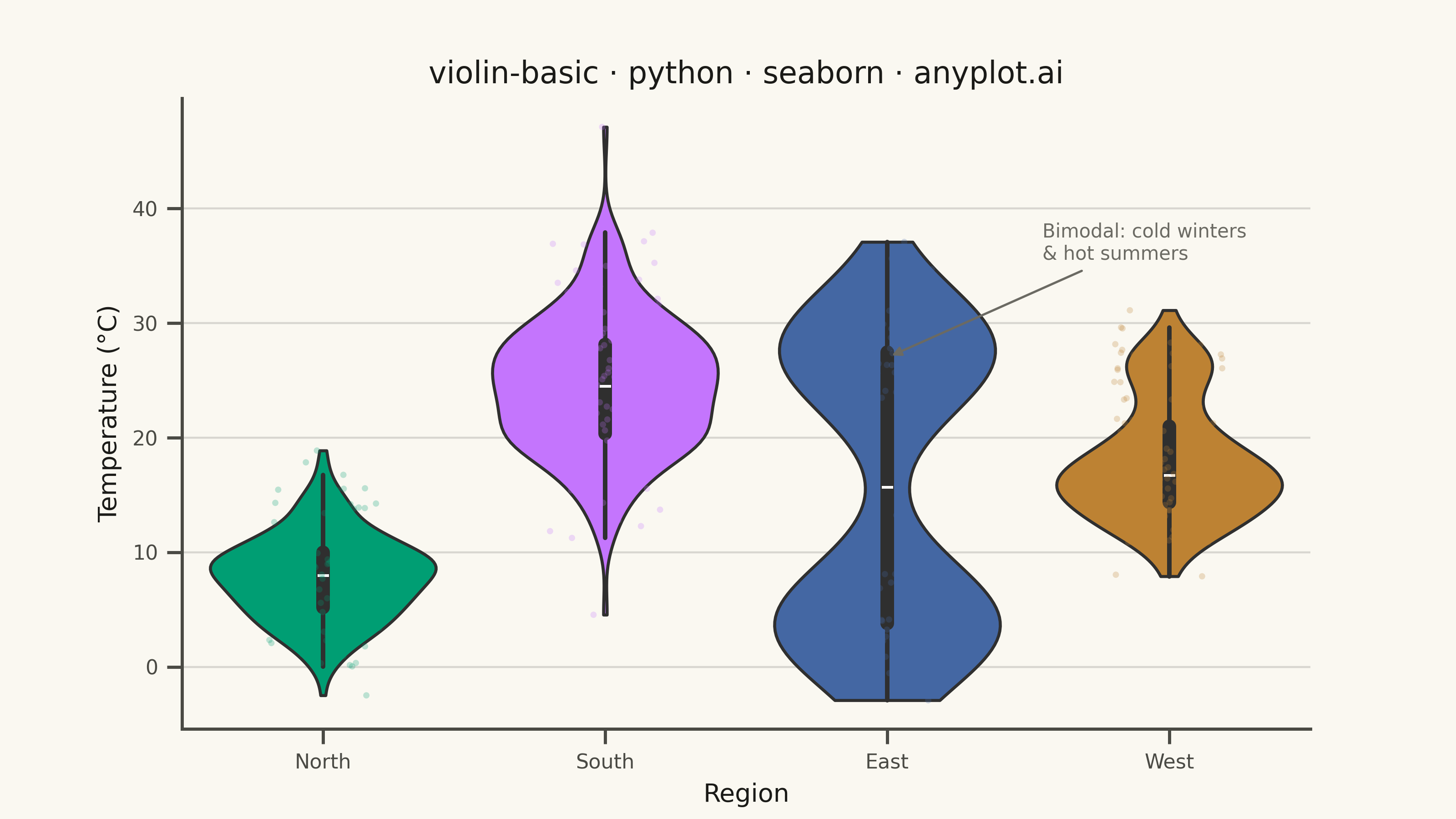
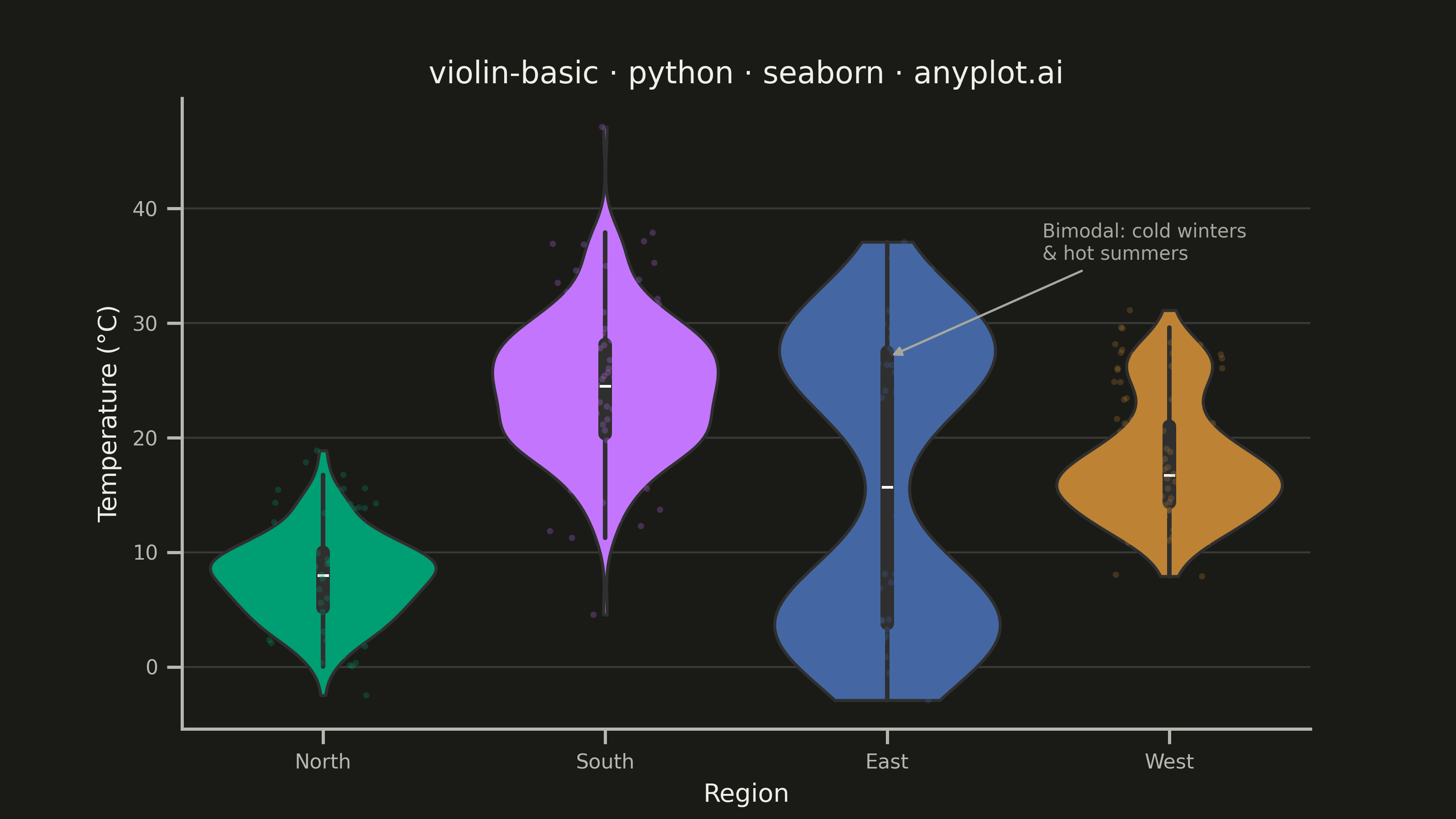
A violin plot combining a box plot with a kernel density estimation on each side, showing the distribution shape of numerical data. The width of the violin at each point represents the frequency of data values at that level. Excellent for comparing distributions across categories while revealing their underlying shape, providing more detail than a traditional box plot.
""" anyplot.ai
violin-basic: Basic Violin Plot
Library: seaborn 0.13.2 | Python 3.13.13
Quality: 91/100 | Updated: 2026-05-29
"""

import os

import matplotlib.pyplot as plt
import numpy as np
import pandas as pd
import seaborn as sns


# Theme tokens
THEME = os.getenv("ANYPLOT_THEME", "light")
PAGE_BG = "#FAF8F1" if THEME == "light" else "#1A1A17"
ELEVATED_BG = "#FFFDF6" if THEME == "light" else "#242420"
INK = "#1A1A17" if THEME == "light" else "#F0EFE8"
INK_SOFT = "#4A4A44" if THEME == "light" else "#B8B7B0"
INK_MUTED = "#6B6A63" if THEME == "light" else "#A8A79F"

# Imprint palette — canonical order, first series always #009E73
IMPRINT_PALETTE = ["#009E73", "#C475FD", "#4467A3", "#BD8233"]

# Data — daily temperature readings (°C) across four climate regions
np.random.seed(42)
regions = ["North", "South", "East", "West"]
records = []

for region in regions:
    if region == "North":
        # Cold region: compact distribution
        temps = np.random.normal(8, 4, 200)
    elif region == "South":
        # Warm region: broader spread
        temps = np.random.normal(24, 6, 200)
    elif region == "East":
        # Continental: bimodal (cold winters + hot summers) — showcases KDE strength
        temps = np.concatenate([np.random.normal(4, 3, 100), np.random.normal(28, 4, 100)])
    else:
        # Coastal: mild with occasional heat events
        temps = np.concatenate([np.random.normal(16, 3, 160), np.random.normal(26, 2, 40)])
    for t in temps:
        records.append({"Region": region, "Temperature (°C)": t})

df = pd.DataFrame(records)

# Canvas — 3200 × 1800 px (landscape 16:9)
sns.set_theme(
    style="ticks",
    rc={
        "figure.facecolor": PAGE_BG,
        "axes.facecolor": PAGE_BG,
        "axes.edgecolor": INK_SOFT,
        "axes.labelcolor": INK,
        "text.color": INK,
        "xtick.color": INK_SOFT,
        "ytick.color": INK_SOFT,
        "grid.color": INK,
        "grid.alpha": 0.15,
        "legend.facecolor": ELEVATED_BG,
        "legend.edgecolor": INK_SOFT,
    },
)

fig, ax = plt.subplots(figsize=(8, 4.5), dpi=400, facecolor=PAGE_BG)
ax.set_facecolor(PAGE_BG)

# Violin plot
sns.violinplot(
    data=df,
    x="Region",
    y="Temperature (°C)",
    hue="Region",
    palette=IMPRINT_PALETTE,
    inner="box",
    cut=0,
    linewidth=1.2,
    saturation=1.0,
    legend=False,
    ax=ax,
)

# Stripplot overlay — signature seaborn layering pattern
sns.stripplot(
    data=df,
    x="Region",
    y="Temperature (°C)",
    hue="Region",
    palette=IMPRINT_PALETTE,
    dodge=False,
    jitter=0.2,
    size=2.5,
    alpha=0.25,
    legend=False,
    ax=ax,
)

# Style
title = "violin-basic · python · seaborn · anyplot.ai"
ax.set_xlabel("Region", fontsize=10, color=INK)
ax.set_ylabel("Temperature (°C)", fontsize=10, color=INK)
ax.set_title(title, fontsize=12, fontweight="medium", color=INK)
ax.tick_params(axis="both", labelsize=8, colors=INK_SOFT)

ax.spines["top"].set_visible(False)
ax.spines["right"].set_visible(False)
for s in ("left", "bottom"):
    ax.spines[s].set_color(INK_SOFT)

ax.yaxis.grid(True, linewidth=0.8)
ax.set_axisbelow(True)

# Annotation: highlight the bimodal East distribution (the key storytelling insight)
ax.annotate(
    "Bimodal: cold winters\n& hot summers",
    xy=(2, 27),
    xytext=(2.55, 37),
    fontsize=7.5,
    color=INK_MUTED,
    ha="left",
    va="center",
    arrowprops={"arrowstyle": "-|>", "color": INK_MUTED, "lw": 0.9},
)

# Save — no bbox_inches='tight' (seaborn canvas contract: figsize×dpi sets exact target)
plt.savefig(f"plot-{THEME}.png", dpi=400, facecolor=PAGE_BG)
Runnable source as JSON, for any HTTP client: https://api.anyplot.ai/specs/violin-basic/seaborn/code. Any spec id and library id listed in llms-full.txt fit the same URL shape; every URL below is complete and callable.
{
  "spec_id": "violin-basic",
  "language": "python",
  "library": "seaborn",
  "page": "https://anyplot.ai/violin-basic/python/seaborn",
  "hub": "https://anyplot.ai/violin-basic",
  "code_json": "https://api.anyplot.ai/specs/violin-basic/seaborn/code",
  "spec_json": "https://api.anyplot.ai/specs/violin-basic",
  "render_light_png": "https://storage.googleapis.com/anyplot-images/plots/violin-basic/python/seaborn/plot-light.png",
  "render_dark_png": "https://storage.googleapis.com/anyplot-images/plots/violin-basic/python/seaborn/plot-dark.png",
  "quality_score": 91.0,
  "license": "MIT",
  "guide": "https://anyplot.ai/llms.txt"
}
Part of Basic Violin Plot on anyplot.ai.