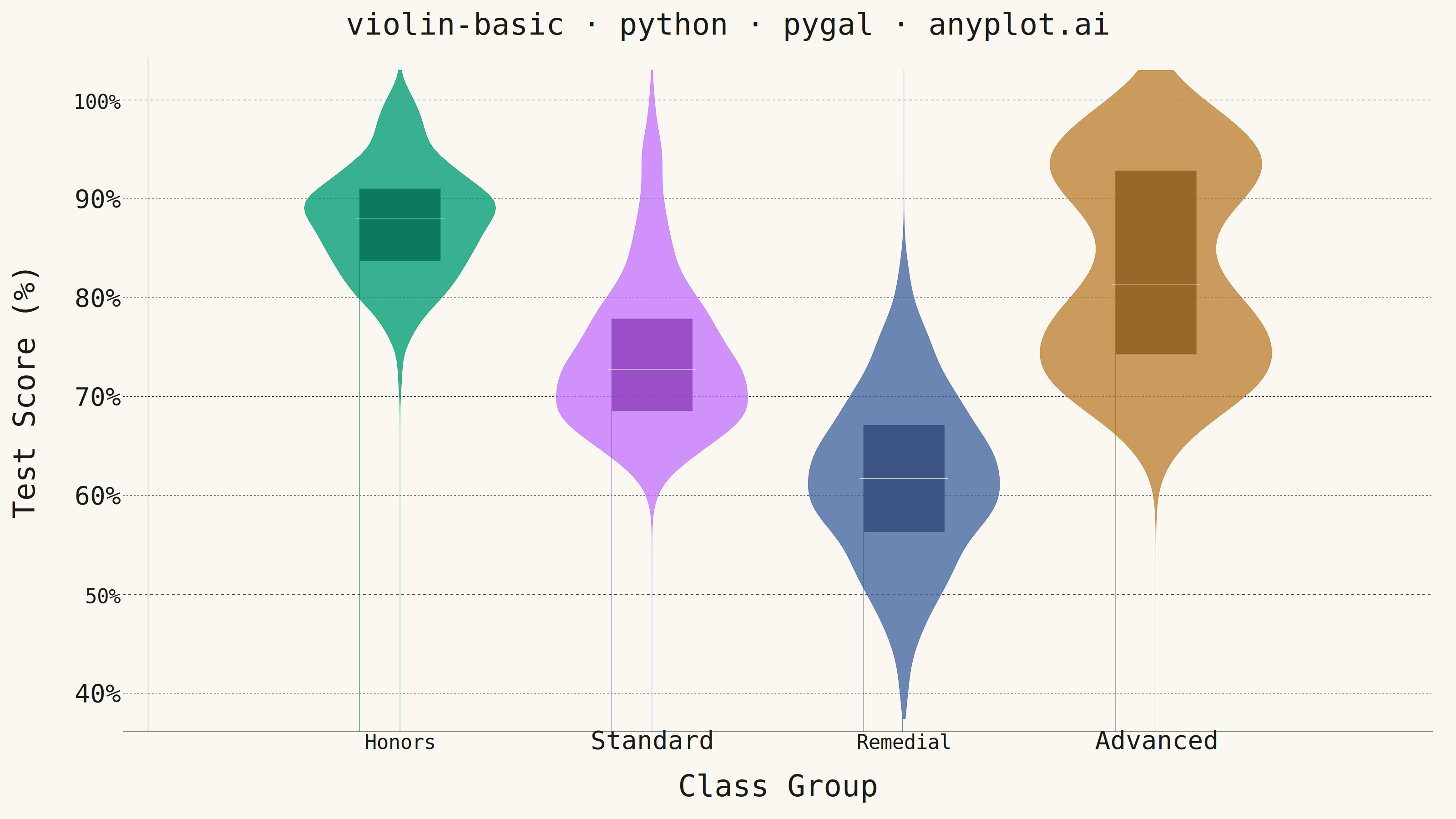
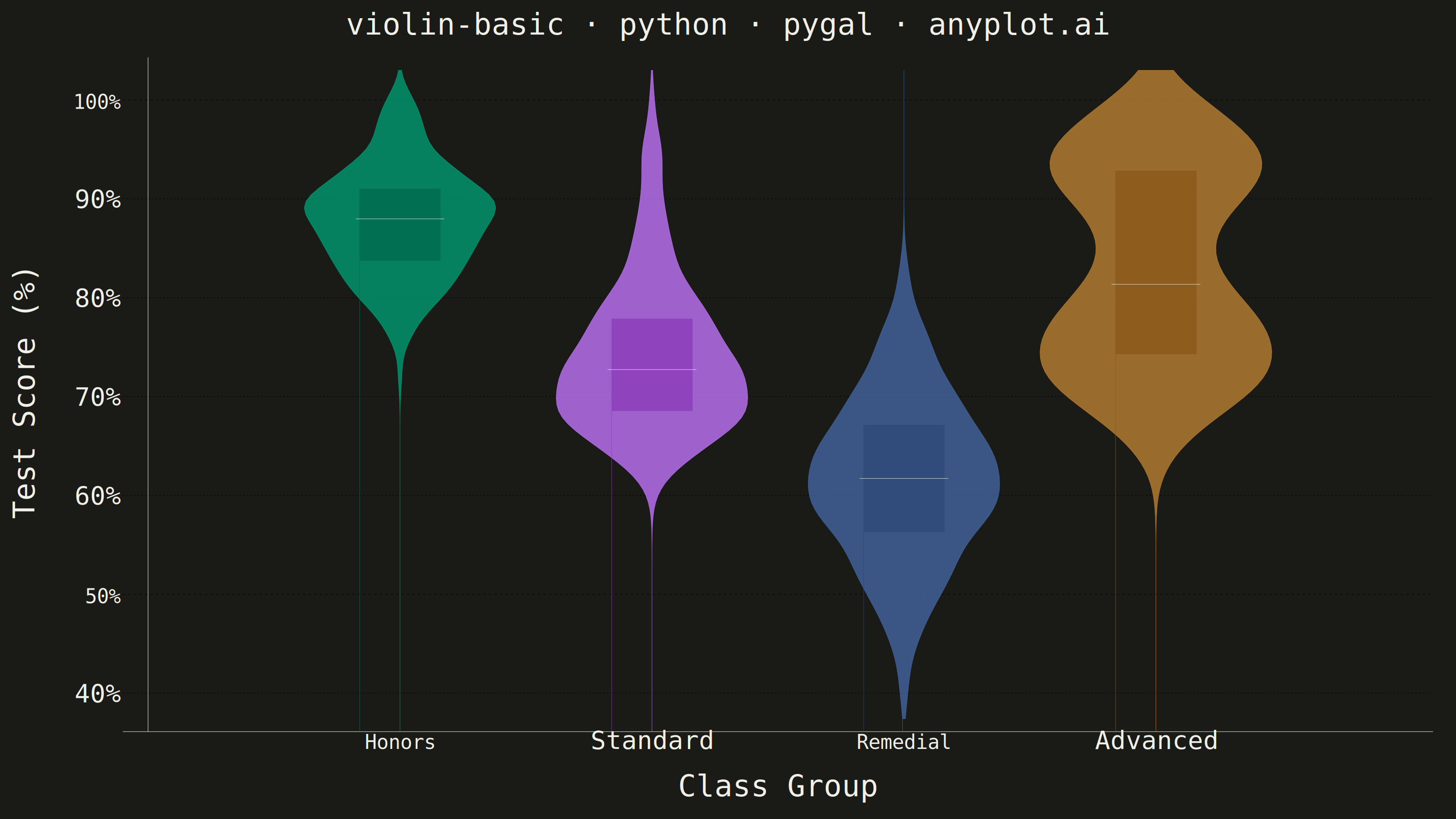
A violin plot combining a box plot with a kernel density estimation on each side, showing the distribution shape of numerical data. The width of the violin at each point represents the frequency of data values at that level. Excellent for comparing distributions across categories while revealing their underlying shape, providing more detail than a traditional box plot.
""" anyplot.ai
violin-basic: Basic Violin Plot
Library: pygal 3.1.0 | Python 3.13.13
Quality: 91/100 | Updated: 2026-05-29
"""

import os

import numpy as np
import pygal
from pygal.style import Style


# Theme tokens
THEME = os.getenv("ANYPLOT_THEME", "light")
PAGE_BG = "#FAF8F1" if THEME == "light" else "#1A1A17"
INK = "#1A1A17" if THEME == "light" else "#F0EFE8"
INK_MUTED = "#6B6A63" if THEME == "light" else "#A8A79F"

# Imprint palette — positions 1-4 for 4 category violins
VIOLIN_COLORS = ["#009E73", "#C475FD", "#4467A3", "#BD8233"]
# Darker variants for IQR boxes (depth inside the violin)
IQR_COLORS = ["#006B4E", "#8B3DB8", "#2E4878", "#8A5A1A"]
# Warm white median line — high contrast against all dark IQR boxes in both themes
MEDIAN_COLOR = "#FAF8F1"

# Interleaved palette: 3 tokens per violin (fill, IQR fill, median line)
palette = []
for vc, ic in zip(VIOLIN_COLORS, IQR_COLORS, strict=True):
    palette.extend([vc, ic, MEDIAN_COLOR])

custom_style = Style(
    background=PAGE_BG,
    plot_background=PAGE_BG,
    foreground=INK,
    foreground_strong=INK,
    foreground_subtle=INK_MUTED,
    colors=tuple(palette),
    title_font_size=66,
    label_font_size=56,
    major_label_font_size=44,
    legend_font_size=44,
    value_font_size=36,
    opacity=0.78,
    opacity_hover=0.92,
    transition="200ms ease-in",
)

# Data — test scores across 4 class groups with distinct distribution shapes
np.random.seed(42)
data = {
    "Honors": np.clip(np.random.normal(88, 6, 200), 50, 100),
    "Standard": np.clip(60 + np.random.gamma(3.5, 4, 200), 40, 100),
    "Remedial": np.clip(np.random.normal(62, 8, 200), 30, 100),
    "Advanced": np.clip(np.concatenate([np.random.normal(75, 6, 120), np.random.normal(93, 4, 80)]), 45, 100),
}

# Y range computed from data to minimise unused canvas space
all_values = np.concatenate(list(data.values()))
y_pad = 3.0
y_min = float(all_values.min()) - y_pad
y_max = float(all_values.max()) + y_pad

chart = pygal.XY(
    width=3200,
    height=1800,
    style=custom_style,
    title="violin-basic · python · pygal · anyplot.ai",
    x_title="Class Group",
    y_title="Test Score (%)",
    show_legend=False,
    stroke=True,
    fill=True,
    dots_size=0,
    show_x_guides=False,
    show_y_guides=True,
    range=(y_min, y_max),
    xrange=(0, 5.0),
    margin=50,
    value_formatter=lambda x: f"{x:.0f}%",
    x_value_formatter=lambda x: "",
    tooltip_border_radius=10,
    tooltip_fancy_mode=True,
    human_readable=True,
    pretty_print=True,
)

# Violin widths — Advanced wider to highlight bimodal shape
base_width = 0.38
widths = {"Honors": base_width, "Standard": base_width, "Remedial": base_width, "Advanced": 0.46}
n_points = 100

for i, (category, values) in enumerate(data.items()):
    center_x = i + 1.0
    violin_width = widths[category]

    # KDE with Silverman's rule
    n = len(values)
    std = np.std(values)
    iqr_val = np.percentile(values, 75) - np.percentile(values, 25)
    bandwidth = 0.9 * min(std, iqr_val / 1.34) * n ** (-0.2)

    y_grid = np.linspace(y_min, y_max, n_points)
    density = np.zeros_like(y_grid)
    for v in values:
        density += np.exp(-0.5 * ((y_grid - v) / bandwidth) ** 2)
    density /= n * bandwidth * np.sqrt(2 * np.pi)
    density = density / density.max() * violin_width

    median_val = float(np.median(values))
    q1 = float(np.percentile(values, 25))
    q3 = float(np.percentile(values, 75))
    tooltip = f"{category} — Median: {median_val:.1f}%, Q1: {q1:.1f}%, Q3: {q3:.1f}%"
    if category == "Advanced":
        tooltip += " · Bimodal: two sub-populations (75% & 93%)"

    # Mirrored violin shape
    left_pts = [(center_x - d, y) for y, d in zip(y_grid, density, strict=True)]
    right_pts = [(center_x + d, y) for y, d in zip(y_grid[::-1], density[::-1], strict=True)]
    violin_pts = left_pts + right_pts + [left_pts[0]]
    chart.add(category, violin_pts, formatter=lambda x, t=tooltip: t, stroke_style={"width": 2})

    # IQR box — darker Imprint shade, drawn with next palette slot
    box_w = 0.16
    iqr_box = [
        (center_x - box_w, q1),
        (center_x - box_w, q3),
        (center_x + box_w, q3),
        (center_x + box_w, q1),
        (center_x - box_w, q1),
    ]
    chart.add(None, iqr_box, stroke=True, fill=True, show_dots=False, stroke_style={"width": 4, "color": INK_MUTED})

    # Median line — warm white against dark IQR box (third palette slot per violin)
    median_line = [(center_x - box_w * 1.1, median_val), (center_x + box_w * 1.1, median_val)]
    chart.add(None, median_line, stroke=True, fill=False, show_dots=False, stroke_style={"width": 18})

chart.x_labels = ["", "Honors", "Standard", "Remedial", "Advanced", ""]
chart.x_labels_major_count = 4

# Save
with open(f"plot-{THEME}.html", "wb") as f:
    f.write(chart.render())
chart.render_to_png(f"plot-{THEME}.png")
Runnable source as JSON, for any HTTP client: https://api.anyplot.ai/specs/violin-basic/pygal/code. Any spec id and library id listed in llms-full.txt fit the same URL shape; every URL below is complete and callable.
{
  "spec_id": "violin-basic",
  "language": "python",
  "library": "pygal",
  "page": "https://anyplot.ai/violin-basic/python/pygal",
  "hub": "https://anyplot.ai/violin-basic",
  "code_json": "https://api.anyplot.ai/specs/violin-basic/pygal/code",
  "spec_json": "https://api.anyplot.ai/specs/violin-basic",
  "render_light_png": "https://storage.googleapis.com/anyplot-images/plots/violin-basic/python/pygal/plot-light.png",
  "render_dark_png": "https://storage.googleapis.com/anyplot-images/plots/violin-basic/python/pygal/plot-dark.png",
  "interactive_light_html": "https://storage.googleapis.com/anyplot-images/plots/violin-basic/python/pygal/plot-light.html",
  "interactive_dark_html": "https://storage.googleapis.com/anyplot-images/plots/violin-basic/python/pygal/plot-dark.html",
  "quality_score": 91.0,
  "license": "MIT",
  "guide": "https://anyplot.ai/llms.txt"
}
Part of Basic Violin Plot on anyplot.ai.