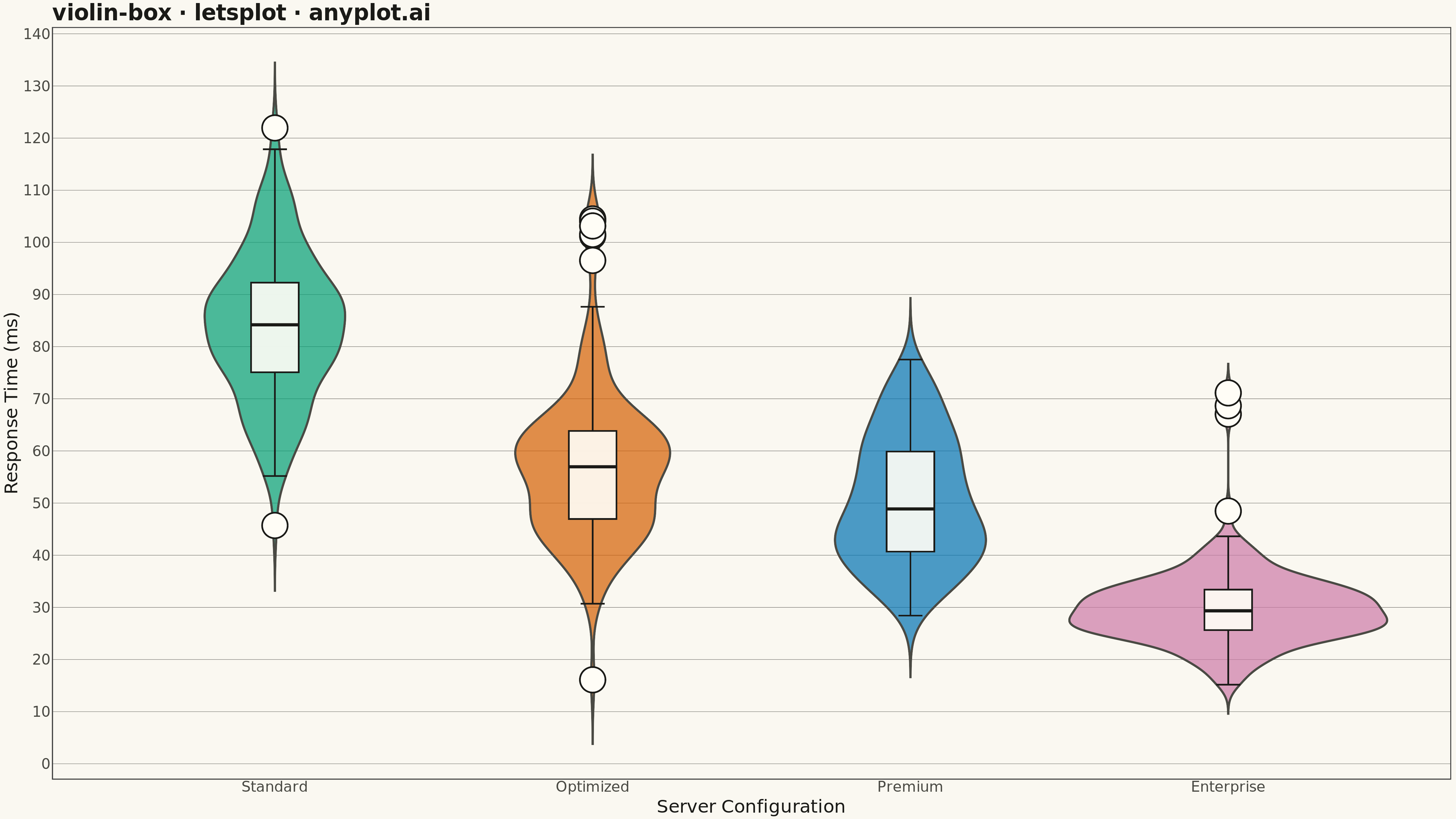
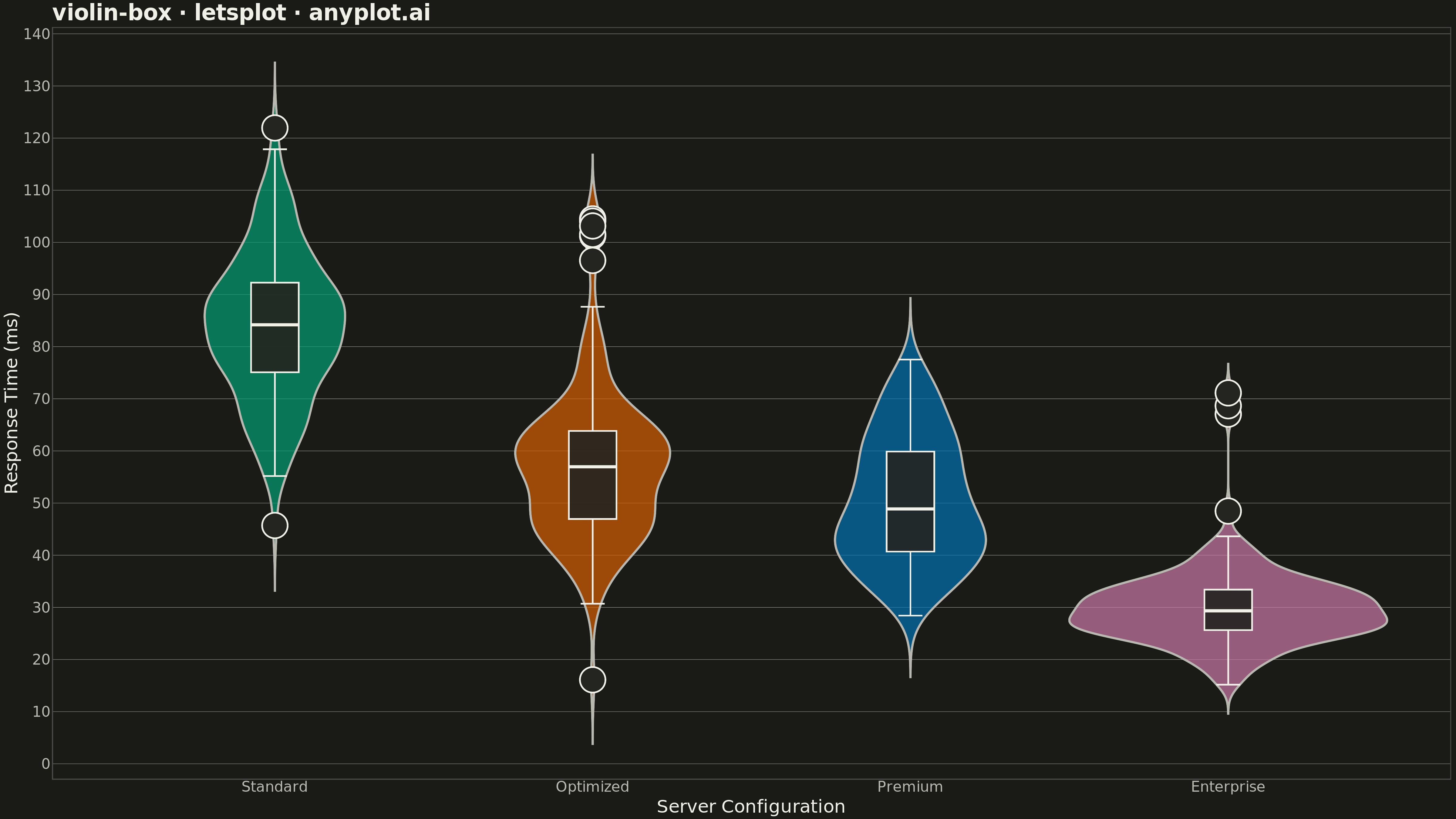
A violin plot with an embedded box plot inside, combining the distribution shape visualization (KDE) with traditional quartile statistics. Shows both the probability density and summary statistics in one plot.
""" anyplot.ai
violin-box: Violin Plot with Embedded Box Plot
Library: letsplot 4.9.0 | Python 3.13.13
Quality: 83/100 | Updated: 2026-05-15
"""

import numpy as np
import pandas as pd
from lets_plot import *


LetsPlot.setup_html()

# Data - Response times (ms) for different server configurations
np.random.seed(42)

n_per_group = 150
groups = ["Standard", "Optimized", "Premium", "Enterprise"]

data = []
# Standard: higher mean, moderate spread
data.extend([(np.random.normal(85, 15), "Standard") for _ in range(n_per_group)])
# Optimized: lower mean, some outliers
vals = np.concatenate([np.random.normal(55, 12, n_per_group - 5), np.random.normal(100, 5, 5)])
data.extend([(v, "Optimized") for v in vals])
# Premium: bimodal distribution
vals = np.concatenate([np.random.normal(40, 8, n_per_group // 2), np.random.normal(60, 8, n_per_group // 2)])
data.extend([(v, "Premium") for v in vals])
# Enterprise: low mean, tight spread, few outliers
vals = np.concatenate([np.random.normal(30, 6, n_per_group - 3), np.random.normal(70, 3, 3)])
data.extend([(v, "Enterprise") for v in vals])

df = pd.DataFrame(data, columns=["response_time", "configuration"])

# Create violin plot with embedded box plot
plot = (
    ggplot(df, aes(x="configuration", y="response_time", fill="configuration"))
    + geom_violin(alpha=0.7, color="#306998", size=1.0, trim=False)
    + geom_boxplot(width=0.15, fill="white", color="#306998", alpha=0.9, outlier_shape=21, outlier_size=3)
    + scale_fill_manual(values=["#306998", "#FFD43B", "#4A90A4", "#7CB342"])
    + labs(x="Server Configuration", y="Response Time (ms)", title="violin-box · letsplot · pyplots.ai")
    + theme_minimal()
    + theme(
        plot_title=element_text(size=24, face="bold"),
        axis_title=element_text(size=20),
        axis_text=element_text(size=16),
        legend_position="none",
        panel_grid_major_x=element_blank(),
        panel_grid_minor=element_blank(),
    )
    + ggsize(1600, 900)
)

# Save as PNG (scale 3x for 4800x2700 px)
ggsave(plot, "plot.png", path=".", scale=3)

# Save as HTML for interactive version
ggsave(plot, "plot.html", path=".")
Runnable source as JSON, for any HTTP client: https://api.anyplot.ai/specs/violin-box/letsplot/code. Any spec id and library id listed in llms-full.txt fit the same URL shape; every URL below is complete and callable.
{
  "spec_id": "violin-box",
  "language": "python",
  "library": "letsplot",
  "page": "https://anyplot.ai/violin-box/python/letsplot",
  "hub": "https://anyplot.ai/violin-box",
  "code_json": "https://api.anyplot.ai/specs/violin-box/letsplot/code",
  "spec_json": "https://api.anyplot.ai/specs/violin-box",
  "render_light_png": "https://storage.googleapis.com/anyplot-images/plots/violin-box/python/letsplot/plot-light.png",
  "render_dark_png": "https://storage.googleapis.com/anyplot-images/plots/violin-box/python/letsplot/plot-dark.png",
  "interactive_light_html": "https://storage.googleapis.com/anyplot-images/plots/violin-box/python/letsplot/plot-light.html",
  "interactive_dark_html": "https://storage.googleapis.com/anyplot-images/plots/violin-box/python/letsplot/plot-dark.html",
  "quality_score": 83.0,
  "license": "MIT",
  "guide": "https://anyplot.ai/llms.txt"
}
Part of Violin Plot with Embedded Box Plot on anyplot.ai.