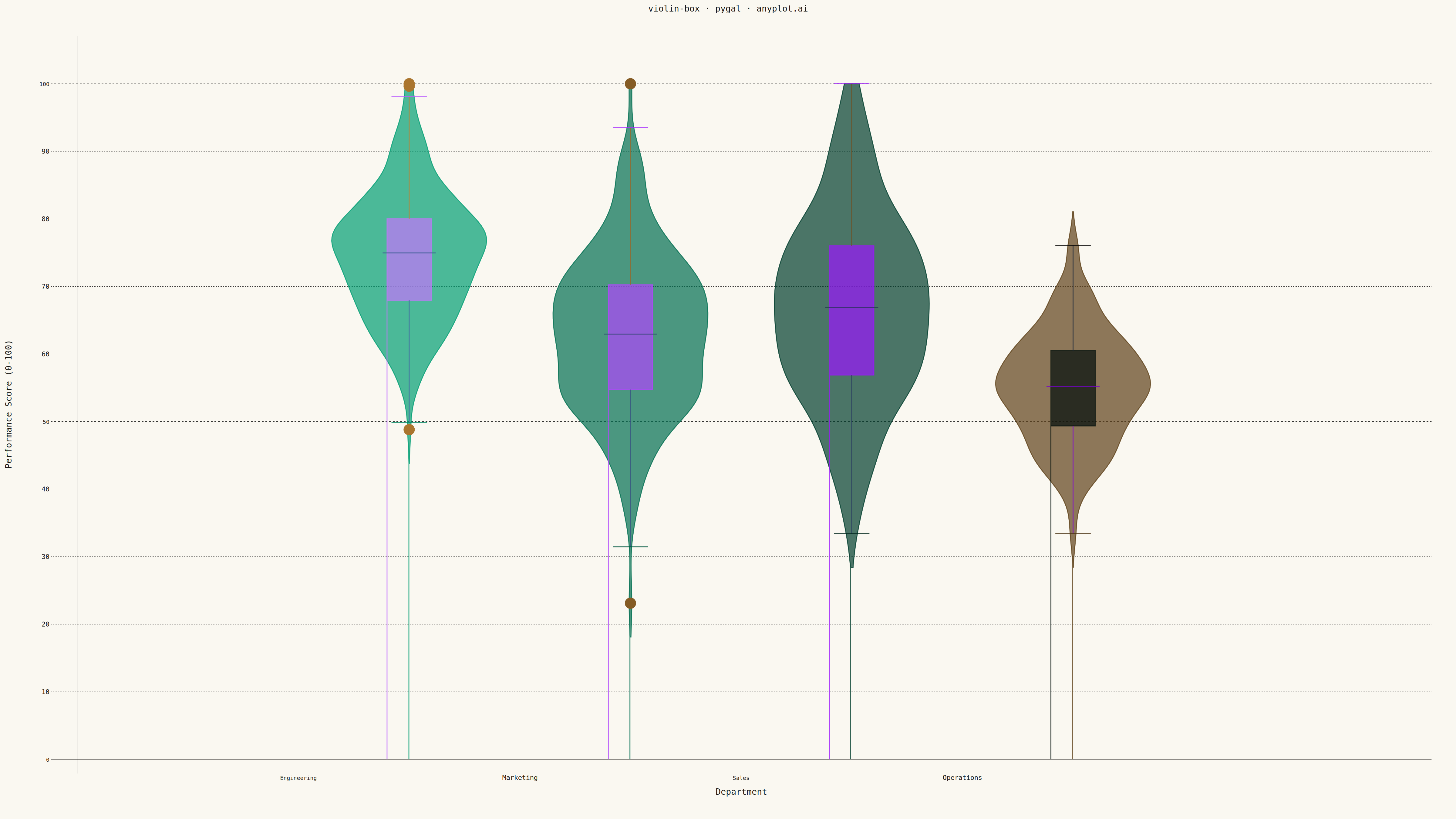
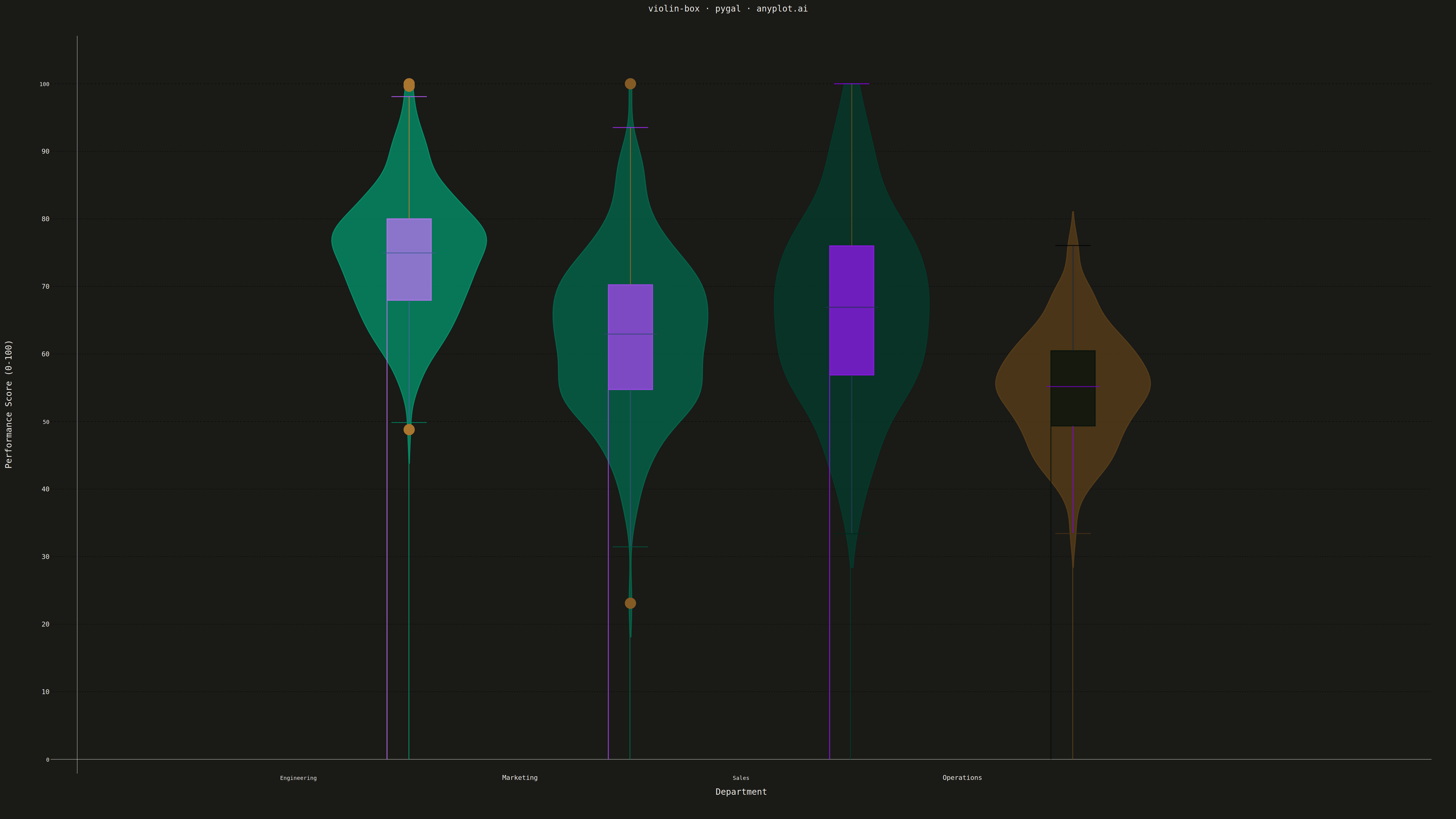
A violin plot with an embedded box plot inside, combining the distribution shape visualization (KDE) with traditional quartile statistics. Shows both the probability density and summary statistics in one plot.
""" anyplot.ai
violin-box: Violin Plot with Embedded Box Plot
Library: pygal 3.1.0 | Python 3.13.13
Quality: 86/100 | Updated: 2026-05-12
"""

import os
import sys

import numpy as np


sys.path = [p for p in sys.path if not p.endswith("/python")]
import pygal
from pygal.style import Style


# Theme tokens
THEME = os.getenv("ANYPLOT_THEME", "light")
PAGE_BG = "#FAF8F1" if THEME == "light" else "#1A1A17"
INK = "#1A1A17" if THEME == "light" else "#F0EFE8"
INK_SOFT = "#4A4A44" if THEME == "light" else "#B8B7B0"
INK_MUTED = "#6B6A63" if THEME == "light" else "#A8A79F"

# Okabe-Ito palette - use first 4 colors for violin categories
IMPRINT = ("#009E73", "#C475FD", "#4467A3", "#BD8233")

# Data - Generate distributions for different categories with scores constrained to 0-100
np.random.seed(42)
raw_data = {
    "Engineering": np.random.normal(75, 10, 200),
    "Marketing": np.random.normal(62, 12, 200),
    "Sales": np.random.normal(68, 14, 200),
    "Operations": np.random.normal(55, 8, 200),
}
# Clip all values to 0-100 range
data = {k: np.clip(v, 0, 100) for k, v in raw_data.items()}

# Custom style for 4800x2700 px canvas
custom_style = Style(
    background=PAGE_BG,
    plot_background=PAGE_BG,
    foreground=INK,
    foreground_strong=INK,
    foreground_subtle=INK_MUTED,
    colors=IMPRINT,
    title_font_size=28,
    label_font_size=22,
    major_label_font_size=18,
    legend_font_size=16,
    value_font_size=14,
    stroke_width=3,
)

# Create XY chart for violin plot with embedded box
chart = pygal.XY(
    width=4800,
    height=2700,
    style=custom_style,
    title="violin-box · pygal · anyplot.ai",
    x_title="Department",
    y_title="Performance Score (0-100)",
    show_legend=False,
    stroke=True,
    fill=True,
    dots_size=0,
    show_x_guides=False,
    show_y_guides=True,
    range=(0, 105),
    xrange=(0, 6),
    margin=80,
)

# Parameters for violin shapes
violin_width = 0.35
n_points = 100

# Box plot styling
box_stroke_style = {"width": 4, "dasharray": ""}
median_stroke_style = {"width": 6, "dasharray": ""}
whisker_stroke_style = {"width": 3, "dasharray": ""}

# Add violins with embedded box plots for each category
for i, (category, values) in enumerate(data.items()):
    center_x = i + 1.5
    violin_color = IMPRINT[i]

    # Compute KDE using Silverman's rule
    n = len(values)
    std = np.std(values)
    iqr = np.percentile(values, 75) - np.percentile(values, 25)
    bandwidth = 0.9 * min(std, iqr / 1.34) * n ** (-0.2)

    # Create range of y values for density
    y_min, y_max = values.min(), values.max()
    y_range = np.linspace(max(0, y_min - 5), min(100, y_max + 5), n_points)

    # Gaussian kernel density estimation
    density = np.zeros_like(y_range)
    for v in values:
        density += np.exp(-0.5 * ((y_range - v) / bandwidth) ** 2)
    density /= n * bandwidth * np.sqrt(2 * np.pi)

    # Normalize density to desired width
    density = density / density.max() * violin_width

    # Create violin shape (mirrored density)
    left_points = [(center_x - d, y) for y, d in zip(y_range, density, strict=True)]
    right_points = [(center_x + d, y) for y, d in zip(y_range[::-1], density[::-1], strict=True)]
    violin_points = left_points + right_points + [left_points[0]]

    chart.add(category, violin_points)

    # Calculate box plot statistics
    median = float(np.median(values))
    q1 = float(np.percentile(values, 25))
    q3 = float(np.percentile(values, 75))
    iqr_val = q3 - q1

    # Whiskers: 1.5 * IQR or data min/max
    lower_whisker = max(values.min(), q1 - 1.5 * iqr_val)
    upper_whisker = min(values.max(), q3 + 1.5 * iqr_val)

    # Identify outliers
    outliers = values[(values < lower_whisker) | (values > upper_whisker)]

    box_width = 0.10

    # Quartile box - use elevated background color for visibility
    elevated_bg = "#FFFDF6" if THEME == "light" else "#242420"
    quartile_box = [
        (center_x - box_width, q1),
        (center_x - box_width, q3),
        (center_x + box_width, q3),
        (center_x + box_width, q1),
        (center_x - box_width, q1),
    ]
    chart.add(None, quartile_box, stroke=True, fill=True, show_dots=False, stroke_style=box_stroke_style)

    # Whisker lines (vertical lines from box to whisker ends)
    lower_whisker_line = [(center_x, q1), (center_x, lower_whisker)]
    upper_whisker_line = [(center_x, q3), (center_x, upper_whisker)]
    chart.add(None, lower_whisker_line, stroke=True, fill=False, show_dots=False, stroke_style=whisker_stroke_style)
    chart.add(None, upper_whisker_line, stroke=True, fill=False, show_dots=False, stroke_style=whisker_stroke_style)

    # Whisker caps (horizontal lines at ends)
    cap_width = box_width * 0.8
    lower_cap = [(center_x - cap_width, lower_whisker), (center_x + cap_width, lower_whisker)]
    upper_cap = [(center_x - cap_width, upper_whisker), (center_x + cap_width, upper_whisker)]
    chart.add(None, lower_cap, stroke=True, fill=False, show_dots=False, stroke_style=whisker_stroke_style)
    chart.add(None, upper_cap, stroke=True, fill=False, show_dots=False, stroke_style=whisker_stroke_style)

    # Median line (thicker, contrasting)
    median_line = [(center_x - box_width * 1.2, median), (center_x + box_width * 1.2, median)]
    chart.add(None, median_line, stroke=True, fill=False, show_dots=False, stroke_style=median_stroke_style)

    # Outliers as points
    if len(outliers) > 0:
        outlier_points = [(center_x, float(o)) for o in outliers]
        chart.add(None, outlier_points, stroke=False, fill=False, show_dots=True, dots_size=18)

# X-axis labels at violin positions
chart.x_labels = ["", "Engineering", "Marketing", "Sales", "Operations", ""]
chart.x_labels_major_count = 4

# Save outputs
chart.render_to_file(f"plot-{THEME}.html")
chart.render_to_png(f"plot-{THEME}.png")
Runnable source as JSON, for any HTTP client: https://api.anyplot.ai/specs/violin-box/pygal/code. Any spec id and library id listed in llms-full.txt fit the same URL shape; every URL below is complete and callable.
{
  "spec_id": "violin-box",
  "language": "python",
  "library": "pygal",
  "page": "https://anyplot.ai/violin-box/python/pygal",
  "hub": "https://anyplot.ai/violin-box",
  "code_json": "https://api.anyplot.ai/specs/violin-box/pygal/code",
  "spec_json": "https://api.anyplot.ai/specs/violin-box",
  "render_light_png": "https://storage.googleapis.com/anyplot-images/plots/violin-box/python/pygal/plot-light.png",
  "render_dark_png": "https://storage.googleapis.com/anyplot-images/plots/violin-box/python/pygal/plot-dark.png",
  "interactive_light_html": "https://storage.googleapis.com/anyplot-images/plots/violin-box/python/pygal/plot-light.html",
  "interactive_dark_html": "https://storage.googleapis.com/anyplot-images/plots/violin-box/python/pygal/plot-dark.html",
  "quality_score": 86.0,
  "license": "MIT",
  "guide": "https://anyplot.ai/llms.txt"
}
Part of Violin Plot with Embedded Box Plot on anyplot.ai.