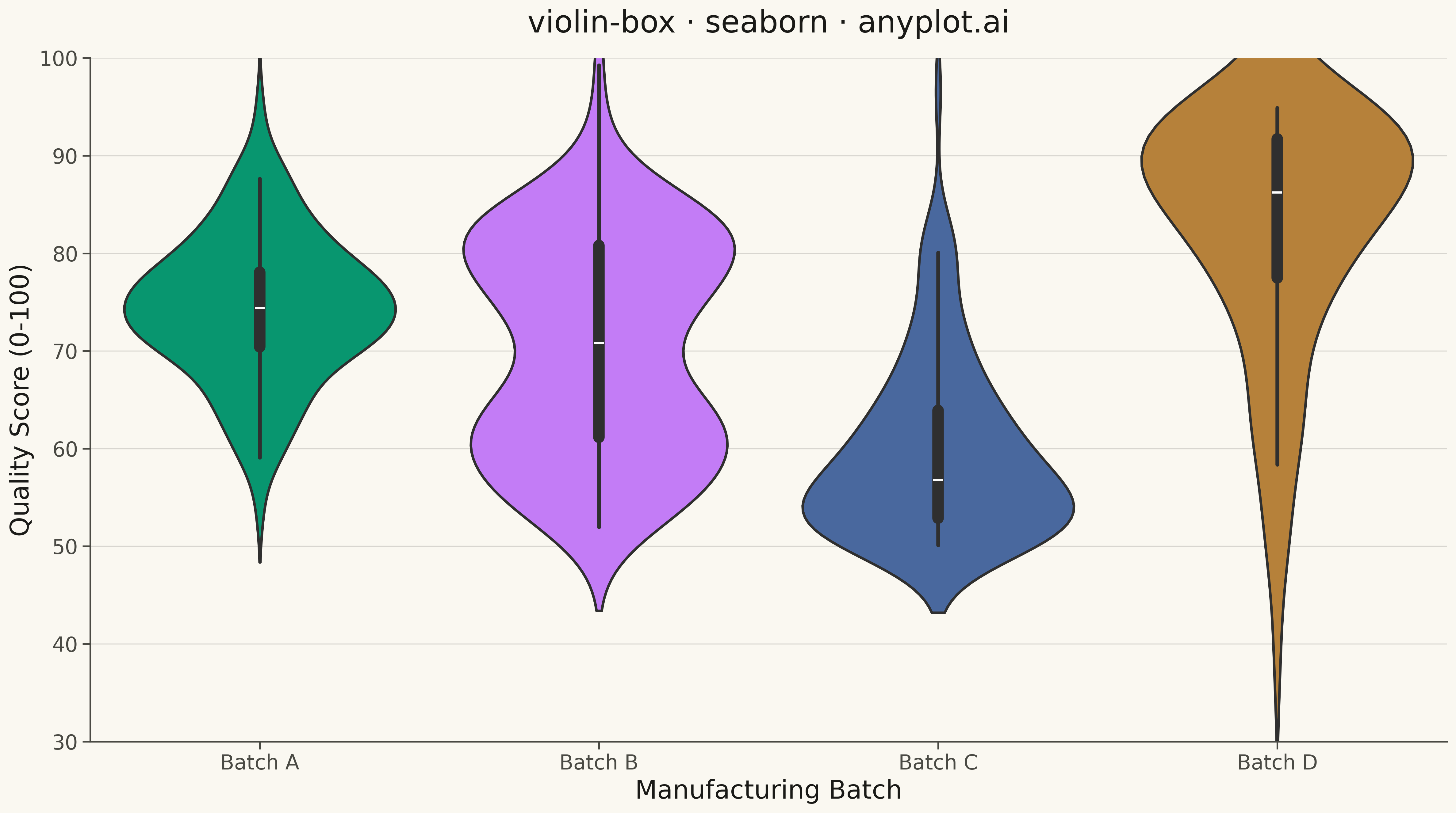
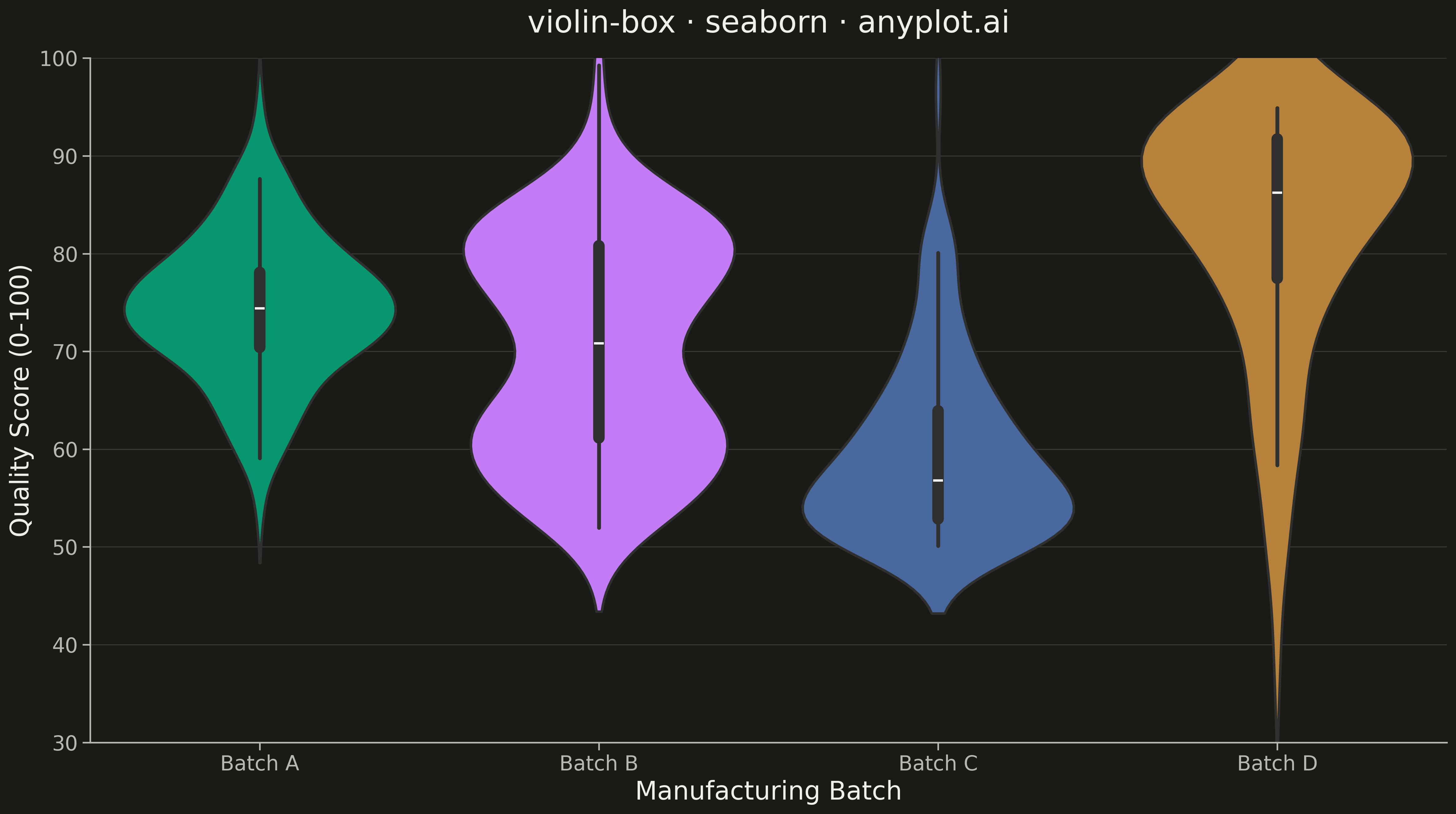
A violin plot with an embedded box plot inside, combining the distribution shape visualization (KDE) with traditional quartile statistics. Shows both the probability density and summary statistics in one plot.
""" anyplot.ai
violin-box: Violin Plot with Embedded Box Plot
Library: seaborn 0.13.2 | Python 3.13.13
Quality: 92/100 | Updated: 2026-05-12
"""

import importlib
import os
import sys


# Avoid importing from local directory
for path in list(sys.path):
    if "violin-box" in path or "implementations" in path:
        sys.path.remove(path)

matplotlib = importlib.import_module("matplotlib")
plt = importlib.import_module("matplotlib.pyplot")
np = importlib.import_module("numpy")
pd = importlib.import_module("pandas")
sns = importlib.import_module("seaborn")

# Theme tokens
THEME = os.getenv("ANYPLOT_THEME", "light")
PAGE_BG = "#FAF8F1" if THEME == "light" else "#1A1A17"
ELEVATED_BG = "#FFFDF6" if THEME == "light" else "#242420"
INK = "#1A1A17" if THEME == "light" else "#F0EFE8"
INK_SOFT = "#4A4A44" if THEME == "light" else "#B8B7B0"

# Okabe-Ito palette - first series always #009E73
IMPRINT = ["#009E73", "#C475FD", "#4467A3", "#BD8233"]

# Data - Product quality scores across manufacturing batches
np.random.seed(42)

# Create varied distributions for each batch to demonstrate violin plot value
batch_a = np.random.normal(75, 8, 120)  # Normal, centered around 75
batch_b = np.concatenate([np.random.normal(60, 5, 60), np.random.normal(80, 5, 60)])  # Bimodal
batch_c = np.random.exponential(10, 120) + 50  # Right-skewed
batch_d = 95 - np.random.exponential(10, 120)  # Left-skewed

# Combine into DataFrame
df = pd.DataFrame(
    {
        "Quality Score": np.concatenate([batch_a, batch_b, batch_c, batch_d]),
        "Batch": ["Batch A"] * 120 + ["Batch B"] * 120 + ["Batch C"] * 120 + ["Batch D"] * 120,
    }
)

# Configure seaborn theme with theme-adaptive chrome
sns.set_theme(
    style="ticks",
    rc={
        "figure.facecolor": PAGE_BG,
        "axes.facecolor": PAGE_BG,
        "axes.edgecolor": INK_SOFT,
        "axes.labelcolor": INK,
        "text.color": INK,
        "xtick.color": INK_SOFT,
        "ytick.color": INK_SOFT,
        "grid.color": INK,
        "grid.alpha": 0.10,
        "legend.facecolor": ELEVATED_BG,
        "legend.edgecolor": INK_SOFT,
    },
)

# Create figure
fig, ax = plt.subplots(figsize=(16, 9))

# Create violin plot with embedded box plot
sns.violinplot(
    data=df,
    x="Batch",
    y="Quality Score",
    hue="Batch",
    palette=IMPRINT,
    inner="box",
    linewidth=2,
    saturation=0.9,
    legend=False,
    ax=ax,
)

# Styling
ax.set_title("violin-box · seaborn · anyplot.ai", fontsize=24, fontweight="medium", pad=20)
ax.set_xlabel("Manufacturing Batch", fontsize=20, color=INK)
ax.set_ylabel("Quality Score (0-100)", fontsize=20, color=INK)
ax.tick_params(axis="both", labelsize=16, colors=INK_SOFT)
ax.grid(True, alpha=0.15, axis="y", linewidth=0.8)
ax.set_ylim(30, 100)

# Remove top and right spines
ax.spines["top"].set_visible(False)
ax.spines["right"].set_visible(False)
for spine in ["left", "bottom"]:
    ax.spines[spine].set_color(INK_SOFT)

# Save to script directory
script_dir = os.path.dirname(os.path.abspath(__file__))
output_path = os.path.join(script_dir, f"plot-{THEME}.png")

plt.tight_layout()
plt.savefig(output_path, dpi=300, bbox_inches="tight", facecolor=PAGE_BG)
Runnable source as JSON, for any HTTP client: https://api.anyplot.ai/specs/violin-box/seaborn/code. Any spec id and library id listed in llms-full.txt fit the same URL shape; every URL below is complete and callable.
{
  "spec_id": "violin-box",
  "language": "python",
  "library": "seaborn",
  "page": "https://anyplot.ai/violin-box/python/seaborn",
  "hub": "https://anyplot.ai/violin-box",
  "code_json": "https://api.anyplot.ai/specs/violin-box/seaborn/code",
  "spec_json": "https://api.anyplot.ai/specs/violin-box",
  "render_light_png": "https://storage.googleapis.com/anyplot-images/plots/violin-box/python/seaborn/plot-light.png",
  "render_dark_png": "https://storage.googleapis.com/anyplot-images/plots/violin-box/python/seaborn/plot-dark.png",
  "quality_score": 92.0,
  "license": "MIT",
  "guide": "https://anyplot.ai/llms.txt"
}
Part of Violin Plot with Embedded Box Plot on anyplot.ai.