The same plot in 14 other libraries — JavaScript: D3.js, Apache ECharts, Highcharts, MUI X Charts; Python: Altair, Bokeh, lets-plot, Matplotlib, Plotly, plotnine, Pygal, Seaborn; R: ggplot2; Julia: Makie.jl. Compare all 15 side by side: Wind Rose Chart in Python, R, Julia and JavaScript.
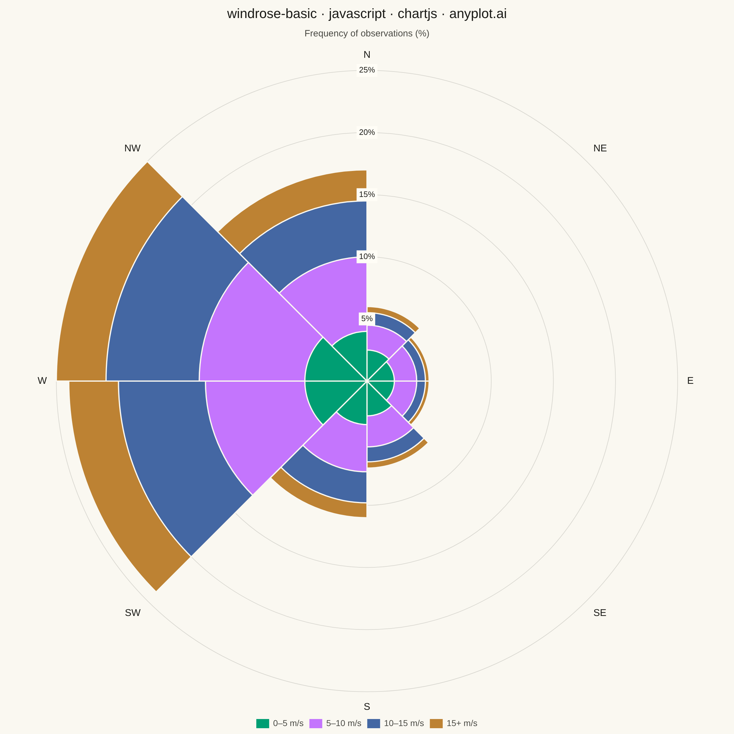
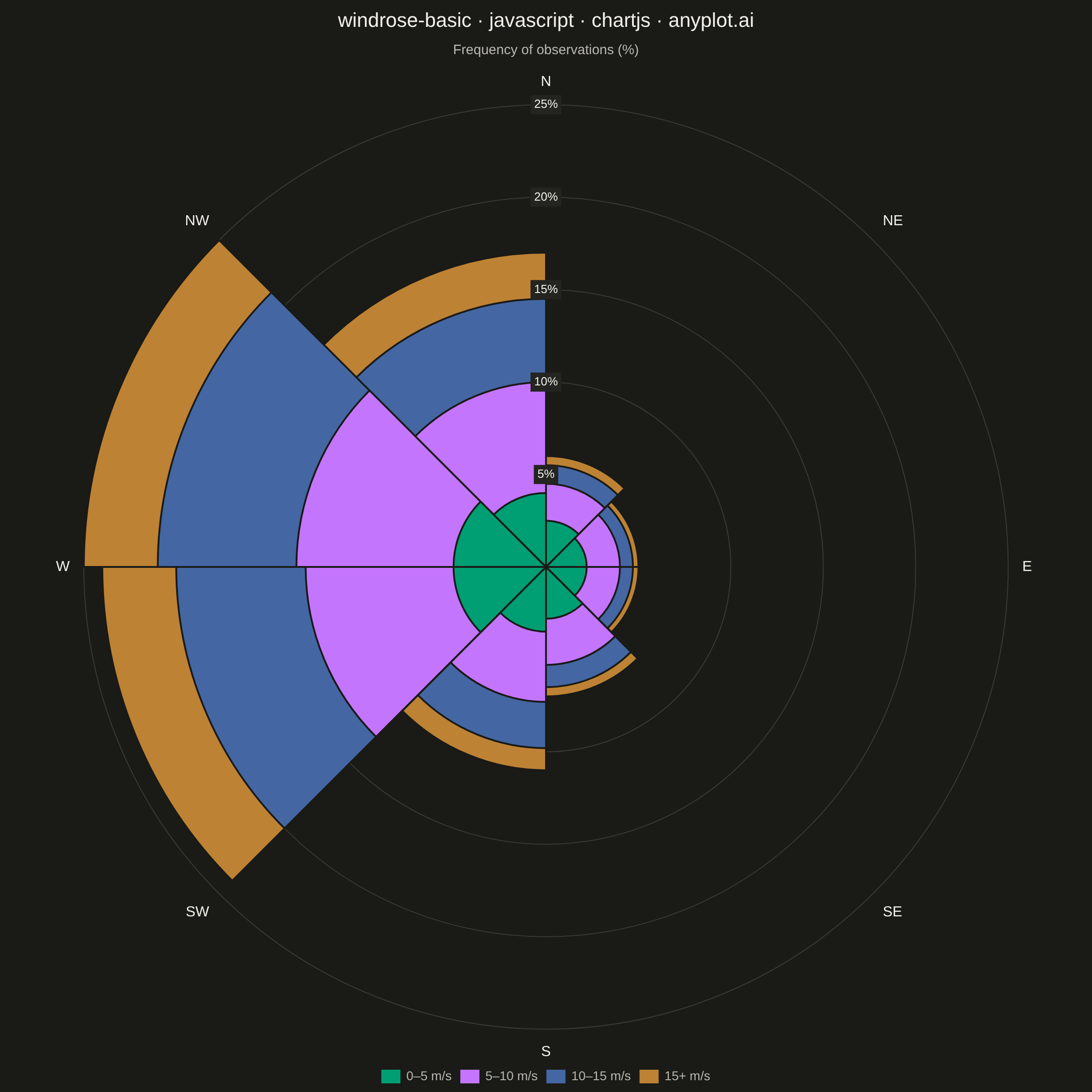
A wind rose displays wind speed and direction data as a polar stacked histogram showing the frequency distribution of wind across compass directions. Each spoke represents a direction sector (typically 8-16 bins), with stacked colored segments indicating different wind speed ranges. This specialized meteorological visualization reveals dominant wind patterns, prevailing directions, and speed distributions simultaneously, making it essential for site assessment and environmental analysis.
// anyplot.ai
// windrose-basic: Wind Rose Chart
// Library: chartjs 4.4.7 | JavaScript 22.23.1
// Quality: 91/100 | Created: 2026-08-05
//# anyplot-orientation: square

const t = window.ANYPLOT_TOKENS;

// --- Data (in-memory, deterministic) ----------------------------------------
// One year of hourly wind observations from a coastal weather station,
// binned into 8 compass sectors × 4 speed classes. Values are % of all
// observations and sum to 100 (calm-sector totals show the prevailing
// westerly/south-westerly wind with a secondary north-westerly lobe from
// post-frontal outflow).
const directions = ["N", "NE", "E", "SE", "S", "SW", "W", "NW"];
const speedBinLabels = ["0–5 m/s", "5–10 m/s", "10–15 m/s", "15+ m/s"];

const frequencyCalm = [2.5, 2.2, 2.2, 2.8, 3.5, 5.0, 5.0, 4.0];
const frequencyLight = [2.0, 1.8, 1.8, 2.5, 3.8, 8.0, 8.5, 6.0];
const frequencyModerate = [1.0, 0.7, 0.7, 1.2, 2.5, 7.0, 7.5, 4.5];
const frequencyStrong = [0.5, 0.3, 0.3, 0.5, 1.2, 4.0, 4.0, 2.5];
const frequencyBySpeedBin = [
  frequencyCalm,
  frequencyLight,
  frequencyModerate,
  frequencyStrong,
];

// Chart.js polarArea draws dataset 0 last (on top). Feeding it the running
// cumulative sum per bin — smallest (calm) first, total last — turns the
// overlapping wedges into an honest stacked ring per direction: each dataset's
// arc reaches exactly its own cumulative frequency, so the visible band width
// between two rings equals that bin's real share, not an approximation.
const cumulativeBySpeedBin = frequencyBySpeedBin.map((_, bin) =>
  directions.map((_, dir) =>
    frequencyBySpeedBin
      .slice(0, bin + 1)
      .reduce((sum, series) => sum + series[dir], 0),
  ),
);

// --- Mount -------------------------------------------------------------------
const canvas = document.createElement("canvas");
document.getElementById("container").appendChild(canvas);

// --- Chart ---------------------------------------------------------------
new Chart(canvas, {
  type: "polarArea",
  data: {
    labels: directions,
    datasets: frequencyBySpeedBin.map((_, bin) => ({
      data: cumulativeBySpeedBin[bin],
      backgroundColor: t.palette[bin],
      borderColor: t.pageBg,
      borderWidth: 2,
    })),
  },
  options: {
    responsive: true,
    maintainAspectRatio: false,
    animation: false,
    plugins: {
      title: {
        display: true,
        text: "windrose-basic · javascript · chartjs · anyplot.ai",
        color: t.ink,
        font: { size: 22, weight: "500" },
      },
      subtitle: {
        display: true,
        text: "Frequency of observations (%)",
        color: t.inkSoft,
        font: { size: 15 },
        padding: { bottom: 16 },
      },
      legend: {
        position: "bottom",
        labels: {
          color: t.inkSoft,
          font: { size: 14 },
          boxWidth: 20,
          boxHeight: 14,
          // Default polarArea legend lists one entry per direction, all colored
          // from dataset 0 — not useful here. Build one entry per speed bin instead.
          generateLabels: (chart) =>
            speedBinLabels.map((label, bin) => ({
              text: label,
              fillStyle: t.palette[bin],
              strokeStyle: t.palette[bin],
              fontColor: t.inkSoft,
              index: bin,
              hidden: !chart.isDatasetVisible(bin),
            })),
        },
        onClick: (evt, item, legend) => {
          const chart = legend.chart;
          chart.setDatasetVisibility(
            item.index,
            !chart.isDatasetVisible(item.index),
          );
          chart.update();
        },
      },
    },
    scales: {
      r: {
        beginAtZero: true,
        angleLines: { color: t.grid },
        grid: { color: t.grid, circular: true },
        pointLabels: {
          display: true,
          color: t.ink,
          font: { size: 16, weight: "500" },
        },
        ticks: {
          color: t.ink,
          // z > 0 draws tick labels after the datasets (see Chart.js core.scale
          // _layers()) — without it the opaque wedges paint over the numbers
          // wherever a wedge's radius exceeds a gridline.
          z: 1,
          showLabelBackdrop: true,
          backdropColor: t.elevatedBg,
          backdropPadding: 4,
          font: { size: 13 },
          callback: (value) => value + "%",
        },
      },
    },
  },
});
Runnable source as JSON, for any HTTP client: https://api.anyplot.ai/specs/windrose-basic/chartjs/code. Any spec id and library id listed in llms-full.txt fit the same URL shape; every URL below is complete and callable.
{
  "spec_id": "windrose-basic",
  "language": "javascript",
  "library": "chartjs",
  "page": "https://anyplot.ai/windrose-basic/javascript/chartjs",
  "hub": "https://anyplot.ai/windrose-basic",
  "code_json": "https://api.anyplot.ai/specs/windrose-basic/chartjs/code",
  "spec_json": "https://api.anyplot.ai/specs/windrose-basic",
  "render_light_png": "https://storage.googleapis.com/anyplot-images/plots/windrose-basic/javascript/chartjs/plot-light.png",
  "render_dark_png": "https://storage.googleapis.com/anyplot-images/plots/windrose-basic/javascript/chartjs/plot-dark.png",
  "interactive_light_html": "https://storage.googleapis.com/anyplot-images/plots/windrose-basic/javascript/chartjs/plot-light.html",
  "interactive_dark_html": "https://storage.googleapis.com/anyplot-images/plots/windrose-basic/javascript/chartjs/plot-dark.html",
  "quality_score": 91.0,
  "license": "MIT",
  "guide": "https://anyplot.ai/llms.txt"
}
Part of Wind Rose Chart on anyplot.ai.