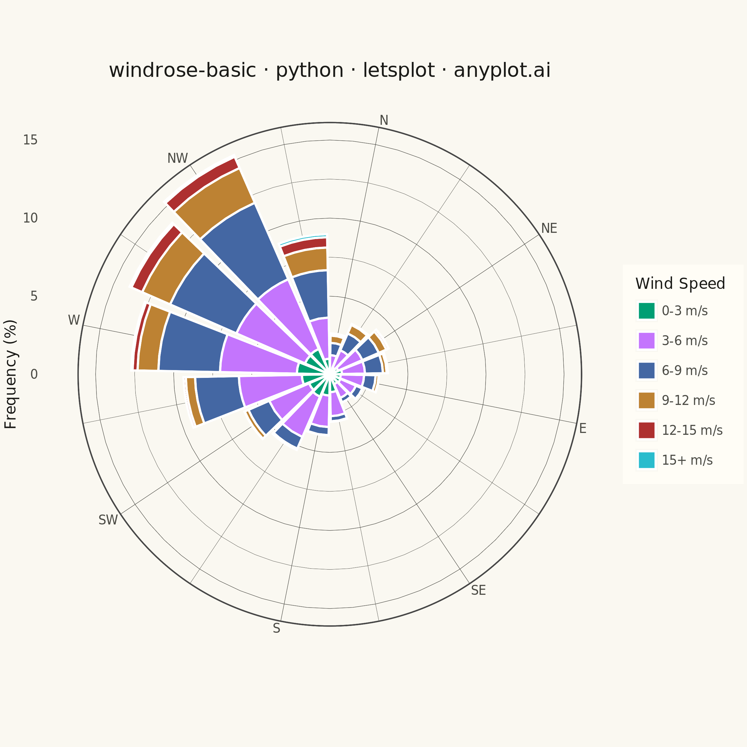
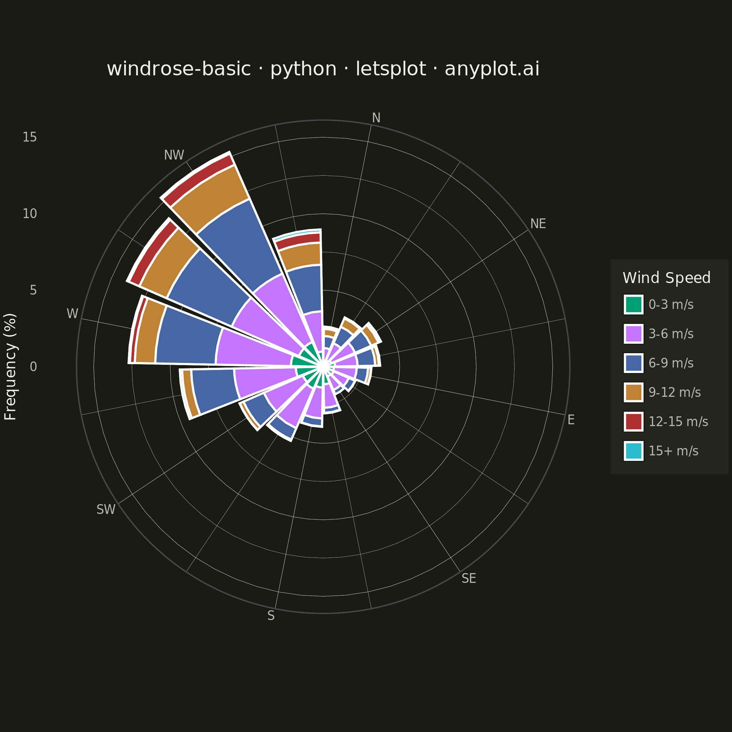
A wind rose displays wind speed and direction data as a polar stacked histogram showing the frequency distribution of wind across compass directions. Each spoke represents a direction sector (typically 8-16 bins), with stacked colored segments indicating different wind speed ranges. This specialized meteorological visualization reveals dominant wind patterns, prevailing directions, and speed distributions simultaneously, making it essential for site assessment and environmental analysis.
""" anyplot.ai
windrose-basic: Wind Rose Chart
Library: letsplot 4.11.0 | Python 3.13.14
Quality: 84/100 | Updated: 2026-08-05
"""

import os

import numpy as np
import pandas as pd
from lets_plot import *
from lets_plot import element_line, element_rect, element_text, ggsave, layer_tooltips, theme
from PIL import Image


LetsPlot.setup_html()

# Theme tokens
THEME = os.getenv("ANYPLOT_THEME", "light")
PAGE_BG = "#FAF8F1" if THEME == "light" else "#1A1A17"
PAGE_BG_RGB = (250, 248, 241) if THEME == "light" else (26, 26, 23)
ELEVATED_BG = "#FFFDF6" if THEME == "light" else "#242420"
INK = "#1A1A17" if THEME == "light" else "#F0EFE8"
INK_SOFT = "#4A4A44" if THEME == "light" else "#B8B7B0"

# Generate realistic wind data (1 year of hourly measurements)
np.random.seed(42)
n_obs = 8760  # hours in a year

# Simulate prevailing westerly winds with secondary NE component
direction_weights = np.array([0.05, 0.08, 0.06, 0.04, 0.08, 0.12, 0.25, 0.32])
direction_centers = np.array([0, 45, 90, 135, 180, 225, 270, 315])

# Sample directions based on weights
chosen_sectors = np.random.choice(8, size=n_obs, p=direction_weights / direction_weights.sum())
# Add noise within each 45° sector
directions = direction_centers[chosen_sectors] + np.random.uniform(-22.5, 22.5, n_obs)
directions = directions % 360

# Wind speeds - Weibull-like distribution, varying by direction
base_speed = np.random.weibull(2.2, n_obs) * 6
direction_speed_factor = 1 + 0.3 * np.sin(np.radians(directions - 250))
speeds = base_speed * direction_speed_factor
speeds = np.clip(speeds, 0, 25)

# Bin directions into 16 sectors
n_sectors = 16
sector_size = 360 / n_sectors
direction_bins = ((directions + sector_size / 2) % 360) // sector_size

# Bin speeds into categories
speed_bins = pd.cut(
    speeds, bins=[0, 3, 6, 9, 12, 15, 25], labels=["0-3 m/s", "3-6 m/s", "6-9 m/s", "9-12 m/s", "12-15 m/s", "15+ m/s"]
)

# Create DataFrame for aggregation
df = pd.DataFrame({"direction_bin": direction_bins.astype(int), "speed_bin": speed_bins})

# Aggregate counts per direction/speed combination
counts = df.groupby(["direction_bin", "speed_bin"], observed=True).size().reset_index(name="count")
total_obs = counts["count"].sum()
counts["frequency"] = counts["count"] / total_obs * 100

# Direction as discrete variable for x-axis
counts["direction"] = counts["direction_bin"]

# Full 16-point compass labels for tooltips (axis itself only labels the 8 cardinal/intercardinal points)
compass_16 = [
    "N", "NNE", "NE", "ENE", "E", "ESE", "SE", "SSE",
    "S", "SSW", "SW", "WSW", "W", "WNW", "NW", "NNW",
]  # fmt: skip
counts["direction_label"] = counts["direction_bin"].map(dict(enumerate(compass_16)))

# Speed category order for proper stacking
speed_order = ["0-3 m/s", "3-6 m/s", "6-9 m/s", "9-12 m/s", "12-15 m/s", "15+ m/s"]
counts["speed_bin"] = pd.Categorical(counts["speed_bin"], categories=speed_order, ordered=True)
counts = counts.sort_values(["direction_bin", "speed_bin"])

# Imprint palette, canonical positions 1-6 in order
colors = ["#009E73", "#C475FD", "#4467A3", "#BD8233", "#AE3030", "#2ABCCD"]

# Create wind rose using polar bar chart
# Distinctive lets-plot feature: per-segment tooltips surfaced in the interactive
# HTML export (compass direction, speed band, and exact frequency on hover).
bar_tooltips = (
    layer_tooltips()
    .title("@direction_label")
    .line("@speed_bin: @{frequency}%")
    .format(field="@frequency", format=".1f")
)

plot = (
    ggplot(counts, aes(x="direction", y="frequency", fill="speed_bin"))
    + geom_bar(stat="identity", width=0.9, position="stack", tooltips=bar_tooltips)
    + coord_polar(start=0, direction=1)
    + scale_x_continuous(
        breaks=list(range(0, 16, 2)),
        labels=["N", "NE", "E", "SE", "S", "SW", "W", "NW"],
        limits=[-0.5, 15.5],
        expand=[0, 0],
    )
    + scale_y_continuous(expand=[0, 0])
    + scale_fill_manual(values=colors, name="Wind Speed")
    + labs(title="windrose-basic · python · letsplot · anyplot.ai", x="", y="Frequency (%)")
    + theme_minimal()
    + theme(
        plot_background=element_rect(fill=PAGE_BG, color=PAGE_BG),
        panel_background=element_rect(fill=PAGE_BG),
        panel_grid_major=element_line(color=INK_SOFT, size=0.3),
        panel_grid_minor=element_line(color=INK_SOFT, size=0.2),
        plot_title=element_text(size=16, color=INK, hjust=0.5),
        axis_text=element_text(size=10, color=INK_SOFT),
        axis_title_y=element_text(size=12, color=INK),
        legend_title=element_text(size=12, color=INK),
        legend_text=element_text(size=10, color=INK_SOFT),
        legend_background=element_rect(fill=ELEVATED_BG, color=INK_SOFT),
        legend_position="right",
        legend_key_size=18,
        legend_key_spacing_y=6,
        legend_margin=10,
    )
    + ggsize(600, 600)
)

# Save as PNG and HTML (scale=4 to get 2400×2400 px)
ggsave(plot, f"plot-{THEME}.png", path=".", scale=4)

# coord_polar()'s layout pass leaves a transparent margin around the plot when a
# title is present; flatten it onto the theme background so PNG edges are opaque.
img = Image.open(f"plot-{THEME}.png").convert("RGBA")
bg = Image.new("RGBA", img.size, (*PAGE_BG_RGB, 255))
Image.alpha_composite(bg, img).convert("RGB").save(f"plot-{THEME}.png")

ggsave(plot, f"plot-{THEME}.html", path=".")
Runnable source as JSON, for any HTTP client: https://api.anyplot.ai/specs/windrose-basic/letsplot/code. Any spec id and library id listed in llms-full.txt fit the same URL shape; every URL below is complete and callable.
{
  "spec_id": "windrose-basic",
  "language": "python",
  "library": "letsplot",
  "page": "https://anyplot.ai/windrose-basic/python/letsplot",
  "hub": "https://anyplot.ai/windrose-basic",
  "code_json": "https://api.anyplot.ai/specs/windrose-basic/letsplot/code",
  "spec_json": "https://api.anyplot.ai/specs/windrose-basic",
  "render_light_png": "https://storage.googleapis.com/anyplot-images/plots/windrose-basic/python/letsplot/plot-light.png",
  "render_dark_png": "https://storage.googleapis.com/anyplot-images/plots/windrose-basic/python/letsplot/plot-dark.png",
  "interactive_light_html": "https://storage.googleapis.com/anyplot-images/plots/windrose-basic/python/letsplot/plot-light.html",
  "interactive_dark_html": "https://storage.googleapis.com/anyplot-images/plots/windrose-basic/python/letsplot/plot-dark.html",
  "quality_score": 84.0,
  "license": "MIT",
  "guide": "https://anyplot.ai/llms.txt"
}
Part of Wind Rose Chart on anyplot.ai.