The same plot in 14 other libraries — Python: Altair, Bokeh, lets-plot, Matplotlib, Plotly, plotnine, Pygal, Seaborn; Julia: Makie.jl; JavaScript: Chart.js, D3.js, Apache ECharts, Highcharts, MUI X Charts. Compare all 15 side by side: Wind Rose Chart in Python, R, Julia and JavaScript.
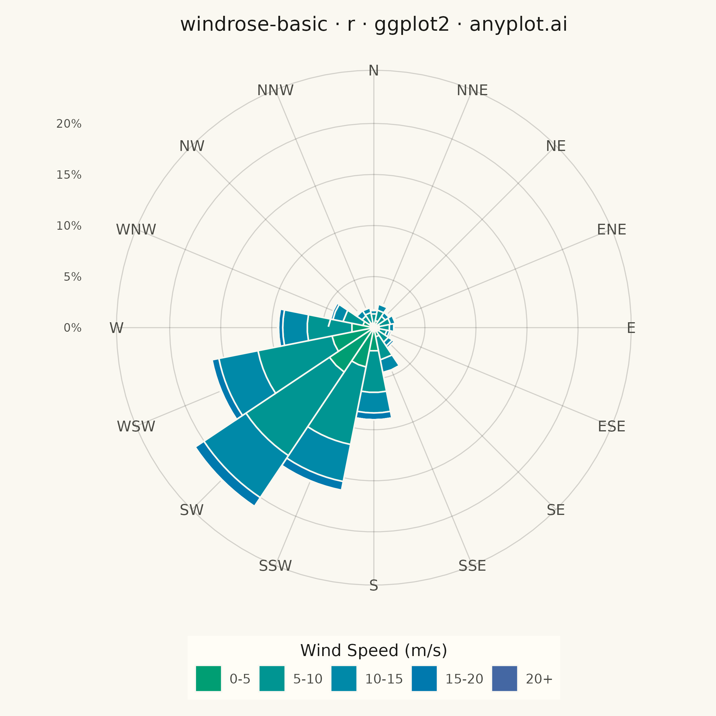
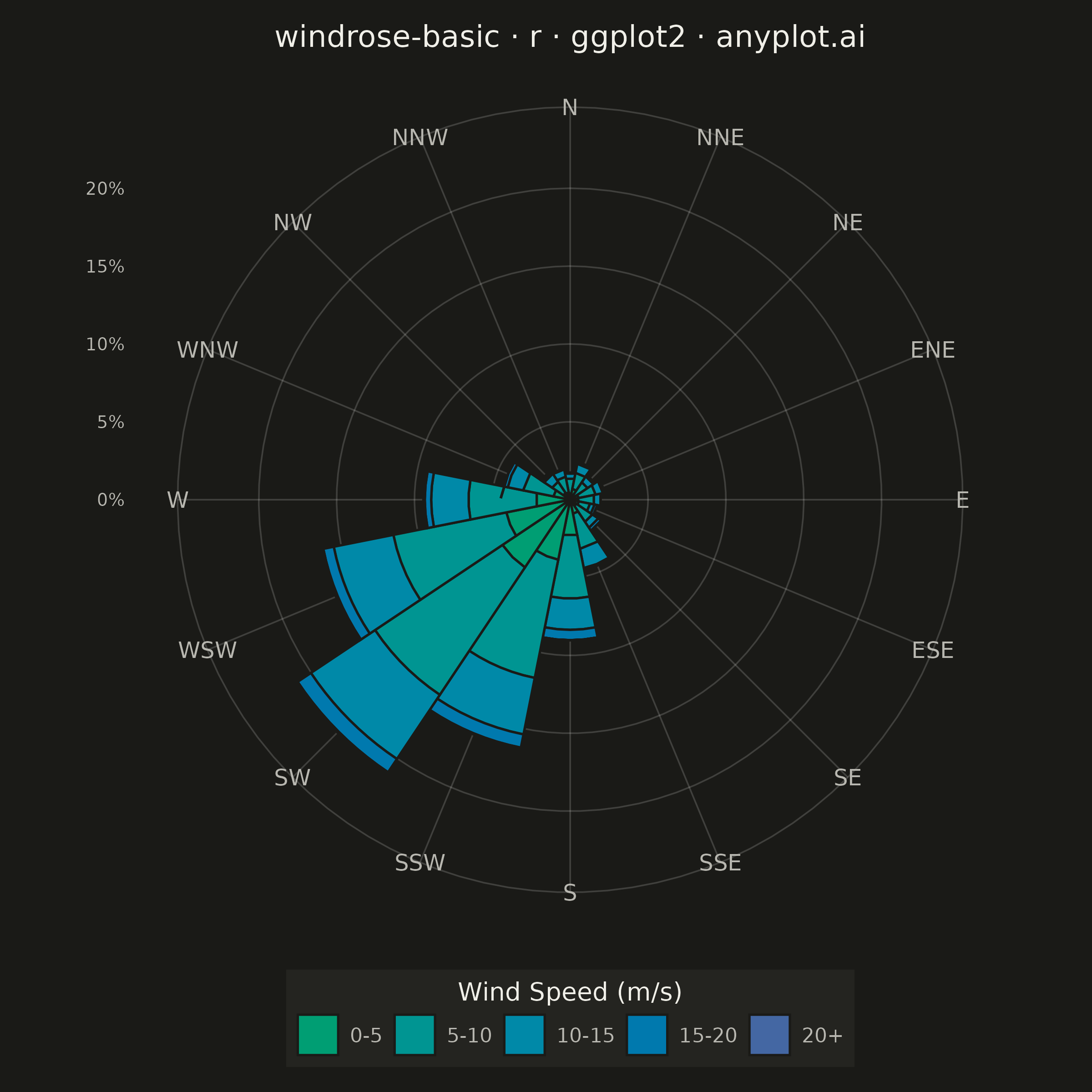
A wind rose displays wind speed and direction data as a polar stacked histogram showing the frequency distribution of wind across compass directions. Each spoke represents a direction sector (typically 8-16 bins), with stacked colored segments indicating different wind speed ranges. This specialized meteorological visualization reveals dominant wind patterns, prevailing directions, and speed distributions simultaneously, making it essential for site assessment and environmental analysis.
#' anyplot.ai
#' windrose-basic: Wind Rose Chart
#' Library: ggplot2 3.5.1 | R 4.4.1
#' Quality: 87/100 | Created: 2026-08-05

library(ggplot2)
library(dplyr)
library(tidyr)
library(scales)
library(ragg)

set.seed(42)

# --- Theme tokens -------------------------------------------------------
THEME       <- Sys.getenv("ANYPLOT_THEME", "light")
PAGE_BG     <- if (THEME == "light") "#FAF8F1" else "#1A1A17"
ELEVATED_BG <- if (THEME == "light") "#FFFDF6" else "#242420"
INK         <- if (THEME == "light") "#1A1A17" else "#F0EFE8"
INK_SOFT    <- if (THEME == "light") "#4A4A44" else "#B8B7B0"

# --- Data -----------------------------------------------------------------
# Simulated hourly wind observations from a coastal weather station over one
# year: a prevailing south-westerly flow plus a background of variable winds.
n <- 4380
from_prevailing <- runif(n) < 0.7
direction_raw <- ifelse(
  from_prevailing,
  rnorm(n, mean = 225, sd = 32),
  runif(n, 0, 360)
)
direction <- direction_raw %% 360
speed <- rweibull(n, shape = 2.1, scale = 9)

compass <- c(
  "N", "NNE", "NE", "ENE", "E", "ESE", "SE", "SSE",
  "S", "SSW", "SW", "WSW", "W", "WNW", "NW", "NNW"
)
sector_idx <- floor(((direction + 11.25) %% 360) / 22.5) + 1
sector <- factor(compass[sector_idx], levels = compass)

speed_breaks <- c(0, 5, 10, 15, 20, Inf)
speed_labels <- c("0-5", "5-10", "10-15", "15-20", "20+")
speed_bin <- cut(speed, breaks = speed_breaks, labels = speed_labels, right = FALSE)

wind <- tibble::tibble(sector = sector, speed_bin = speed_bin)

wind_freq <- wind %>%
  count(sector, speed_bin, name = "n") %>%
  complete(sector, speed_bin, fill = list(n = 0)) %>%
  mutate(pct = 100 * n / sum(n))

# --- Colors -----------------------------------------------------------------
# imprint_seq (single-polarity, calm -> strong): brand green -> blue.
# A straight RGB/Lab blend crosses the cyan hues on the "short way" between
# green and blue, where the sRGB gamut is narrower - chroma dips in the
# middle and the 5-10 / 10-15 stops become hard to tell apart. Interpolating
# in polar LCh space (circular hue, linear L/C) keeps chroma decreasing
# smoothly instead of dipping, while the two endpoints stay exact.
imprint_seq_lch <- function(hex_from, hex_to, n) {
  to_lab <- function(hex) convertColor(t(col2rgb(hex)) / 255, from = "sRGB", to = "Lab")
  polar <- function(lab) c(L = lab[1], C = sqrt(lab[2]^2 + lab[3]^2), H = atan2(lab[3], lab[2]))
  p1 <- polar(to_lab(hex_from))
  p2 <- polar(to_lab(hex_to))
  dH <- p2["H"] - p1["H"]
  if (dH > pi) dH <- dH - 2 * pi
  if (dH < -pi) dH <- dH + 2 * pi
  t <- seq(0, 1, length.out = n)
  L <- p1["L"] + t * (p2["L"] - p1["L"])
  C <- p1["C"] + t * (p2["C"] - p1["C"])
  H <- p1["H"] + t * dH
  lab_mat <- cbind(L, C * cos(H), C * sin(H))
  rgb_mat <- pmin(pmax(convertColor(lab_mat, from = "Lab", to = "sRGB"), 0), 1)
  grDevices::rgb(rgb_mat[, 1], rgb_mat[, 2], rgb_mat[, 3])
}
speed_colors <- imprint_seq_lch("#009E73", "#4467A3", length(speed_labels))
names(speed_colors) <- speed_labels

# --- Plot ---------------------------------------------------------------
p <- ggplot(wind_freq, aes(x = sector, y = pct, fill = speed_bin)) +
  geom_col(
    width = 1,
    color = PAGE_BG,
    linewidth = 0.45,
    position = position_stack(reverse = TRUE)
  ) +
  coord_polar(start = -pi / 16) +
  scale_x_discrete(name = NULL) +
  scale_y_continuous(
    name = NULL,
    breaks = scales::pretty_breaks(n = 4),
    labels = function(x) paste0(x, "%"),
    expand = expansion(mult = c(0, 0.06))
  ) +
  scale_fill_manual(values = speed_colors, name = "Wind Speed (m/s)") +
  labs(title = "windrose-basic · r · ggplot2 · anyplot.ai") +
  guides(fill = guide_legend(title.position = "top", nrow = 1)) +
  theme_minimal(base_size = 8) +
  theme(
    plot.background    = element_rect(fill = PAGE_BG, color = PAGE_BG),
    panel.background   = element_rect(fill = PAGE_BG, color = NA),
    panel.grid.major   = element_line(color = scales::alpha(INK, 0.18), linewidth = 0.3),
    panel.grid.minor   = element_blank(),
    axis.text.x        = element_text(color = INK_SOFT, size = 9),
    axis.text.y        = element_text(color = INK_SOFT, size = 7),
    axis.ticks         = element_blank(),
    plot.title         = element_text(color = INK, size = 12, hjust = 0.5),
    legend.position     = "bottom",
    legend.direction    = "horizontal",
    legend.background   = element_rect(fill = ELEVATED_BG, color = NA),
    legend.text         = element_text(color = INK_SOFT, size = 8),
    legend.title         = element_text(color = INK, size = 10, hjust = 0.5),
    plot.margin         = margin(10, 10, 10, 10)
  )

# --- Save -----------------------------------------------------------------
ggsave(
  filename = sprintf("plot-%s.png", THEME),
  plot     = p,
  device   = ragg::agg_png,
  width    = 6,
  height   = 6,
  units    = "in",
  dpi      = 400
)
Runnable source as JSON, for any HTTP client: https://api.anyplot.ai/specs/windrose-basic/ggplot2/code. Any spec id and library id listed in llms-full.txt fit the same URL shape; every URL below is complete and callable.
{
  "spec_id": "windrose-basic",
  "language": "r",
  "library": "ggplot2",
  "page": "https://anyplot.ai/windrose-basic/r/ggplot2",
  "hub": "https://anyplot.ai/windrose-basic",
  "code_json": "https://api.anyplot.ai/specs/windrose-basic/ggplot2/code",
  "spec_json": "https://api.anyplot.ai/specs/windrose-basic",
  "render_light_png": "https://storage.googleapis.com/anyplot-images/plots/windrose-basic/r/ggplot2/plot-light.png",
  "render_dark_png": "https://storage.googleapis.com/anyplot-images/plots/windrose-basic/r/ggplot2/plot-dark.png",
  "quality_score": 87.0,
  "license": "MIT",
  "guide": "https://anyplot.ai/llms.txt"
}
Part of Wind Rose Chart on anyplot.ai.