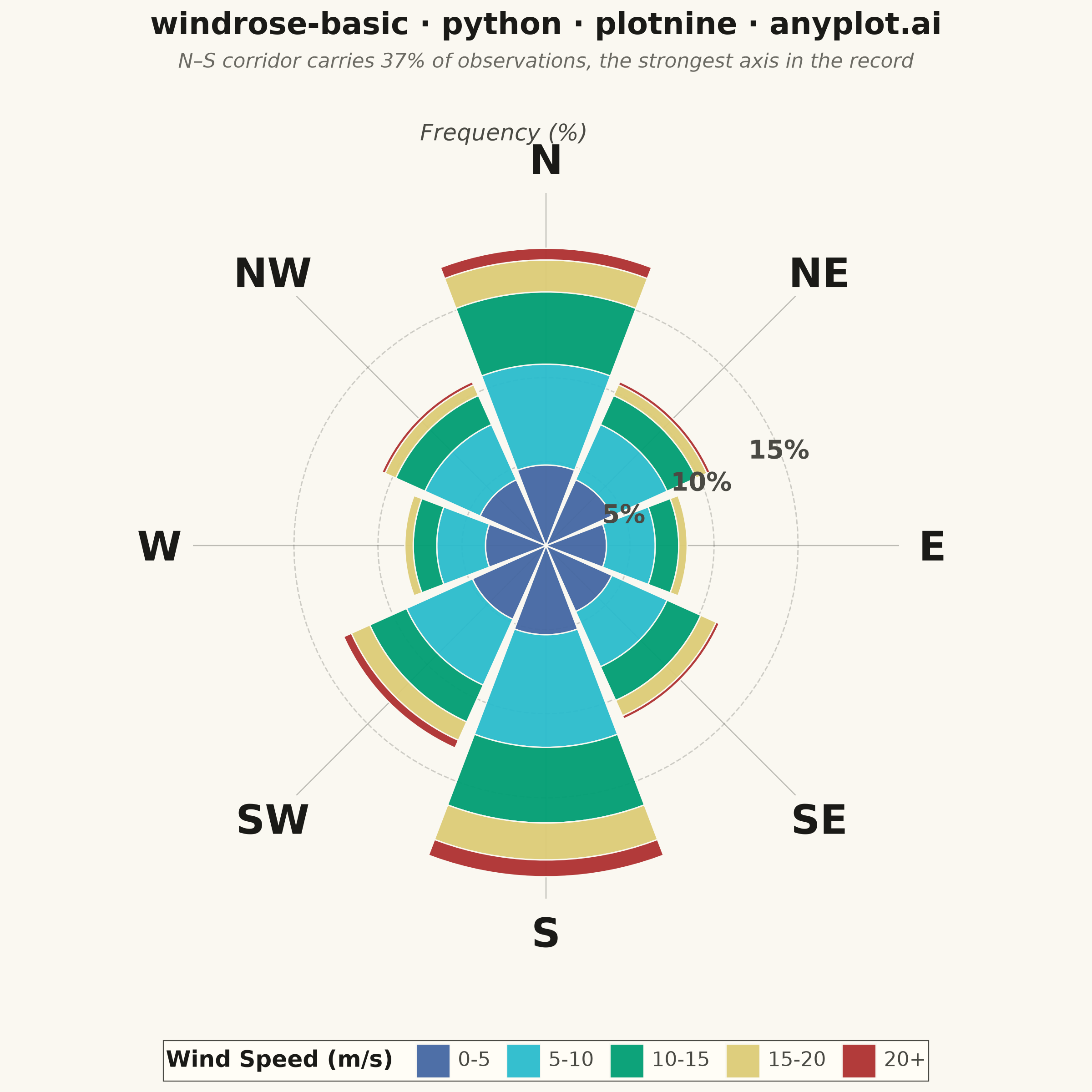
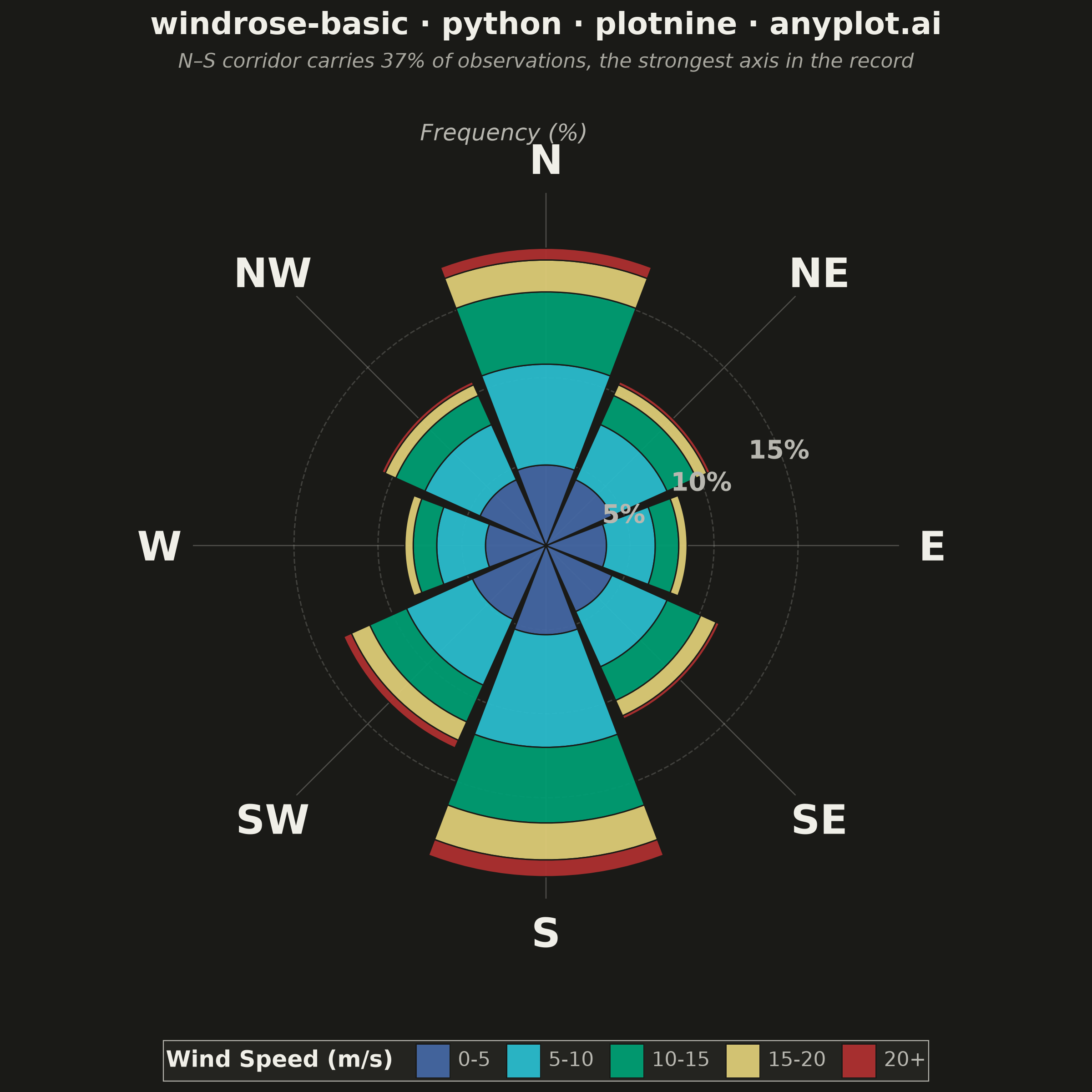
A wind rose displays wind speed and direction data as a polar stacked histogram showing the frequency distribution of wind across compass directions. Each spoke represents a direction sector (typically 8-16 bins), with stacked colored segments indicating different wind speed ranges. This specialized meteorological visualization reveals dominant wind patterns, prevailing directions, and speed distributions simultaneously, making it essential for site assessment and environmental analysis.
""" anyplot.ai
windrose-basic: Wind Rose Chart
Library: plotnine 0.15.7 | Python 3.13.14
Quality: 90/100 | Updated: 2026-08-05
"""

import math
import os

import numpy as np
import pandas as pd
from plotnine import (
    aes,
    coord_equal,
    element_blank,
    element_rect,
    element_text,
    geom_path,
    geom_polygon,
    geom_text,
    ggplot,
    guide_legend,
    labs,
    scale_fill_manual,
    scale_x_continuous,
    scale_y_continuous,
    theme,
)


# Theme tokens (see prompts/default-style-guide.md "Background" + "Theme-adaptive Chrome")
THEME = os.getenv("ANYPLOT_THEME", "light")
PAGE_BG = "#FAF8F1" if THEME == "light" else "#1A1A17"
ELEVATED_BG = "#FFFDF6" if THEME == "light" else "#242420"
INK = "#1A1A17" if THEME == "light" else "#F0EFE8"
INK_SOFT = "#4A4A44" if THEME == "light" else "#B8B7B0"
INK_MUTED = "#6B6A63" if THEME == "light" else "#A8A79F"

# Data - Simulated wind measurements from an airport runway environment
# 8 direction bins: N, NE, E, SE, S, SW, W, NW
# 5 speed bins: 0-5, 5-10, 10-15, 15-20, 20+ m/s
# Airport wind patterns show influence from local terrain and seasonal variations
directions = ["N", "NE", "E", "SE", "S", "SW", "W", "NW"]
n_dirs = len(directions)

# Wind speed bins and their labels
speed_bins = ["0-5", "5-10", "10-15", "15-20", "20+"]

# Frequencies (%) for each direction and speed bin - sums to ~100% of the full year of
# observations (N/S dominance, minimal calm winds)
frequencies = {
    "N": [4.8, 6.0, 4.3, 1.9, 0.7],
    "NE": [4.3, 3.6, 1.9, 0.7, 0.2],
    "E": [3.6, 2.9, 1.4, 0.5, 0.0],
    "SE": [4.3, 3.6, 2.2, 1.0, 0.2],
    "S": [5.3, 6.7, 4.5, 2.2, 1.0],  # Secondary wind direction
    "SW": [4.8, 4.3, 2.4, 1.2, 0.5],
    "W": [3.6, 2.9, 1.4, 0.5, 0.0],
    "NW": [4.3, 3.6, 1.9, 0.7, 0.2],
}

# Colors for wind speed bins: cool (calm) to warm (strong) progression
# imprint anchors arranged to keep the intensity ramp monotonic
speed_colors = {
    "0-5": "#4467A3",  # imprint blue (calm)
    "5-10": "#2ABCCD",  # imprint cyan
    "10-15": "#009E73",  # imprint green (mid)
    "15-20": "#DDCC77",  # imprint amber (caution)
    "20+": "#AE3030",  # imprint red (strong, hottest)
}

# Calculate direction angles (N=top, clockwise)
# N is at 90 degrees (top), going clockwise
dir_angles = {
    "N": math.pi / 2,
    "NE": math.pi / 4,
    "E": 0,
    "SE": -math.pi / 4,
    "S": -math.pi / 2,
    "SW": -3 * math.pi / 4,
    "W": math.pi,
    "NW": 3 * math.pi / 4,
}

# Create stacked wedges for each direction
wedge_rows = []
n_arc_points = 20  # Points along the arc for smooth edges
wedge_width = 2 * math.pi / n_dirs  # Width of each direction bin

wedge_id = 0
for direction in directions:
    center_angle = dir_angles[direction]
    start_angle = center_angle + wedge_width / 2 - 0.03  # Small gap
    end_angle = center_angle - wedge_width / 2 + 0.03

    cumulative_radius = 0
    for speed_idx, speed_bin in enumerate(speed_bins):
        freq = frequencies[direction][speed_idx]
        if freq <= 0:
            continue

        # Inner and outer radius for this stack segment
        inner_radius = cumulative_radius
        outer_radius = cumulative_radius + freq

        # Build wedge polygon: inner arc -> outer arc -> close
        # Start with inner arc (from start to end angle)
        arc_angles = np.linspace(start_angle, end_angle, n_arc_points)

        # Inner arc points (counterclockwise from start to end)
        for angle in arc_angles:
            x = inner_radius * math.cos(angle)
            y = inner_radius * math.sin(angle)
            wedge_rows.append({"x": x, "y": y, "wedge_id": wedge_id, "speed": speed_bin, "direction": direction})

        # Outer arc points (clockwise from end to start)
        for angle in reversed(arc_angles):
            x = outer_radius * math.cos(angle)
            y = outer_radius * math.sin(angle)
            wedge_rows.append({"x": x, "y": y, "wedge_id": wedge_id, "speed": speed_bin, "direction": direction})

        # Close the polygon
        first_x = inner_radius * math.cos(start_angle)
        first_y = inner_radius * math.sin(start_angle)
        wedge_rows.append(
            {"x": first_x, "y": first_y, "wedge_id": wedge_id, "speed": speed_bin, "direction": direction}
        )

        cumulative_radius = outer_radius
        wedge_id += 1

df = pd.DataFrame(wedge_rows)

# Preserve speed order for legend
df["speed"] = pd.Categorical(df["speed"], categories=speed_bins, ordered=True)

# Create radial gridlines (circles at frequency percentages)
grid_rows = []
grid_angles = np.linspace(0, 2 * math.pi, 101)
grid_radii = [5, 10, 15]  # Frequency percentage circles

for radius in grid_radii:
    for angle in grid_angles:
        grid_rows.append({"x": radius * math.cos(angle), "y": radius * math.sin(angle), "radius": radius})

grid_df = pd.DataFrame(grid_rows)

# Create spoke lines (one for each direction)
spoke_rows = []
max_radius = 21  # Extend spokes beyond the tallest stack (S ~ 19.7%)
for i, direction in enumerate(directions):
    angle = dir_angles[direction]
    spoke_rows.append({"x": 0, "y": 0, "spoke_id": i})
    spoke_rows.append({"x": max_radius * math.cos(angle), "y": max_radius * math.sin(angle), "spoke_id": i})

spoke_df = pd.DataFrame(spoke_rows)

# Create direction labels positioned outside the chart
label_rows = []
label_radius = 23
for direction in directions:
    angle = dir_angles[direction]
    label_rows.append({"label": direction, "x": label_radius * math.cos(angle), "y": label_radius * math.sin(angle)})

label_df = pd.DataFrame(label_rows)

# Create frequency labels on gridlines, positioned in the angular gap between the E and
# NE wedges (each wedge is inset 0.03 rad from its sector boundary) so the label always
# lands on blank background instead of on top of a colored stack segment
freq_label_rows = []
freq_label_angle = math.pi / 8
for radius in grid_radii:
    freq_label_rows.append(
        {"label": f"{radius}%", "x": radius * math.cos(freq_label_angle), "y": radius * math.sin(freq_label_angle)}
    )

freq_label_df = pd.DataFrame(freq_label_rows)

# Create "Frequency (%)" label to explain what gridlines represent
freq_axis_label_df = pd.DataFrame([{"label": "Frequency (%)", "x": -2.5, "y": label_radius + 1.5}])

# Data-driven insight for the subtitle: identify the dominant direction corridor
# (a direction and its 180-degree opposite) by summed frequency share
direction_totals = {d: sum(frequencies[d]) for d in directions}
opposite = {"N": "S", "NE": "SW", "E": "W", "SE": "NW", "S": "N", "SW": "NE", "W": "E", "NW": "SE"}
total_frequency = sum(direction_totals.values())
corridor_share = {d: direction_totals[d] + direction_totals[opposite[d]] for d in directions if d < opposite[d]}
top_corridor = max(corridor_share, key=corridor_share.get)
top_corridor_pct = round(100 * corridor_share[top_corridor] / total_frequency)
subtitle = (
    f"{top_corridor}–{opposite[top_corridor]} corridor carries {top_corridor_pct}% of observations, "
    "the strongest axis in the record"
)

# Plot
plot = (
    ggplot()
    # Gridlines (circles) — geom_path preserves point order (pre-sorted by angle),
    # unlike geom_line which would re-sort by x and zigzag across the circle
    + geom_path(
        aes(x="x", y="y", group="radius"), data=grid_df, color=INK_SOFT, size=0.3, alpha=0.25, linetype="dashed"
    )
    # Spoke lines
    + geom_path(aes(x="x", y="y", group="spoke_id"), data=spoke_df, color=INK_SOFT, size=0.25, alpha=0.35)
    # Wind rose wedges (stacked)
    + geom_polygon(aes(x="x", y="y", fill="speed", group="wedge_id"), data=df, color=PAGE_BG, size=0.3, alpha=0.95)
    # Direction labels
    + geom_text(aes(x="x", y="y", label="label"), data=label_df, size=16, fontweight="bold", color=INK)
    # Frequency labels
    + geom_text(aes(x="x", y="y", label="label"), data=freq_label_df, size=10, color=INK_SOFT, fontweight="bold")
    # Frequency axis label
    + geom_text(aes(x="x", y="y", label="label"), data=freq_axis_label_df, size=9, color=INK_SOFT, fontstyle="italic")
    # Colors with native legend
    + scale_fill_manual(values=speed_colors, name="Wind Speed (m/s)", guide=guide_legend(reverse=False))
    # Axis scaling
    + scale_x_continuous(limits=(-25, 25))
    + scale_y_continuous(limits=(-25, 25))
    + coord_equal()
    # Title + data-driven subtitle (Data Storytelling: names the dominant corridor)
    + labs(title="windrose-basic · python · plotnine · anyplot.ai", subtitle=subtitle)
    # Theme for clean wind rose appearance
    + theme(
        figure_size=(6, 6),
        plot_background=element_rect(fill=PAGE_BG, color=PAGE_BG),
        panel_background=element_rect(fill=PAGE_BG, color=None),
        plot_title=element_text(size=12, ha="center", color=INK, weight="bold"),
        plot_subtitle=element_text(size=8, ha="center", color=INK_MUTED, style="italic"),
        axis_title=element_blank(),
        axis_text=element_blank(),
        axis_ticks=element_blank(),
        axis_line=element_blank(),
        panel_grid_major=element_blank(),
        panel_grid_minor=element_blank(),
        legend_position="bottom",
        legend_title=element_text(size=9, weight="bold", color=INK),
        legend_text=element_text(size=8, color=INK_SOFT),
        legend_background=element_rect(fill=ELEVATED_BG, color=INK_SOFT, size=0.4),
        legend_key=element_rect(fill=ELEVATED_BG, color=None),
        legend_key_size=14,
    )
)

# Save
plot.save(f"plot-{THEME}.png", dpi=400, width=6, height=6, units="in")
Runnable source as JSON, for any HTTP client: https://api.anyplot.ai/specs/windrose-basic/plotnine/code. Any spec id and library id listed in llms-full.txt fit the same URL shape; every URL below is complete and callable.
{
  "spec_id": "windrose-basic",
  "language": "python",
  "library": "plotnine",
  "page": "https://anyplot.ai/windrose-basic/python/plotnine",
  "hub": "https://anyplot.ai/windrose-basic",
  "code_json": "https://api.anyplot.ai/specs/windrose-basic/plotnine/code",
  "spec_json": "https://api.anyplot.ai/specs/windrose-basic",
  "render_light_png": "https://storage.googleapis.com/anyplot-images/plots/windrose-basic/python/plotnine/plot-light.png",
  "render_dark_png": "https://storage.googleapis.com/anyplot-images/plots/windrose-basic/python/plotnine/plot-dark.png",
  "quality_score": 90.0,
  "license": "MIT",
  "guide": "https://anyplot.ai/llms.txt"
}
Part of Wind Rose Chart on anyplot.ai.