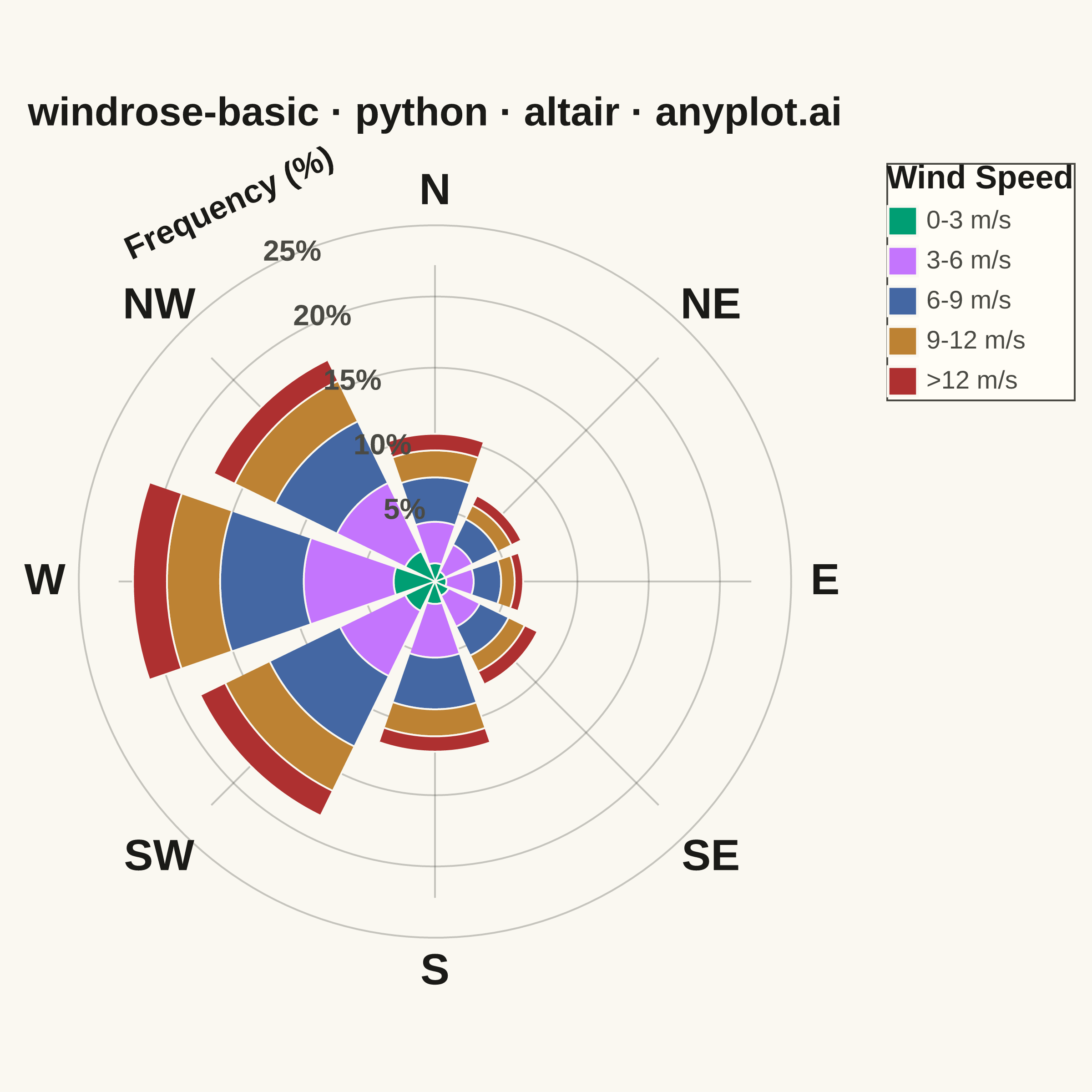
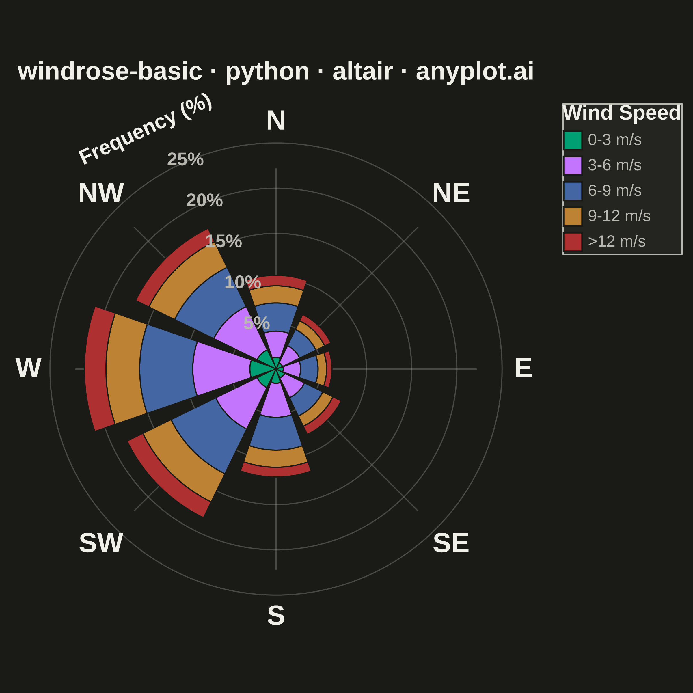
A wind rose displays wind speed and direction data as a polar stacked histogram showing the frequency distribution of wind across compass directions. Each spoke represents a direction sector (typically 8-16 bins), with stacked colored segments indicating different wind speed ranges. This specialized meteorological visualization reveals dominant wind patterns, prevailing directions, and speed distributions simultaneously, making it essential for site assessment and environmental analysis.
""" anyplot.ai
windrose-basic: Wind Rose Chart
Library: altair 6.2.2 | Python 3.13.14
Quality: 87/100 | Updated: 2026-08-05
"""

import os

import altair as alt
import numpy as np
import pandas as pd
from PIL import Image


# Theme tokens
THEME = os.getenv("ANYPLOT_THEME", "light")
PAGE_BG = "#FAF8F1" if THEME == "light" else "#1A1A17"
ELEVATED_BG = "#FFFDF6" if THEME == "light" else "#242420"
INK = "#1A1A17" if THEME == "light" else "#F0EFE8"
INK_SOFT = "#4A4A44" if THEME == "light" else "#B8B7B0"

# Data - Simulated hourly wind measurements for one year
np.random.seed(42)
n_samples = 8760  # One year of hourly data

# Generate wind directions with prevailing westerly/southwesterly pattern
direction_weights = np.array([0.05, 0.04, 0.06, 0.08, 0.12, 0.18, 0.22, 0.15, 0.06, 0.04])
direction_centers = np.array([0, 45, 90, 135, 180, 225, 270, 315, 337.5, 22.5])

directions = []
for _ in range(n_samples):
    center_idx = np.random.choice(len(direction_centers), p=direction_weights / direction_weights.sum())
    direction = direction_centers[center_idx] + np.random.normal(0, 15)
    directions.append(direction % 360)

directions = np.array(directions)

# Generate wind speeds with Weibull-like distribution (typical for wind)
speeds = np.random.weibull(2, n_samples) * 8  # Scale for realistic m/s values

# Define direction bins (8 sectors)
direction_bins = [0, 22.5, 67.5, 112.5, 157.5, 202.5, 247.5, 292.5, 337.5, 360]
direction_labels = ["N", "NE", "E", "SE", "S", "SW", "W", "NW"]

# Define speed bins
speed_bins = [0, 3, 6, 9, 12, np.inf]
speed_labels = ["0-3 m/s", "3-6 m/s", "6-9 m/s", "9-12 m/s", ">12 m/s"]

# Bin directions (handle wraparound at North)
dir_binned = np.digitize(directions, direction_bins[:-1]) - 1
dir_binned[dir_binned == 8] = 0  # Wrap 337.5-360 to North
dir_names = [direction_labels[i] for i in dir_binned]

# Bin speeds
speed_binned = np.digitize(speeds, speed_bins) - 1
speed_binned = np.clip(speed_binned, 0, len(speed_labels) - 1)
speed_names = [speed_labels[i] for i in speed_binned]

# Create DataFrame and calculate frequencies
df = pd.DataFrame({"direction": dir_names, "speed_range": speed_names})
freq_df = df.groupby(["direction", "speed_range"]).size().reset_index(name="count")
freq_df["frequency"] = freq_df["count"] / n_samples * 100

# Add all combinations to ensure complete data
all_combinations = pd.DataFrame([{"direction": d, "speed_range": s} for d in direction_labels for s in speed_labels])
freq_df = all_combinations.merge(freq_df, on=["direction", "speed_range"], how="left").fillna(0)

# Set categorical order
direction_order = ["N", "NE", "E", "SE", "S", "SW", "W", "NW"]
speed_order = ["0-3 m/s", "3-6 m/s", "6-9 m/s", "9-12 m/s", ">12 m/s"]

freq_df["direction"] = pd.Categorical(freq_df["direction"], categories=direction_order, ordered=True)
freq_df["speed_range"] = pd.Categorical(freq_df["speed_range"], categories=speed_order, ordered=True)
freq_df = freq_df.sort_values(["direction", "speed_range"])

# Calculate angle for polar positioning (N at top = 90 degrees in standard math coords)
direction_angles = {"N": 90, "NE": 45, "E": 0, "SE": -45, "S": -90, "SW": -135, "W": 180, "NW": 135}
freq_df["angle"] = freq_df["direction"].map(direction_angles)

# Calculate cumulative frequency for stacking
freq_df = freq_df.sort_values(["direction", "speed_range"])
freq_df["cumulative"] = freq_df.groupby("direction", observed=True)["frequency"].cumsum()
freq_df["cumulative_start"] = freq_df["cumulative"] - freq_df["frequency"]

# Convert polar to cartesian for each bar segment (using arc approach)
wedge_data = []
bar_width = 38  # Angular width in degrees

for _, row in freq_df.iterrows():
    if row["frequency"] > 0:
        angle_center = row["angle"]
        r_inner = row["cumulative_start"]
        r_outer = row["cumulative"]

        # Create arc points - trace the closed polygon
        n_arc_points = 20
        points = []

        # Inner arc (left to right)
        for i in range(n_arc_points + 1):
            angle_offset = (i / n_arc_points - 0.5) * bar_width
            angle_rad = np.radians(angle_center + angle_offset)
            points.append((r_inner * np.cos(angle_rad), r_inner * np.sin(angle_rad)))

        # Outer arc (right to left)
        for i in range(n_arc_points, -1, -1):
            angle_offset = (i / n_arc_points - 0.5) * bar_width
            angle_rad = np.radians(angle_center + angle_offset)
            points.append((r_outer * np.cos(angle_rad), r_outer * np.sin(angle_rad)))

        # Add all points with order
        for idx, (px, py) in enumerate(points):
            wedge_data.append(
                {
                    "direction": str(row["direction"]),
                    "speed_range": str(row["speed_range"]),
                    "x": px,
                    "y": py,
                    "path_order": idx,
                    "segment_id": f"{row['direction']}_{row['speed_range']}",
                    "frequency": row["frequency"],
                }
            )

wedge_df = pd.DataFrame(wedge_data)

# Color scale - Imprint palette, canonical order (first series is always brand green)
colors = ["#009E73", "#C475FD", "#4467A3", "#BD8233", "#AE3030"]

max_freq = freq_df["cumulative"].max()
max_radius = max_freq * 1.15
axis_range = [-max_radius - 5, max_radius + 5]

# Create the wind rose chart - wedges
wedges = (
    alt.Chart(wedge_df)
    .mark_line(strokeWidth=1, stroke=PAGE_BG, filled=True)
    .encode(
        x=alt.X("x:Q").scale(domain=axis_range).axis(None),
        y=alt.Y("y:Q").scale(domain=axis_range).axis(None),
        fill=alt.Fill(
            "speed_range:N",
            scale=alt.Scale(domain=speed_order, range=colors),
            legend=alt.Legend(
                title="Wind Speed",
                titleFontSize=18,
                labelFontSize=14,
                orient="right",
                symbolSize=260,
                titleLimit=160,
                symbolType="square",
            ),
        ),
        order=alt.Order("path_order:O"),
        detail=alt.Detail("segment_id:N"),
        tooltip=[
            alt.Tooltip("direction:N", title="Direction"),
            alt.Tooltip("speed_range:N", title="Speed"),
            alt.Tooltip("frequency:Q", format=".1f", title="Frequency (%)"),
        ],
    )
)

# Add compass direction labels
label_radius = max_radius + 3
label_data = pd.DataFrame(
    [
        {"label": d, "x": label_radius * np.cos(np.radians(a)), "y": label_radius * np.sin(np.radians(a))}
        for d, a in direction_angles.items()
    ]
)

labels = (
    alt.Chart(label_data)
    .mark_text(fontSize=24, fontWeight="bold", color=INK)
    .encode(
        x=alt.X("x:Q").scale(domain=axis_range).axis(None),
        y=alt.Y("y:Q").scale(domain=axis_range).axis(None),
        text="label:N",
    )
)

# Add concentric circles for reference as line marks
circle_step = 5 if max_freq > 15 else 3
circle_radii = list(range(circle_step, int(max_freq) + circle_step, circle_step))

# Create smooth circles using many points
circle_points = []
for r in circle_radii:
    angles = np.linspace(0, 360, 180)
    for point_order, angle in enumerate(angles):
        circle_points.append(
            {
                "radius": r,
                "x": r * np.cos(np.radians(angle)),
                "y": r * np.sin(np.radians(angle)),
                "point_order": point_order,
            }
        )
circle_df = pd.DataFrame(circle_points)

circles = (
    alt.Chart(circle_df)
    .mark_line(strokeWidth=1, color=INK_SOFT, opacity=0.3)
    .encode(
        x=alt.X("x:Q").scale(domain=axis_range).axis(None),
        y=alt.Y("y:Q").scale(domain=axis_range).axis(None),
        detail=alt.Detail("radius:O"),
        order=alt.Order("point_order:O"),
    )
)

# Add radial lines as separate rule marks using mark_rule
radial_data = []
for d, a in direction_angles.items():
    angle_rad = np.radians(a)
    radial_data.append(
        {
            "direction": d,
            "x": 0,
            "y": 0,
            "x2": (max_freq + 1) * np.cos(angle_rad),
            "y2": (max_freq + 1) * np.sin(angle_rad),
        }
    )

radial_df = pd.DataFrame(radial_data)

radial_lines = (
    alt.Chart(radial_df)
    .mark_rule(strokeWidth=1, color=INK_SOFT, opacity=0.3)
    .encode(
        x=alt.X("x:Q").scale(domain=axis_range).axis(None),
        y=alt.Y("y:Q").scale(domain=axis_range).axis(None),
        x2="x2:Q",
        y2="y2:Q",
    )
)

# Add percentage labels on circles (positioned at 115° between N and NW to avoid NE overlap)
pct_label_data = pd.DataFrame(
    [
        {"label": f"{r}%", "x": r * np.cos(np.radians(115)) - 1.5, "y": r * np.sin(np.radians(115)) + 0.5}
        for r in circle_radii
    ]
)

# Add radial axis title "Frequency (%)", same 115° column as the percentage labels but
# pushed past the outermost one (circle_radii max) so the two text elements never overlap.
axis_title_radius = max(circle_radii) + 2
axis_title_data = pd.DataFrame(
    [
        {
            "label": "Frequency (%)",
            "x": axis_title_radius * np.cos(np.radians(115)) - 3,
            "y": axis_title_radius * np.sin(np.radians(115)) + 2,
        }
    ]
)

pct_labels = (
    alt.Chart(pct_label_data)
    .mark_text(fontSize=16, align="left", color=INK_SOFT, fontWeight="bold")
    .encode(
        x=alt.X("x:Q").scale(domain=axis_range).axis(None),
        y=alt.Y("y:Q").scale(domain=axis_range).axis(None),
        text="label:N",
    )
)

axis_title = (
    alt.Chart(axis_title_data)
    .mark_text(fontSize=18, align="center", color=INK, fontWeight="bold", angle=335)
    .encode(
        x=alt.X("x:Q").scale(domain=axis_range).axis(None),
        y=alt.Y("y:Q").scale(domain=axis_range).axis(None),
        text="label:N",
    )
)

# Combine all layers - order matters: grid first, then data, then labels
chart = (
    (circles + radial_lines + wedges + labels + pct_labels + axis_title)
    .properties(
        width=460,
        height=460,
        background=PAGE_BG,
        title=alt.Title("windrose-basic · python · altair · anyplot.ai", fontSize=22, anchor="middle", color=INK),
    )
    .configure_view(strokeWidth=0, fill=PAGE_BG)
    .configure_legend(fillColor=ELEVATED_BG, strokeColor=INK_SOFT, labelColor=INK_SOFT, titleColor=INK)
)

# Save
chart.save(f"plot-{THEME}.png", scale_factor=4.0)

# PAD-only to the canonical 2400x2400 square target — never crop (would clip title/labels).
TW, TH = 2400, 2400
_img = Image.open(f"plot-{THEME}.png").convert("RGB")
_w, _h = _img.size
if _w > TW or _h > TH:
    raise SystemExit(
        f"altair vl-convert produced {_w}x{_h}, exceeds target {TW}x{TH}. "
        f"Shrink chart .properties(width=, height=) values and re-render."
    )
if _w < TW or _h < TH:
    _canvas = Image.new("RGB", (TW, TH), PAGE_BG)
    _canvas.paste(_img, ((TW - _w) // 2, (TH - _h) // 2))
    _canvas.save(f"plot-{THEME}.png")

chart.save(f"plot-{THEME}.html")
Runnable source as JSON, for any HTTP client: https://api.anyplot.ai/specs/windrose-basic/altair/code. Any spec id and library id listed in llms-full.txt fit the same URL shape; every URL below is complete and callable.
{
  "spec_id": "windrose-basic",
  "language": "python",
  "library": "altair",
  "page": "https://anyplot.ai/windrose-basic/python/altair",
  "hub": "https://anyplot.ai/windrose-basic",
  "code_json": "https://api.anyplot.ai/specs/windrose-basic/altair/code",
  "spec_json": "https://api.anyplot.ai/specs/windrose-basic",
  "render_light_png": "https://storage.googleapis.com/anyplot-images/plots/windrose-basic/python/altair/plot-light.png",
  "render_dark_png": "https://storage.googleapis.com/anyplot-images/plots/windrose-basic/python/altair/plot-dark.png",
  "interactive_light_html": "https://storage.googleapis.com/anyplot-images/plots/windrose-basic/python/altair/plot-light.html",
  "interactive_dark_html": "https://storage.googleapis.com/anyplot-images/plots/windrose-basic/python/altair/plot-dark.html",
  "quality_score": 87.0,
  "license": "MIT",
  "guide": "https://anyplot.ai/llms.txt"
}
Part of Wind Rose Chart on anyplot.ai.