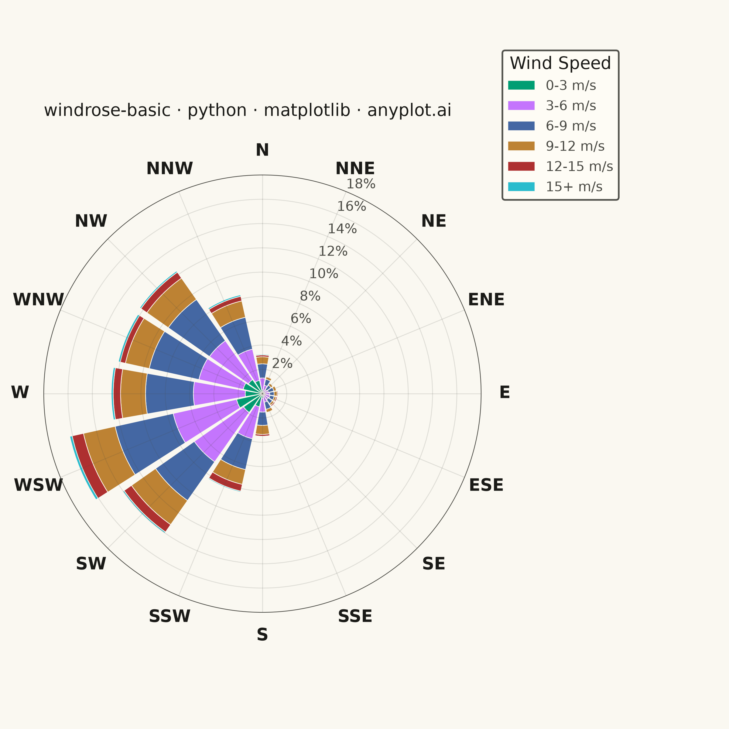
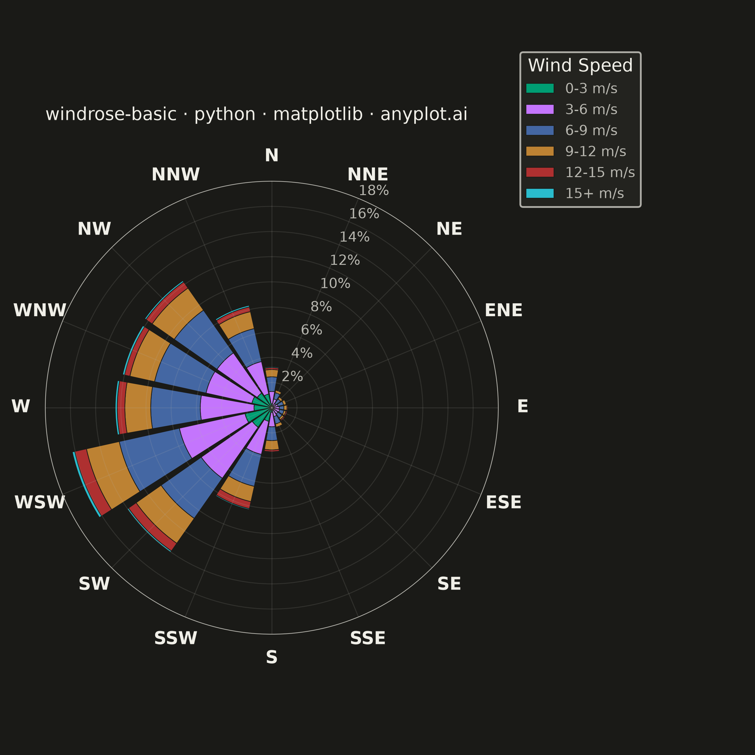
A wind rose displays wind speed and direction data as a polar stacked histogram showing the frequency distribution of wind across compass directions. Each spoke represents a direction sector (typically 8-16 bins), with stacked colored segments indicating different wind speed ranges. This specialized meteorological visualization reveals dominant wind patterns, prevailing directions, and speed distributions simultaneously, making it essential for site assessment and environmental analysis.
""" anyplot.ai
windrose-basic: Wind Rose Chart
Library: matplotlib 3.11.1 | Python 3.13.14
Quality: 91/100 | Updated: 2026-08-05
"""

import os
import sys


sys.path = [p for p in sys.path if p not in ("", ".", os.path.dirname(os.path.abspath(__file__)))]

import matplotlib.pyplot as plt
import numpy as np


# Theme tokens
THEME = os.getenv("ANYPLOT_THEME", "light")
PAGE_BG = "#FAF8F1" if THEME == "light" else "#1A1A17"
ELEVATED_BG = "#FFFDF6" if THEME == "light" else "#242420"
INK = "#1A1A17" if THEME == "light" else "#F0EFE8"
INK_SOFT = "#4A4A44" if THEME == "light" else "#B8B7B0"

# Imprint palette for wind speed bins (starting with brand green)
IMPRINT = ["#009E73", "#C475FD", "#4467A3", "#BD8233", "#AE3030", "#2ABCCD"]

# Data - Simulated annual wind measurements (8760 hourly readings)
np.random.seed(42)

n_observations = 8760  # One year of hourly data

# Generate realistic wind direction data with prevailing westerly winds
# Using mixture of normal distributions wrapped to [0, 360)
directions_main = np.random.normal(240, 30, int(n_observations * 0.5))  # SW prevailing
directions_secondary = np.random.normal(315, 25, int(n_observations * 0.3))  # NW secondary
directions_random = np.random.uniform(0, 360, int(n_observations * 0.2))  # Random

directions = np.concatenate([directions_main, directions_secondary, directions_random])
directions = directions % 360  # Wrap to [0, 360)

# Wind speeds using Weibull distribution (common for wind data)
# Scale=7.5 keeps the mean around 6.6 m/s (typical moderate wind-climate) while
# giving the 15+ m/s tail bin ~1% of observations so it stays visible in the rose
speeds = np.random.weibull(2.2, len(directions)) * 7.5
speeds = np.clip(speeds, 0, 25)

# Define bins - 16 direction sectors (22.5 degrees each)
n_dir_bins = 16
dir_bin_width = 360 / n_dir_bins
direction_centers = np.radians(np.arange(0, 360, dir_bin_width))

# Speed bins in m/s
speed_bins = [0, 3, 6, 9, 12, 15, 25]
speed_labels = ["0-3", "3-6", "6-9", "9-12", "12-15", "15+"]

# Calculate frequencies for each direction/speed combination
freq_matrix = np.zeros((n_dir_bins, len(speed_bins) - 1))

for i in range(n_dir_bins):
    # Calculate bin edges, centered on the direction
    bin_center = i * dir_bin_width
    bin_low = (bin_center - dir_bin_width / 2) % 360
    bin_high = (bin_center + dir_bin_width / 2) % 360

    # Handle wrap-around at 0/360 degrees
    if bin_low > bin_high:
        dir_mask = (directions >= bin_low) | (directions < bin_high)
    else:
        dir_mask = (directions >= bin_low) & (directions < bin_high)

    dir_speeds = speeds[dir_mask]

    for j in range(len(speed_bins) - 1):
        speed_mask = (dir_speeds >= speed_bins[j]) & (dir_speeds < speed_bins[j + 1])
        freq_matrix[i, j] = np.sum(speed_mask)

# Convert to percentage
freq_matrix = freq_matrix / len(directions) * 100

# Plot - square canonical canvas (6in x 6in @ 400dpi -> 2400x2400px) for radial symmetry
fig, ax = plt.subplots(figsize=(6, 6), dpi=400, subplot_kw={"projection": "polar"}, facecolor=PAGE_BG)
ax.set_facecolor(PAGE_BG)
fig.subplots_adjust(left=0.06, right=0.66, top=0.86, bottom=0.06)

# Bar width slightly less than bin width for visual clarity
bar_width = np.radians(20)

# Stack the bars for each speed category
bottoms = np.zeros(n_dir_bins)

for j in range(len(speed_bins) - 1):
    ax.bar(
        direction_centers,
        freq_matrix[:, j],
        width=bar_width,
        bottom=bottoms,
        color=IMPRINT[j],
        edgecolor=PAGE_BG,
        linewidth=0.4,
        label=f"{speed_labels[j]} m/s",
    )
    bottoms += freq_matrix[:, j]

# Configure polar plot - North at top, clockwise direction (meteorological convention)
ax.set_theta_zero_location("N")
ax.set_theta_direction(-1)

# Direction labels for 16 sectors
direction_labels = ["N", "NNE", "NE", "ENE", "E", "ESE", "SE", "SSE", "S", "SSW", "SW", "WSW", "W", "WNW", "NW", "NNW"]
ax.set_xticks(np.radians(np.arange(0, 360, 22.5)))
ax.set_xticklabels(direction_labels, fontsize=10, fontweight="bold", color=INK)

# Radial axis - frequency percentage
max_freq = np.ceil(bottoms.max() * 1.1)
ax.set_ylim(0, max_freq)
yticks = np.arange(0, max_freq + 1, 2)
ax.set_yticks(yticks)
ax.set_yticklabels([f"{int(y)}%" for y in yticks], fontsize=8, color=INK_SOFT)

# Grid styling - subtle, solid lines
ax.grid(True, alpha=0.15, linestyle="-", color=INK_SOFT, linewidth=0.5)

# Spine styling
ax.spines["polar"].set_color(INK_SOFT)
ax.spines["polar"].set_linewidth(0.4)

# Title
ax.set_title(
    "windrose-basic · python · matplotlib · anyplot.ai", fontsize=10, fontweight="medium", color=INK, pad=16, loc="left"
)

# Legend - positioned in the right margin reserved by subplots_adjust
leg = ax.legend(
    title="Wind Speed",
    title_fontsize=10,
    fontsize=8,
    loc="upper left",
    bbox_to_anchor=(0.68, 0.94),
    bbox_transform=fig.transFigure,
    framealpha=0.95,
    facecolor=ELEVATED_BG,
    edgecolor=INK_SOFT,
)
if leg:
    plt.setp(leg.get_title(), color=INK)
    plt.setp(leg.get_texts(), color=INK_SOFT)

plt.savefig(f"plot-{THEME}.png", dpi=400, facecolor=PAGE_BG)
Runnable source as JSON, for any HTTP client: https://api.anyplot.ai/specs/windrose-basic/matplotlib/code. Any spec id and library id listed in llms-full.txt fit the same URL shape; every URL below is complete and callable.
{
  "spec_id": "windrose-basic",
  "language": "python",
  "library": "matplotlib",
  "page": "https://anyplot.ai/windrose-basic/python/matplotlib",
  "hub": "https://anyplot.ai/windrose-basic",
  "code_json": "https://api.anyplot.ai/specs/windrose-basic/matplotlib/code",
  "spec_json": "https://api.anyplot.ai/specs/windrose-basic",
  "render_light_png": "https://storage.googleapis.com/anyplot-images/plots/windrose-basic/python/matplotlib/plot-light.png",
  "render_dark_png": "https://storage.googleapis.com/anyplot-images/plots/windrose-basic/python/matplotlib/plot-dark.png",
  "quality_score": 91.0,
  "license": "MIT",
  "guide": "https://anyplot.ai/llms.txt"
}
Part of Wind Rose Chart on anyplot.ai.