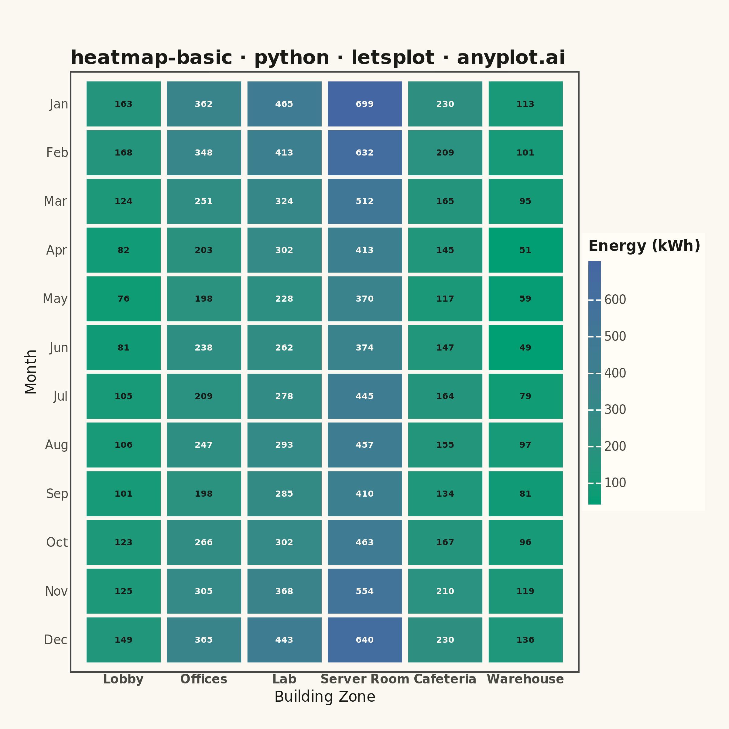
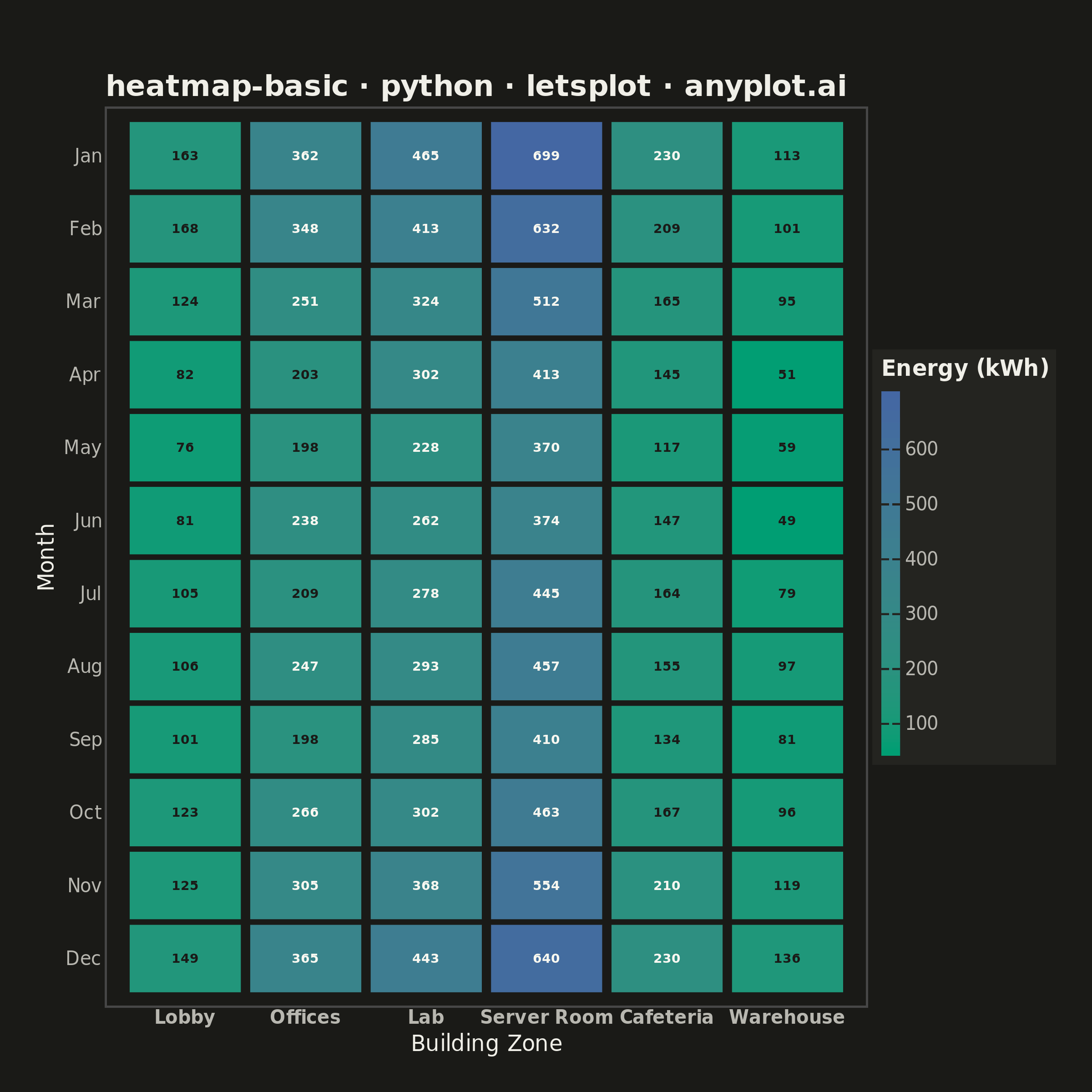
A heatmap displaying values in a matrix format using color intensity. Each cell's color represents the magnitude of the value, making it easy to identify patterns, clusters, and outliers in two-dimensional data. Essential for visualizing correlations, frequencies, and relationships between variables.
""" anyplot.ai
heatmap-basic: Basic Heatmap
Library: letsplot 4.10.1 | Python 3.13.13
Quality: 90/100 | Updated: 2026-05-28
"""

import os

import numpy as np
from lets_plot import (
    LetsPlot,
    aes,
    element_blank,
    element_rect,
    element_text,
    geom_text,
    geom_tile,
    ggplot,
    ggsize,
    guide_colorbar,
    labs,
    layer_tooltips,
    scale_color_identity,
    scale_fill_gradient,
    scale_x_discrete,
    scale_y_discrete,
    theme,
    theme_minimal,
)
from lets_plot.export import ggsave


LetsPlot.setup_html()

THEME = os.getenv("ANYPLOT_THEME", "light")
PAGE_BG = "#FAF8F1" if THEME == "light" else "#1A1A17"
ELEVATED_BG = "#FFFDF6" if THEME == "light" else "#242420"
INK = "#1A1A17" if THEME == "light" else "#F0EFE8"
INK_SOFT = "#4A4A44" if THEME == "light" else "#B8B7B0"

# Data - Monthly energy consumption (kWh) by building zone
np.random.seed(42)
months = ["Jan", "Feb", "Mar", "Apr", "May", "Jun", "Jul", "Aug", "Sep", "Oct", "Nov", "Dec"]
zones = ["Lobby", "Offices", "Lab", "Server Room", "Cafeteria", "Warehouse"]

# Realistic patterns: seasonal variation + zone-specific baselines
baselines = np.array([120, 280, 350, 520, 180, 90])
seasonal = np.array([1.3, 1.2, 1.0, 0.8, 0.7, 0.75, 0.85, 0.9, 0.8, 0.9, 1.1, 1.25])

values = np.outer(seasonal, baselines)
noise = np.random.normal(0, 15, (len(months), len(zones)))
values = np.round(values + noise, 0).astype(int)

# Build long-form data using vectorized operations
n_months, n_zones = len(months), len(zones)
zone_col = np.tile(zones, n_months).tolist()
month_col = np.repeat(months, n_zones).tolist()
kwh_col = values.flatten().tolist()

# Adaptive text color: dark on green cells (low kWh), white on blue cells (high kWh)
# Imprint sequential: low → #009E73 (bright green), high → #4467A3 (dark blue)
median_val = int(np.median(kwh_col))
text_color = ["#FAF8F1" if v > median_val else "#1A1A17" for v in kwh_col]

data = {"Zone": zone_col, "Month": month_col, "kWh": kwh_col, "label_color": text_color}

# Heatmap with Imprint sequential colormap (brand green → blue)
plot = (
    ggplot(data, aes(x="Zone", y="Month", fill="kWh"))
    + geom_tile(
        width=0.92,
        height=0.92,
        tooltips=layer_tooltips()
        .line("@Zone | @Month")
        .line("Energy: @kWh kWh")
        .line("Median: " + str(median_val) + " kWh"),
    )
    + geom_text(aes(label="kWh", color="label_color"), size=3.5, fontface="bold")
    + scale_color_identity()
    + scale_fill_gradient(
        low="#009E73", high="#4467A3", name="Energy (kWh)", guide=guide_colorbar(barwidth=10, barheight=200, nbin=256)
    )
    + scale_x_discrete(limits=zones)
    + scale_y_discrete(limits=months[::-1])
    + labs(x="Building Zone", y="Month", title="heatmap-basic · python · letsplot · anyplot.ai")
    + theme_minimal()
    + theme(
        plot_title=element_text(size=16, face="bold", color=INK),
        axis_title=element_text(size=12, color=INK),
        axis_text_x=element_text(size=10, face="bold", color=INK_SOFT),
        axis_text_y=element_text(size=10, color=INK_SOFT),
        legend_text=element_text(size=10, color=INK_SOFT),
        legend_title=element_text(size=12, face="bold", color=INK),
        legend_background=element_rect(fill=ELEVATED_BG, color=INK_SOFT),
        panel_grid=element_blank(),
        plot_background=element_rect(fill=PAGE_BG, color=PAGE_BG),
        panel_background=element_rect(fill=PAGE_BG),
        plot_margin=[40, 20, 20, 20],
    )
    + ggsize(600, 600)
)

# Square canvas: ggsize(600, 600) × scale=4 → 2400×2400 px
ggsave(plot, f"plot-{THEME}.png", path=".", scale=4)

# HTML for interactive tooltips
ggsave(plot, f"plot-{THEME}.html", path=".")
Runnable source as JSON, for any HTTP client: https://api.anyplot.ai/specs/heatmap-basic/letsplot/code. Any spec id and library id listed in llms-full.txt fit the same URL shape; every URL below is complete and callable.
{
  "spec_id": "heatmap-basic",
  "language": "python",
  "library": "letsplot",
  "page": "https://anyplot.ai/heatmap-basic/python/letsplot",
  "hub": "https://anyplot.ai/heatmap-basic",
  "code_json": "https://api.anyplot.ai/specs/heatmap-basic/letsplot/code",
  "spec_json": "https://api.anyplot.ai/specs/heatmap-basic",
  "render_light_png": "https://storage.googleapis.com/anyplot-images/plots/heatmap-basic/python/letsplot/plot-light.png",
  "render_dark_png": "https://storage.googleapis.com/anyplot-images/plots/heatmap-basic/python/letsplot/plot-dark.png",
  "interactive_light_html": "https://storage.googleapis.com/anyplot-images/plots/heatmap-basic/python/letsplot/plot-light.html",
  "interactive_dark_html": "https://storage.googleapis.com/anyplot-images/plots/heatmap-basic/python/letsplot/plot-dark.html",
  "quality_score": 90.0,
  "license": "MIT",
  "guide": "https://anyplot.ai/llms.txt"
}
Part of Basic Heatmap on anyplot.ai.