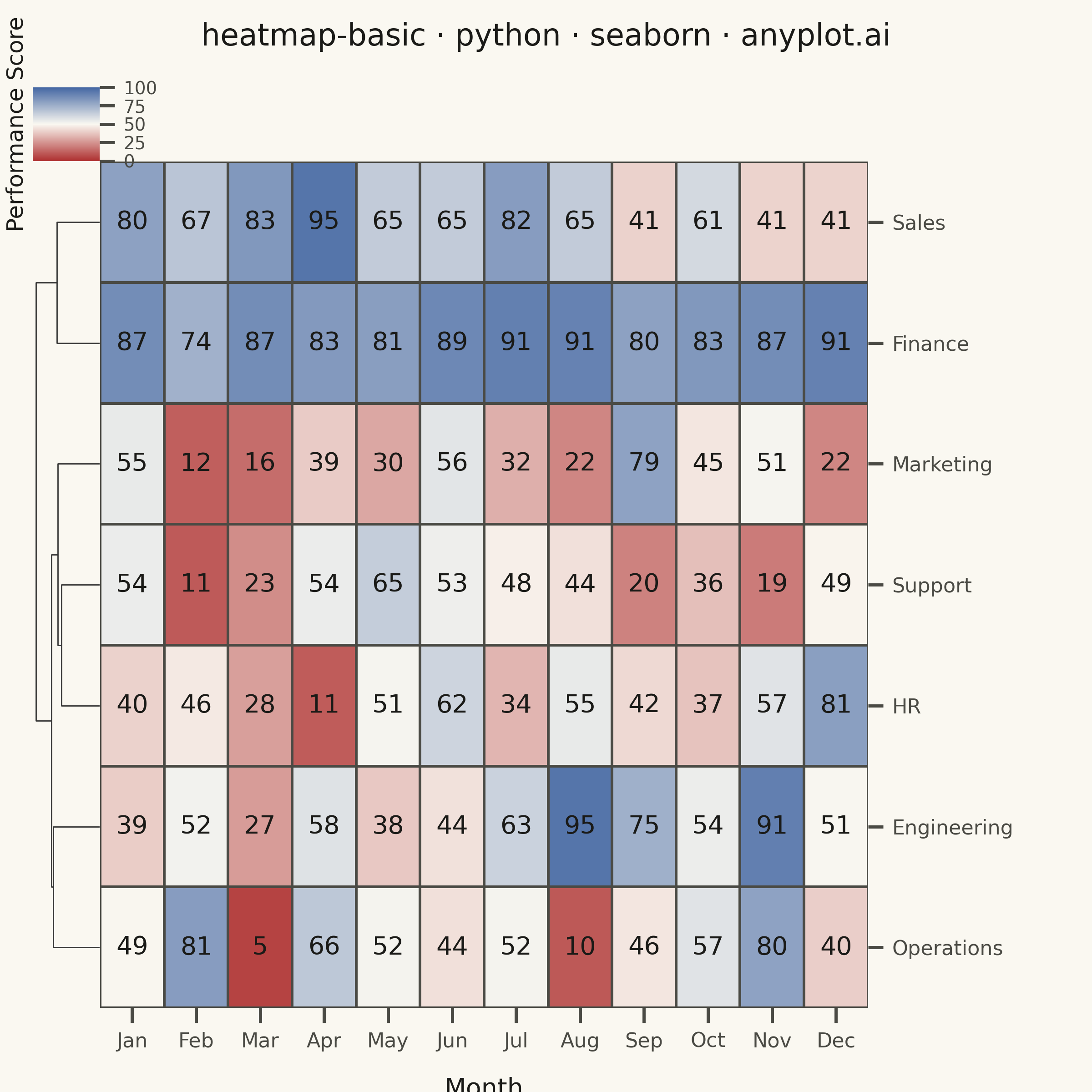
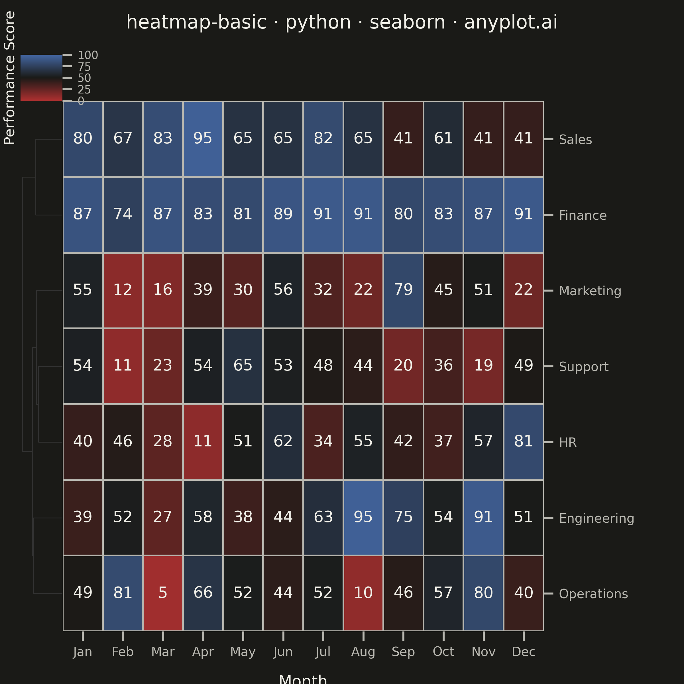
A heatmap displaying values in a matrix format using color intensity. Each cell's color represents the magnitude of the value, making it easy to identify patterns, clusters, and outliers in two-dimensional data. Essential for visualizing correlations, frequencies, and relationships between variables.
""" anyplot.ai
heatmap-basic: Basic Heatmap
Library: seaborn 0.13.2 | Python 3.13.13
Quality: 90/100 | Updated: 2026-05-28
"""

import os

import matplotlib.pyplot as plt
import numpy as np
import seaborn as sns
from matplotlib.colors import LinearSegmentedColormap


# Theme tokens
THEME = os.getenv("ANYPLOT_THEME", "light")
PAGE_BG = "#FAF8F1" if THEME == "light" else "#1A1A17"
ELEVATED_BG = "#FFFDF6" if THEME == "light" else "#242420"
INK = "#1A1A17" if THEME == "light" else "#F0EFE8"
INK_SOFT = "#4A4A44" if THEME == "light" else "#B8B7B0"

# Imprint diverging colormap — theme-adaptive midpoint (matte-red ↔ neutral ↔ blue)
midpoint = "#FAF8F1" if THEME == "light" else "#1A1A17"
imprint_div = LinearSegmentedColormap.from_list("imprint_div", ["#AE3030", midpoint, "#4467A3"])

# Global seaborn style
sns.set_theme(
    style="ticks",
    rc={
        "figure.facecolor": PAGE_BG,
        "axes.facecolor": PAGE_BG,
        "axes.edgecolor": INK_SOFT,
        "axes.labelcolor": INK,
        "text.color": INK,
        "xtick.color": INK_SOFT,
        "ytick.color": INK_SOFT,
    },
)

# Data — monthly performance metrics across departments
np.random.seed(42)
departments = ["Sales", "Marketing", "Engineering", "Support", "Finance", "HR", "Operations"]
months = ["Jan", "Feb", "Mar", "Apr", "May", "Jun", "Jul", "Aug", "Sep", "Oct", "Nov", "Dec"]

data = np.random.randn(len(departments), len(months)) * 20 + 50
data[0, :6] += 20  # Sales surge first half
data[2, 6:] += 25  # Engineering ramp second half
data[4, :] = data[4, :] * 0.3 + 70  # Finance steady high
data[5, 3:9] -= 15  # HR mid-year dip
data[3, 10:] -= 22  # Support year-end slump (sharp outlier)
data = np.clip(data, 5, 95)

# Plot
title = "heatmap-basic · python · seaborn · anyplot.ai"
n = len(title)
ratio = 67 / n if n > 67 else 1.0
title_fontsize = max(8, round(12 * ratio))

g = sns.clustermap(
    data,
    annot=True,
    fmt=".0f",
    cmap=imprint_div,
    center=50,
    xticklabels=months,
    yticklabels=departments,
    linewidths=1.0,
    linecolor=INK_SOFT,
    annot_kws={"fontsize": 10, "fontweight": "medium", "color": INK},
    figsize=(6, 6),
    row_cluster=True,
    col_cluster=False,
    dendrogram_ratio=0.08,
    cbar_pos=(0.05, 0.15, 0.04, 0.6),
    cbar_kws={"ticks": [0, 25, 50, 75, 100]},
    vmin=0,
    vmax=100,
)
g.figure.set_dpi(400)

# Background
g.figure.patch.set_facecolor(PAGE_BG)
g.ax_heatmap.set_facecolor(PAGE_BG)

# Style row dendrogram
g.ax_row_dendrogram.set_facecolor(PAGE_BG)
for spine in g.ax_row_dendrogram.spines.values():
    spine.set_visible(False)
for line in g.ax_row_dendrogram.get_lines():
    line.set_color(INK_SOFT)

# Style column dendrogram area (empty when col_cluster=False)
if g.ax_col_dendrogram is not None:
    g.ax_col_dendrogram.set_facecolor(PAGE_BG)
    for spine in g.ax_col_dendrogram.spines.values():
        spine.set_visible(False)

# Colorbar styling — small labelpad keeps label on-canvas given cbar_pos x=0.05
g.cax.set_ylabel("Performance Score", fontsize=9, labelpad=2, color=INK)
g.cax.yaxis.set_label_position("left")
g.cax.tick_params(labelsize=7, colors=INK_SOFT)
for spine in g.cax.spines.values():
    spine.set_color(INK_SOFT)

# Axis labels and ticks
g.ax_heatmap.set_xlabel("Month", fontsize=10, labelpad=10, color=INK)
g.ax_heatmap.set_ylabel("", fontsize=10)
g.ax_heatmap.tick_params(axis="x", labelsize=8, colors=INK_SOFT)
g.ax_heatmap.tick_params(axis="y", labelsize=8, rotation=0, colors=INK_SOFT)

# Remove heatmap spines
for spine in g.ax_heatmap.spines.values():
    spine.set_visible(False)

# Title
g.figure.subplots_adjust(top=0.92)
g.figure.suptitle(title, fontsize=title_fontsize, fontweight="medium", color=INK)

plt.savefig(f"plot-{THEME}.png", dpi=400, facecolor=PAGE_BG)
Runnable source as JSON, for any HTTP client: https://api.anyplot.ai/specs/heatmap-basic/seaborn/code. Any spec id and library id listed in llms-full.txt fit the same URL shape; every URL below is complete and callable.
{
  "spec_id": "heatmap-basic",
  "language": "python",
  "library": "seaborn",
  "page": "https://anyplot.ai/heatmap-basic/python/seaborn",
  "hub": "https://anyplot.ai/heatmap-basic",
  "code_json": "https://api.anyplot.ai/specs/heatmap-basic/seaborn/code",
  "spec_json": "https://api.anyplot.ai/specs/heatmap-basic",
  "render_light_png": "https://storage.googleapis.com/anyplot-images/plots/heatmap-basic/python/seaborn/plot-light.png",
  "render_dark_png": "https://storage.googleapis.com/anyplot-images/plots/heatmap-basic/python/seaborn/plot-dark.png",
  "quality_score": 90.0,
  "license": "MIT",
  "guide": "https://anyplot.ai/llms.txt"
}
Part of Basic Heatmap on anyplot.ai.